Headway ABA

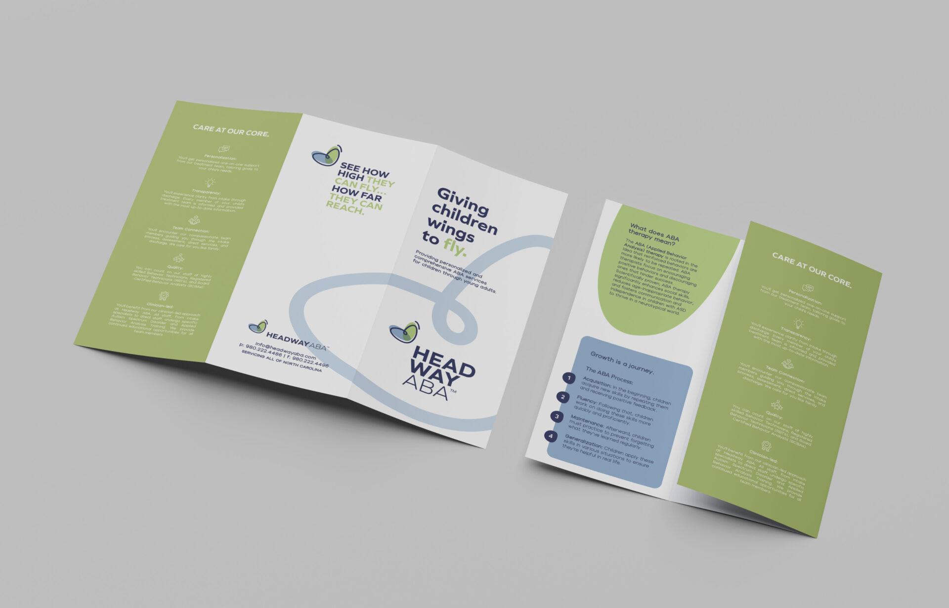
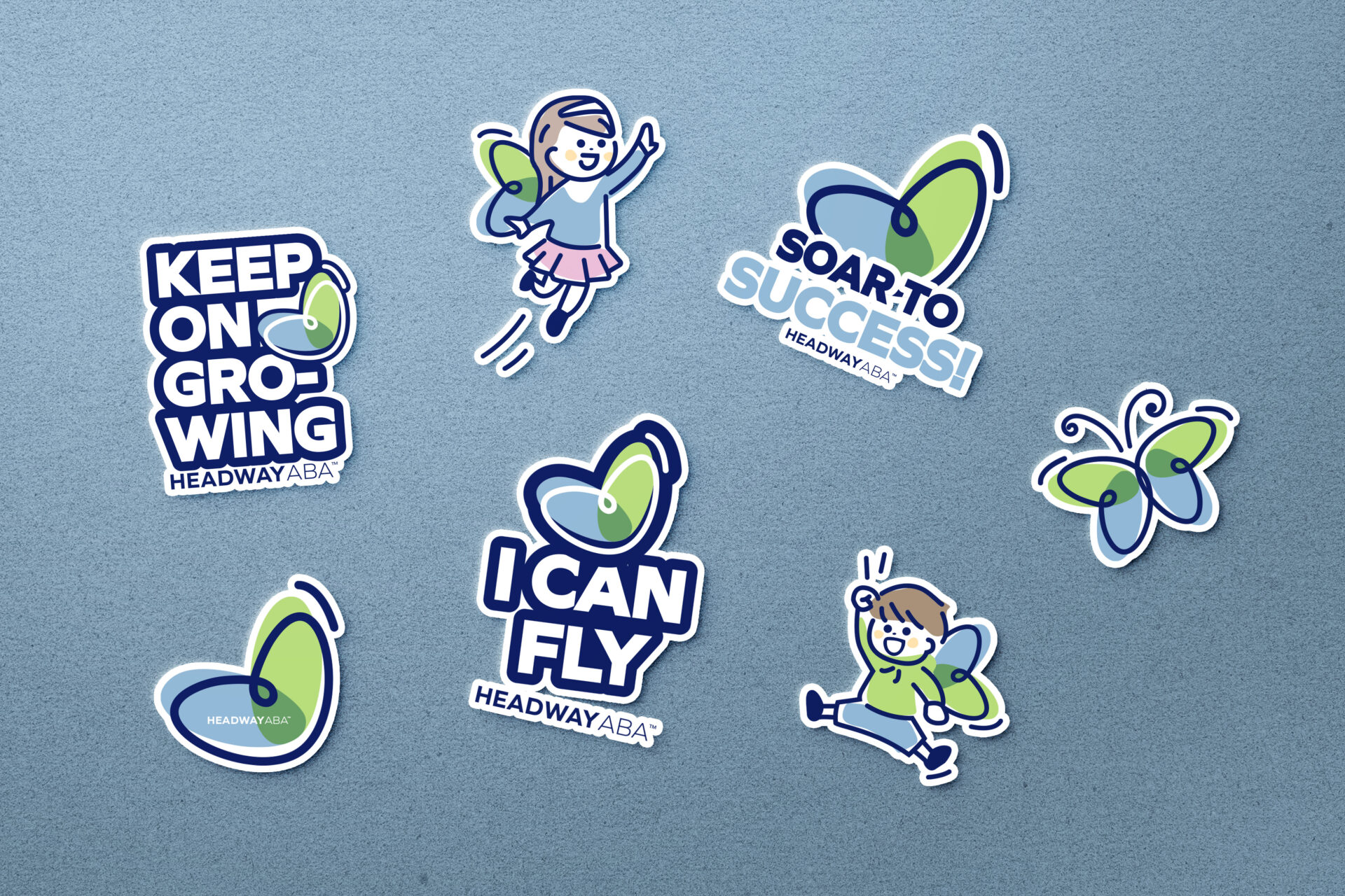
Helping children find their wings. 

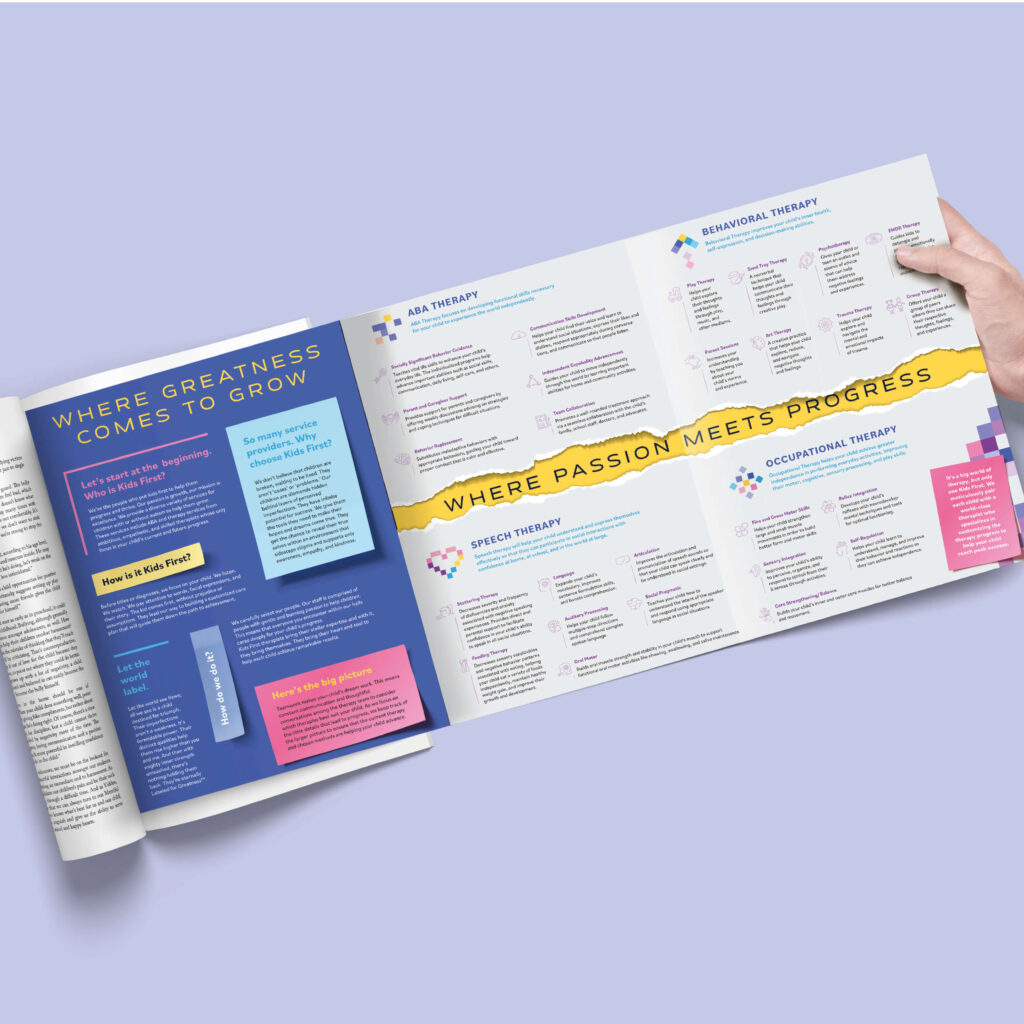
Obsessed with measurable results and unwaveringly focused on empowering growth, Headway ABA’s clinical-led approach sets it apart. Every therapy session, meticulously led by experienced clinicians, is designed to address challenges and instill a sense of accomplishment and independence in each child. 

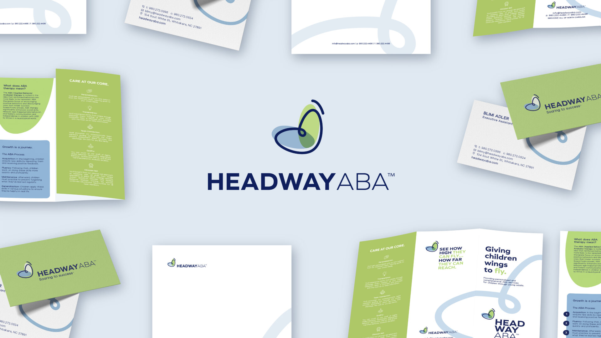
Built from the ground up, the brand’s journey reflects a deep understanding of the unique needs of children undergoing ABA therapy, ensuring a transformative experience beyond conventional approaches. 

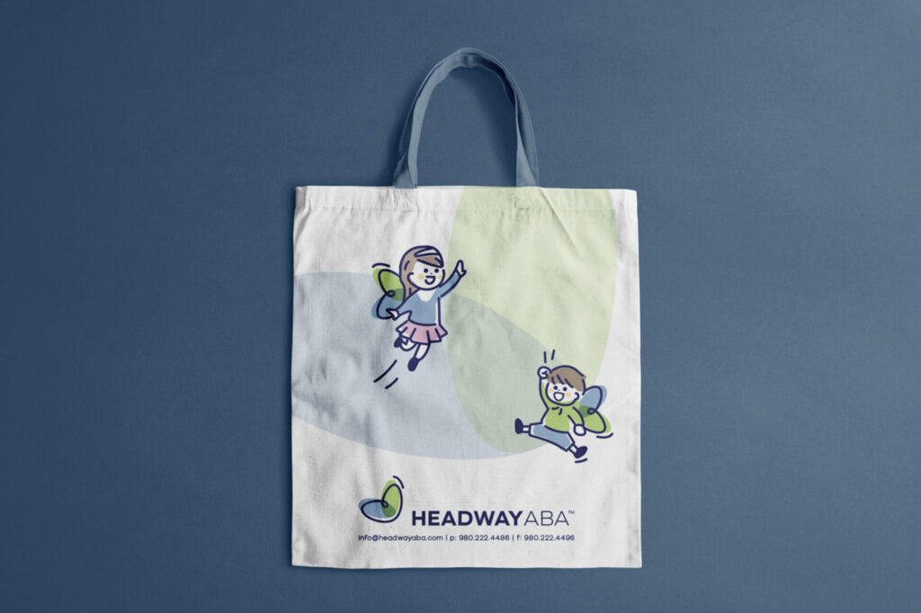
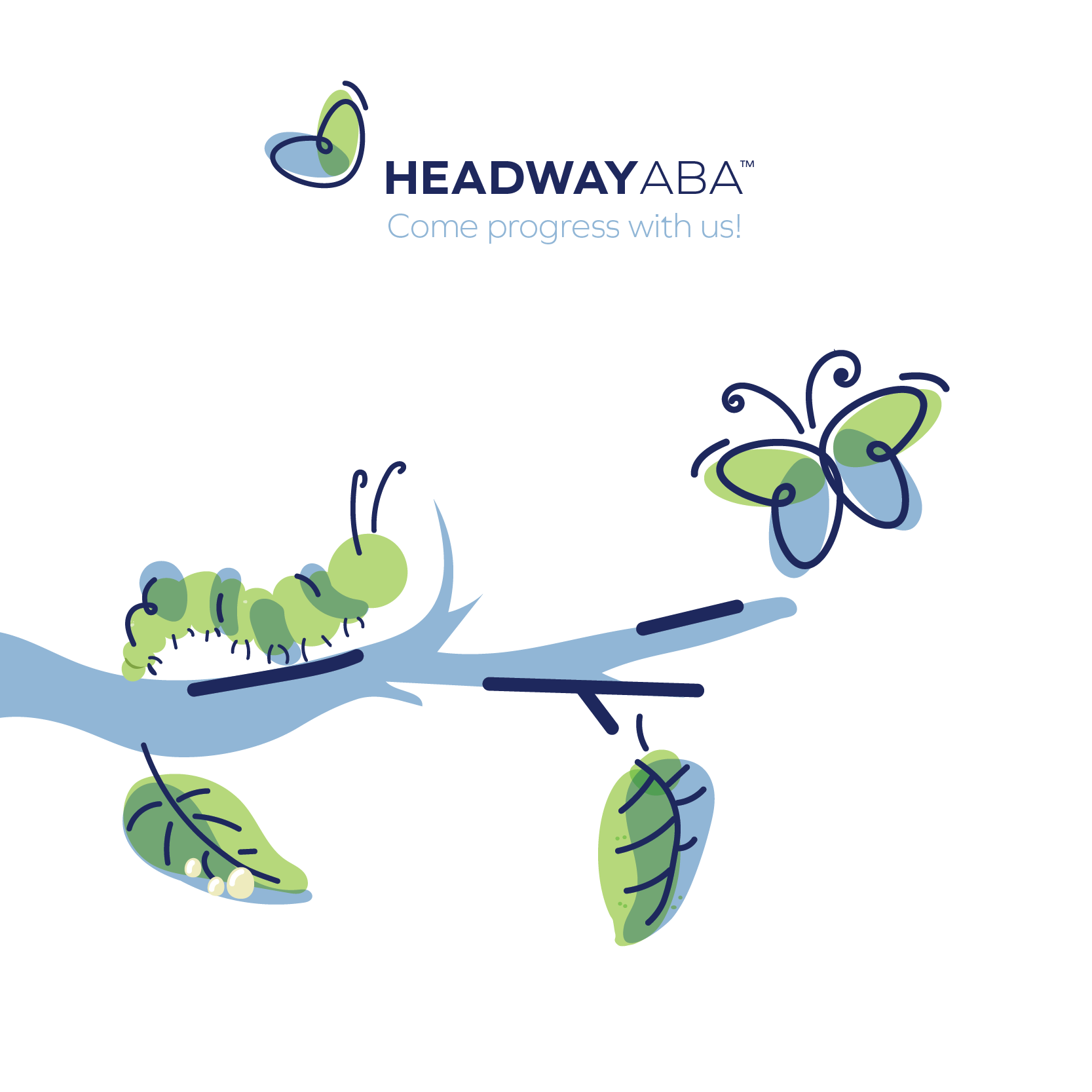
Spread your wings and fly.

Much like the metamorphosis of a caterpillar into a butterfly, the Headway ABA  therapeutic approach aims to guide children through positive growth and development.  The vibrant and graceful presence of the butterfly in the branding serves as a visual metaphor for the significant strides and empowerment children under Headway ABA’s care achieve on their developmental journey.

YU Global

What we did:

The YU Global logo conveys the fluidity of the contemporary job market, highlighting the quick attainment of skills through professional certificates.

Figures depicted looking ahead represent learners of diverse educational and geographical backgrounds, emphasizing perpetual progress and career enhancement. These elements are embraced by the YU shield, symbolizing a steadfast commitment to personal development and adaptable education pathways for lifelong learning or advanced degrees.

To maintain brand recognition and continuity, we preserved YU’s primary color in the logo design.

Minute Mix Blends

Designing the universe.

Our branding and packaging transcends aesthetics; it’s a gateway to the refreshing essence of Minute Mix. “Minute Mix” encapsulates ease and speed — a delightful blend of sun-kissed fruit and vibrant veggies, consolidated and ready in just a minute. It’s nature’s fusion, a symphony of flavors handpicked at their freshest. No sugar, no additives—pure essence. An invitation to “Taste the Real.”

Naming cosmic creations.

We meticulously named each product to reinvigorate and revitalize your senses with names like “Replenish, Cucumber Watermelon Mint” and “Recharge, Dragon Fruit and Elderberry.”

The brand tone, celestial yet grounded, invites exploration of the universe within each refreshment. It underscores Minute Mix’s commitment to natural, refreshing ingredients, creating a caring experience for consumers.

Rewriting the stars.

We crafted marketing materials, brochures, signage, and packaging with vibrant colors, captivating visuals, and concise messaging. Minute Mix transformed drink menus into a flavor-bursting experience.

Our collaboration propels Minute Mix into a unique market position, offering consumers a taste of the universe in every sip, a visual feast, and a compelling narrative that transcends the ordinary.

BSM Facility Solutions

Our journey commenced with a logo that deftly weaves BSM’s essence. It marries the sturdiness of architectural elements, emblematic of infrastructure, with the trust and security represented by a shield. Custom fonts were meticulously curated, radiating professionalism and dependability. Sharp angles and bold design elements infuse a modern and dynamic touch.

For the tagline, “Maintaining your assets” was the natural choice. It succinctly encapsulates BSM’s core competence: the diligent stewardship of your property.

This rebranding endeavor positions BSM Facility Solutions as the epitome of reliability, a trusted partner firmly rooted in the local facility services landscape. The revitalized visual identity and tagline exude professionalism, security, and quality, harmonizing seamlessly with the company’s fundamental values and unwavering commitment to excellence.

ABC Mortgage

Brand messaging and identity.

Our approach was clear: embrace the name while amplifying its essence. We married ABC’s inherent strengths to the brand’s visual identity. A harmonious palette of dark navy and blue tones evoking trust and professionalism, while a clean, crisp font exuding clarity. Three blue circles adjacent to “ABC” symbolize the brand’s core pillars: Process, structure, and ease. 

In crafting the tagline, “As Easy, As Efficient,” we encapsulated ABC Mortgage’s commitment to delivering a seamless, hassle-free experience for their clients. It perfectly resonates with their core values.

Streamlined marketing collateral: A visual symphony.

Our team meticulously developed marketing collateral that harmonized with ABC’s new brand image, ensuring a consistent and compelling message across all touchpoints.

Sealing the brand.

We designed professional email signatures that reinforced the brand’s visual identity, leaving a lasting impression with every communication.

Stern’s Bakery

Our first step was to bid farewell to outdated design elements that had served their time. Gradients, once in vogue but now a relic of the past, were gracefully retired. The tagline design, which had grown tired and worn, was rejuvenated with a modern sensibility. Oversized wheat details, while nostalgic, found their place in the annals of history.

The essence of Stern’s Bakery, however, remained unwavering. We retained the heart and soul of the brand by refining rather than reinventing. The font was simplified, balancing contemporary elegance and timeless tradition. The tagline was rendered more concise and engaging, resonating with a modern audience while paying homage to the bakery’s enduring legacy.

A contemporary touch was introduced with a new wheat detail, meticulously crafted to evoke the spirit of freshness and abundance. It seamlessly integrated into the revamped design, symbolizing Stern’s commitment to quality and authenticity.

The packaging also underwent a transformation to embody the new vision. It featured clean lines and sharper details executed with precision, making each pastry box irresistible to open.

In this grand transformation, Sterns Bakery did not just rebrand; it forged a bridge between its storied past and vibrant future.

The Perfect Week Takes The Cake.

This campaign celebrated the transformative power of good food, turning everyday moments into sweet interludes in life. Stern’s pastries-to-go became the secret ingredient for better moods, sweeter moments, and more playful breaks.

Artfully arranged to spell out the days of the week, Sterns irresistible, flaky, soft, and sweet delights took center stage. Because every day deserves a mouthwatering treat, a single delectable bite can turn your day around.

Wherever wheels go, we follow: A companion for your adventure.

This campaign wasn’t about listing countless reasons why Stern’s individually packaged family-pack cakes make the perfect snack for your adventures. Our aim wasn’t to persuade you of their mess-free convenience, the joy of pre-packaging, or their delightful munchability. We assumed you already knew that. Instead, we showed you. That’s how powerful they are.

Our goal was to demonstrate that Sterns Pastries-to-Go is your trusty sidekick, whether you’re exploring the zoo, braving the King Da Ka roller coaster, ferrying across waters, cycling through Prospect Park, or embarking on a journey to Niagara Falls.

Wherever your wanderlust takes you, Pastry-to-Go will be your delightful companion.

Schmerling’s

Schmerling’s is the finest Swiss chocolate brand that’s been around and loved for ages. And sure, we all have that inner kid who loves chocolate. But we also grow up, and our tastes evolve. That’s where our inner adult comes in. Shmerlings isn’t just about chocolate; it’s an experience. It’s like a cozy hug, a moment of pure pleasure, and a little mindfulness rolled into one delicious bite.

So, why did we go with this messaging – ‘Discover Your Inner Adult’?

Because we want you to savor life’s little pleasures.

Schmerling’s chocolate isn’t just sweet; it’s sophisticated, just like you. It’s a journey, a taste of luxury, and a reminder that growing up doesn’t mean you can’t enjoy a little indulgence.

Cheers to finding your inner adult through one chocolate square at a time.

ICA

The rebrand.

ICA’s iconic logomark has transformed, reflecting its commitment to innovation and excellence. While the fundamental design remains, we’ve refined it with balanced lines and angles, infusing it with a fresh, professional, and polished appearance.

But why keep the same icon? It’s all about preserving recognition. 

We’ve cranked up the vibrancy, infusing it with a bold splash of yellow. The journey towards excellence takes on a brighter, more vibrant tone with a sleek, unified face.

It’s all about the bigger picture.

Our goal was to ensure that ICA’s campaigns shared a consistent visual language.

Every campaign was a piece of a larger puzzle, contributing to ICA’s overarching brand message. This cohesive approach created a strong and memorable brand presence.

Through a consistent color palette, typography, and visual elements, we established a unified brand identity that reinforced ICA’s core values. 

The ICA fashion edition.

Fashion is a constantly shifting playlist, where the beat never stays the same. Runway shows and red-carpet events? They’re practically on a loop. 

For designers, staying in vogue isn’t a challenge; it’s their canvas, their art, and they set the bar.

The rest of us? We often find ourselves chasing after their creative coattails. 

We came in strong with this campaign, choosing a unique angle that speaks to those artists. Instead of chasing trends, we empower them to become the trendsetters, the couture visionaries, and the dream weavers who bring their boldest fashion fantasies to life.

Why be a trend follower when you can be a trendsetter? 

That’s the message we set out to share, and we’re delighted with how we’ve breathed life into it.

The ICA BA edition.

BA programs come by the dime a dozen. How does ICA differentiate itself? Because they’re in it for the long-term end result. They have their eyes on the prize and push you forward.

We chose this bold message to show you the end goal – a transformation from students to leaders. 

With our message and visual direction, you can envision yourself, armed with your degree, heading out into the world confident in your ability to make a mark. 

They say, ‘The future belongs to those who believe in the beauty of their dreams.’ With ICA, your dreams are not just beautiful; they’re achievable.

Who knows where your BA will take you? The sky’s the limit – and maybe even beyond. We made those tassels turn to show you how far you can go. 

The ICA Masters in Special Education edition.

In our campaign for ICA’s Masters in Special Education, we’re painting a picture that tugs at the heartstrings. Forget the usual laundry list of benefits; we’re all about celebrating the magic of your passion.

Our visuals feature backpacks and beaming kids with stickers that declare them as resilient problem solvers, high achievers, and curious learners. We even sprinkle in some ‘Good job’ and ‘Awesome’ vibes because, let’s face it, every success deserves a cheer.

But here’s the real deal: it’s not just about the stickers. It’s about the incredible journey you’ll embark on with ICA.

Yeshiva University

Return on Yeshiva University

At Yeshiva University, they navigated the intricate balance between spiritual fulfillment and educational advancement, acknowledging that life often unfolds in the vast gray areas between absolutes. This institution, where decisions are made, sacrifices endured, and confusion confronted, is a testament to the convergence of values and knowledge.

Our campaign, aptly named “ROYU” or “Return on Yeshiva University,” was meticulously chosen to convey a profound message. It serves as a testament to the tangible, real-world impact that Yeshiva University has on its students and alumni, substantiated by compelling data.

Within the campaign, we introduced you to a select group of alumni, not as mere faces but as living embodiments of success. A Yeshiva University investment is not only an investment in education but also in oneself, securing a lifetime of success and fulfillment.

Yeshiva University on Wall Street: Illuminating success

In a captivating feature within the esteemed Wall Street Journal, Yeshiva University stepped into the spotlight, illuminating its profound influence in education, ethics, and personal development. This strategic positioning within one of the world’s foremost financial publications underscores Yeshiva Universty’s significance in academia and prepares individuals to excel in the intricate world of business and finance.

Pathways at YU: Paving the way to excellence

Under the innovative PATHWAYS program at Yeshiva University, undergraduates embark on a seamless journey from bachelor’s degrees to graduate programs while acquiring advanced training necessary to launch successful careers.

Our comprehensive development efforts spanned a multitude of aspects, encompassing a ground-up approach. This included a complete identity redesign, captivating billboards, meticulously designed signs and banners, engaging advertisements, and highly effective email campaigns. Moreover, we introduced an array of cutting-edge devices and technology to facilitate seamless transitions and engagement for the PATHWAYS program, ensuring that every student’s journey is both productive and inspiring.

Leiter’s Sukkah

Our ad campaign highlights the numerous ways to enhance, enjoy, and decorate Sukkos.

The heart of Sukkos beats within the walls of a Leiter’s Sukkah. While the holiday itself allows for diverse interpretations and celebrations, the vessel that holds its spirit is unequivocal – a Leiter’s Sukkah, the very epitome of excellence.

We bring their unique selling point to the forefront, as the oldest and most trusted name in the industry. It’s not just a sukkah; it’s a Leiters.

Coolmate

We’ve painted the town in shades of energy.

Our journey began with a vision – to revolutionize the way people experience hydration. We didn’t just showcase a product; we crafted a lifestyle. 

Custom illustration. Artistry in every drop.

In a world of digital noise, we believe in the power of tangibility. Our team created a campaign that you could touch, feel, and remember. It’s about making an imprint on your senses.

Sip in color: A taste of the extraordinary.

Coolmate isn’t just a drink; it’s a lifestyle. We’re not just quenching thirst; we’re igniting spirits. From mundane to magical. 

It’s about becoming your best buddy with an infectious energy that could power a dance floor. So, sip in color and join the ranks of those who know what it means to have good energy.

Olivvi

For the colors, we kept away from the classic soft feminine colors and instead chose a strong burnt rustic to convey the boldness of the Olivvi city girl. We added We portray the grit of the city girl within the block letters of the logo. During our research period, one of the things that came across from designer brands was that they kept their logo very simple and not overdone, that way they can blend in with any collection or design. 

The name Olivvi stands out among the brand with strength, yet remains simple not to overwhelm, allowing the clothes to lend their striking impression.

We used a clean font with a strikethrough to subtly hint at the city. The icon is the letter O – for Olivvi – with a continuous line to continue the theme. subtle secondary shades for contrast.

Olivvi is the embodiment of a girl in the city. It’s an image of her strength, coupled with her infectious amiability. Embodying courage and determination, Olivvi speaks with boldness and warmth.

Weaving lines tell of the roads, the crosswalk, the grid that makes the city streets, and traffic lines that lead the way.

The people, the streets, the buildings — she carries them close to her heart, as they do her. She leaves a bit of herself wherever she goes, marking her mark along the way.

If you love the brand, you’ll recognize its pattern anywhere. Think Gucci, think Balenciaga, think Olivvi.

We created 4 beautiful custom patterns to use on the clothing, lining, stationary, and shipping boxes to elevate the entire branding experience.

Five:30

To mirror the Five:30 goer, we showcased tough determination with bold font and sharp lines. The precise lines cut deep, hinting at discipline and routine. The daring, rough feel personifies a woman crushing her fitness goals.

Kids First

The logo depicts a child in motion, running forward, breaking through. It also portrays an arrow pointing upward. 

With the labels on full display, we proudly pronounce: Challenges accepted. We accept every child with open arms and help them attain their true potential.

We went with a variety of vibrant colors to reflect a myriad of individual personalities. Because no one color fits all.

For the fonts, we chose a child-friendly and warm font that reflects the Kids First mission of a kind and welcoming approach to kids with challenges.

At the same time font is also clean and corporate to convey a sense of professionality that Kids First takes pride in.

To unveil this beautiful rebrand, we designed a state-of-the-art multi-page pull-out for the magazines that were published in the Pesach issue. In the designs we used portrayed the brands message and style with the label shapes, luxurious copy, and iconography to exhibit all the services Kids First offers.

Ahava Medical

The heart represents the hub that’s the medical center, doing its part to pump energy and life. The chambers of the heart that hint at the departments that exist within the medical center. Shapes that portrude out of the heart to represent specialists within the trusted circle. A team that comes together in one place to bring stellar medical care.

Various shapes cluster around the heart, representing the numerous specialties the center offers. Together they create a circle that embraces our patients within with the quality care they deserve. The circle conveys openness, trust, and a sense of wholeness.

Let’s talk colors: We went with high-contrast shades of green and blue to convey the brand messaging of professionality and trustworthiness, while showcasing the distinctness of the brand with the bold colors.

Working with the brand colors and shapes, we created a custom iconography set and pattern that displays the different functions of Ahava Medical.

Avery & Jay’s

So how did we come up with the name Avery & Jays? We brainstormed many different ideas until we finally struck gold.

Inspired by the dedication & commitment of the owners Avrumy & Yaakov to their new endeavor, we thought who else personifies the brand more than the owners who live & breathe this dream? And so, Avery (Avrumy) & Jay’s (Yaakov) was born.

The logo design is friendly, flowing, and playful. Dancing lines mimic the swirls of an ice cream scoop. The font is a bold look on a soft pattern to show the contrast of soft ice cream on a crunchy cone. The ‘v’ in Avery presents an ice cream cone with an enticing scoop on top.

Kindzees Headstart Program

Golden Flow UHT Milk Campaign

Our team designed a spread depicting a traveling suitcase featuring the all-new with the UHT milk, illustrating the function. On the left-hand side of the ad, we explained in user-friendly terms the chemical background of how UHT milk can last without being refrigerated.

Mehadrin Website

The website displays the full inventory of all the Mehadrin products alongside relevant information, ingredients and nutrition facts, recipes to munch on using Mehadrin products and news & updates within the Mehadrin company.


This launch is just the beginning. Mehadrin continues to evolve, and our platform is designed to flex along with their growth. With an eye toward growth including future wholesale shopping integration, we crafted a content management system that can accommodate whatever future evolutions the site takes.

To complement the website we had Yossi & Malky Levin shoot beautiful lifestyle photography showcasing the Mehadrin products in nice foody environments with a consistent look, just the way you would like it at home.

See full website: mehadrin.com

The Armon Hotel

The various iterations of the logo give the brand versatility to be used on various mediums across all platforms. We customized a modern font to complement the wordmark.

The font is distinct and clean, alluding to an inviting and open space. Each letter of the name carries a sophisticated, non-rigid shape, conveying a royal and upscale aura. The font’s curves and smooth edges visualize a spa-like shape, lending imagery of a luxury destination escape.

Unveiling In The Papers

To unveil this beautiful Armon Hotel, we designed a state-of-the-art 6-page pull-out for the magazines that will be published in the Sukkos issue. We used bold photography, luxurious copy, and iconography to exhibit all the amenities Armon offers.

The Website

We created a website that visually reflects the elegance and grandeur of the Armon, and has a satisfying user experience that works just as beautifully with mobile, as it does desktop.

With a blend of striking photography, distinct typography, bold copy and the Armon signature colors – the website is a reflection of the upscale Armon Hotel.

J&J Dairy Website

NA’ASEH Branding

King Restoration

Bold colors were used to show strength along with the areas of expertise, with red representing fire and blue representing water. With the overall aesthetic of the logo, we were able to make King Restoration stand out by presenting a memorable, trusted brand for years to come.

We designed a full wrap-around branded van for the company prominently displaying the company’s brand identity and relevant information.

We created a modern and beautiful website with vibrant images, icons, and clear copy with an enjoyable and gratifying user experience optimized for all devices. The website is showcasing relevant information about King Restoration, their services and more.

Maxi Health Billboard Campaign

Gevina Website

Confetti Ice Cream

The Teyva Campaign

Complete Quinoa Cookies

We created an upscale and unique logo. The handwritten font invites you in with the warmth and tells the story of a custom brand that created products tailored especially for you.

The type is gentle and pleasant, lending a lighthearted vibe. Interconnected letters and a definitive underline represent the concept of mind-body health.

The packaging highlights the healthy nature of the food products, giving an organic feel that reflects the mission of the brand. We went for a clear and clean look with the product prominently displayed, which gives the consumer a clear idea of what they are purchasing with just one look.

Donary

Trimblaze

Web Design

With the website, we aimed to communicate the brand’s identity of upscale modern architecture through the design, layout, and user experience.

Print Ads

We also created a series of ads to showcase the rebranding. It was important to the client to display their handiwork while explaining their services. We added an element of blueprint within the design to emphasize the build.

Northside Coffee Rebrand

Wellbound Health Care

Wellbound Pediatric division

For the Wellbound Pediatric division, we replaced the “L” in the logo with a child flying a kite. We used child-friendly branding colors, while still maintaining a corporate look. See their business cards and how we incorporated their logo into their Kidz Thrive program.
We incorporated the geometric branding style into the pediatric website in an engaging and user-friendly way using responsive design. Swipe to see more pages.

Wellbound Adult division

The Wellbound Adult division falls under the umbrella of the general Wellbound Health Care. We customized the logo while keeping the core elements. We went for a lighter and fun look with the colors with strong contrast and switched the middle “L” for an icon with abstract adults.

The Print Ads

We created print ads and pamphlets with bold copy, compelling photography and colors and illustrations that reflect the brand’s story. For each of the Wellbound divisions, we created magnificent brochures that showcase the company’s work. The brochures reflect the branding of the companies division with extensive copy detailing their services.

Mochi Campaign

The Leiters Website

Visit the website: leiterssukkah.com

FINELINE BRANDING

Tuv Taam Website

The focal point of the website is the vibrant images of Tuv Taam products, shot in studio. We had Yossi & Malky Levin shoot beautiful lifestyle photography showcasing the Tuv Taam products in nice foody environments with a consistent look, just the way you would like it at home.

MEHADRIN SUMMER 2020 CAMPAIGN

White Orchid

Aside from the services that White Orchid offers, they carry an exclusive skincare line of products. We designed and created the packaging for those products, integrating their branding, and reflecting the quality of the products.

We aimed to communicate the brand messaging in a way that is bold, crisp, and to the point. The writing style remained consistent throughout so the consumer can recognize the brand from the copy alone.

We ran a series of print ads before, during, and after the grand opening. Aside from the bold copy and information, we created an exclusive coupon campaign strategy in select ads to entice potential clients to come and book their first appointment.

We went for a very soft and feminine color scheme. The tones we used intimated the soothing and relaxing experience one can expect at White Orchid.

We produced a next level website. Apart from it serving as a space to showcase their services, products and communicate information – the website functions as a multi-level platform where clients can purchase products and gift cards and make appointments for spa services.

The website design is cutting edge, while still maintaining a friendly and approachable feel. The user experience makes it easy and enjoyable to scroll through and we complemented the extensive information with a balance of photos and pleasing design that functions just as well on a phone or iPad, as it does on the desktop.

Coffee Direct Branding

Golden Flow Packaging

Bingo Wholesale

The logo reflects it’s Isreali franchise Osher Ad’s identity. Osher Ad is Israel’s fourth largest supermarket chain, with 15 locations throughout the country. Today, BINGO locations in Brooklyn, New York, Lakewood, NJ and Monsey, NY. This marks the first expansion of an Israeli supermarket into the United States or any other foreign market.

We also designed and developed separate brands, sub-brands and packaging designs for the many items available under the store’s own BLU brand – BLU PANTRY offering over 100 food items, BLU SHINE offering quality paper goods, BLU TAGO as the store’s electronics line, and more.

Amber Court

Techloq Campaign

ZipLens Branding & Marketing

The Print Campaign

We created print ads with bold copy, colors and illustrations that reflect the company’s products and services. Our team developed a character that personified the functions of Ziplens. We showed the character in different situations in the comfort of their home easily ordering a new pair of lenses.

The Grove Branding

There’s a reason why

Following the general direction of the campaign, the ads are minimalistic with the credit card set against a stark, white background for a clean and effective corporate look. The campaign targeted existing business owners and new small business owners as well as the everyday consumer.

To extend the campaign even further and broaden its reach, we created ads for bus shelters and billboards in various Jewish communities. These ads specifically reference the location where they’ll be placed, bringing the message out into the real world.

Boulder Builders

Connekt Branding & Marketing

We were faced with a challenge. Apple is advertising its new iPhone with a triple lens. Foldable Smartphones are making their debut. Phones have now turned into fashion statements. How do we promote a phone that has nothing in it besides being a phone – a device to make calls. Yes, our target audience is in the market for a Kosher phone, but how can we persuade them to chose ours over the competitors?

The answer was simple. Make it Attractive, Reliable, and clear lettering. We brought together strong and bright colors to reflect the hot product, as well as showing reliability, and trustworthy. The red represents the attractiveness of the product and the blue represents reliability and trustworthiness.

As you see the brand is quite versatile and balanced you can use it in more a calm way by letting the red take control, you can give it more tone and voice by giving control for the blue, and then you can lit up the brand and emotions by the great mixture of both.

BHQ Branding

TECHLOQ BRAND REFRESH

Preferred Builders

O’s Branding