
Trimblaze – a full-service finish carpentry and installation company who design and construct upscale door and molding installation.
Mission: Rebranding a 20-year-old company to visually communicate their service in a clean and updated way.
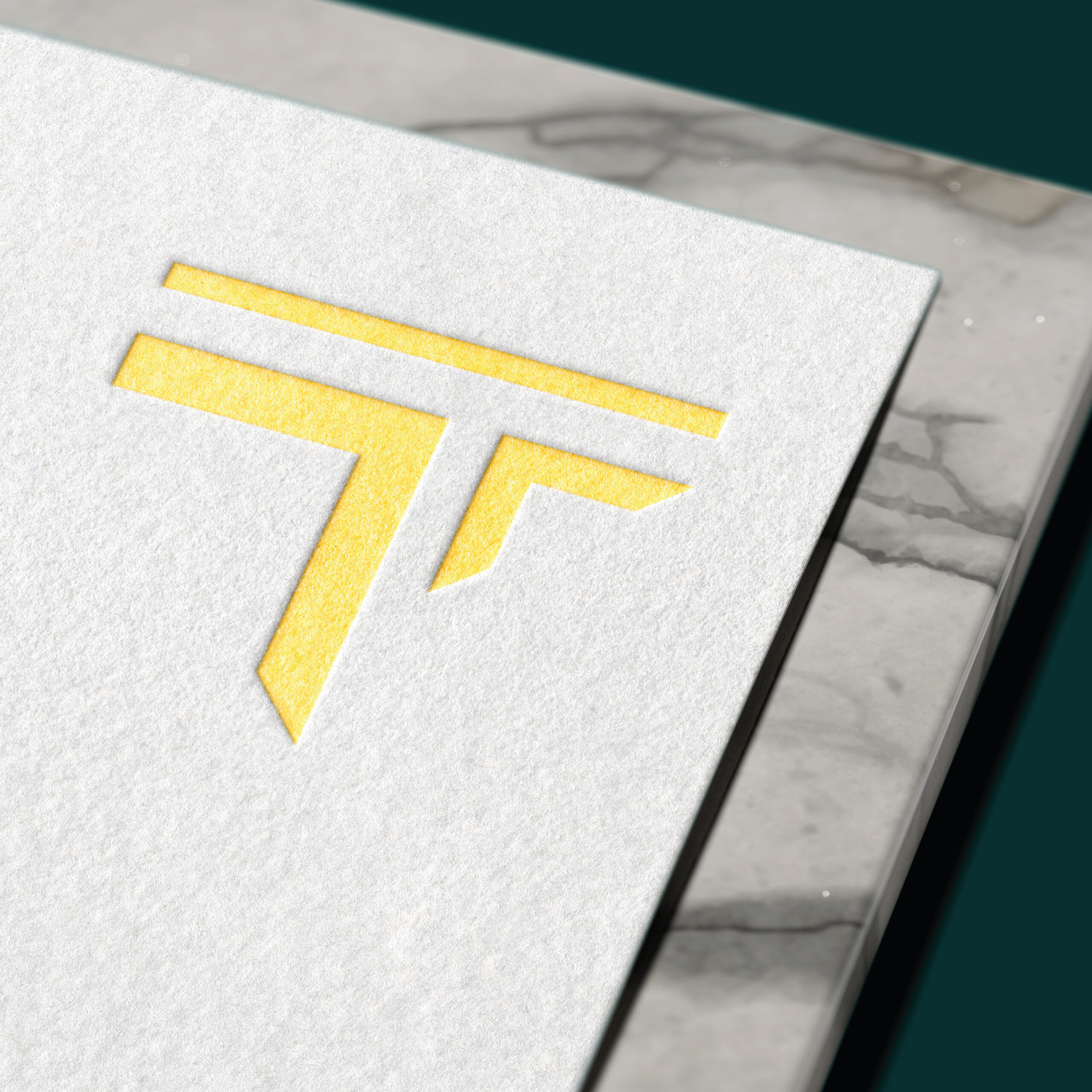
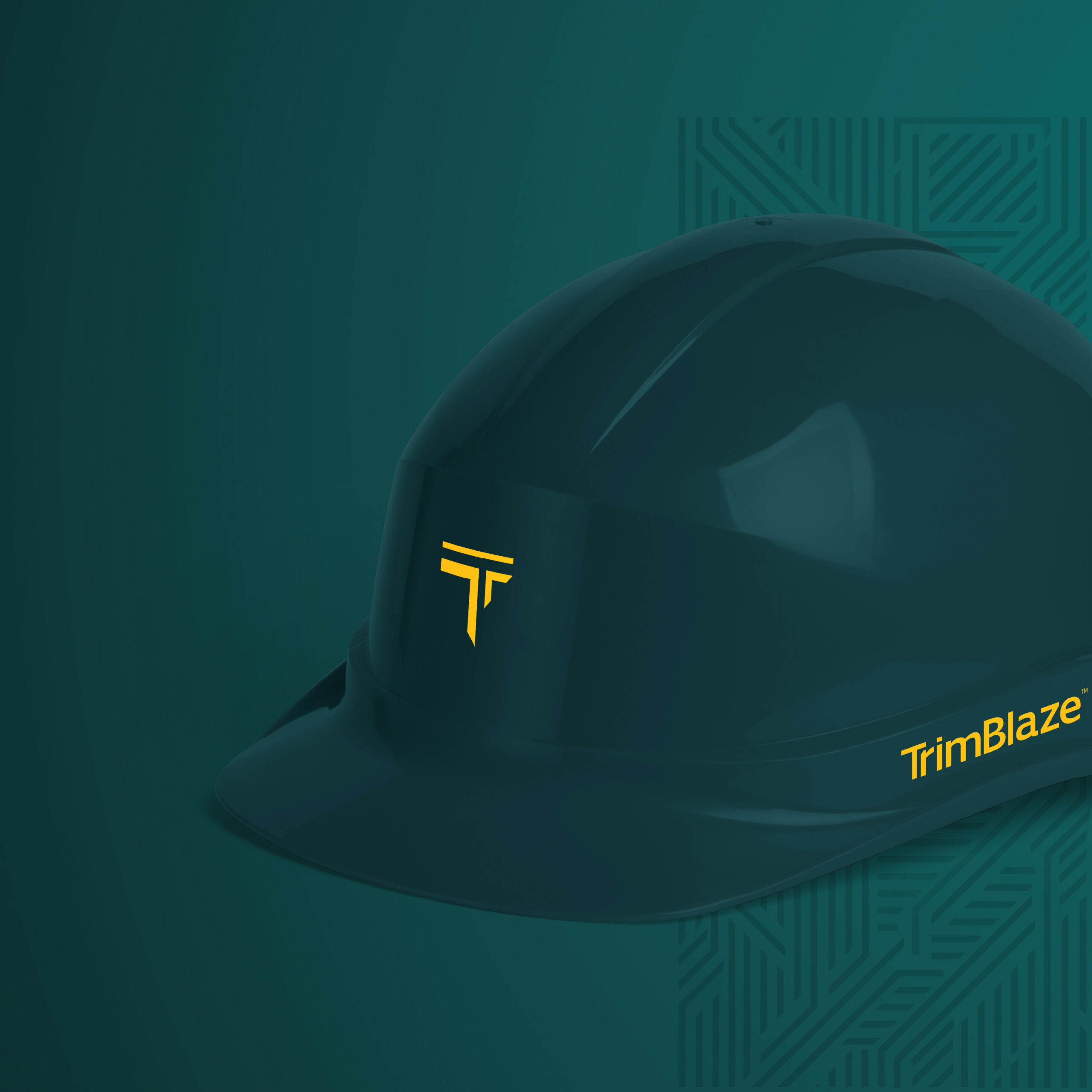
We wanted to highlight the precision of the angles of the cuts when it comes to Trimblaze’s trimmings. We aimed to convey that through the icon which is sharply cut on the angle – all while shaped like a “T” – the first letter of Trimblaze.
The Colors were our upgrade of the classic black & yellow construction colors. We borrow the construction yellow and contrasted it with classy hunter green to communicate the luxurious craftsmanship of Trimblaze.
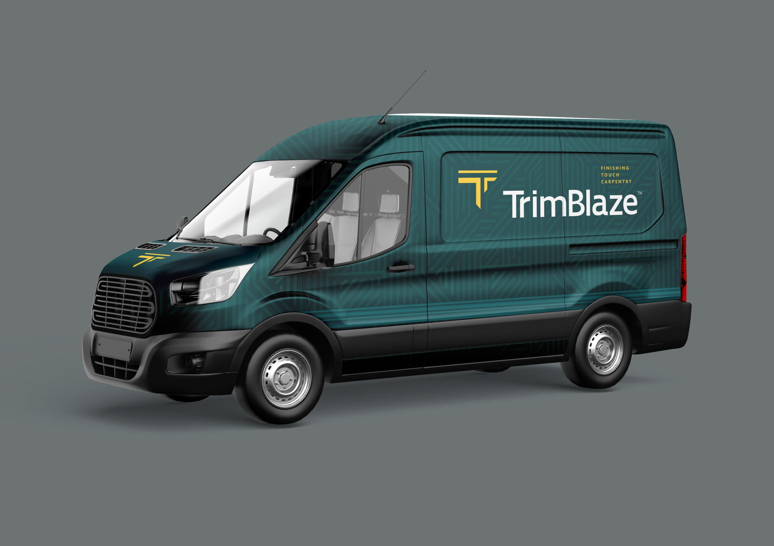
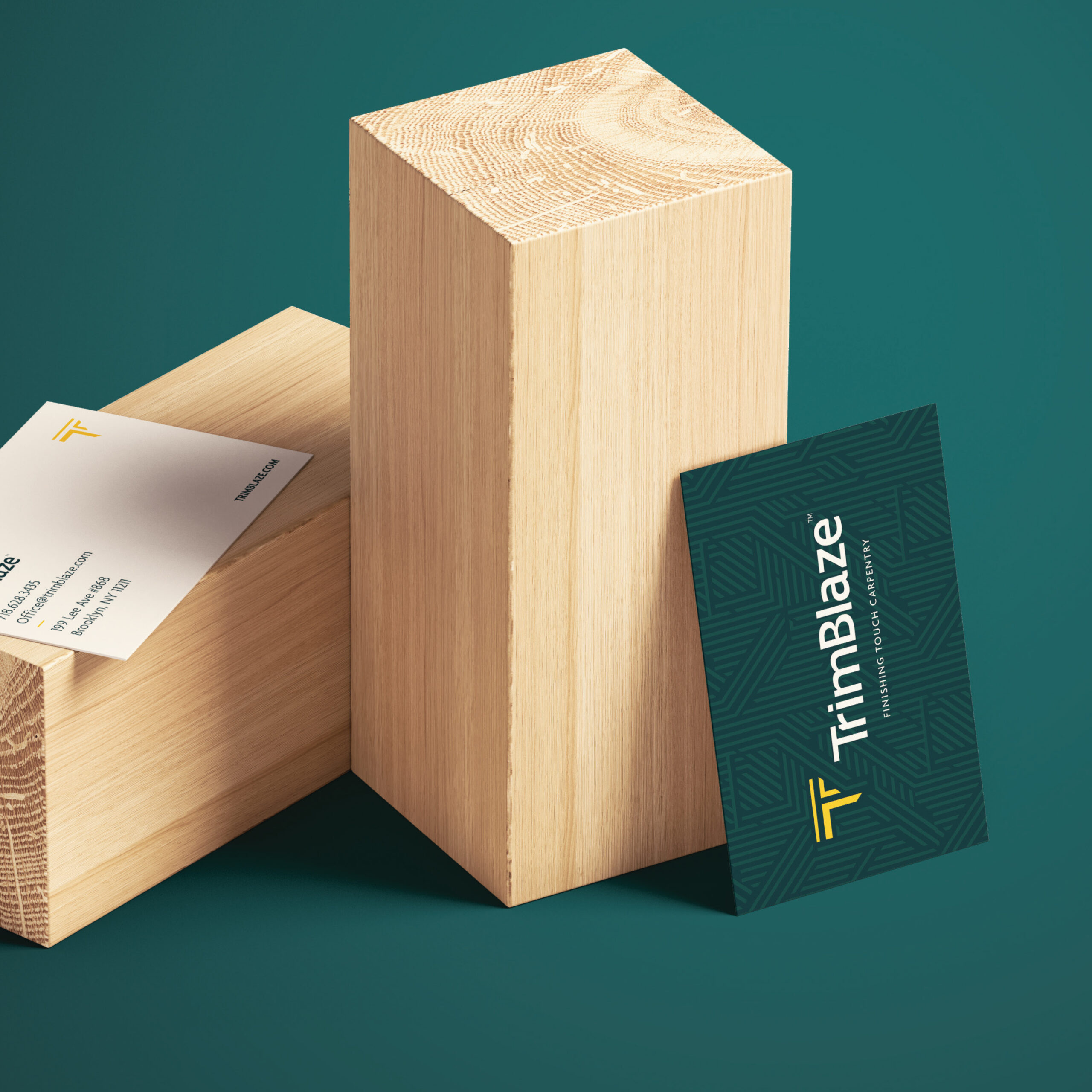
We incorporated the icon throughout the design in the form of a pattern, accentuating the sharp lines and angles.

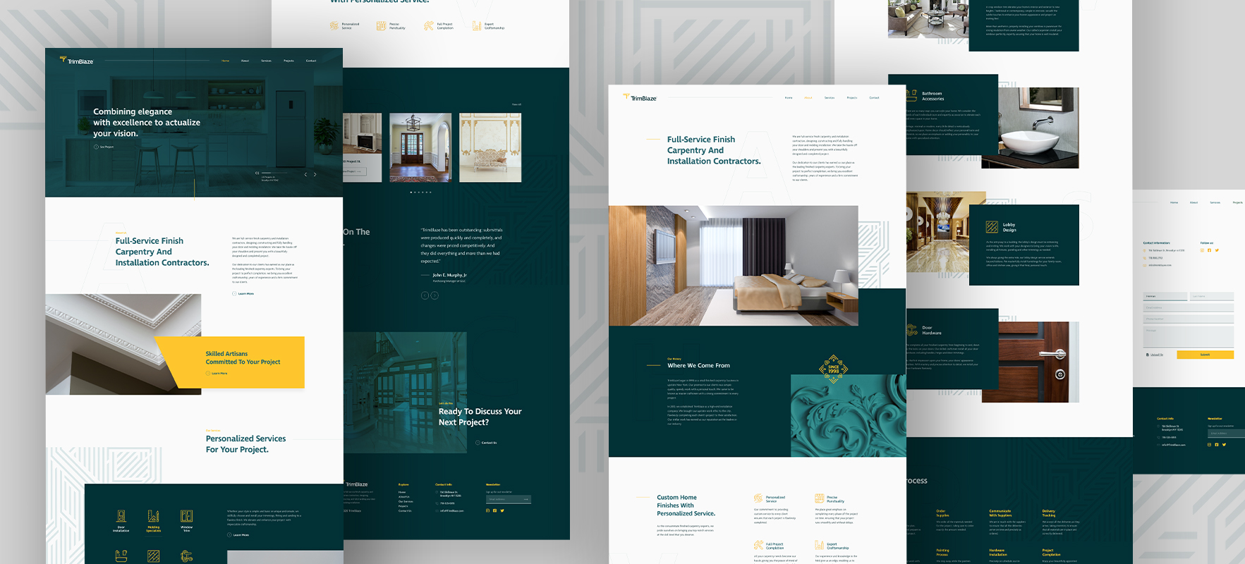
The Website
With the website, we aimed to communicate the brand’s identity of upscale modern architecture through the design, layout, and user experience. Swipe to see the magnificent end product.
Check out the website: Trimblaze.com
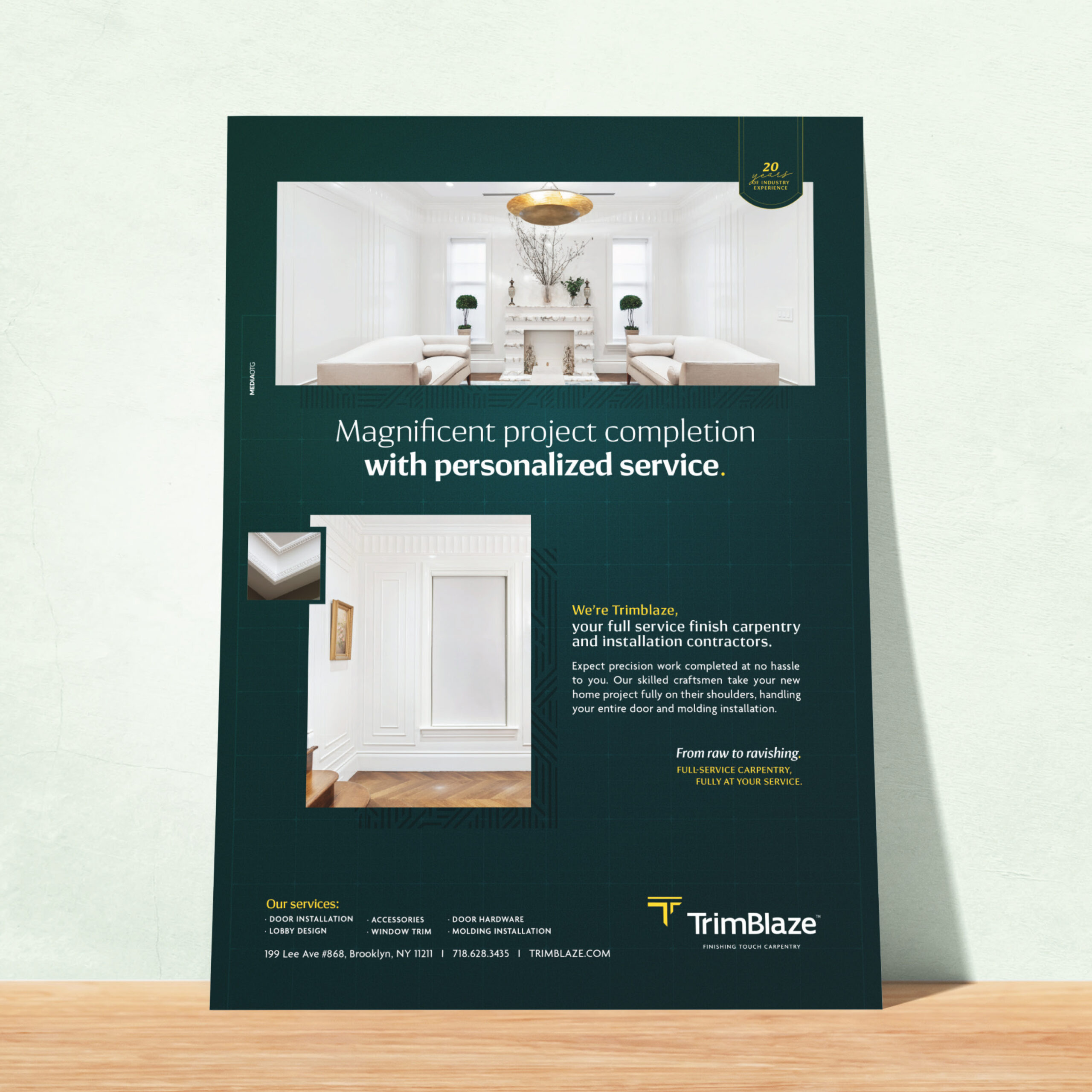
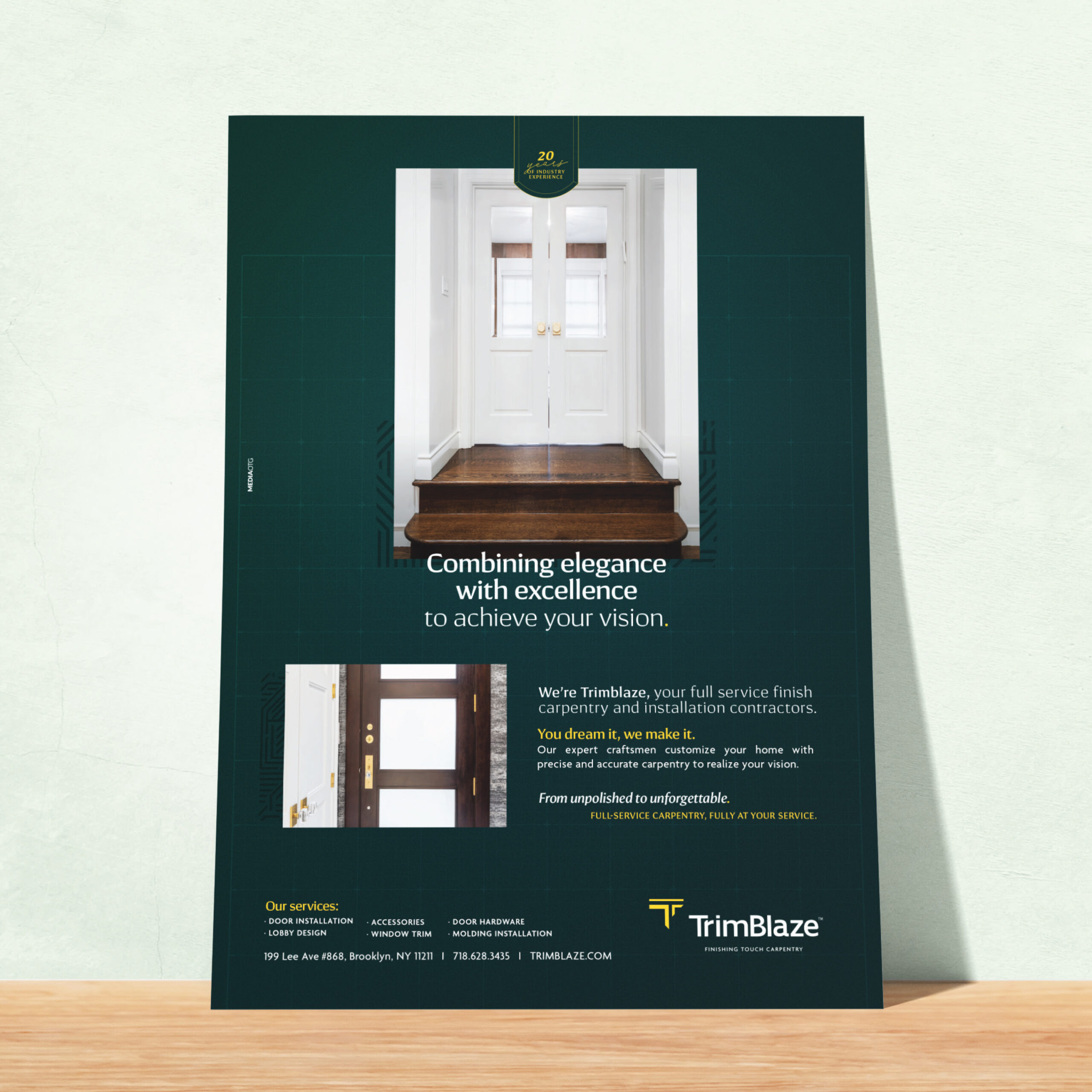
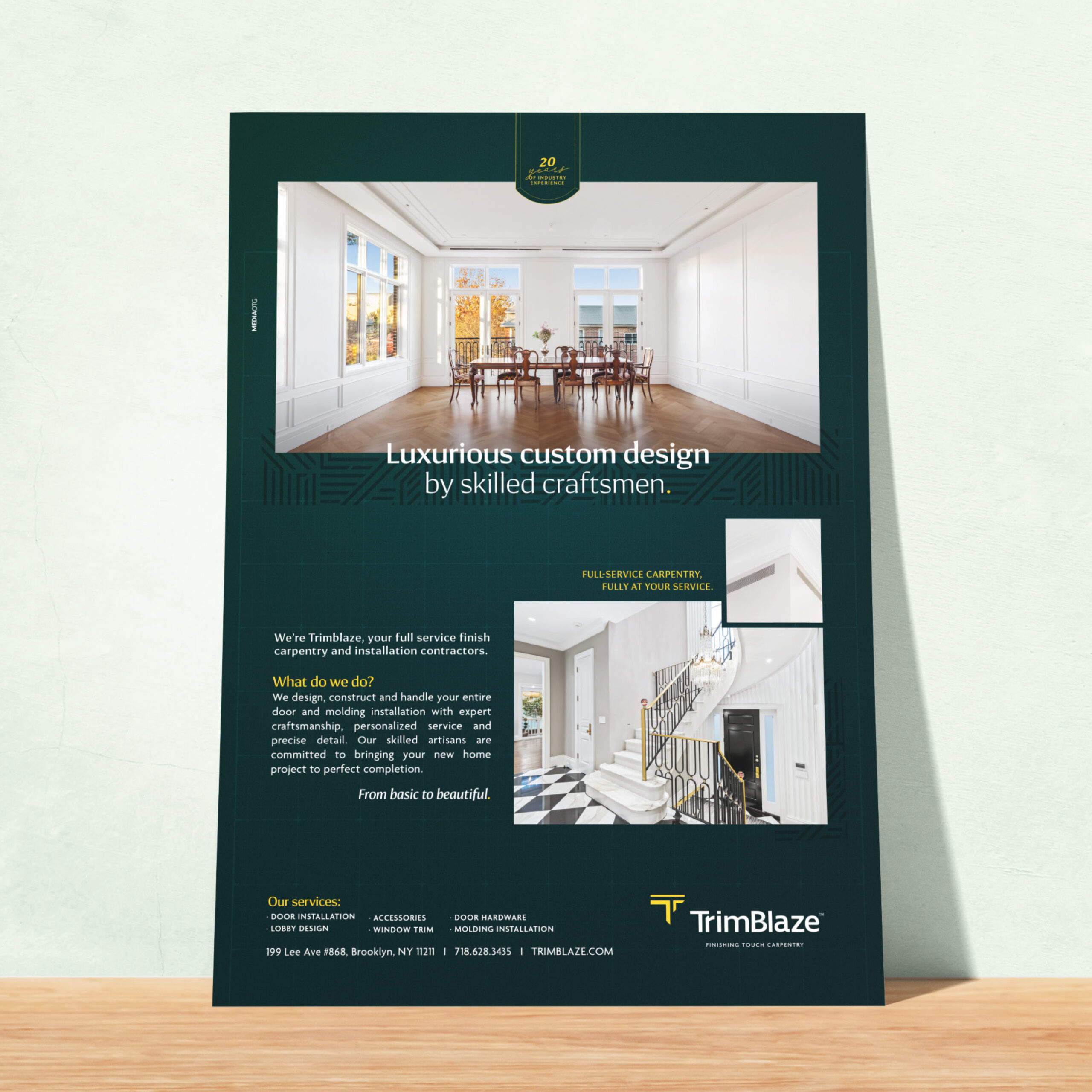
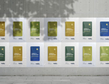
The Print Ads
We also created a series of ads to showcase the rebranding. It was important to the client to display their handiwork while explaining their services. We added an element of blueprint within the design to emphasize the build.