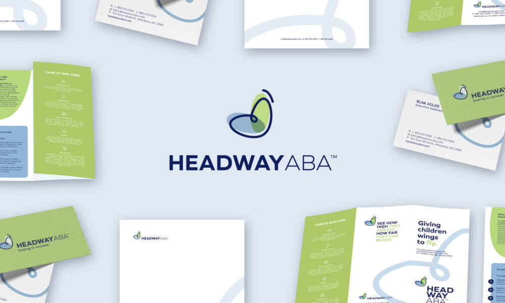
Headway ABA
Client: Headway ABA
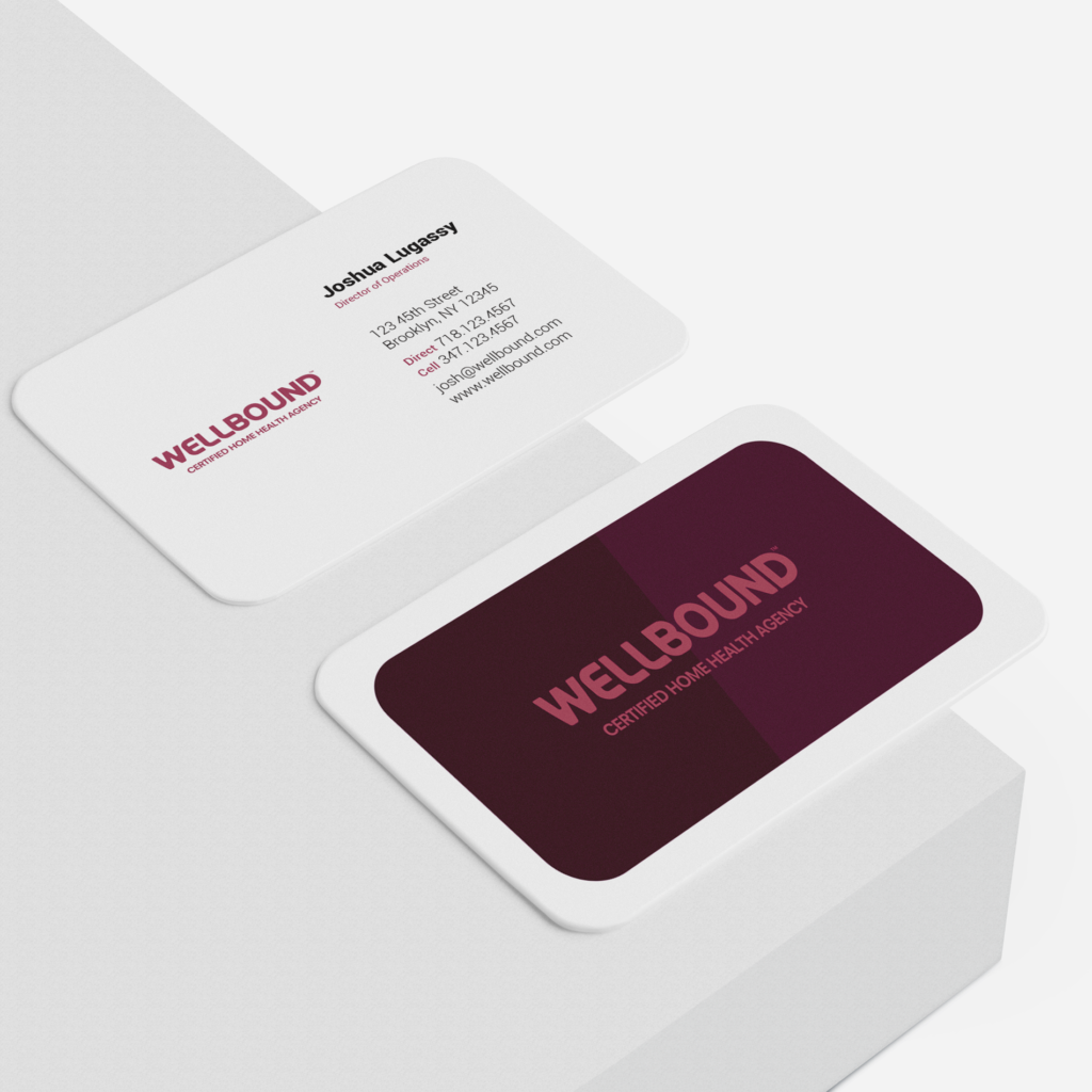
Wellbound is a certified home health agency committed to compassionate care. We designed the brand’s identity, character, and message for three divisions of the company and subprograms. We created a comprehensive corporate identity package for the client replete with print, digital, and web.
When choosing a name, we wanted to cut into the core of what the company represents. The name – Wellbound – was chosen because it reflects the heart of their mission and service. Care is connection. The name promises partners and clients a company that shares a direct bond with the facility, is always bound by wellness intentions and intertwines skill and heart equally.
Wellbound
Brand Naming
Brand Identity Design
Brand Material Design
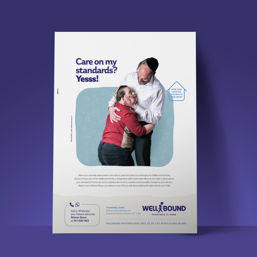
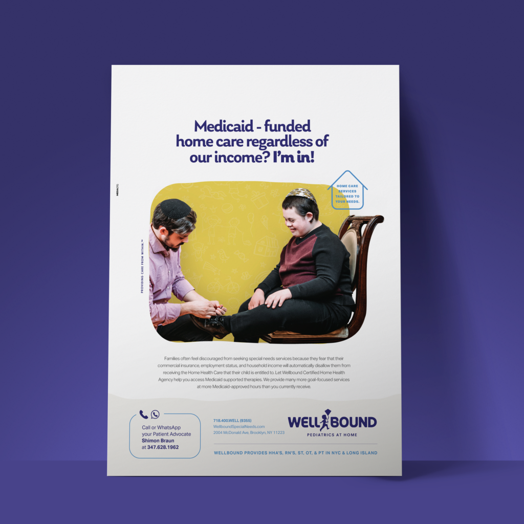
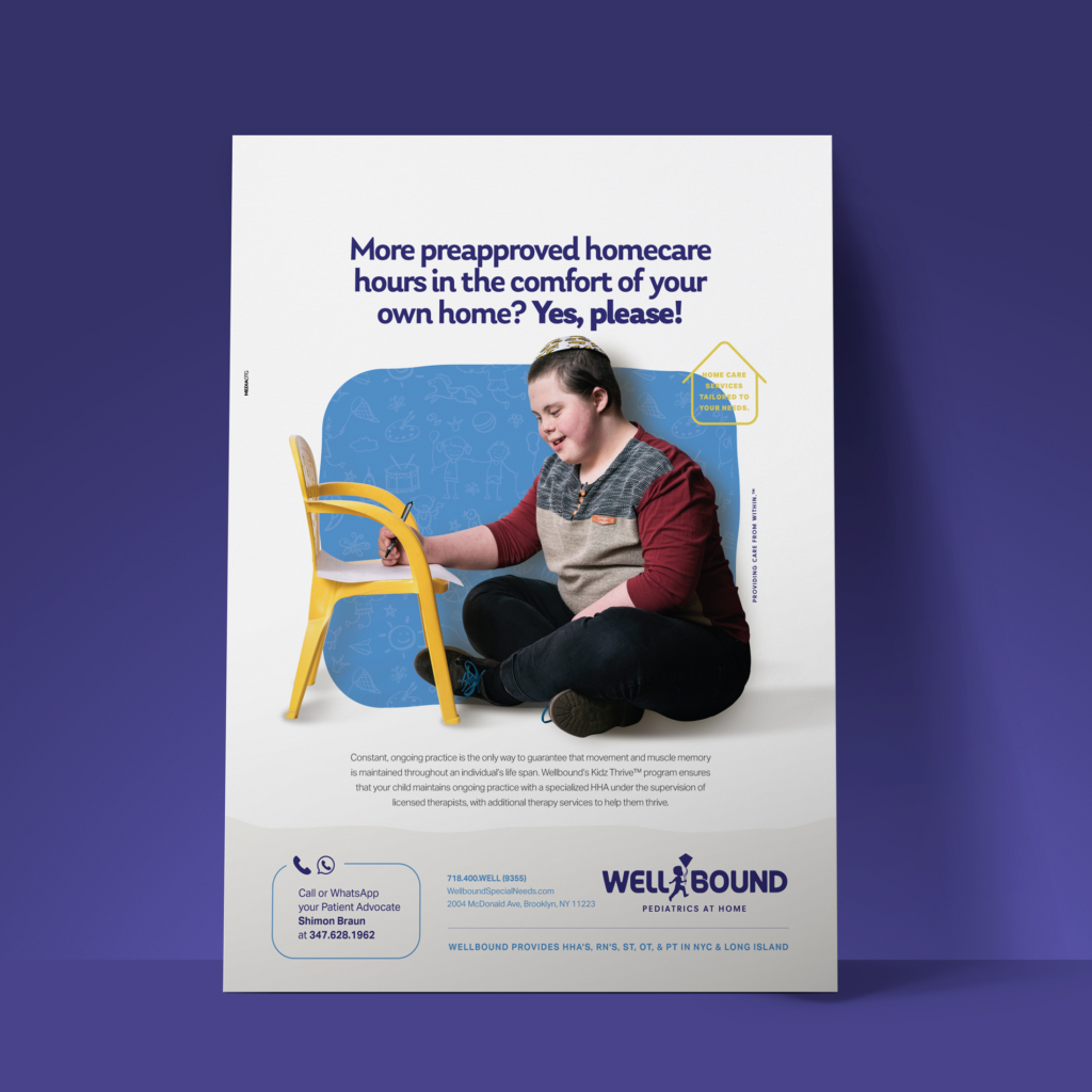
Print Ads
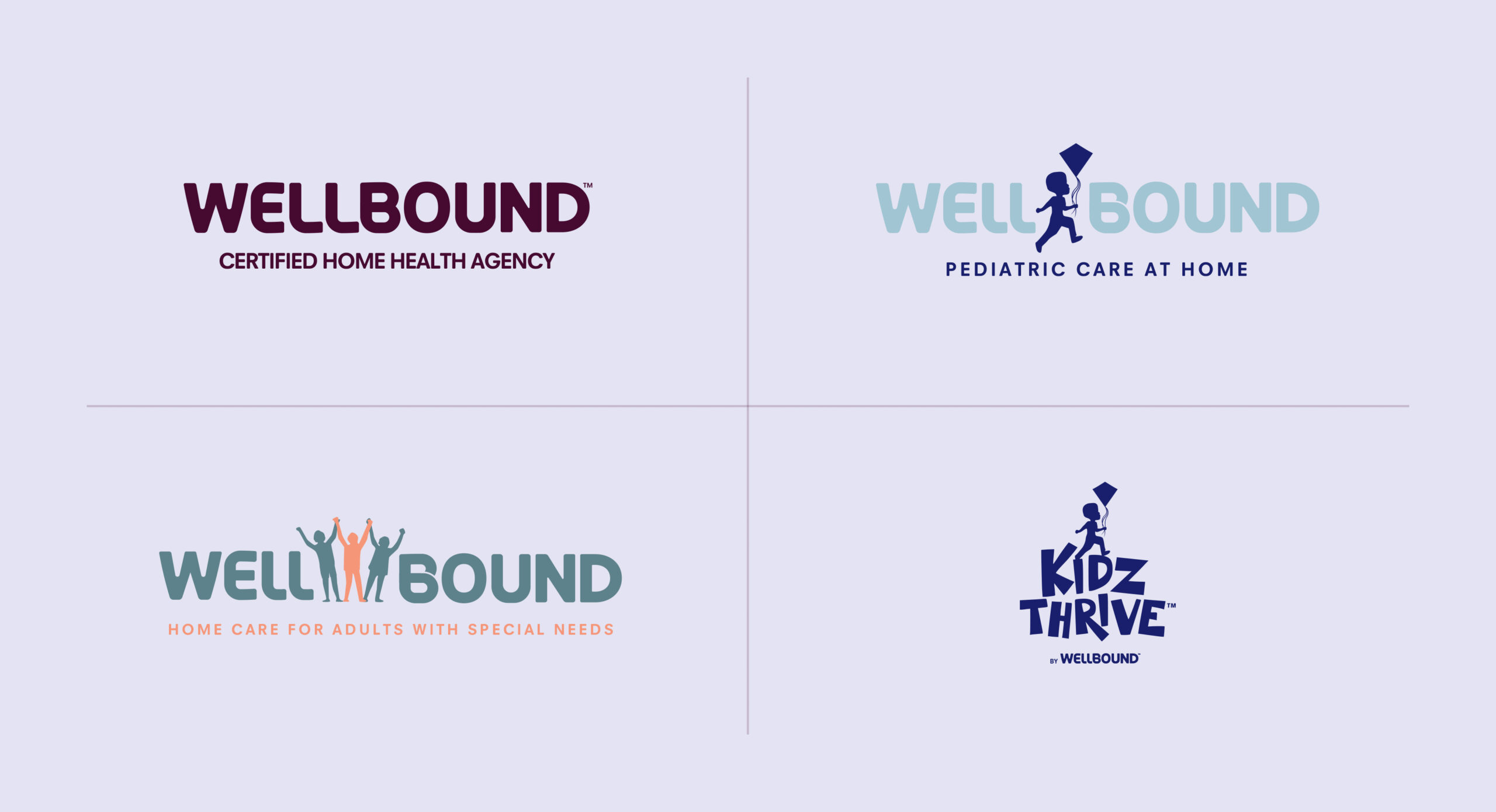
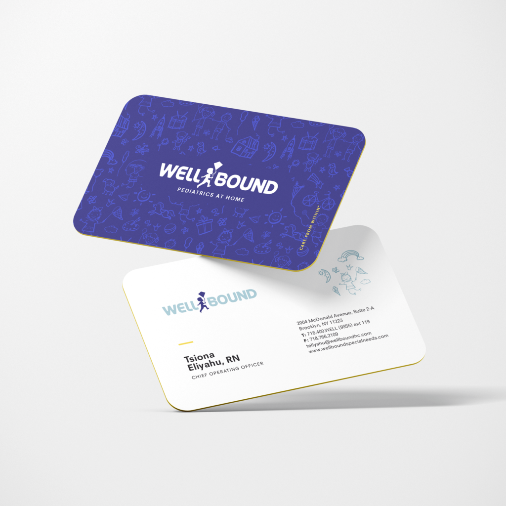
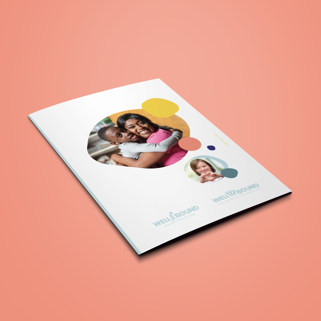
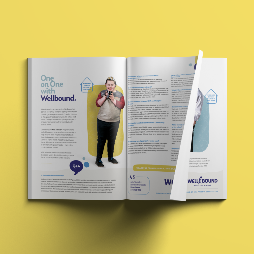
Wellbound Pediatric division
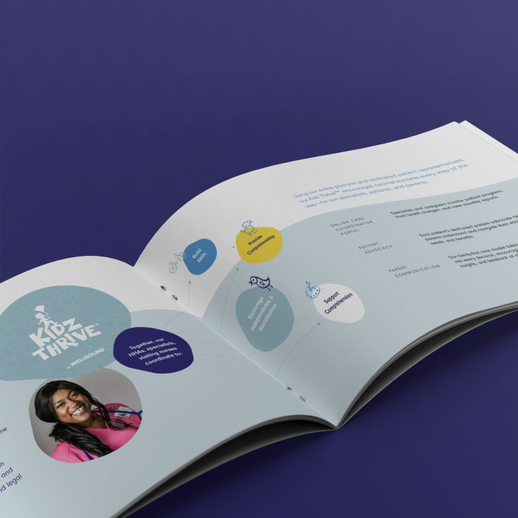
For the Wellbound Pediatric division, we replaced the “L” in the logo with a child flying a kite. We used child-friendly branding colors, while still maintaining a corporate look. See their business cards and how we incorporated their logo into their Kidz Thrive program.
We incorporated the geometric branding style into the pediatric website in an engaging and user-friendly way using responsive design. Swipe to see more pages.
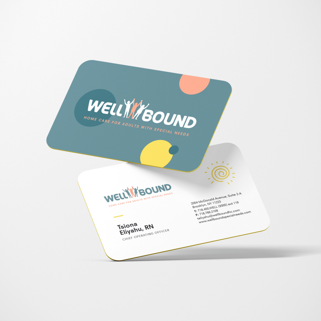
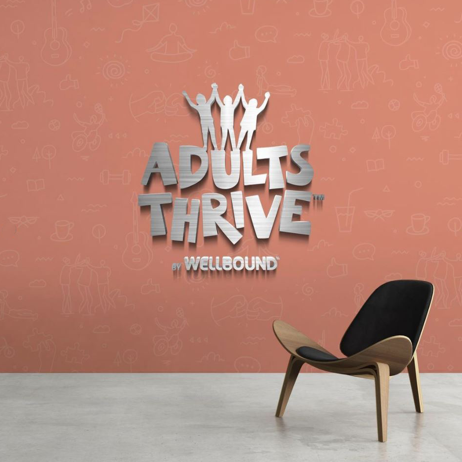
Wellbound Adult division
The Wellbound Adult division falls under the umbrella of the general Wellbound Health Care. We customized the logo while keeping the core elements. We went for a lighter and fun look with the colors with strong contrast and switched the middle “L” for an icon with abstract adults.
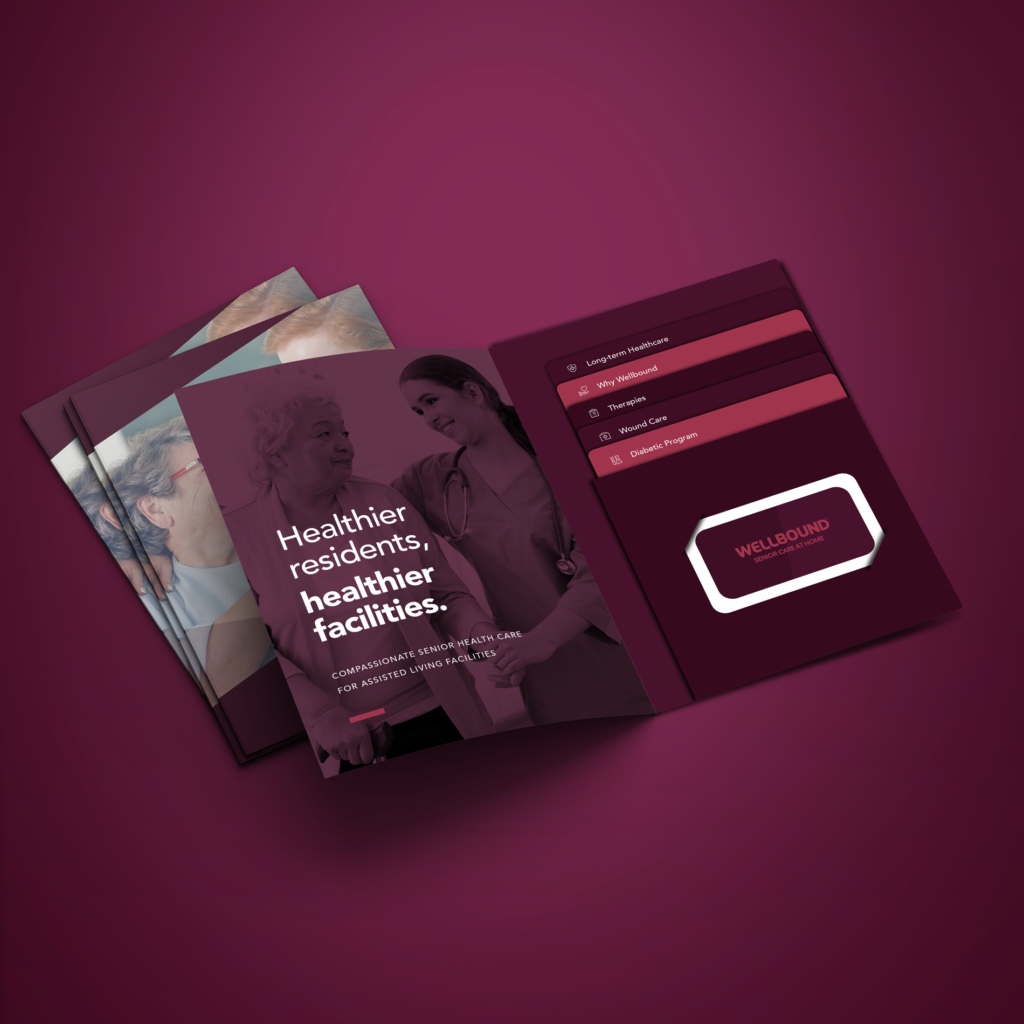
The Print Ads
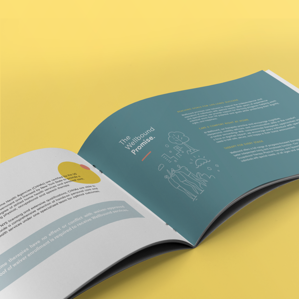
We created print ads and pamphlets with bold copy, compelling photography and colors and illustrations that reflect the brand’s story. For each of the Wellbound divisions, we created magnificent brochures that showcase the company’s work. The brochures reflect the branding of the companies division with extensive copy detailing their services.
Client: Headway ABA
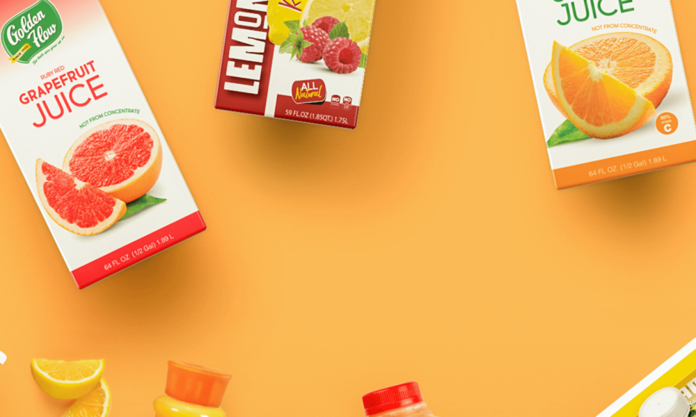
Client: Golden Flow
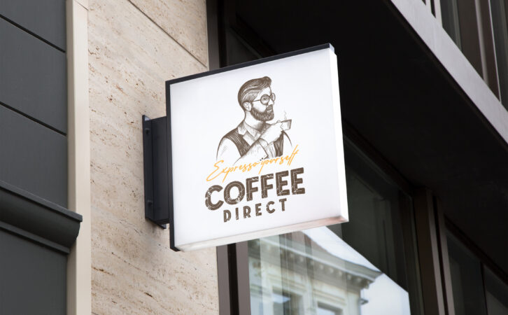
Client: Coffee Direct
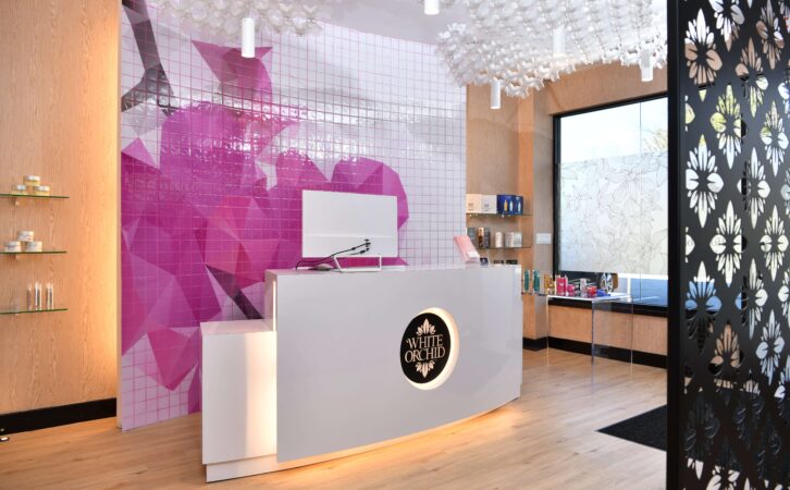
Client: White Orchid Medi Spa
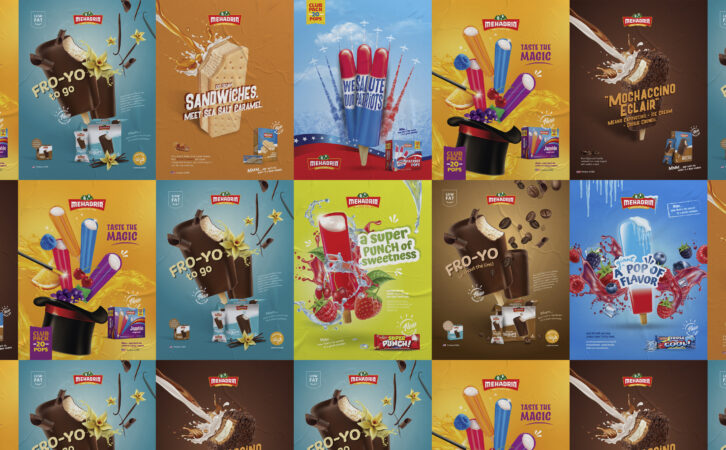
Client: Mehadrin Ice Cream
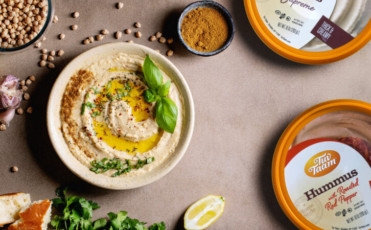
Client: Tuv Taam
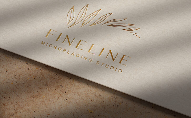
Client: Fineline
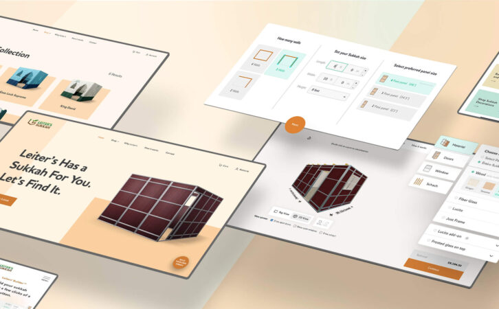
Client: Leiters Sukkah

Client: Mehadrin Ice Cream
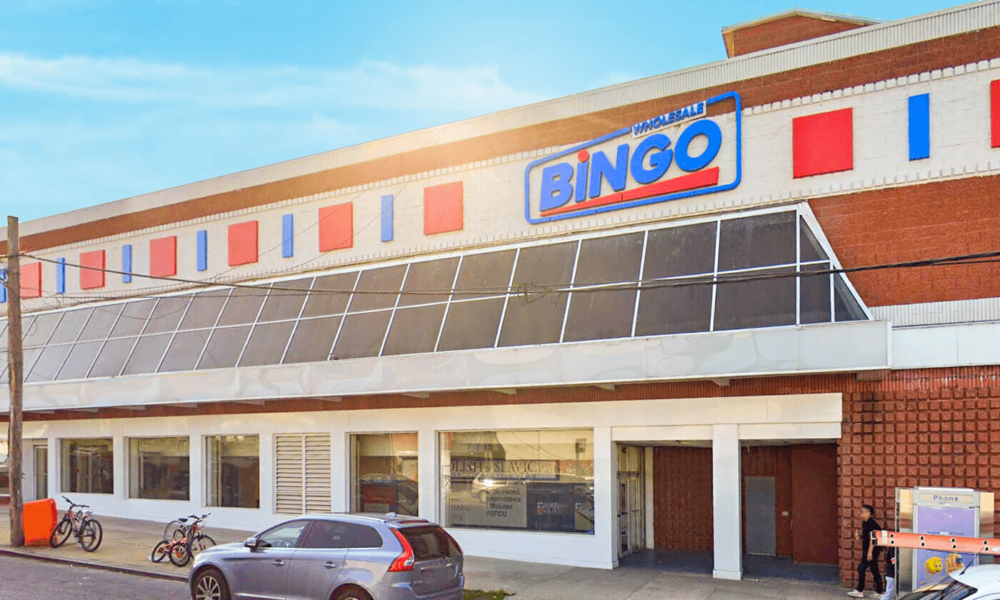
Client: Bingo Wholesale
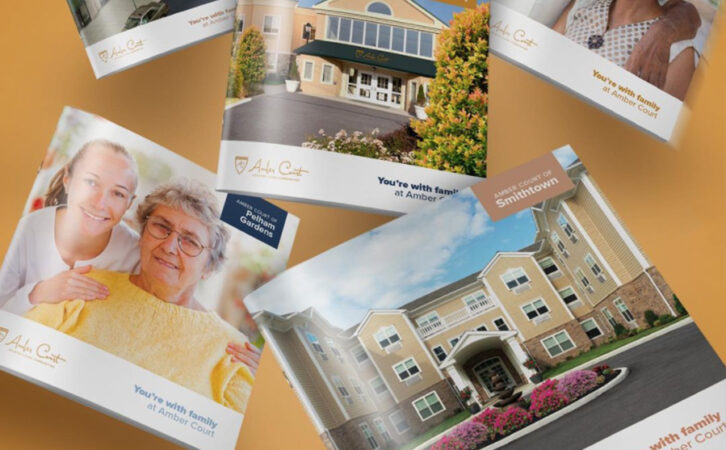
Client: Amber Court Assisted Living
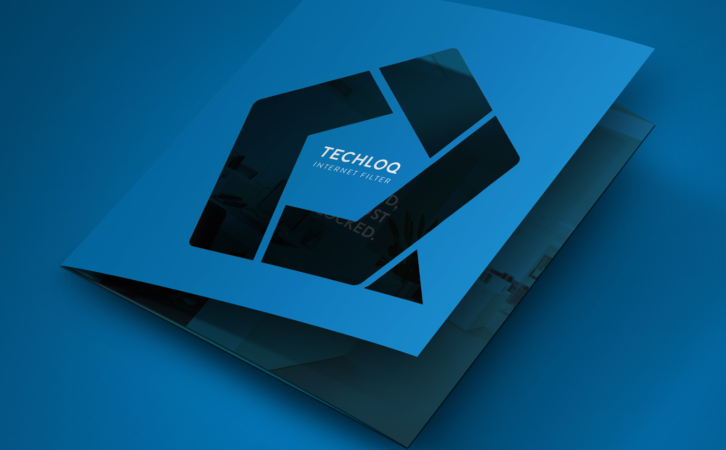
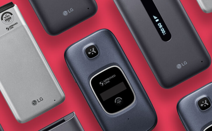
Client: Techloq

Client: Preferred Builders
Client: Techloq
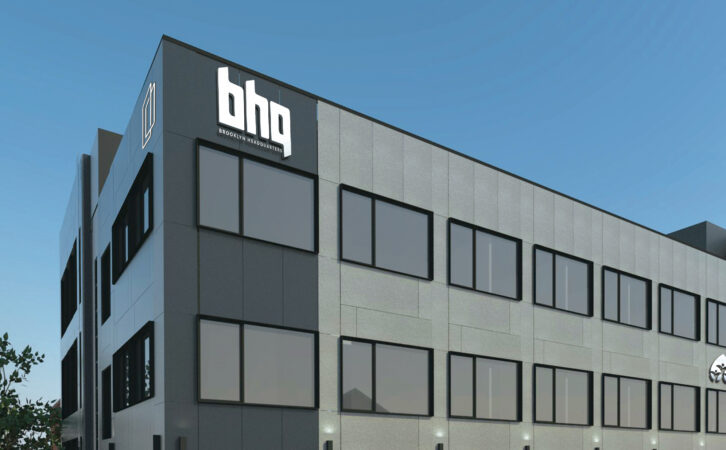
Client: BHQ
Client: Connekt

Client: Boulder Builders
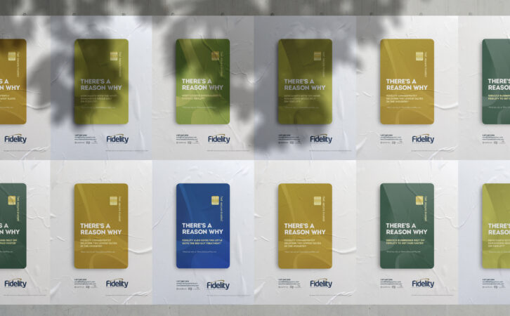
Client: Fidelity Payment Services
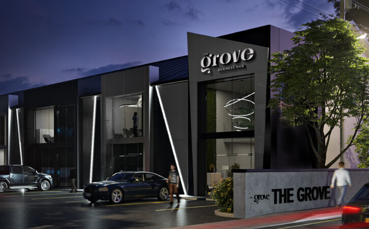
Client: The Grove Business Hub
Client: Ziplens