Wellbound is a certified home health agency committed to compassionate care.
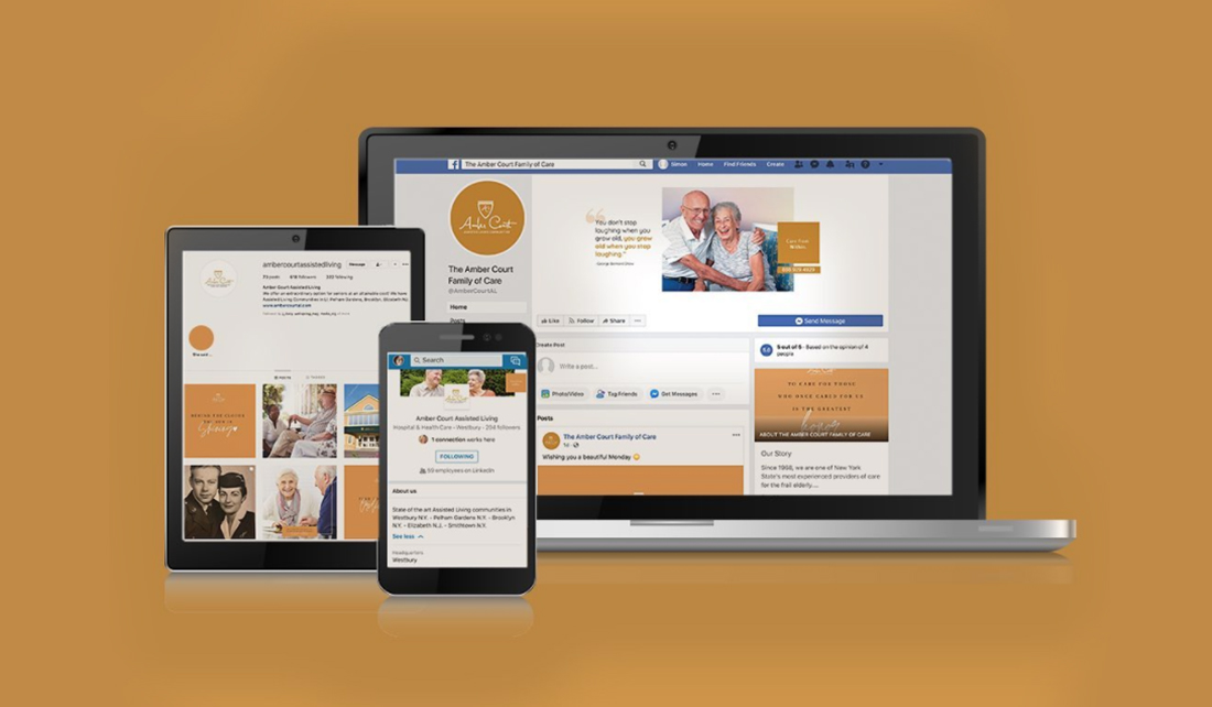
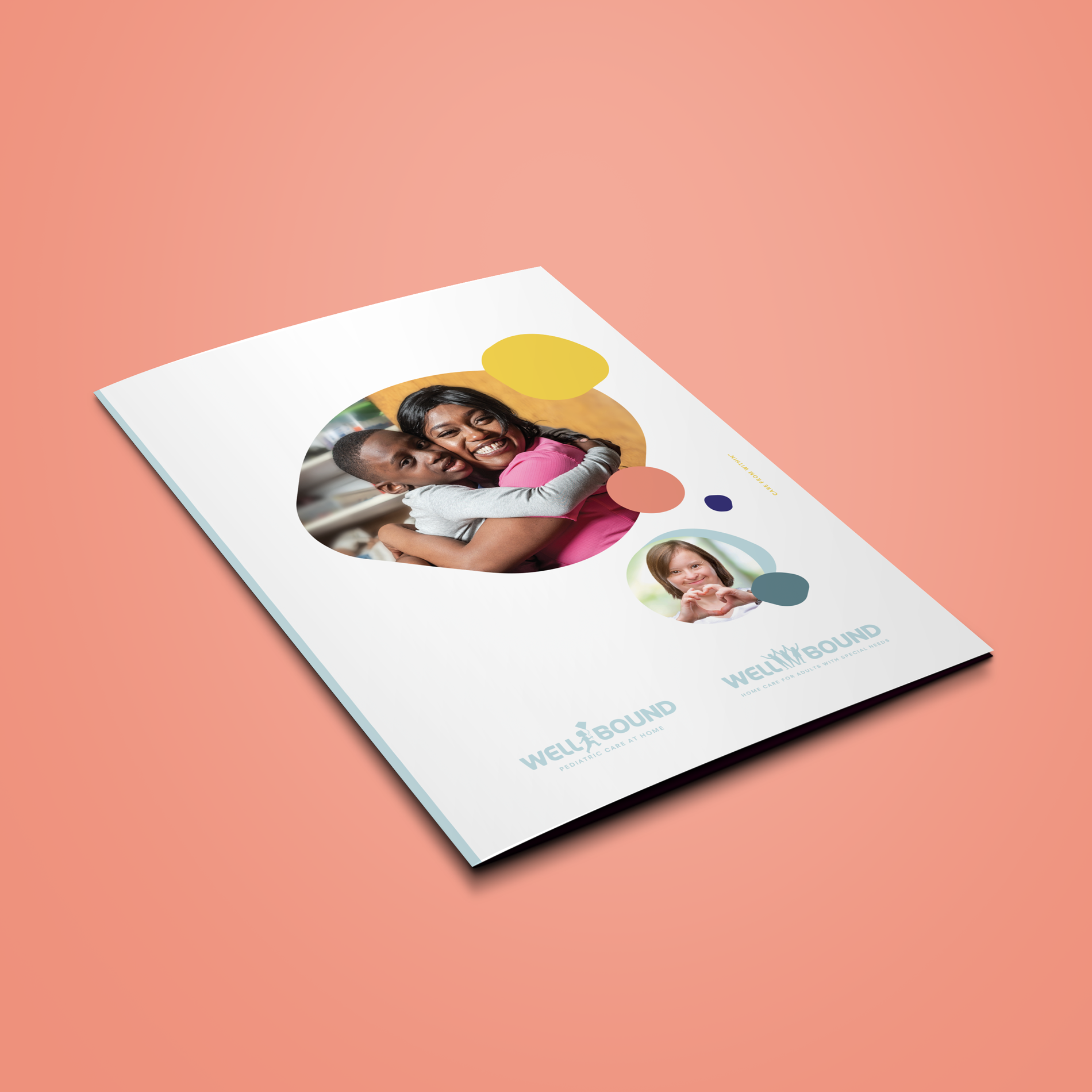
Our mission was to create, develop, and design the brand’s identity, character, and message for three divisions of the company and subprograms. We created a comprehensive corporate identity package for the client replete with print, digital, and web. Swipe to see more brand assets.
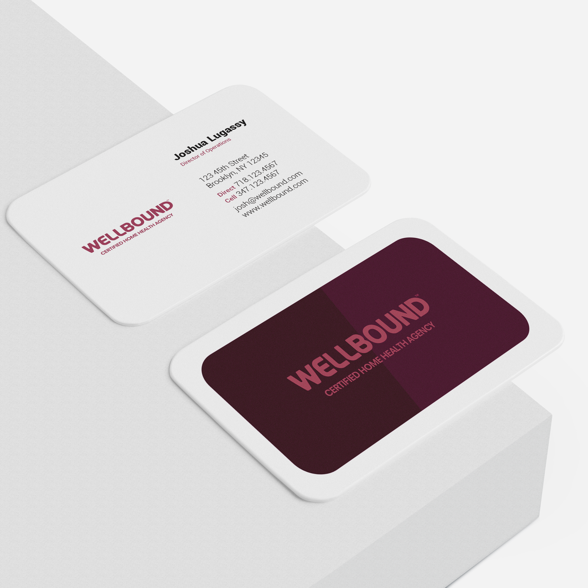
When choosing a name, we wanted to cut into the core of what the company represents. The name – Wellbound – was chosen because it reflects the heart of their mission and service.
Care is connection. The name promises partners and clients a company that shares a direct bond with the facility, is always bound by wellness intentions and intertwines skill and heart equally.
Whether they are facility-based or homebound, we make sure our patients are bound for better.
![]()
![]()
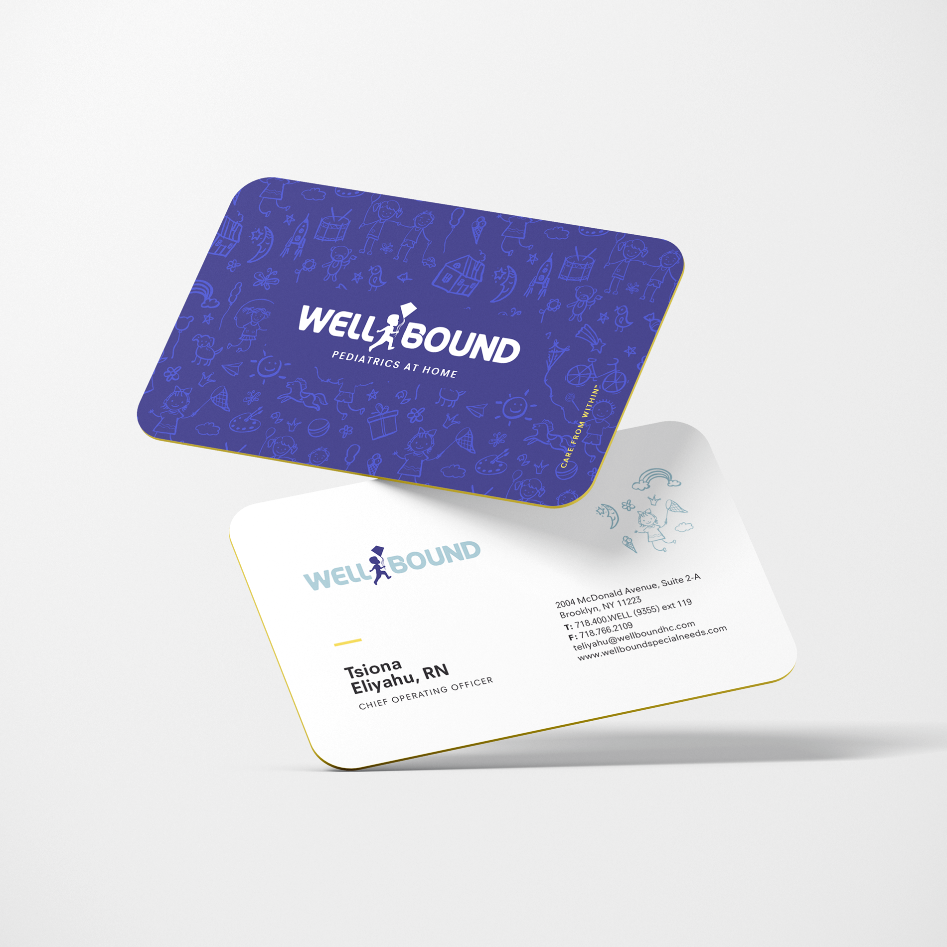
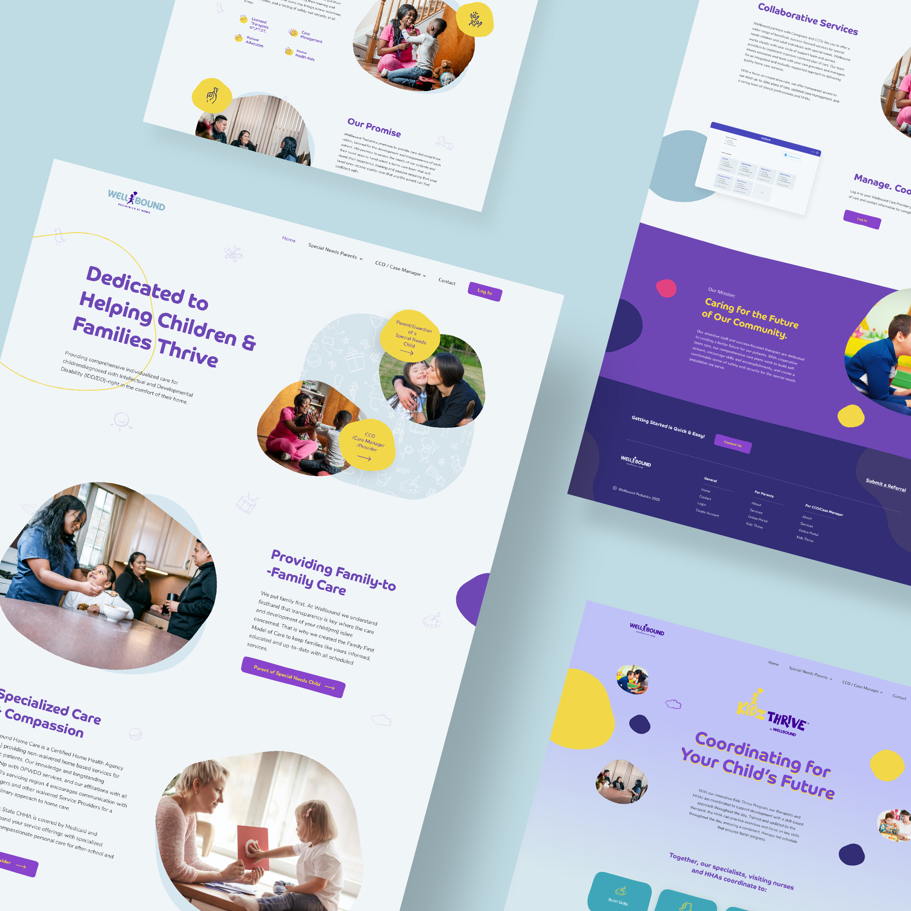
Wellbound Pediatric division
For the Wellbound Pediatric division, we replaced the “L” in the logo with a child flying a kite. We used child-friendly branding colors, while still maintaining a corporate look. See their business cards and how we incorporated their logo into their Kidz Thrive program.
We incorporated the geometric branding style into the pediatric website in an engaging and user-friendly way using responsive design. Swipe to see more pages.
![]()
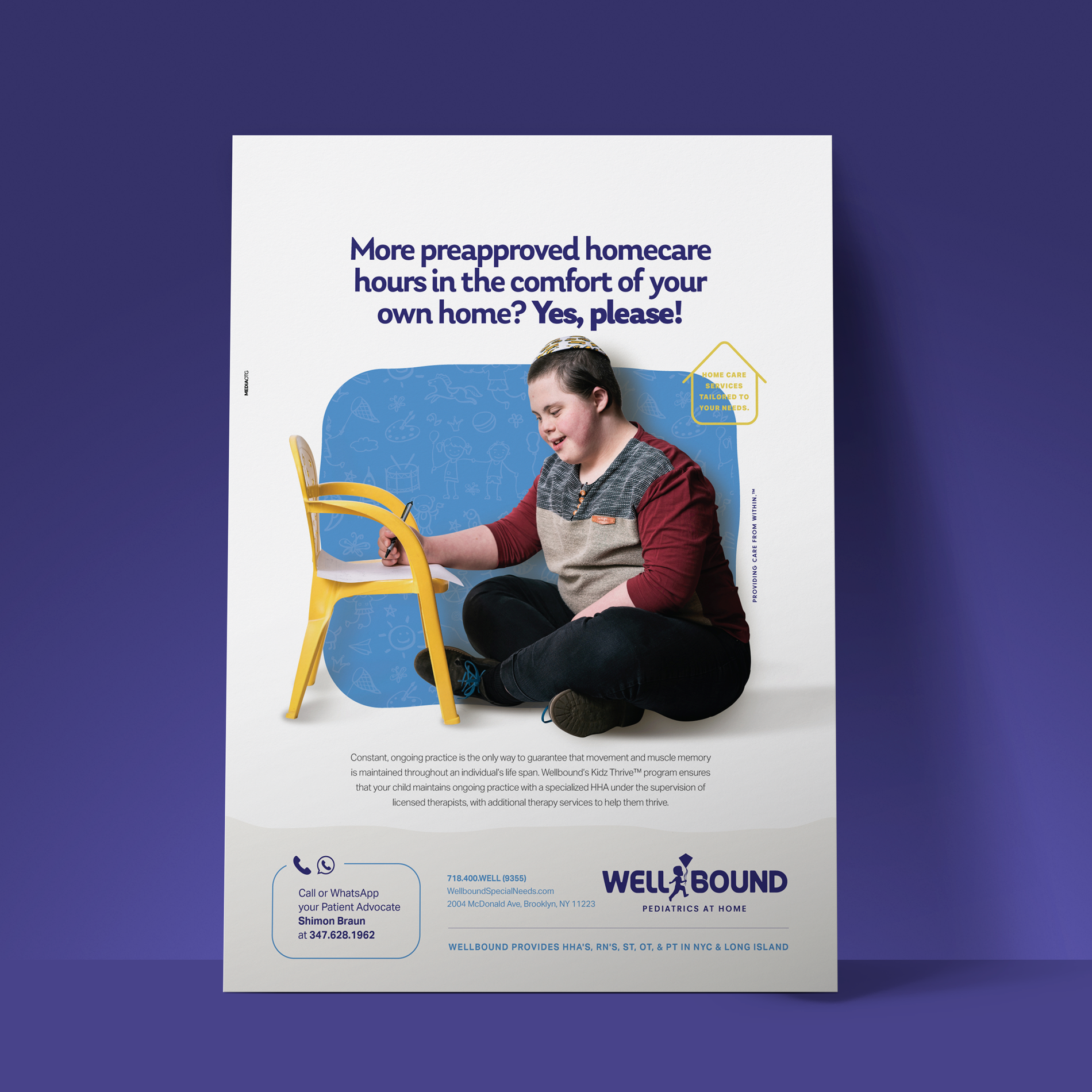
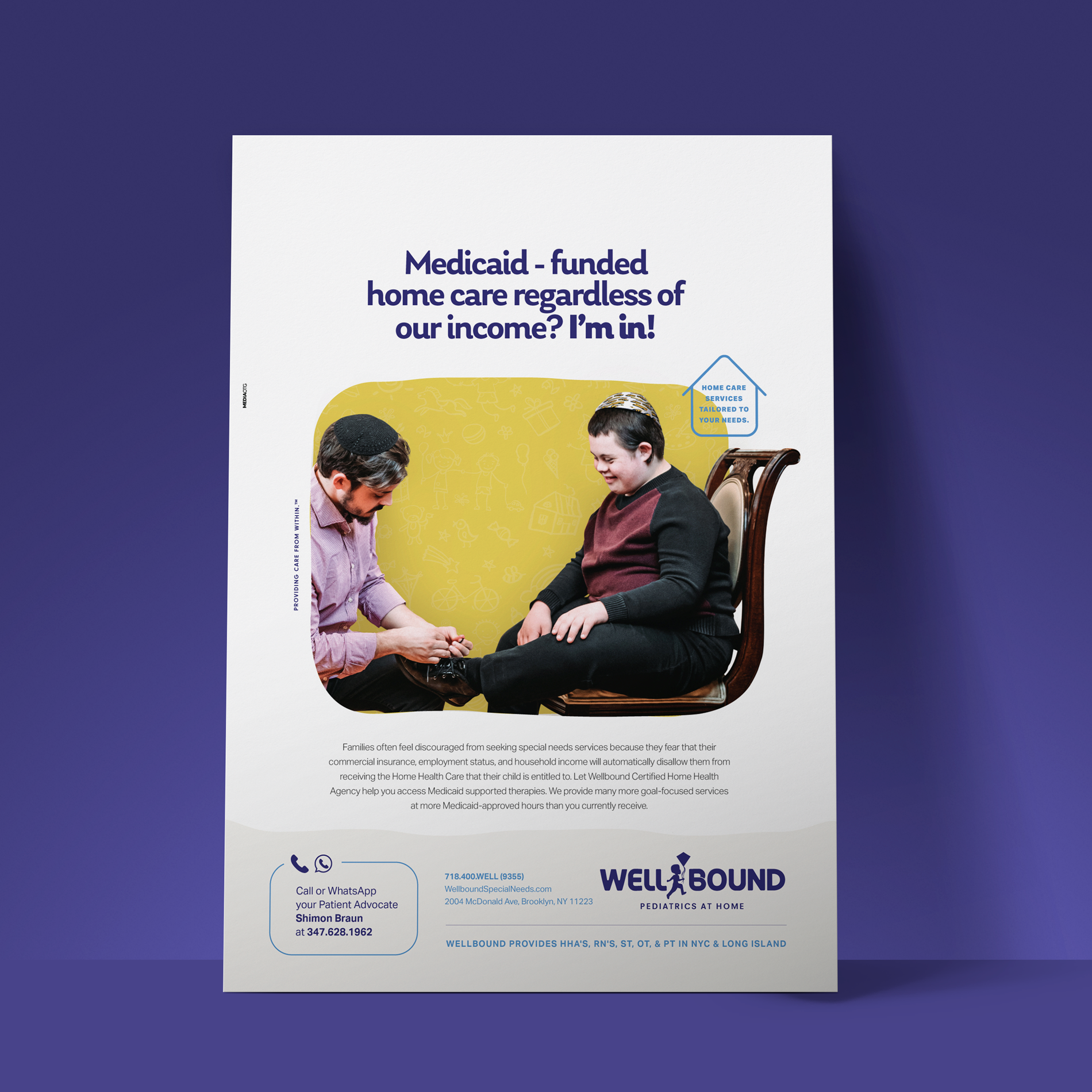
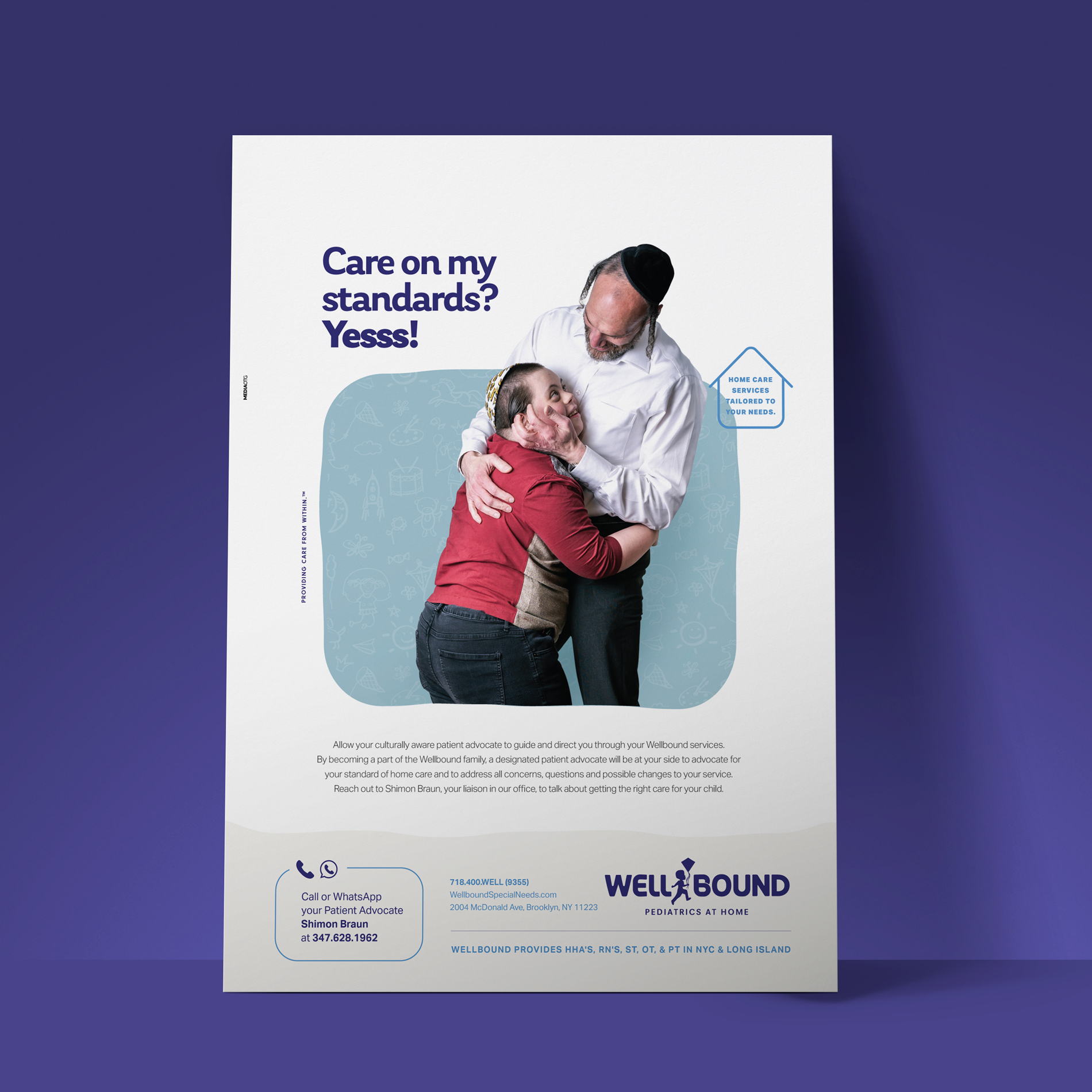
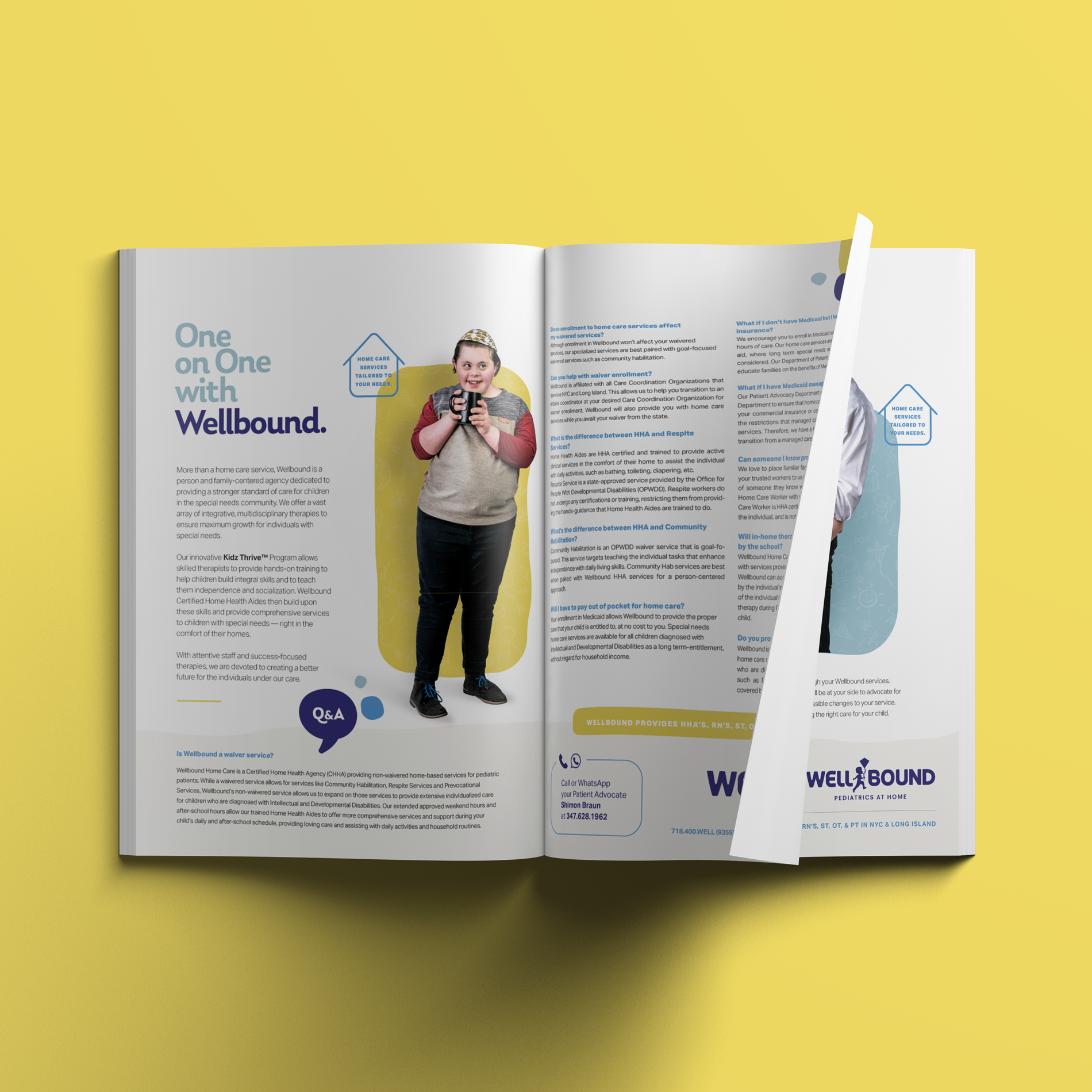
The Print Ads
We created print ads and pamphlets with bold copy, compelling photography and colors and illustrations that reflect the brand’s story.
![]()
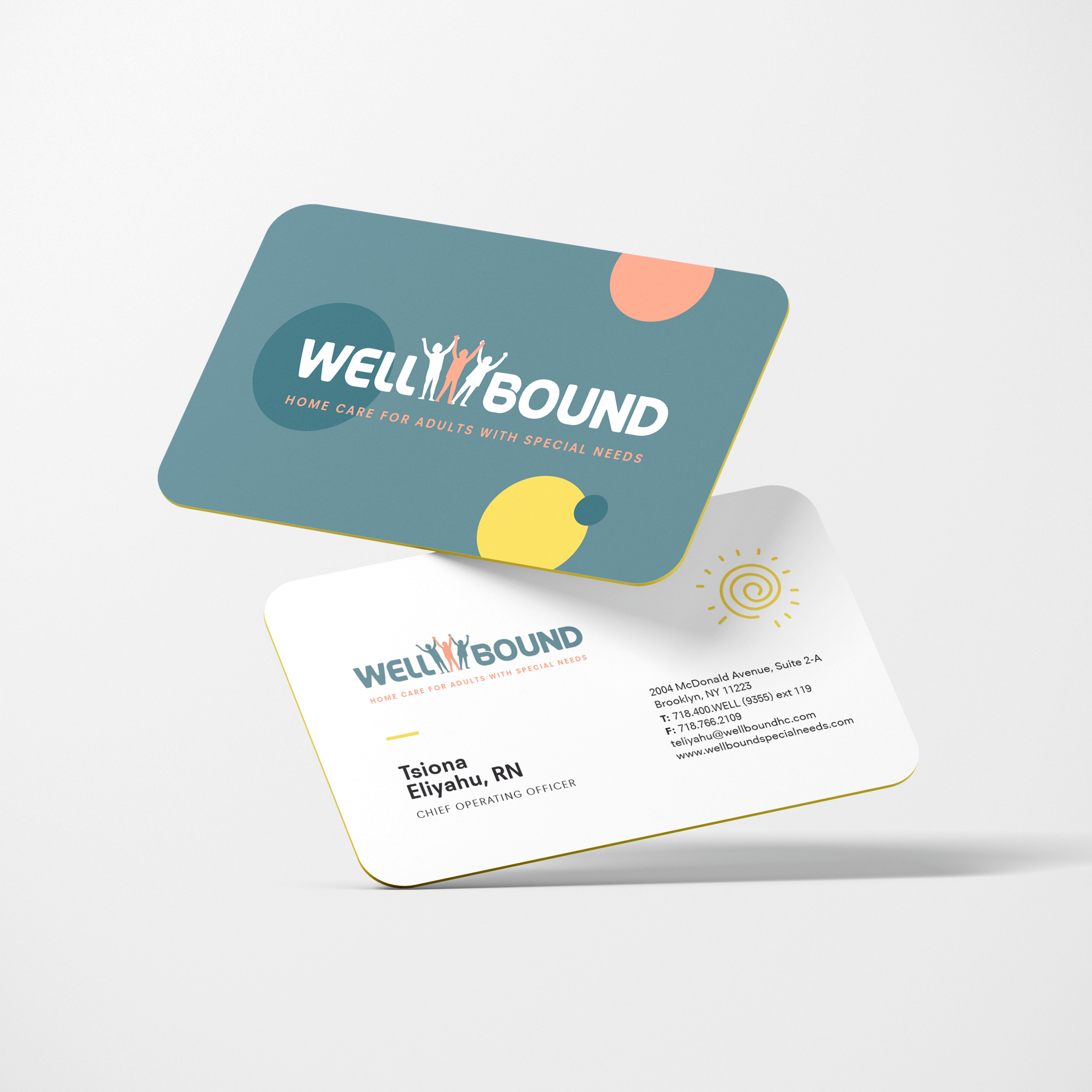
Wellbound Adult division
The Wellbound Adult division falls under the umbrella of the general Wellbound Health Care. We customized the logo while keeping the core elements. We went for a lighter and fun look with the colors with strong contrast and switched the middle “L” for an icon with abstract adults.
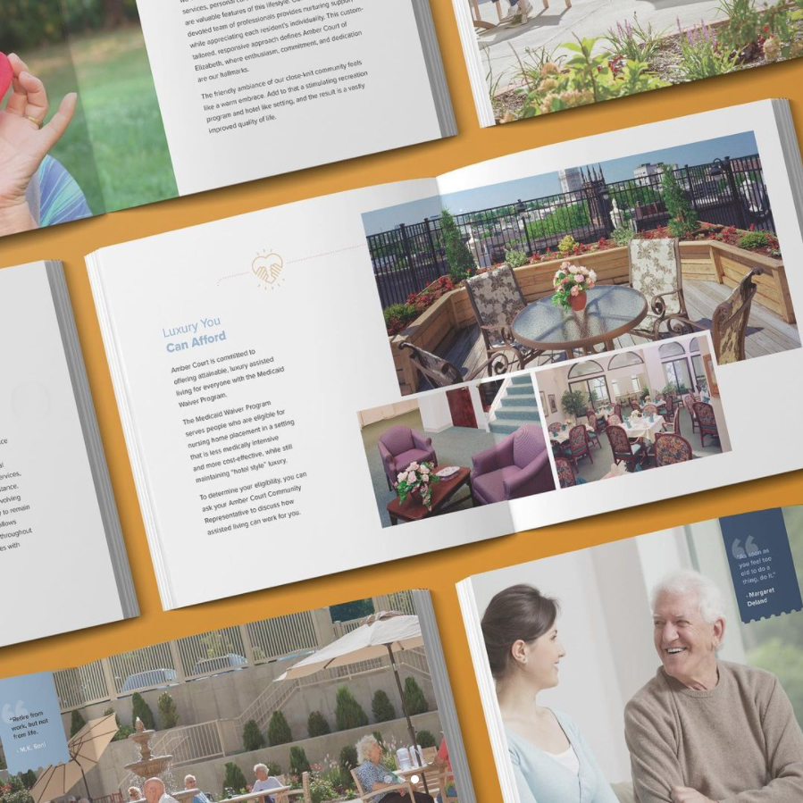
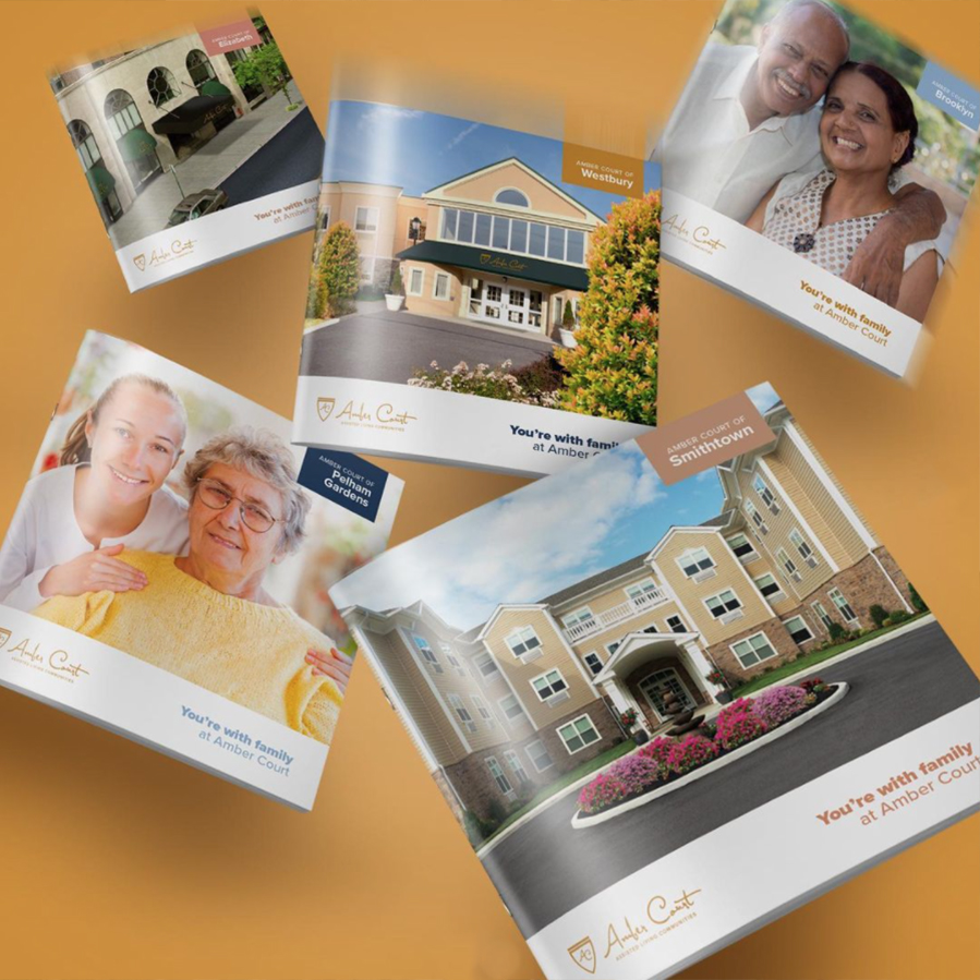
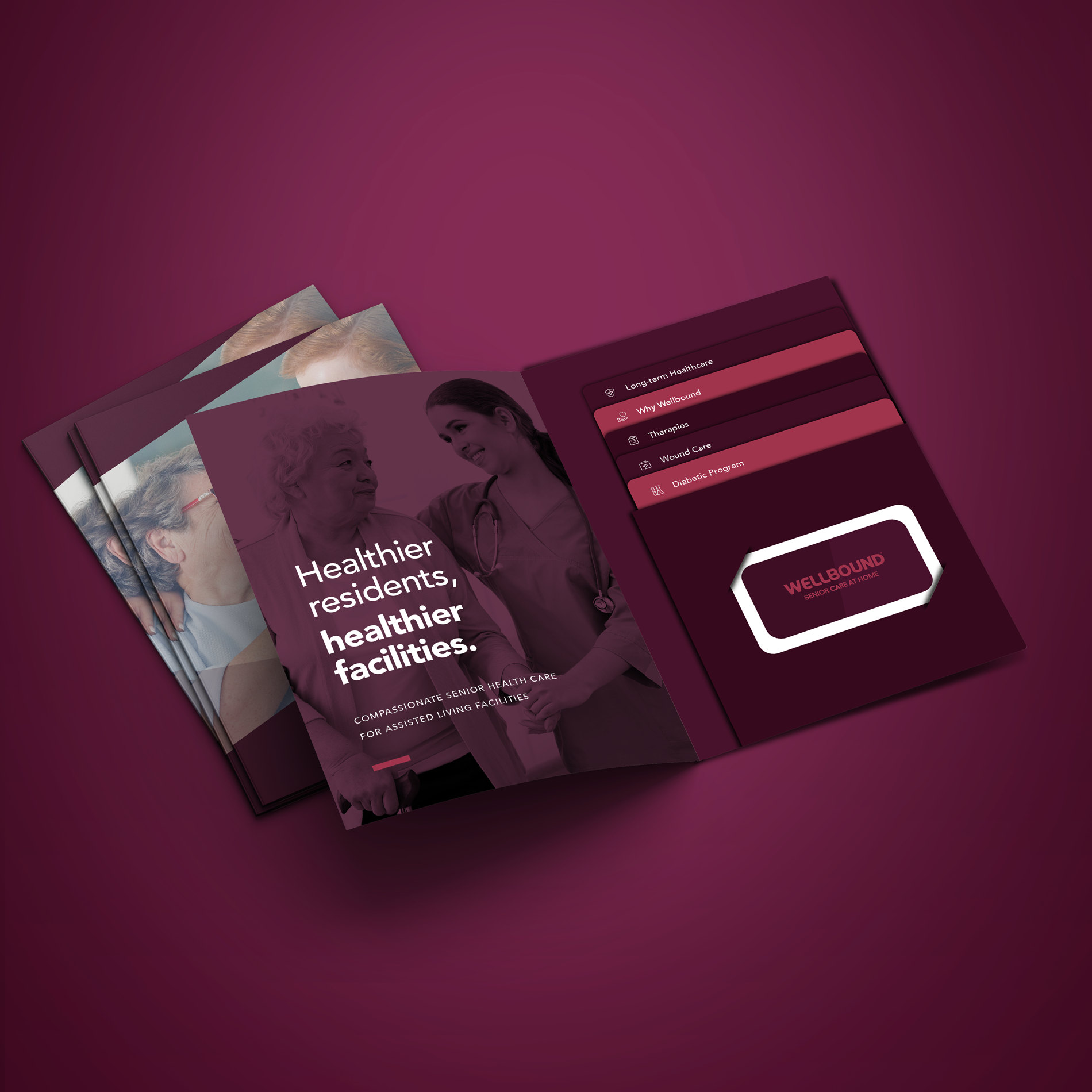
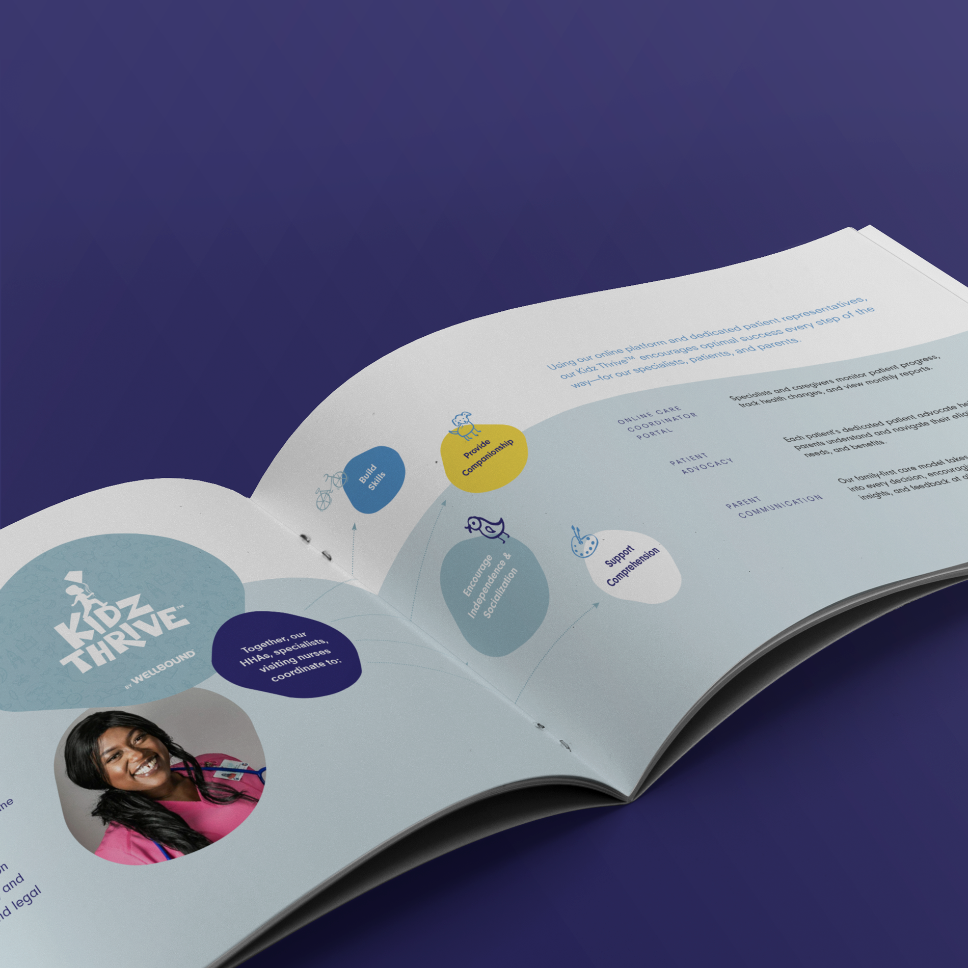
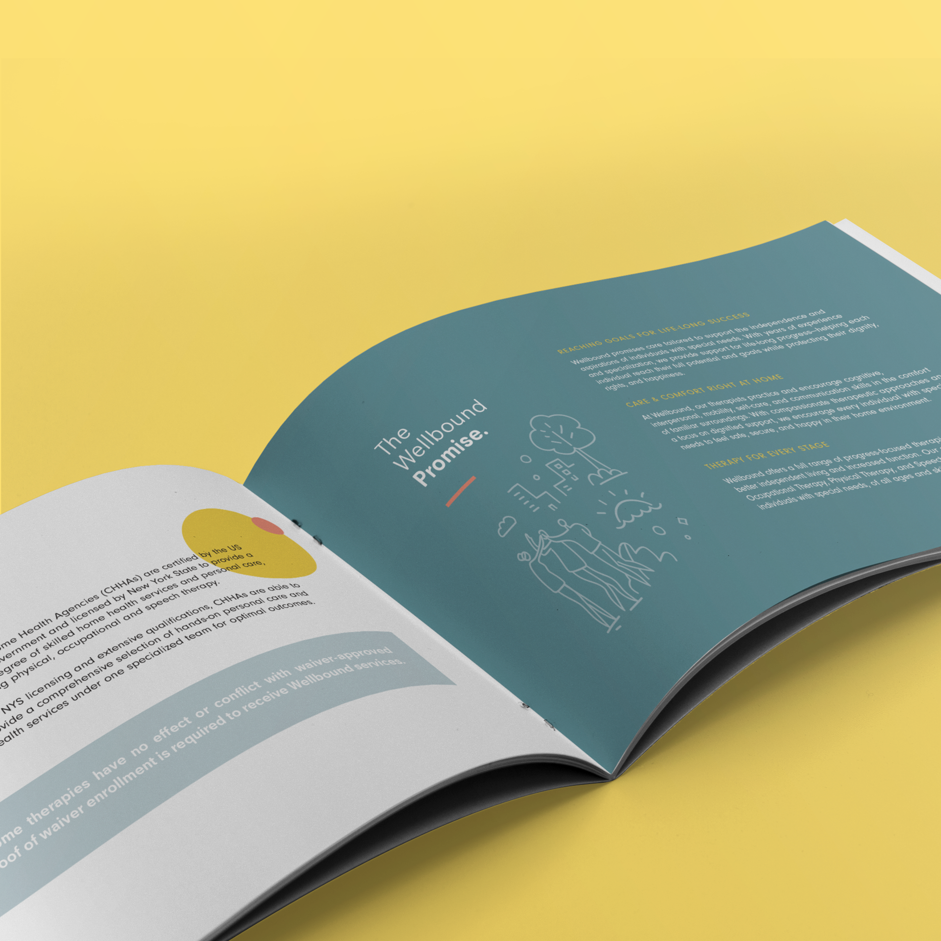
or each of the Wellbound divisions, we created magnificent brochures that showcase the company’s work. The brochures reflect the branding of the companies division with extensive copy detailing their services.
![]()
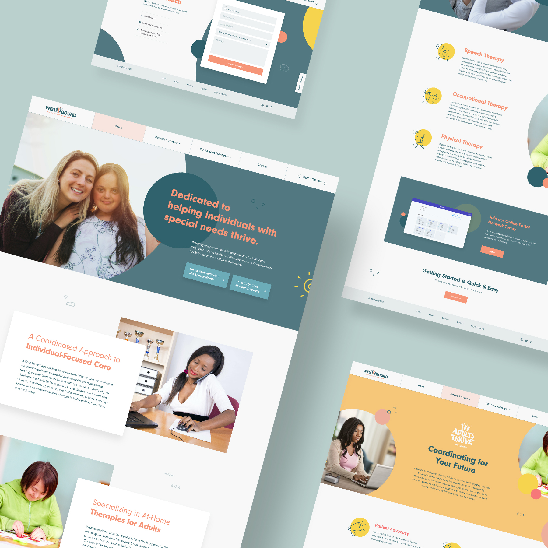
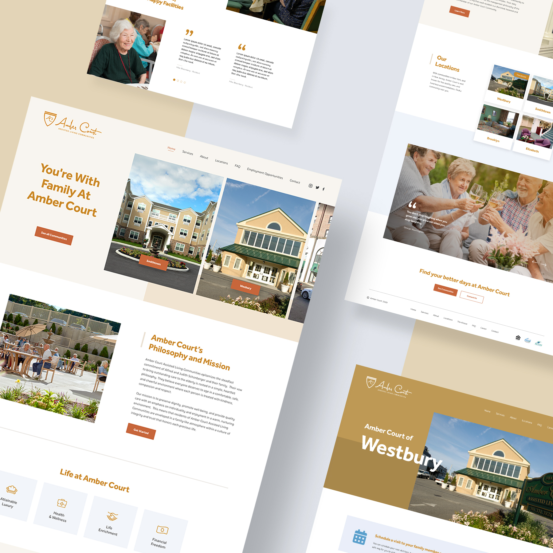
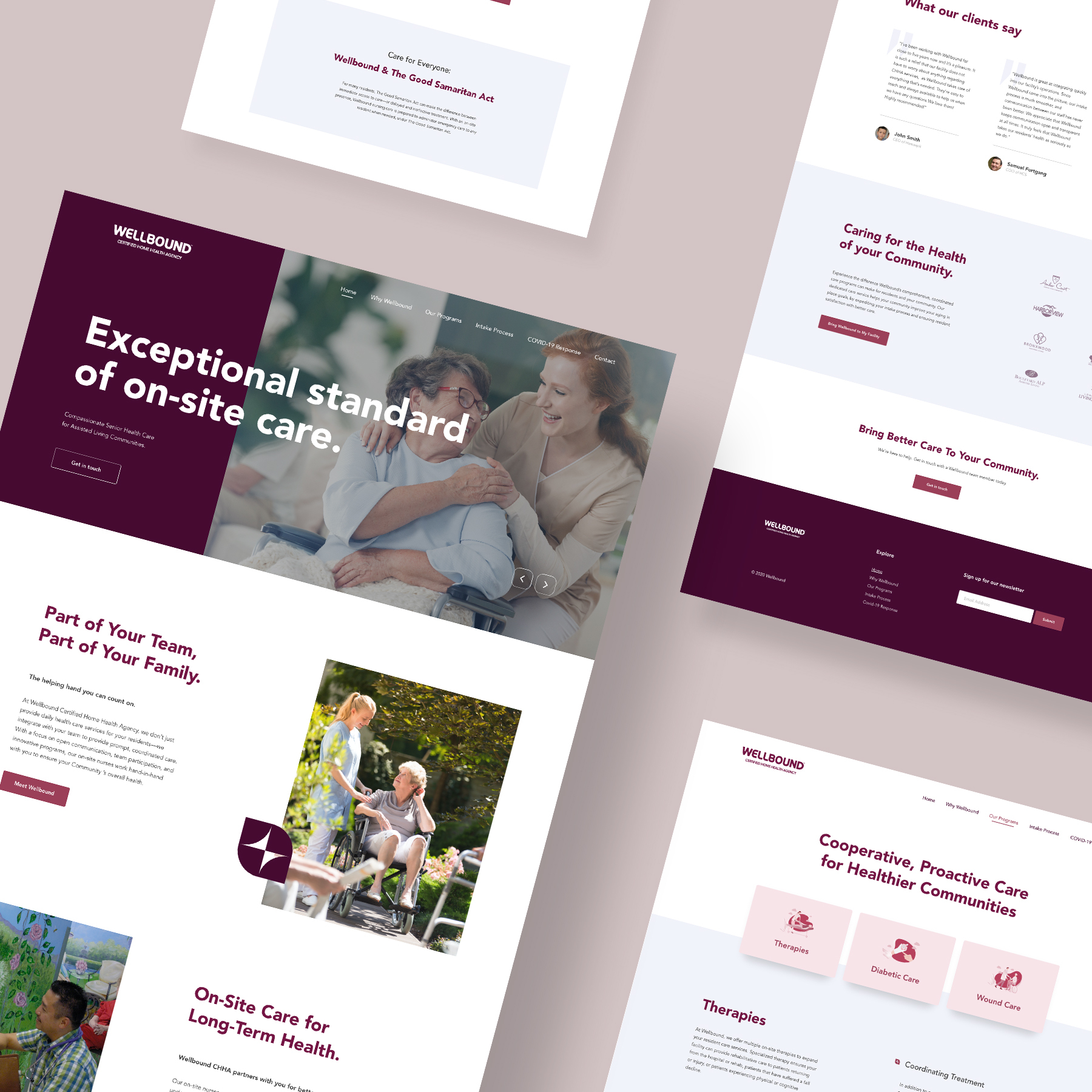
The Websites
For each of the Wellbound divisions, we created magnificent websites that showcase the company’s services and work. The websites reflect the branding of the companies division with extensive copy detailing their services.
Welbound Geriatric Website
Wellbound Pediatric Website
Wellbound Adults Website