
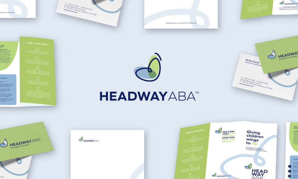
Headway ABA
Client: Headway ABA
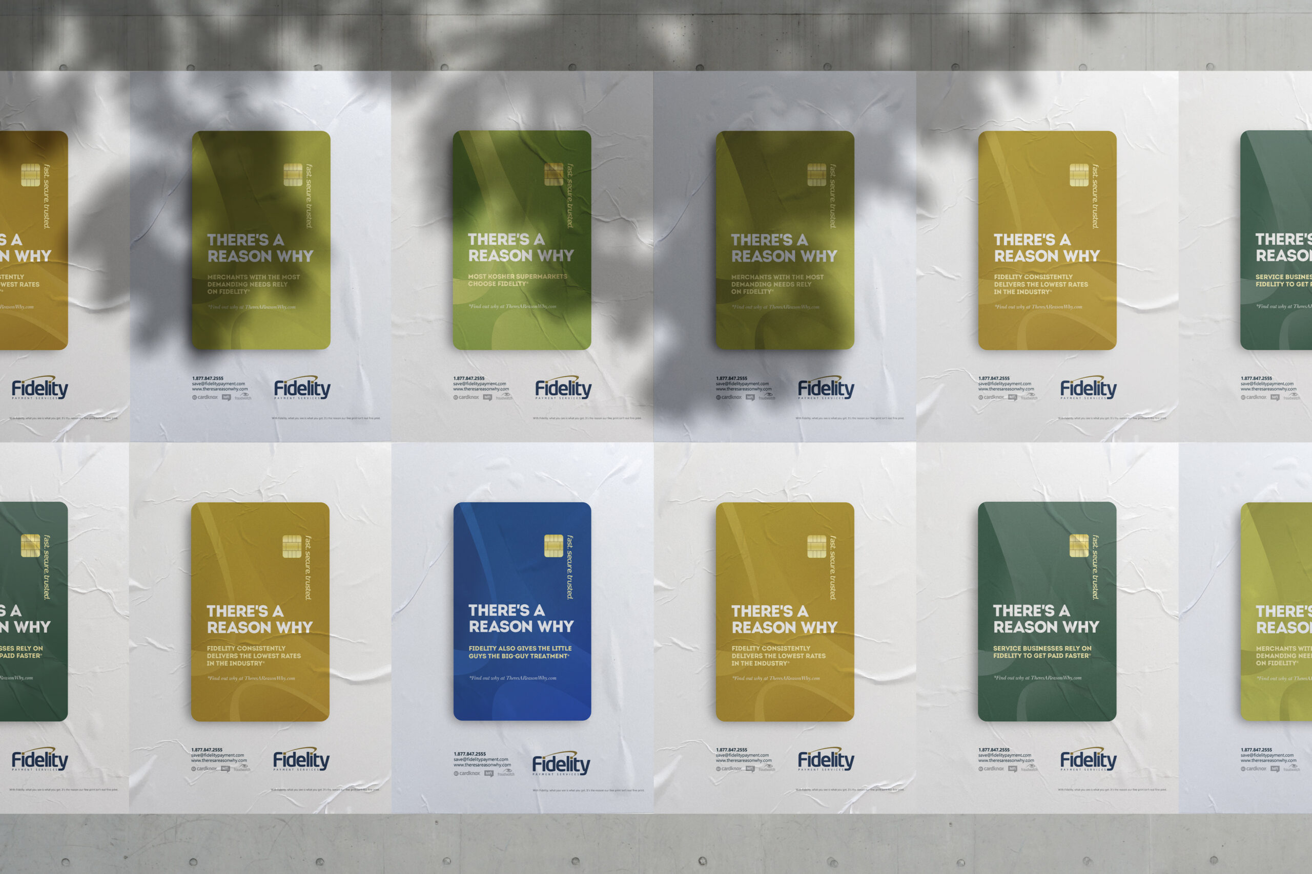
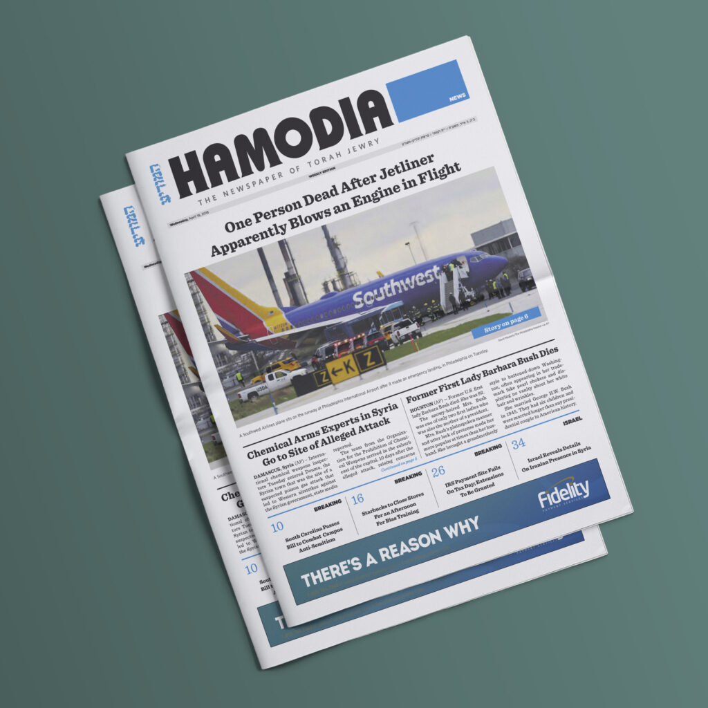
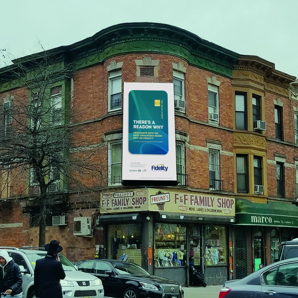
Fidelity is one of the largest and most prestigious electronic payment providers in North America. As such, they do not need to explain to the public who they are, or what they do, or why they’re better at it than their competitors. It’s common knowledge. Hence, the dangling headline and campaign slogan, “There’s a reason why”, that isn’t answered in print.
People are more likely to trust their connections than the word of a big brand like Fidelity, and Fidelity is self-confident enough to propose the concept. The campaign punchline, so to speak, is the small footnote that speaks volumes.
The reason referenced in each ad, the footnote suggests, can be discovered by asking your local what-have you. This connects the end consumer with Fidelity in a strong and personal way.
Fidelity Payment Services
Print Marketing
Public Relations
Graphic Design
Digital Marketing
Campaign Website
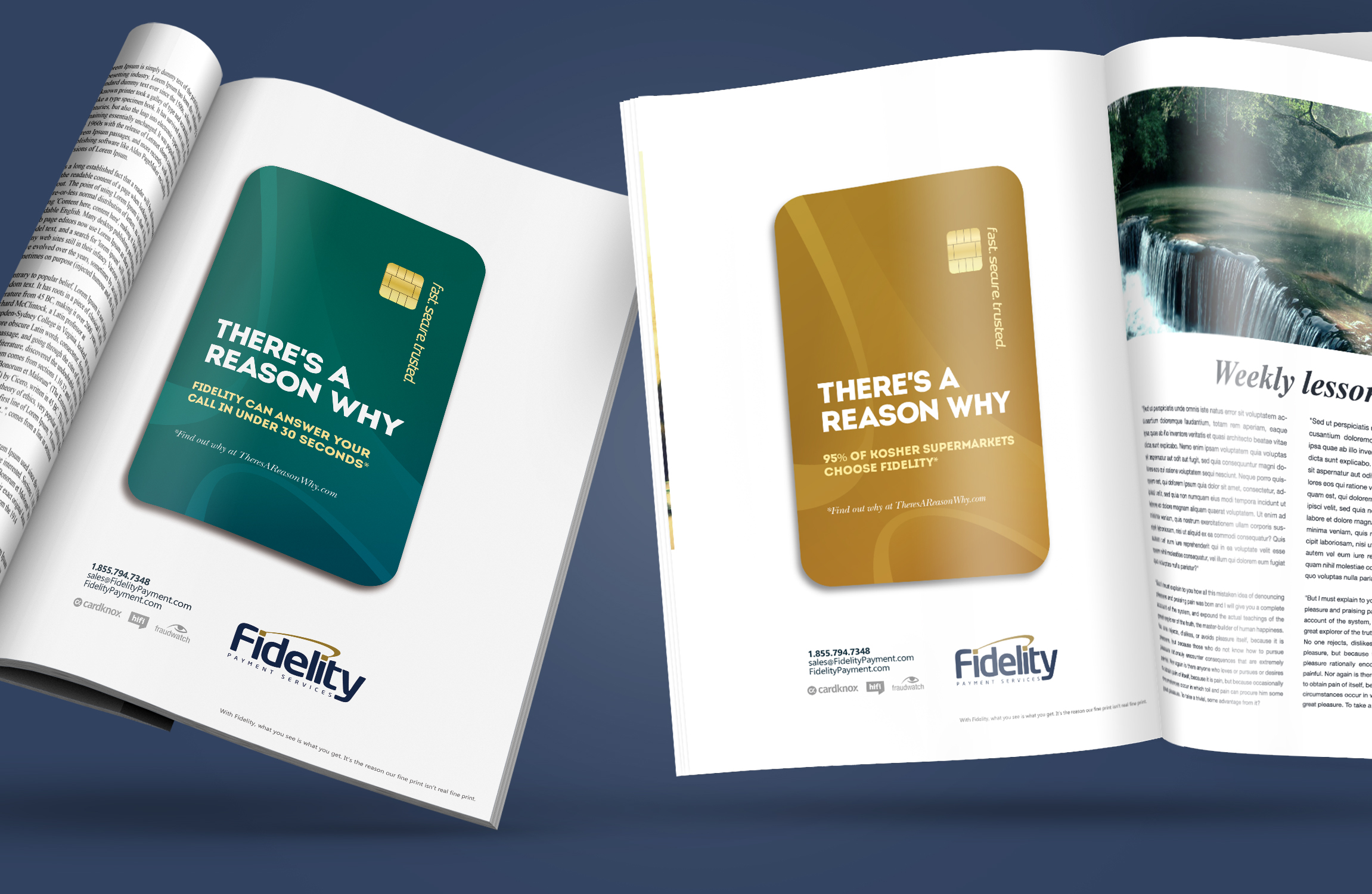
Following the general direction of the campaign, the ads are minimalistic with the credit card set against a stark, white background for a clean and effective corporate look. The campaign targeted existing business owners and new small business owners as well as the everyday consumer.
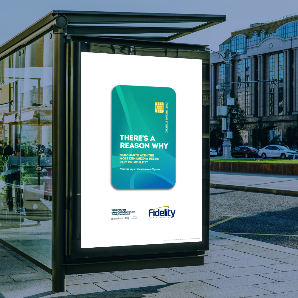
To extend the campaign even further and broaden its reach, we created ads for bus shelters and billboards in various Jewish communities. These ads specifically reference the location where they’ll be placed, bringing the message out into the real world.
Client: Headway ABA

Client: Golden Flow
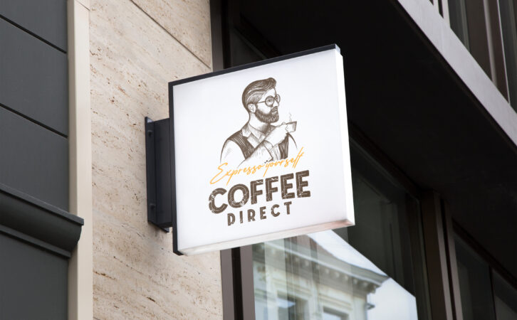
Client: Coffee Direct
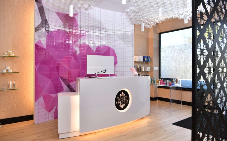
Client: White Orchid Medi Spa
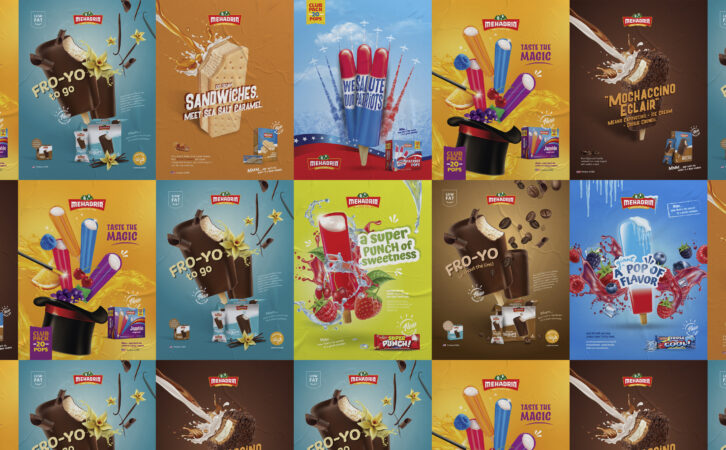
Client: Mehadrin Ice Cream

Client: Tuv Taam

Client: Fineline
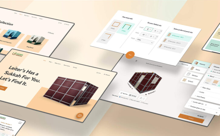
Client: Leiters Sukkah

Client: Mehadrin Ice Cream
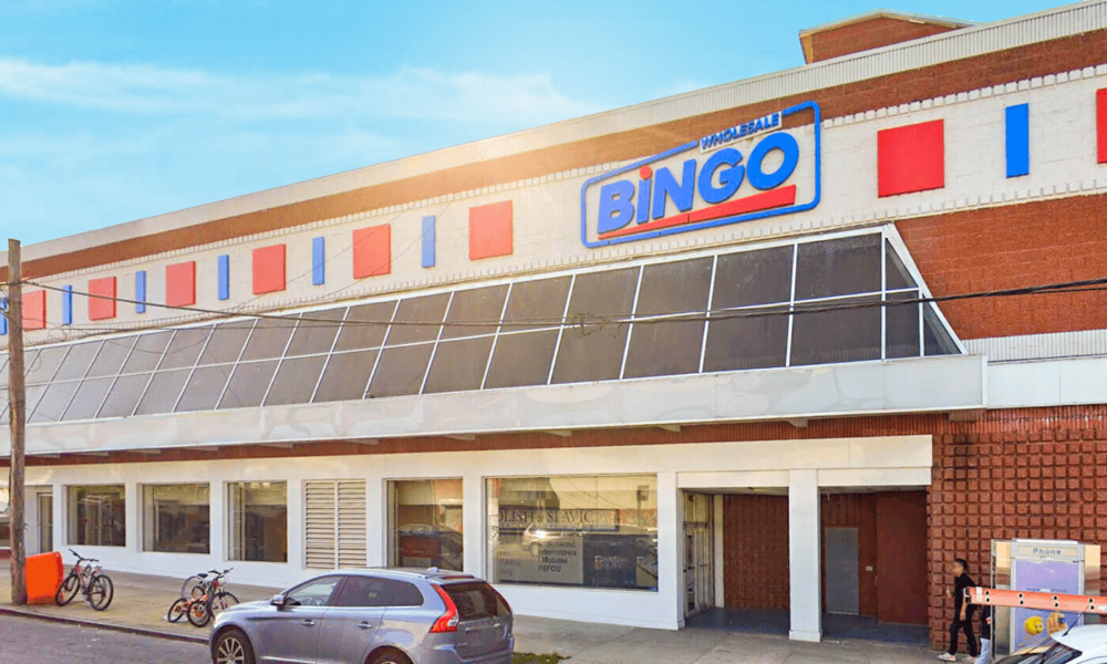
Client: Bingo Wholesale
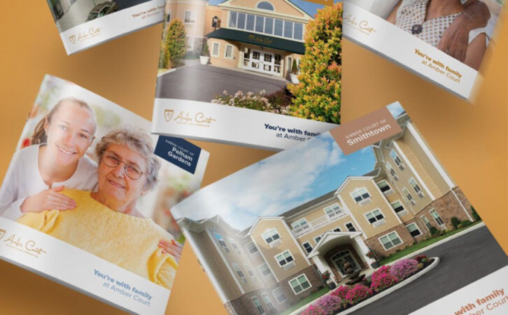
Client: Amber Court Assisted Living
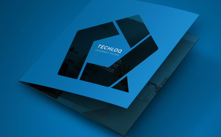
Client: Techloq

Client: Preferred Builders
Client: Techloq
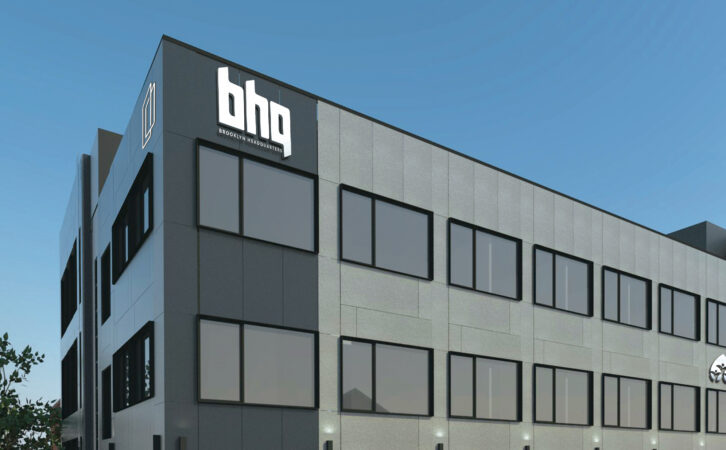
Client: BHQ
Client: Connekt

Client: Boulder Builders
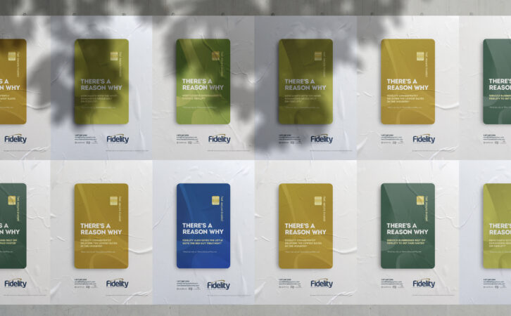
Client: Fidelity Payment Services
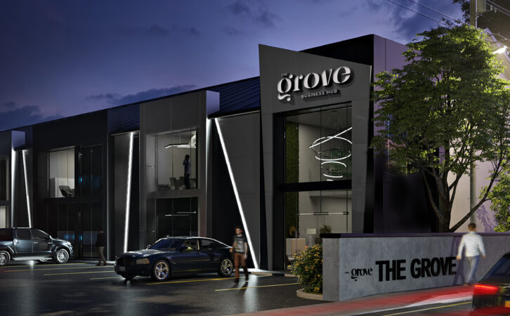
Client: The Grove Business Hub
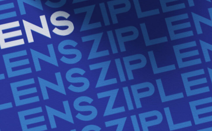
Client: Ziplens