Connekt is a kosher phone and network company designed to reclaim the power of the simple connection.
When we were first approached by this client, we instantly knew what their name will be, and how their message would manifest in the branding. We met with these great people who were passionate about their cause. There was a spark, while they spoke about simple connection. Connection to the world around you, a husband to a wife, parent to child, brothers to sisters and friends. This spark is what inspired us while designing and developing the brand’s message and character.
Connekt isn’t simply a company that sells Kosher phones, it’s an idea. Connecting and appreciating the world, that exists beyond the screen.
Following that mandate, they invested in the best technology to make sure the kosher communication way is safe and smooth without any interference so that you can stay connected to the important things in life.
THE CHALLENGE
We were faced with a challenge. Apple is advertising its new iPhone with a triple lens. Foldable Smartphones are making their debut. Phones have now turned into fashion statements. How do we promote a phone that has nothing in it besides being a phone – a device to make calls. Yes, our target audience is in the market for a Kosher phone, but how can we persuade them to chose ours over the competitors?
THE SOLUTION
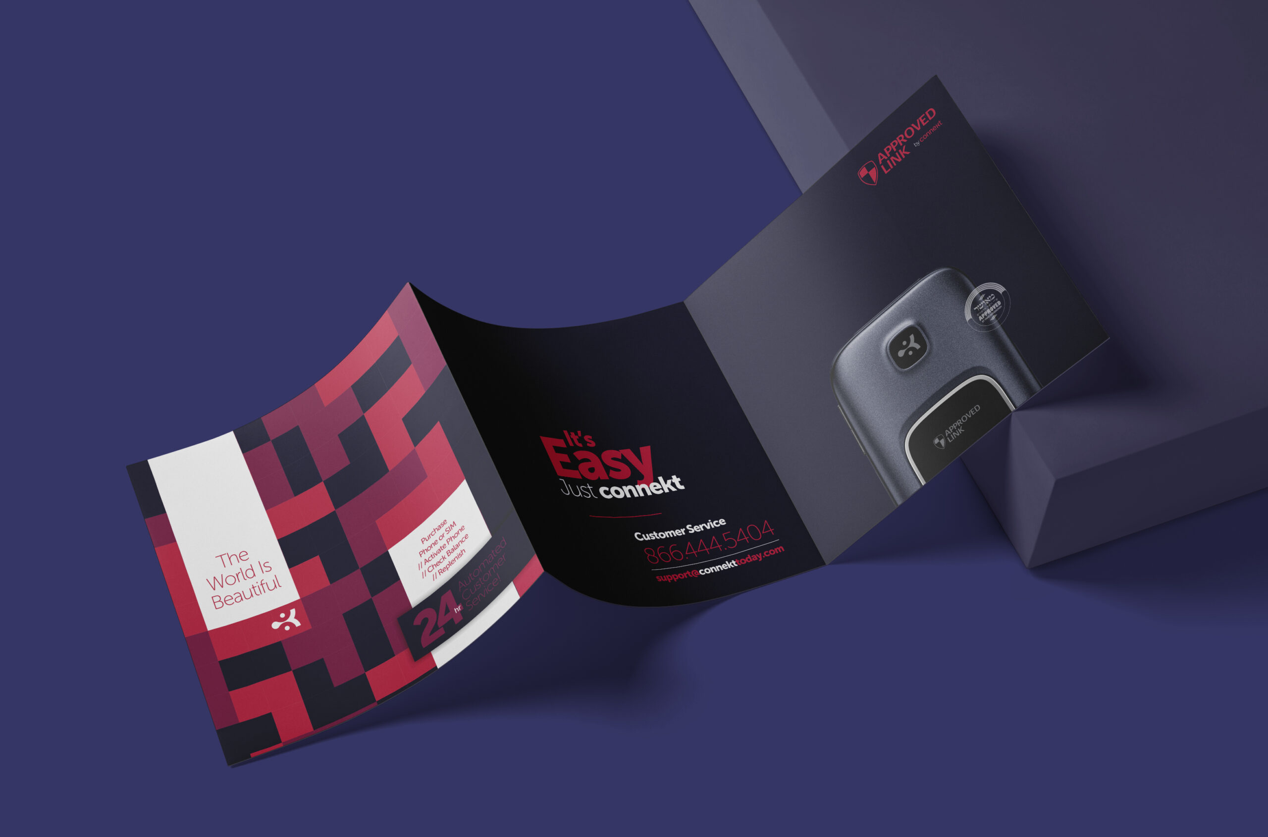
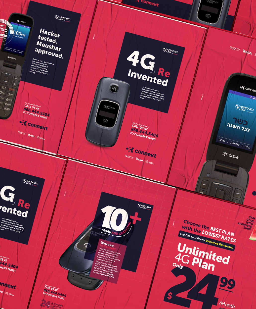
The answer was simple. Make it Attractive, Reliable, and clear lettering.
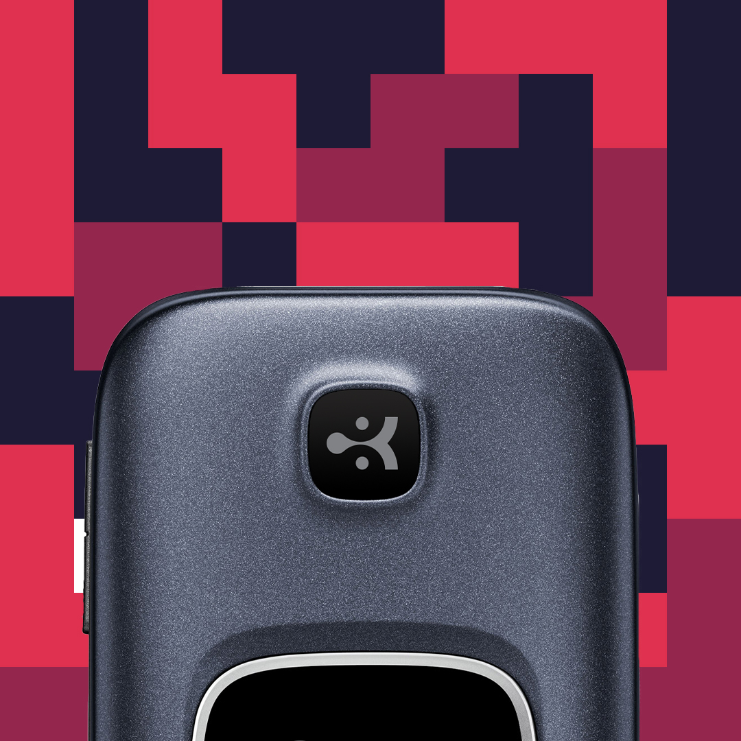
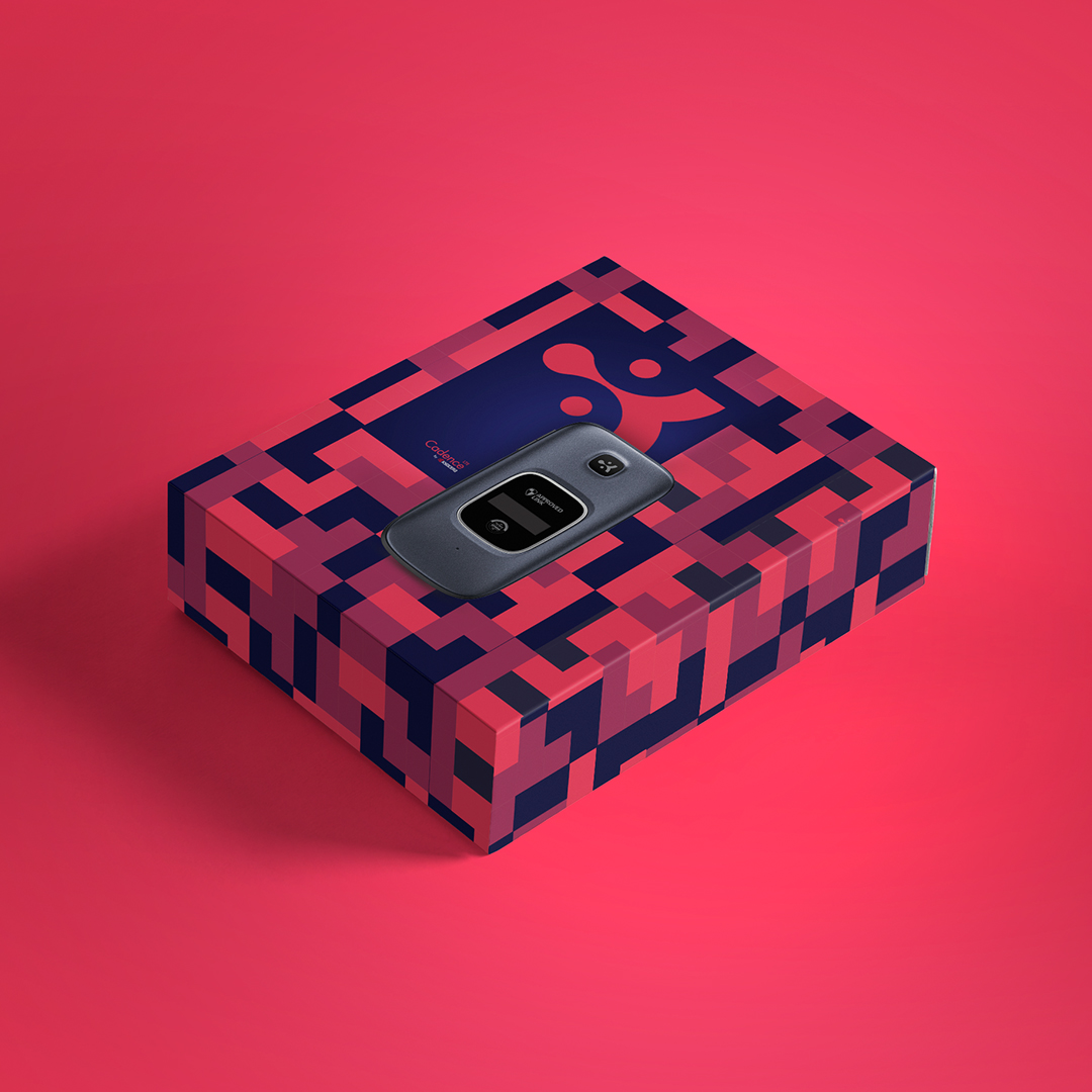
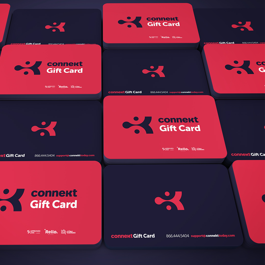
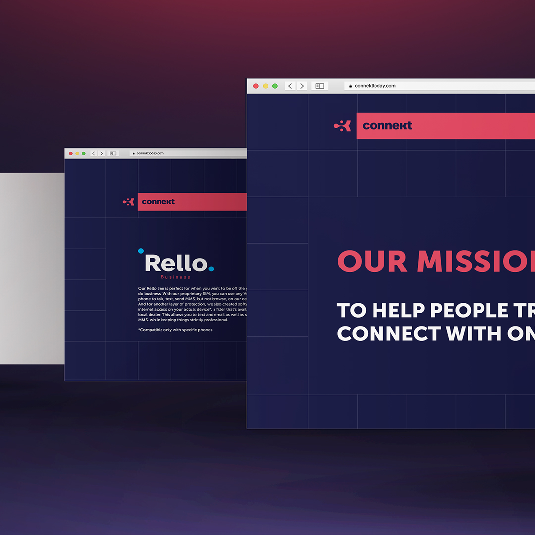
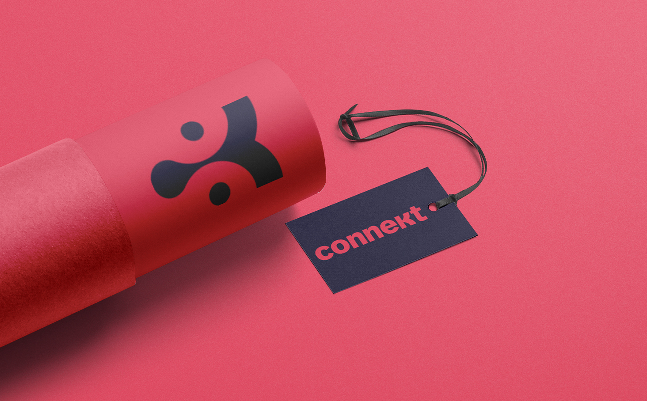
We created a memorable icon for the logo. The K. that makes the name of the brand: Conne’k’t and stands for the kosher word. But we focused on the “Connect to the world” message rather than the kosher, we did so by designing the K in a shape of something that is connected and you can’t disconnect it, the Drop shape captured the look of a drop that wants to stay connected to where it was.
We brought together strong and bright colors to reflect the hot product, as well as showing reliability, and trustworthy. The red represents the attractiveness of the product and the blue represents reliability and trustworthiness. As you see the brand is quite versatile and balanced you can use it in more a calm way by letting the red take control, you can give it more tone and voice by giving control for the blue, and then you can lit up the brand and emotions by the great mixture of both.
The pattern was inspired by the old Tetris game back then when we could see the pixels on our screen. Using this pattern awakes the nostalgia from when Tetris was simply a game, not an addiction. And with our sharp and strong colors, we even spiced it up.
The feedback we received was tremendous. Our campaign stood out and created a buzz. The colors and patterns left an impact. Most of all, the messaging came through. The idea of a simple connection to the world around us, our family and friends is what carried on.