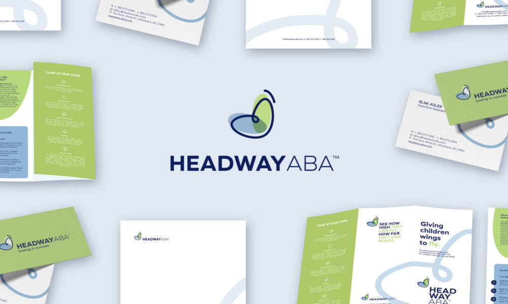
Headway ABA
Client: Headway ABA
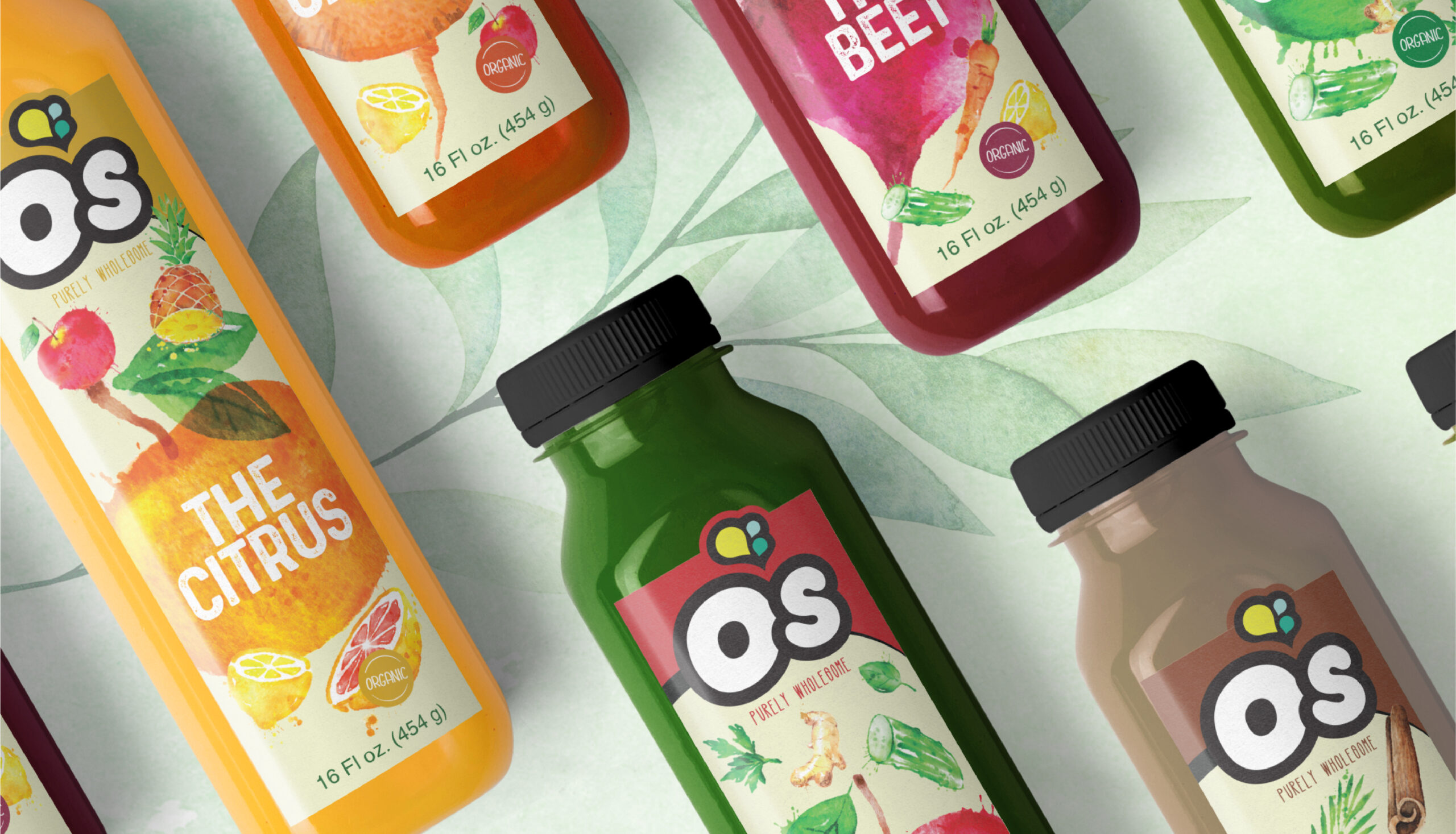
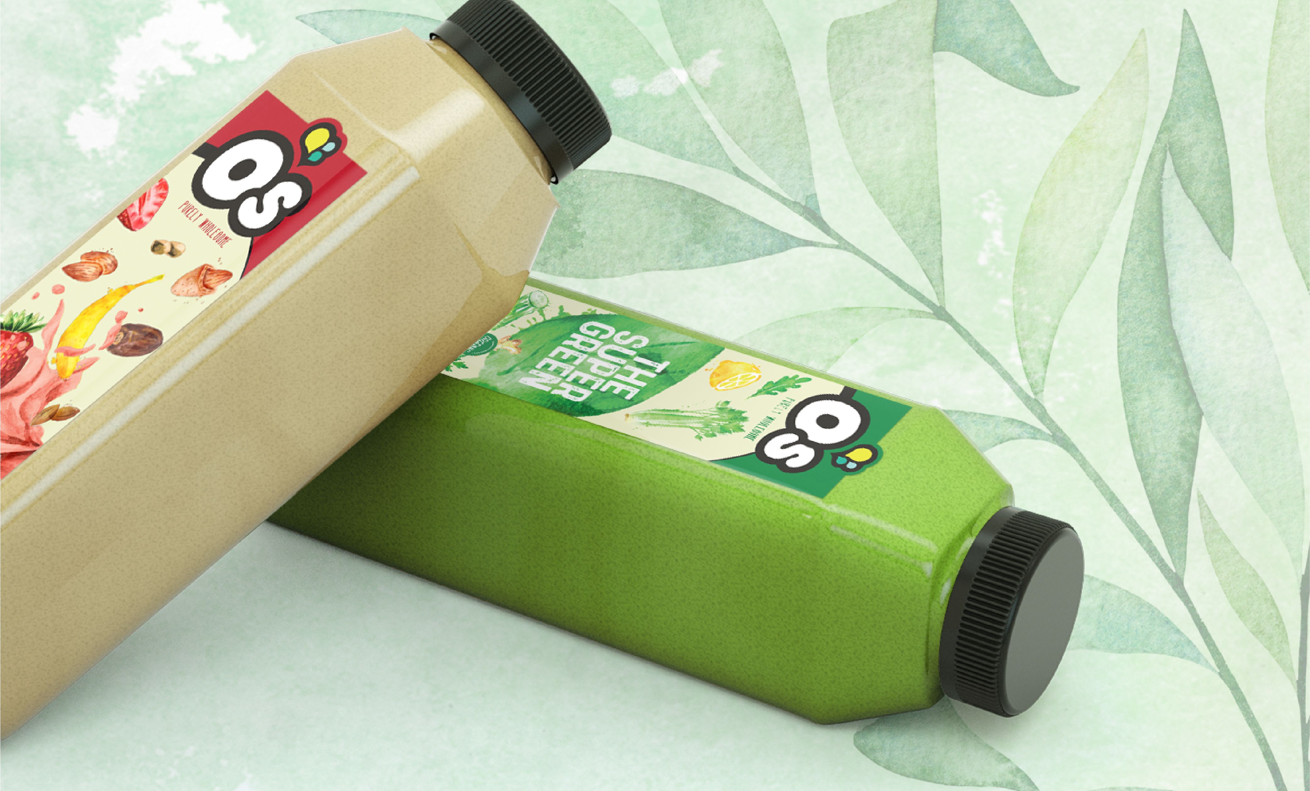
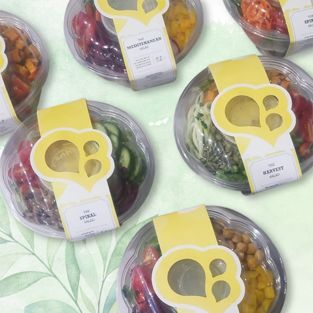
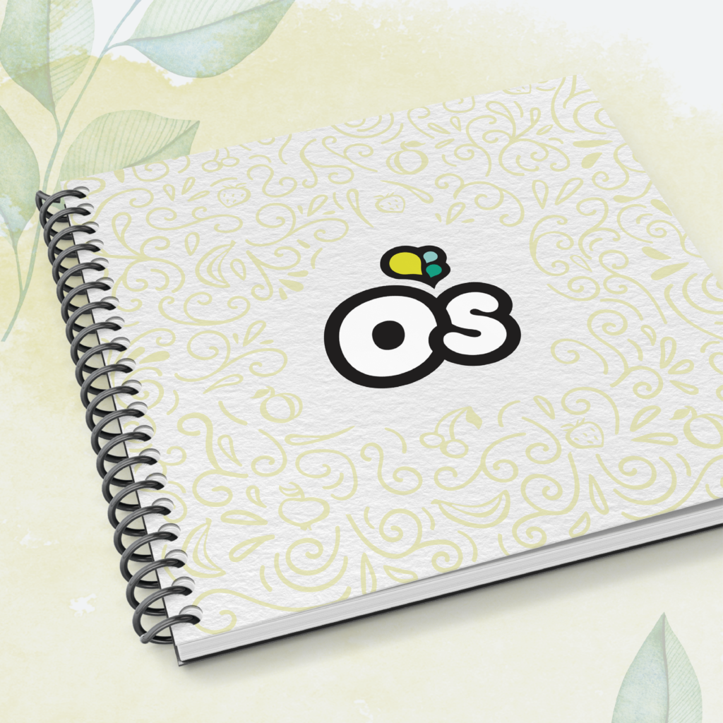
O’s is all about harnessing and rejuvenating powers in fruits and vegetables to boost consumer’s daily living. O’s is proud of it’s all-natural products with its simple ingredients. Perfect for health conscious individuals looking to lead a wholesome, balanced lifestyle, O’s is quite simply, Purely Wholesome.
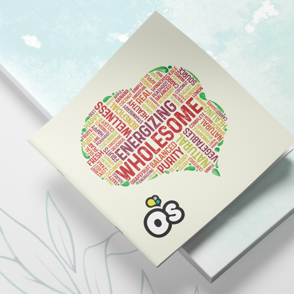
To deliver a natural design, we incorporated water colors on all brand material to create a natural and soft design. Key brand words such as energizing and wholesome, were collected to form a word cloud in the shape of O’s icon.
O's Natural
Branding
Packaging design
Material Design
Client: Headway ABA
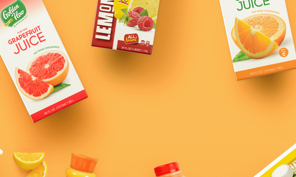
Client: Golden Flow
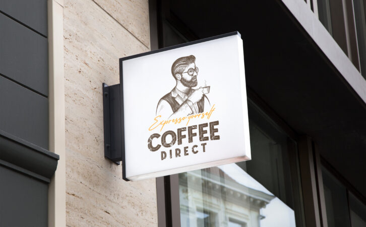
Client: Coffee Direct
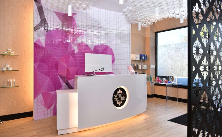
Client: White Orchid Medi Spa
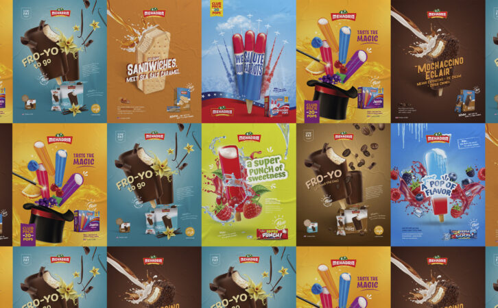
Client: Mehadrin Ice Cream
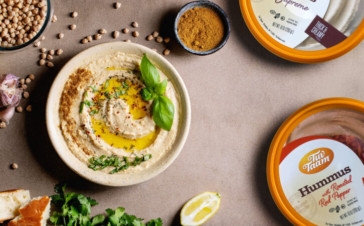
Client: Tuv Taam
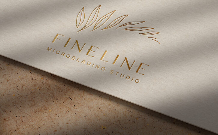
Client: Fineline
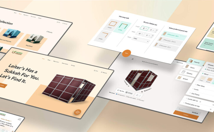
Client: Leiters Sukkah

Client: Mehadrin Ice Cream
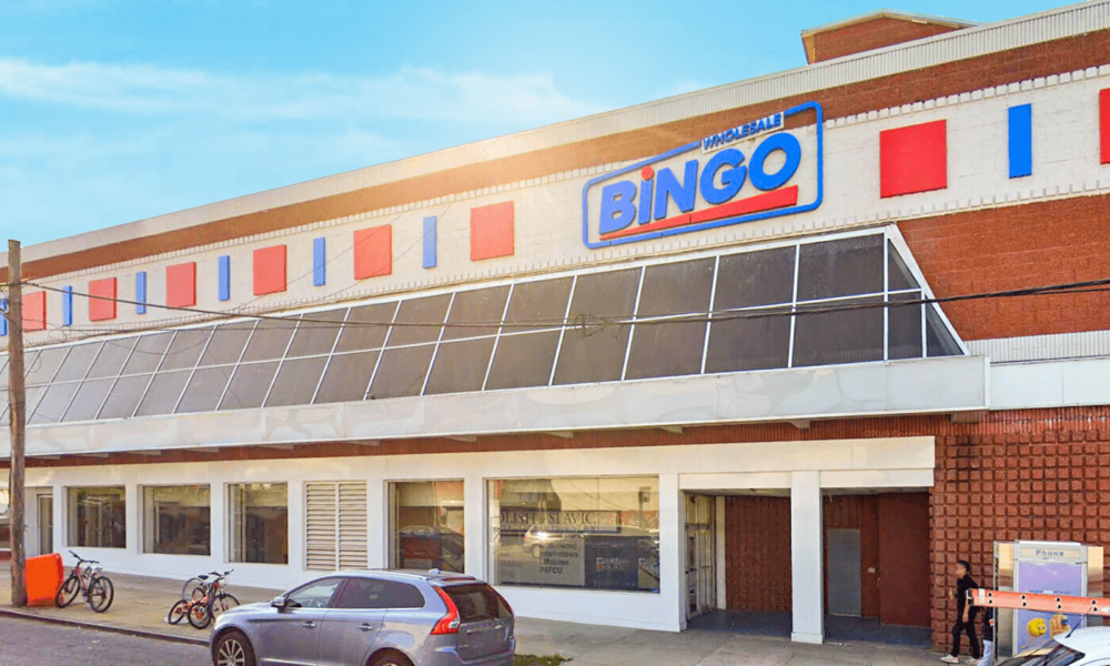
Client: Bingo Wholesale

Client: Amber Court Assisted Living
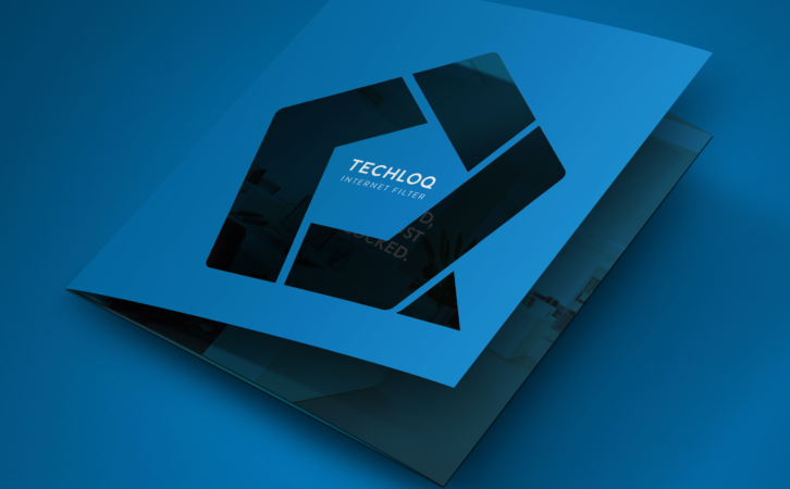
Client: Techloq

Client: Preferred Builders
Client: Techloq
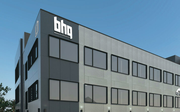
Client: BHQ

Client: Connekt

Client: Boulder Builders
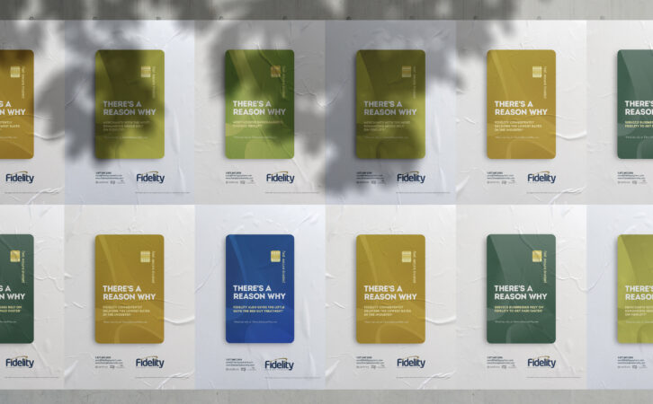
Client: Fidelity Payment Services
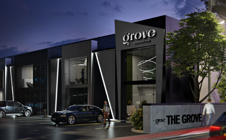
Client: The Grove Business Hub
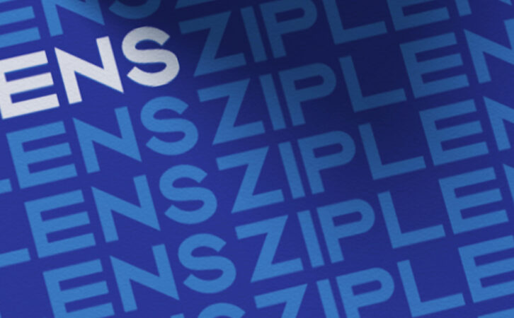
Client: Ziplens