
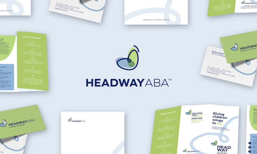
Headway ABA
Client: Headway ABA

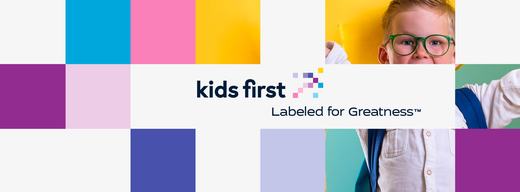
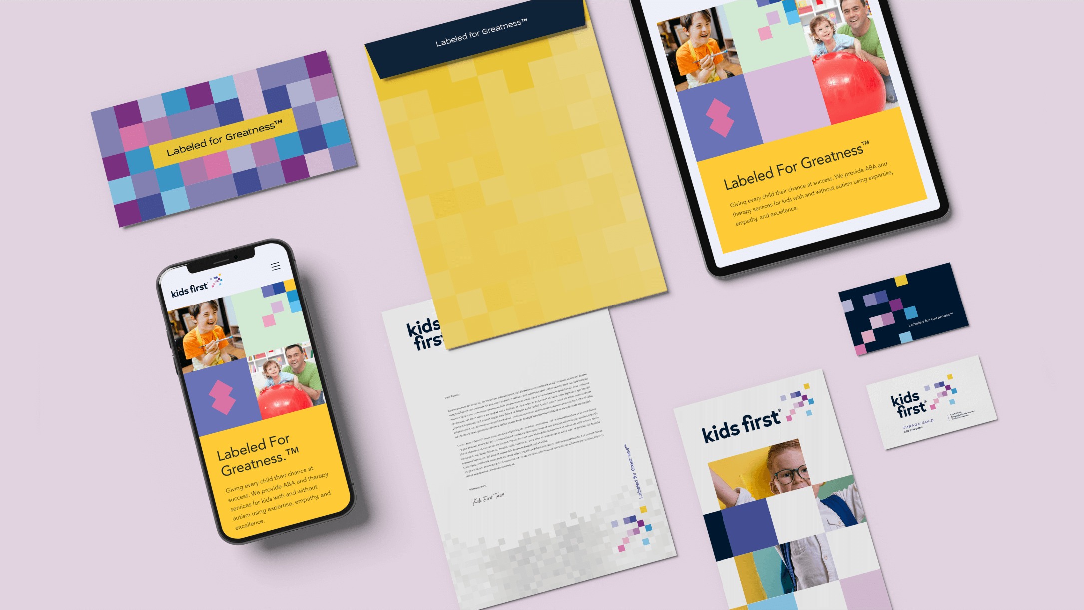
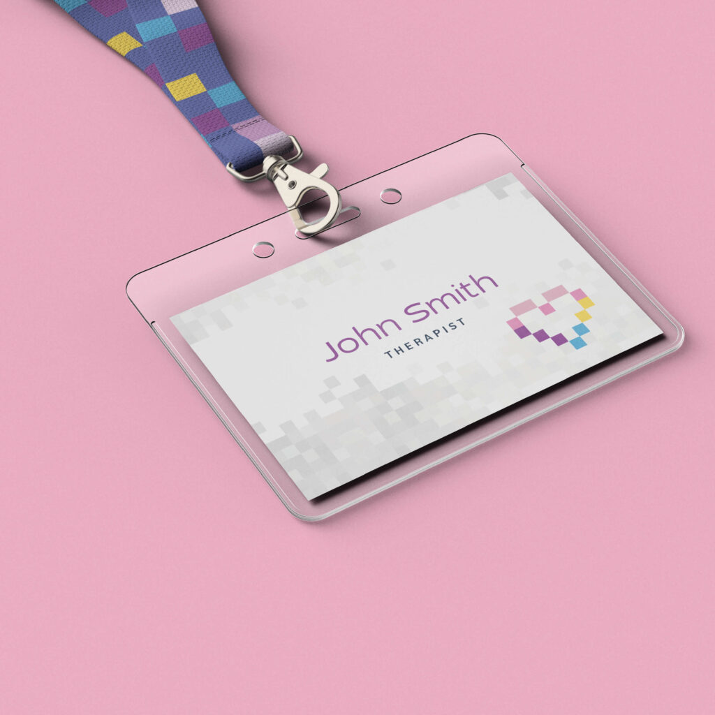
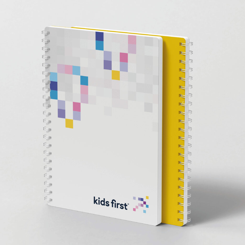
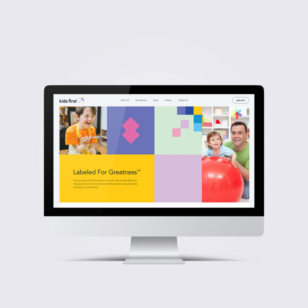
A full-scale branding project for Kids First – a leading child therapy agency located in the New York area. Our team conceptualized, developed, and designed the complete brand identity along with a beautiful state-of-the-art website and innovative ad campaign.
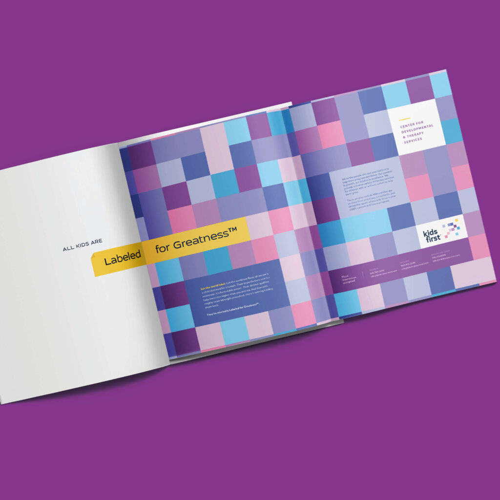
What comes to mind when you think of labels?
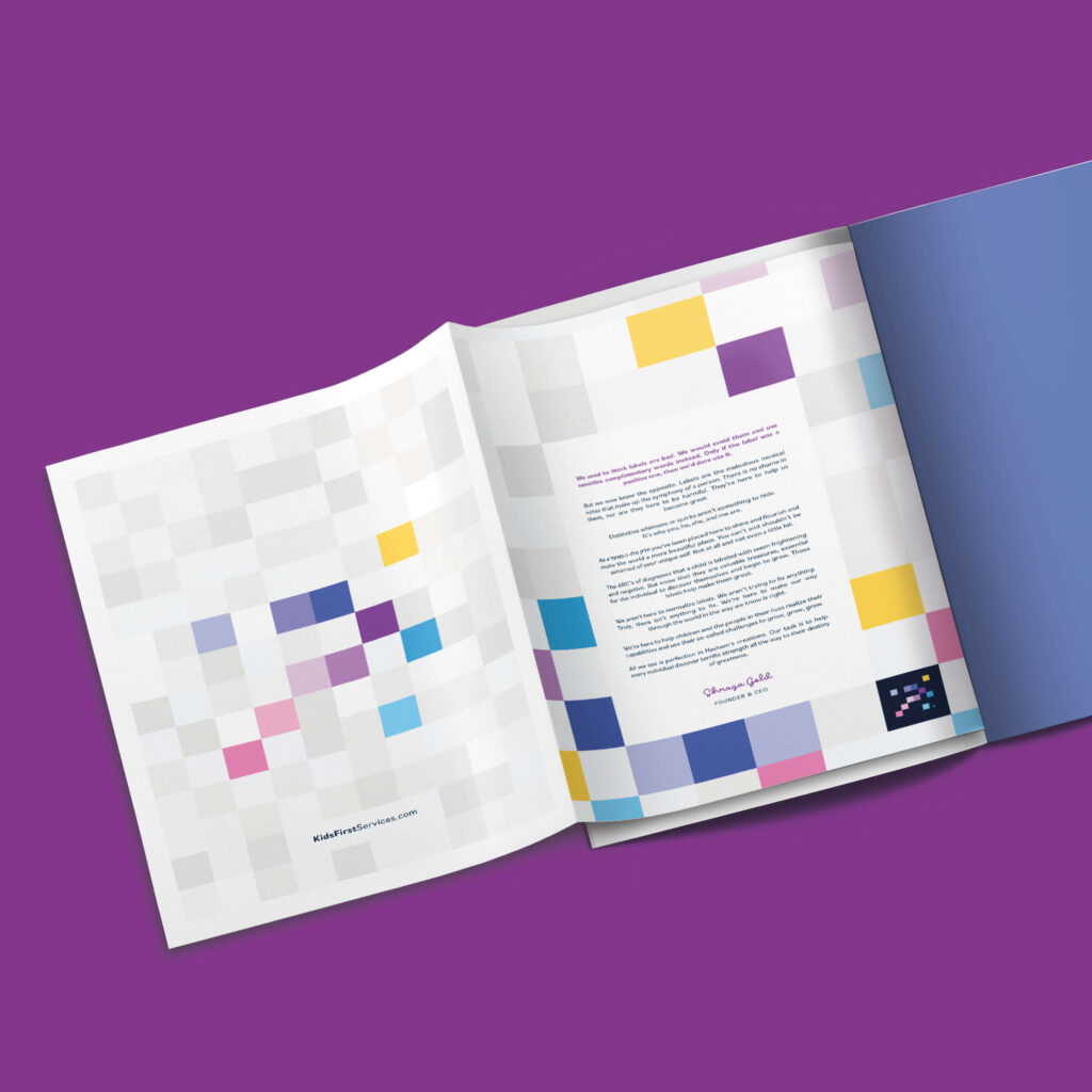
From negativity, we build vibrant positivity. We bring together the labels of stigma and join them together to create a breathtaking masterpiece. The labels stand together — much like parent, kid, and therapist — representing strength in unity.
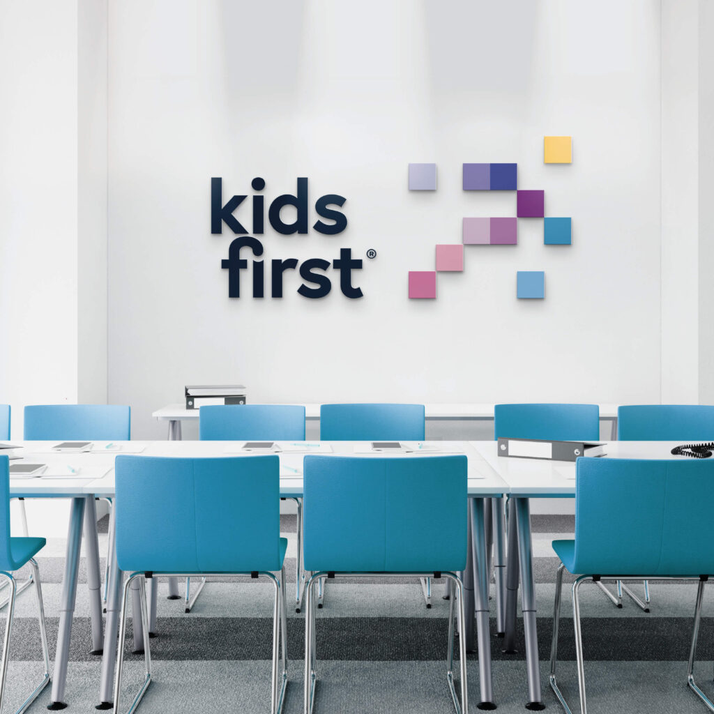
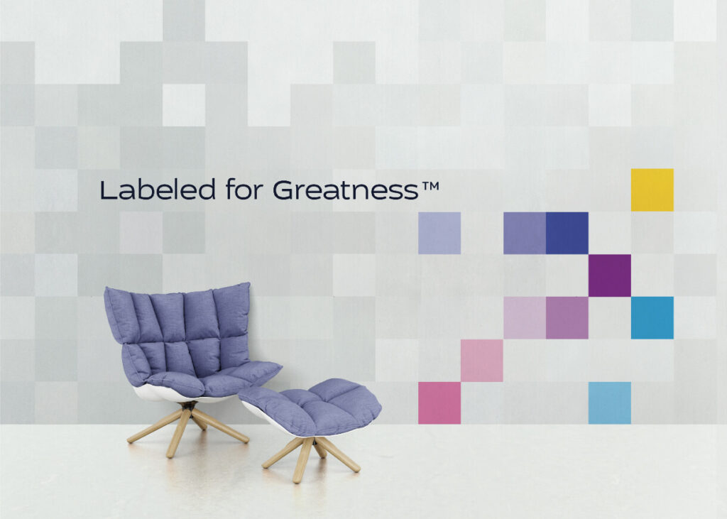
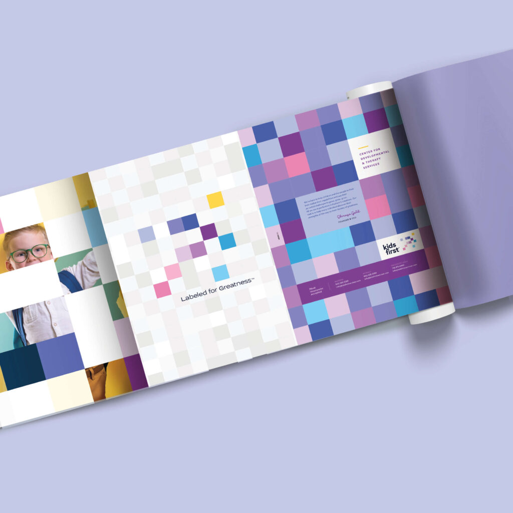
Kids First – Labeled for Greatness.
Kids First Services
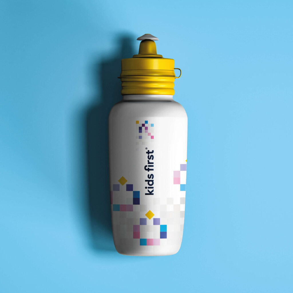
Brand Identity
Material Design
Marketing
Web Design
Web Development
The logo depicts a child in motion, running forward, breaking through. It also portrays an arrow pointing upward.
With the labels on full display, we proudly pronounce: Challenges accepted. We accept every child with open arms and help them attain their true potential.

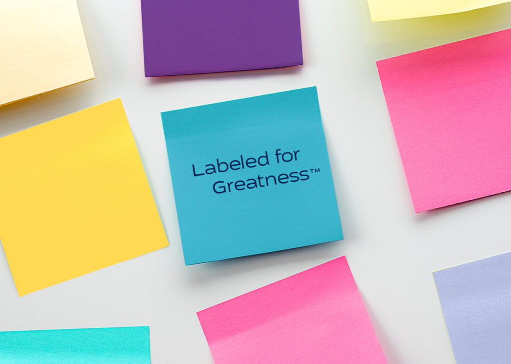
We went with a variety of vibrant colors to reflect a myriad of individual personalities. Because no one color fits all.
For the fonts, we chose a child-friendly and warm font that reflects the Kids First mission of a kind and welcoming approach to kids with challenges.
At the same time font is also clean and corporate to convey a sense of professionality that Kids First takes pride in.
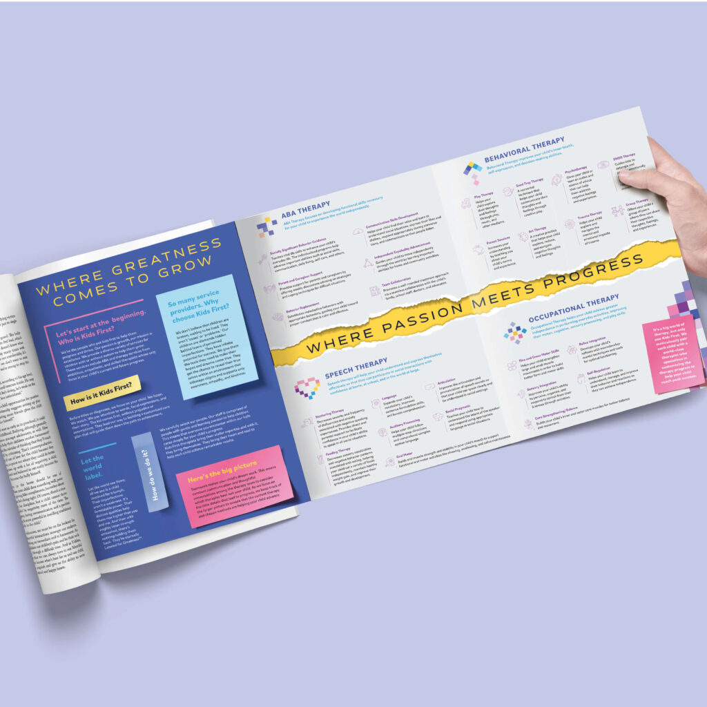
To unveil this beautiful rebrand, we designed a state-of-the-art multi-page pull-out for the magazines that were published in the Pesach issue. In the designs we used portrayed the brands message and style with the label shapes, luxurious copy, and iconography to exhibit all the services Kids First offers.
Client: Headway ABA
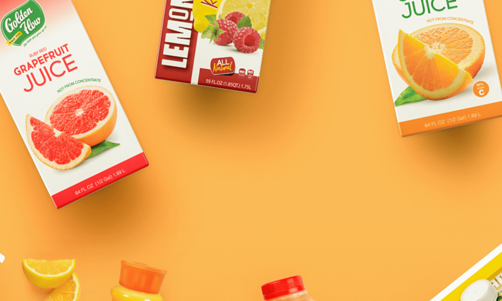
Client: Golden Flow
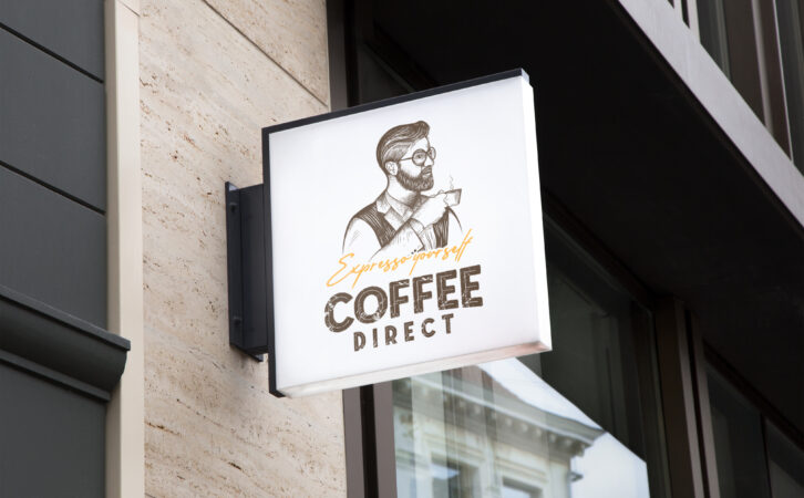
Client: Coffee Direct
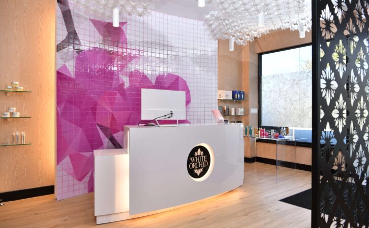
Client: White Orchid Medi Spa
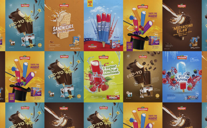
Client: Mehadrin Ice Cream

Client: Tuv Taam

Client: Fineline
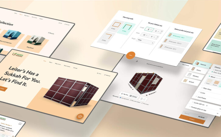
Client: Leiters Sukkah

Client: Mehadrin Ice Cream
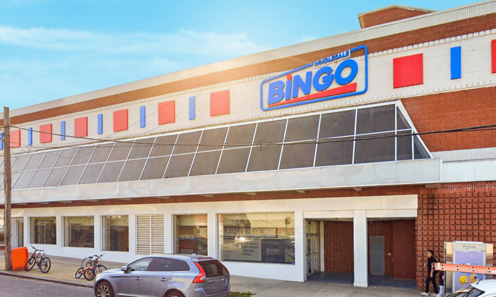
Client: Bingo Wholesale
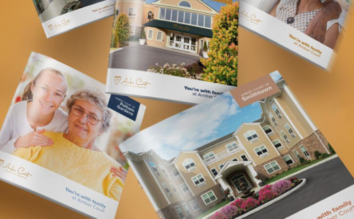
Client: Amber Court Assisted Living

Client: Techloq

Client: Preferred Builders
Client: Techloq
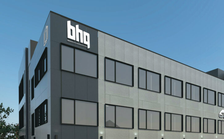
Client: BHQ

Client: Connekt

Client: Boulder Builders
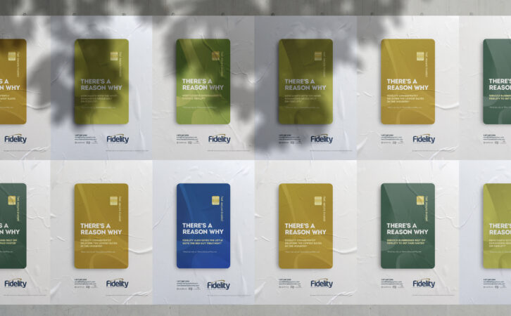
Client: Fidelity Payment Services
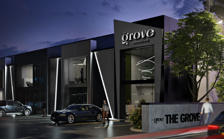
Client: The Grove Business Hub
Client: Ziplens