Category: News
Northside Coffee Rebrand
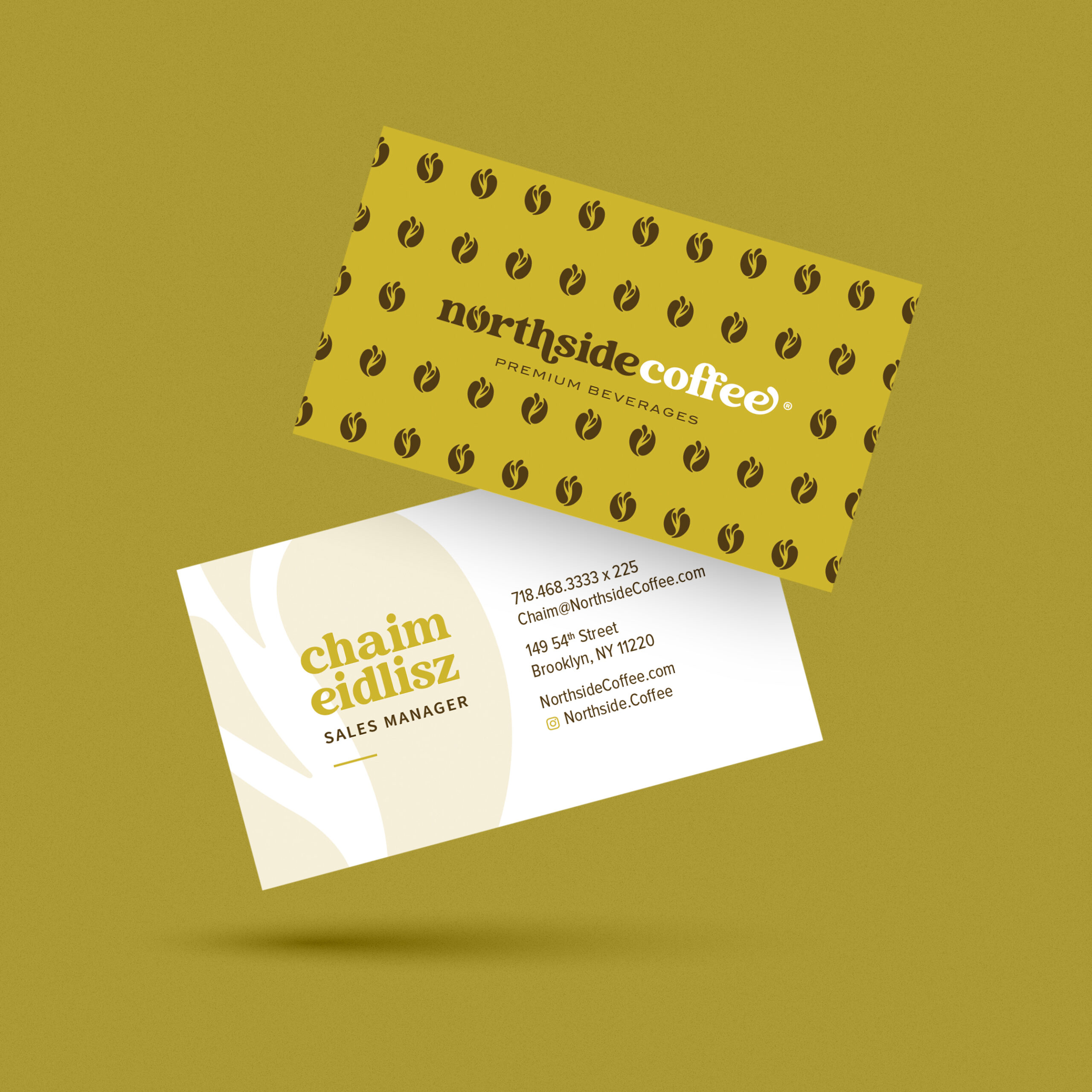
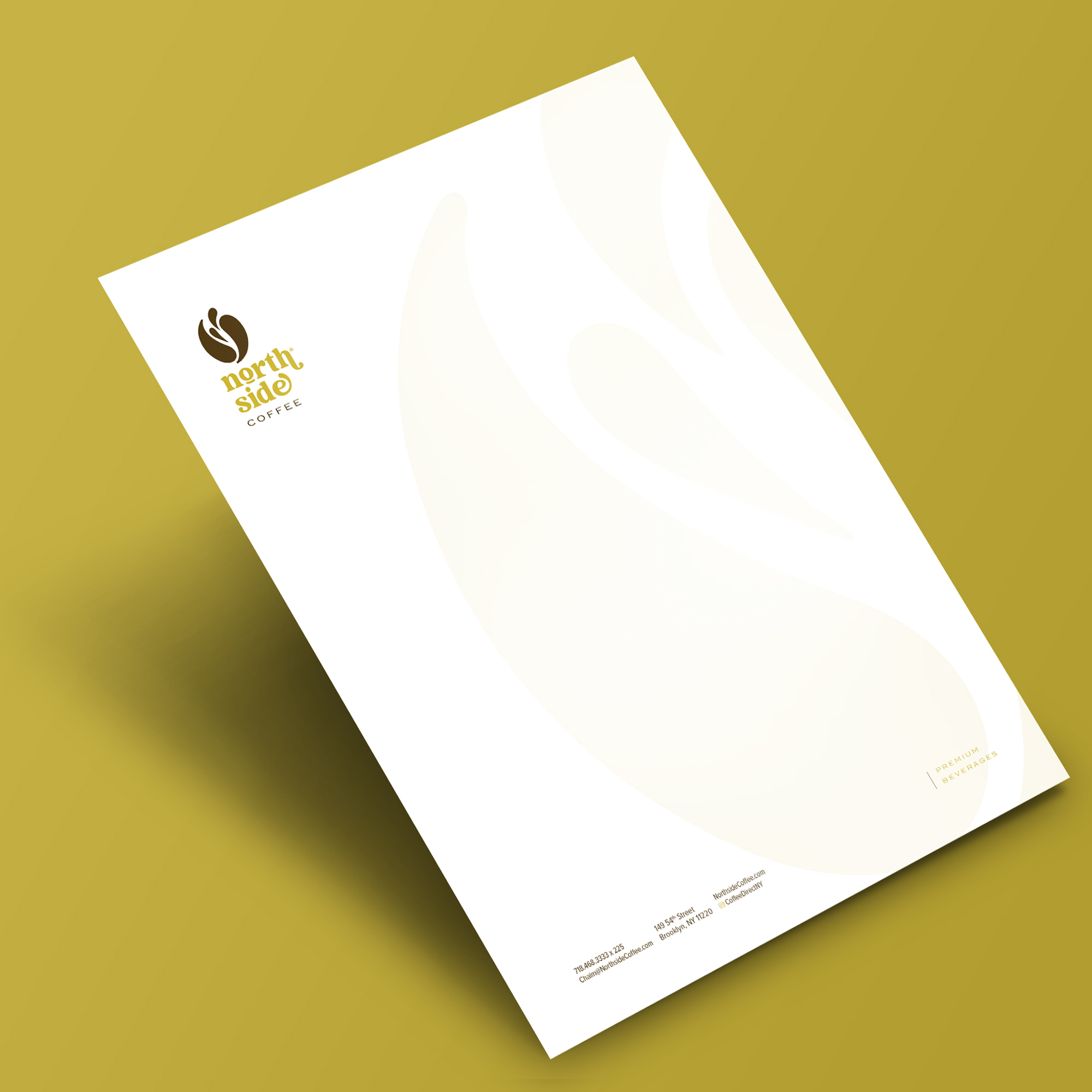
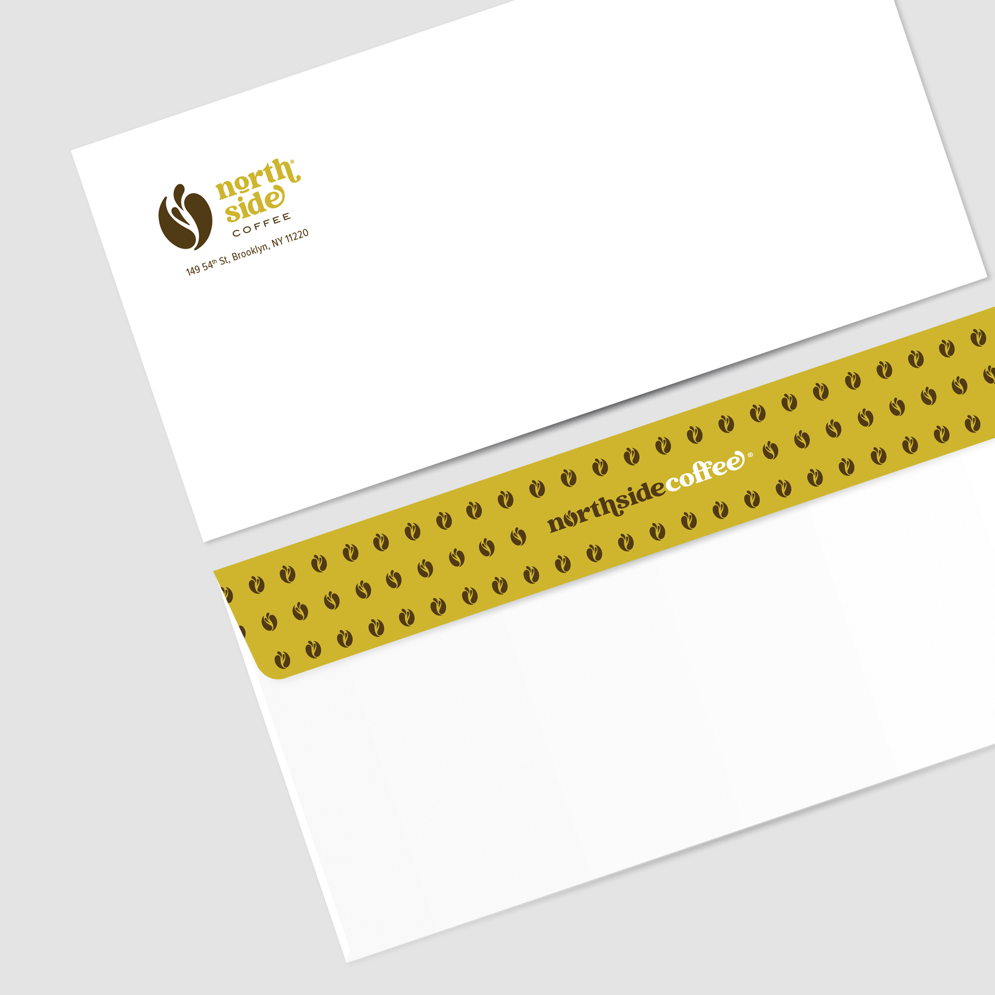
Meet Northside Coffee – a premium drink dispenser company that serves customers at gas stations and takeout cafes.
Mission: Create, design, and develop the brand’s message and character.
While most drink dispenser companies will only offer one type of drink, Northside offers a wide variety including fresh coffee, fruit slush, Iced Cappucino, Hot Cappucino, and lots of flavored coffees. To that end, we worked on creating a brand that can encompass all the specifics, while still maintaining an integrated brand identity. We incorporated a splash within the logo to communicate a juicy and refreshing feel whether your drink of choice is a coffee or a fruit slush slush. We contrasted the brown with the lime green for a fresh and invigorating vibe.
Na’aseh Branding
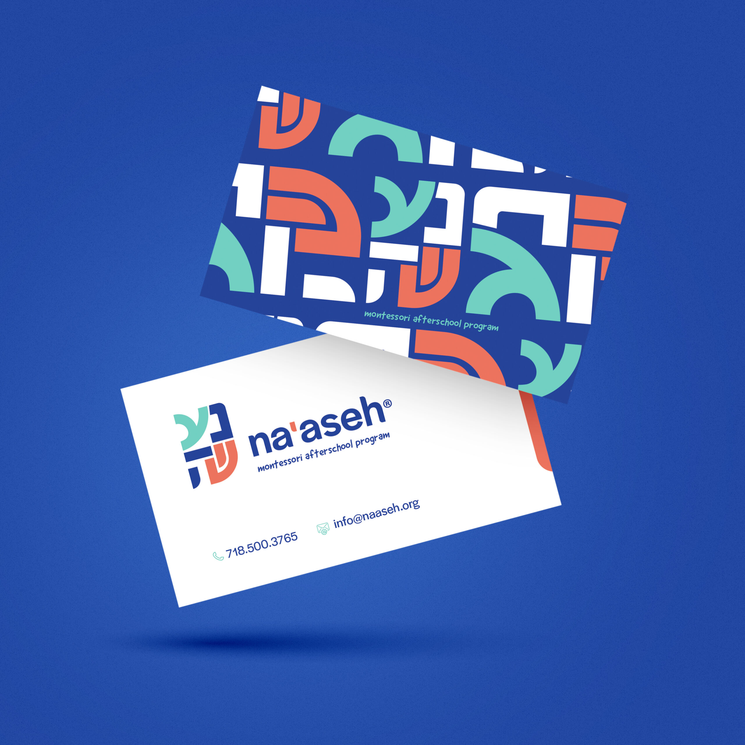
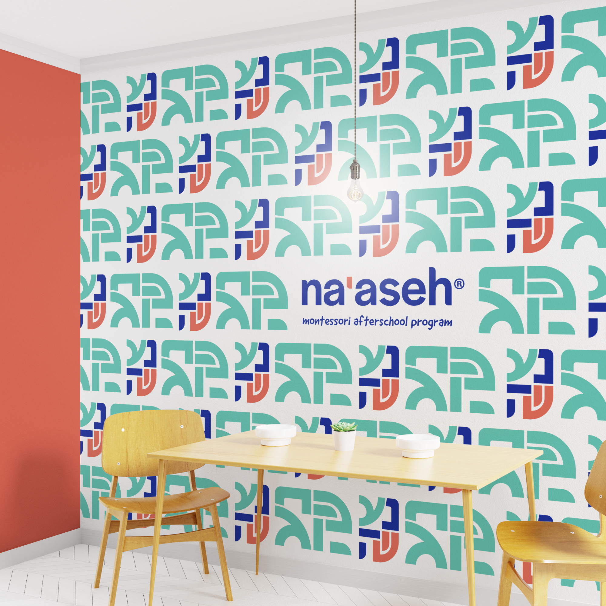
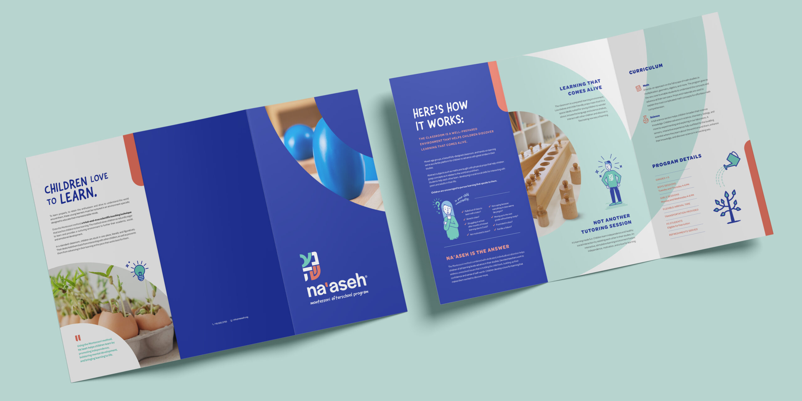
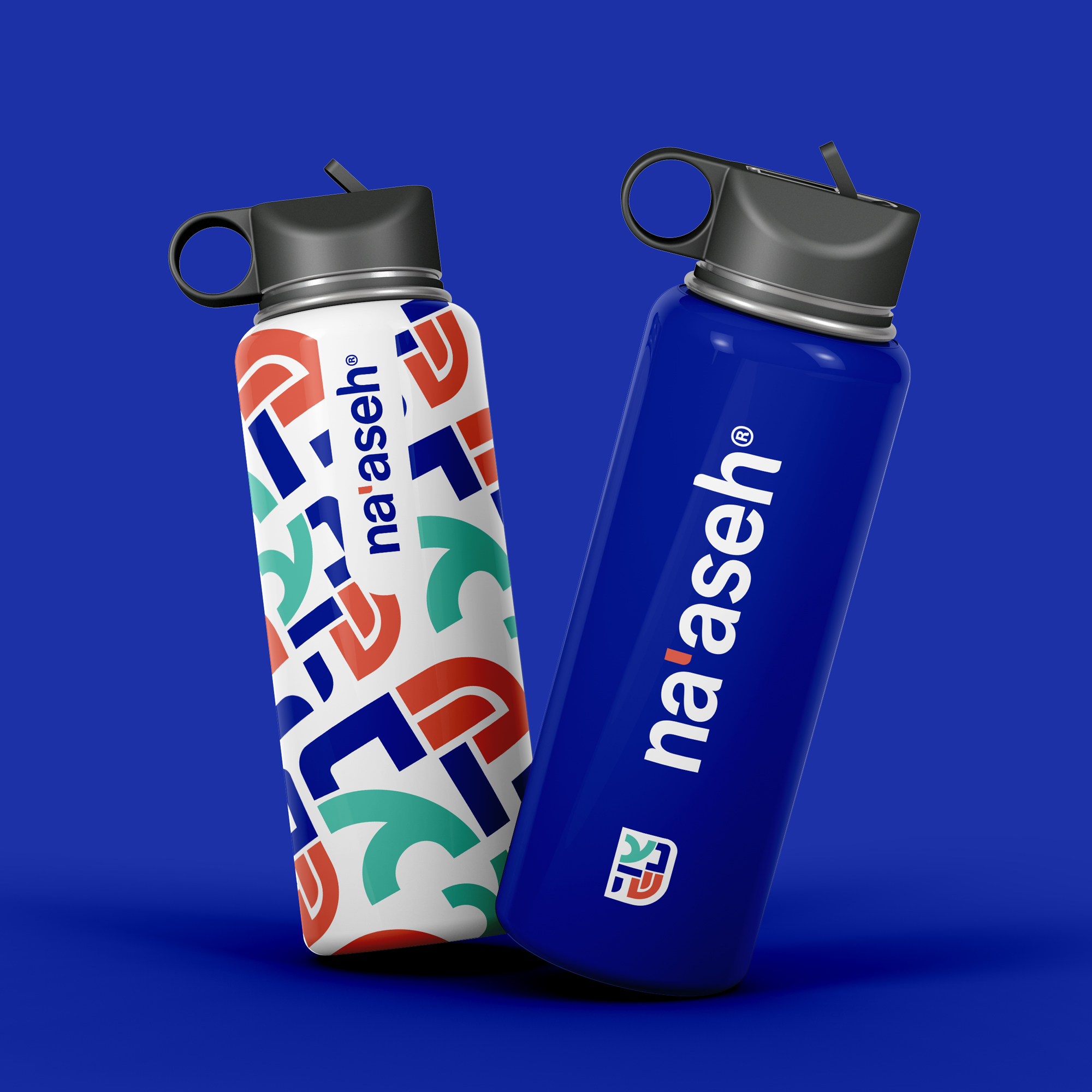
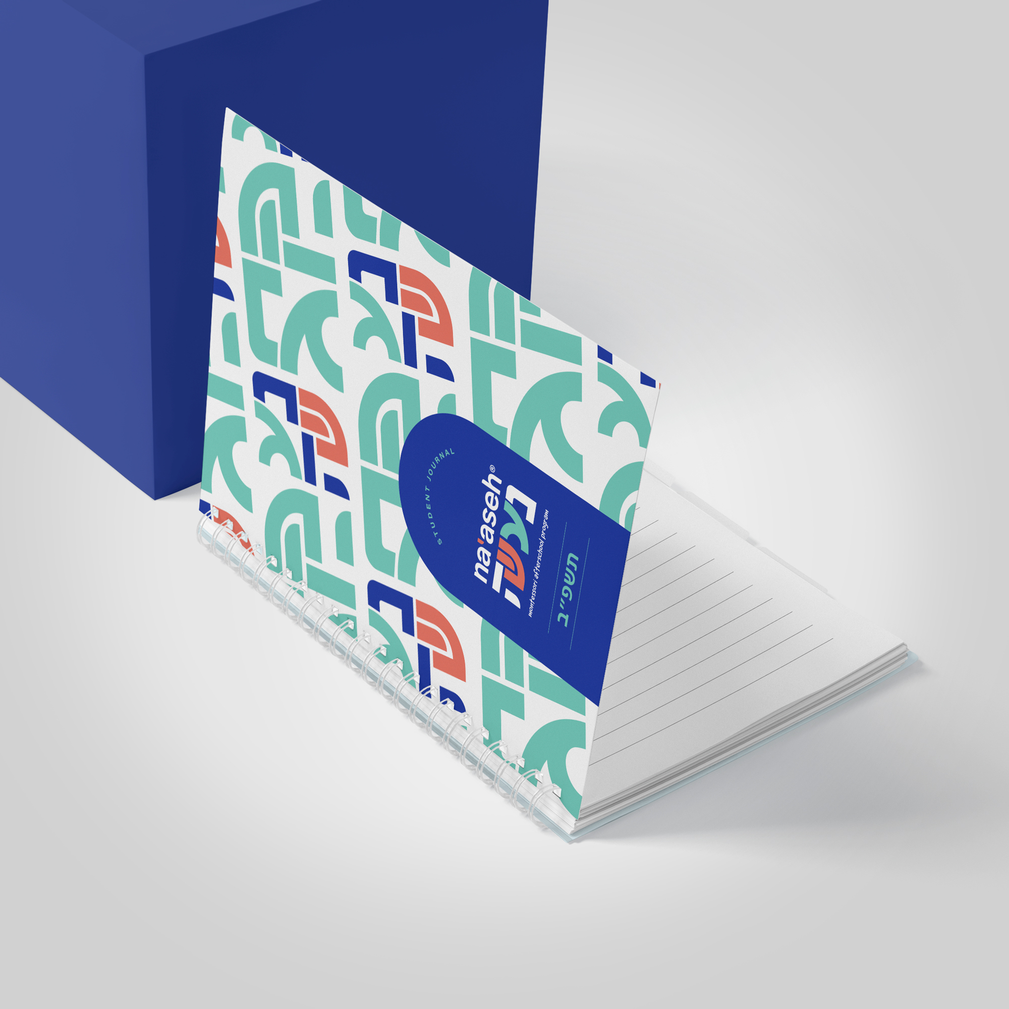
Meet Na’aseh – a cutting-edge Montessori afterschool program for children.
Mission: Create, design, and develop the brand’s message and character.
The Na’aseh brand was designed and executed in a way that will target children of all ages. The style and colors will designed to not only appeal to the kids but the parents of elementary school children. The free and friendly shapes add a modern and cutting-edge feel, give the program a trustworthy and professional vibe, and effectively portray the brand as a pioneering leader.
![]()
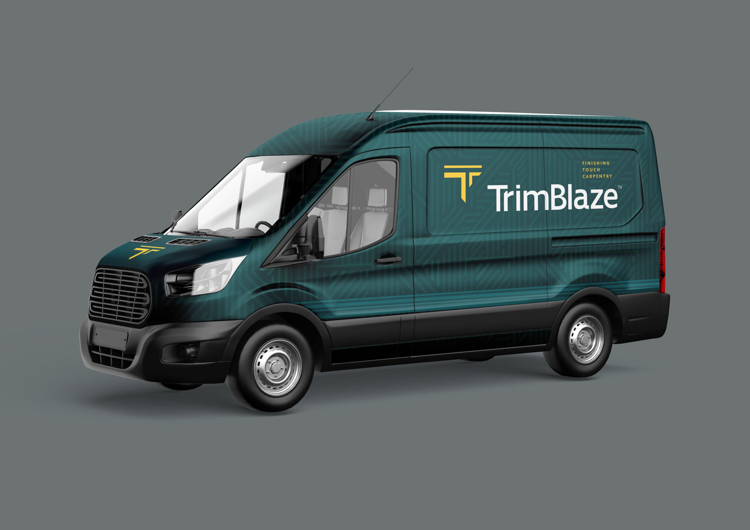
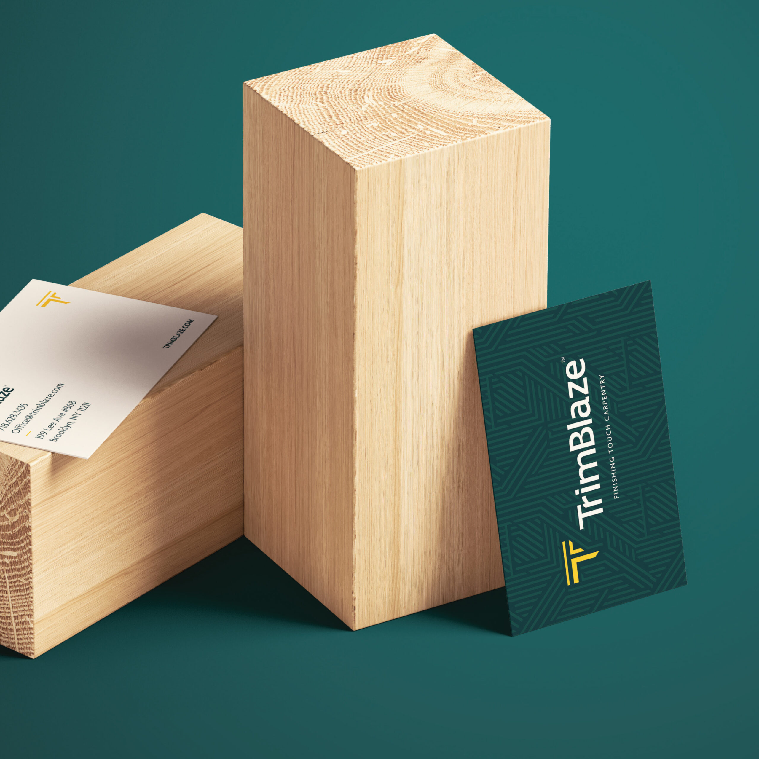
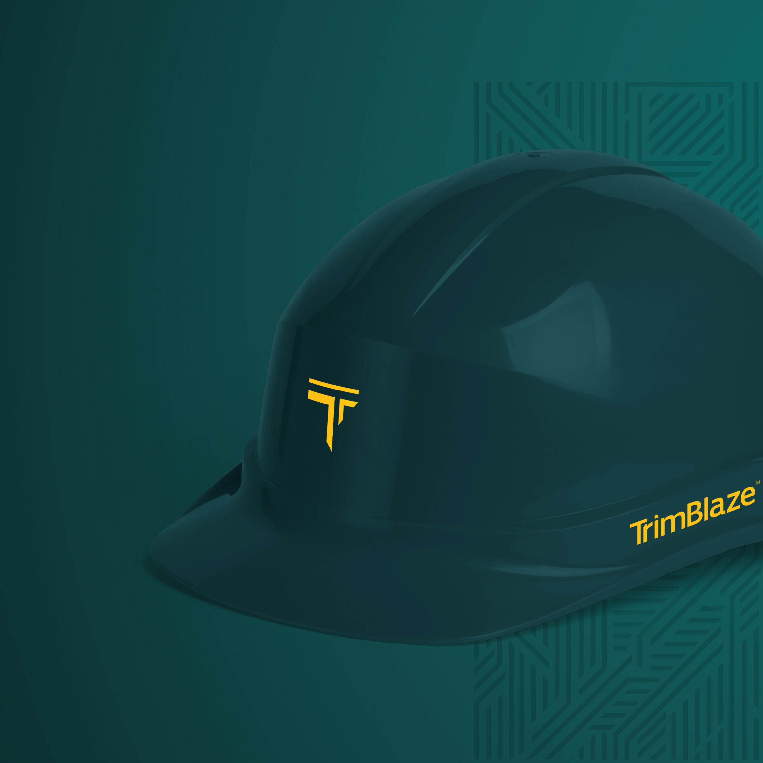
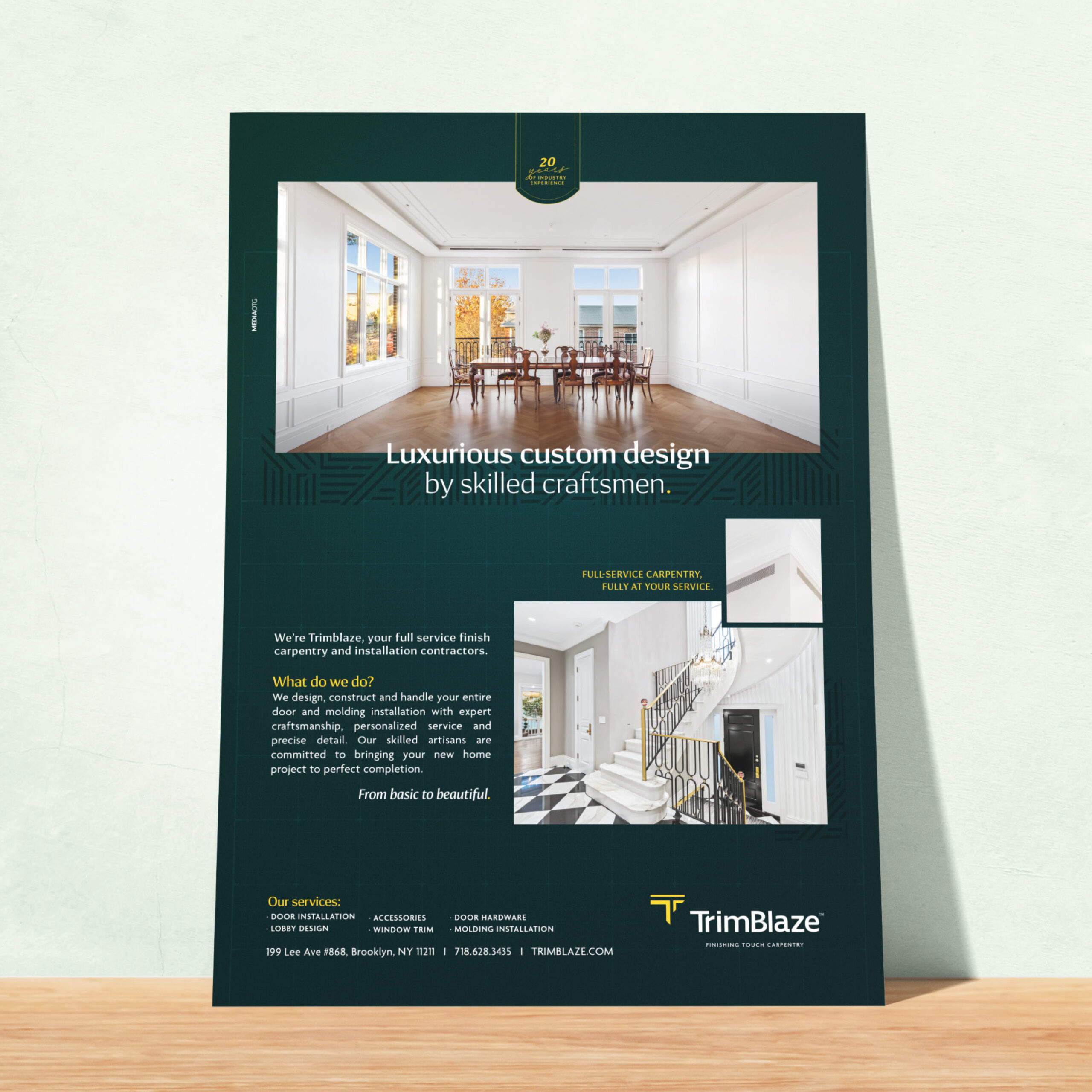
Trimblaze Rebrand
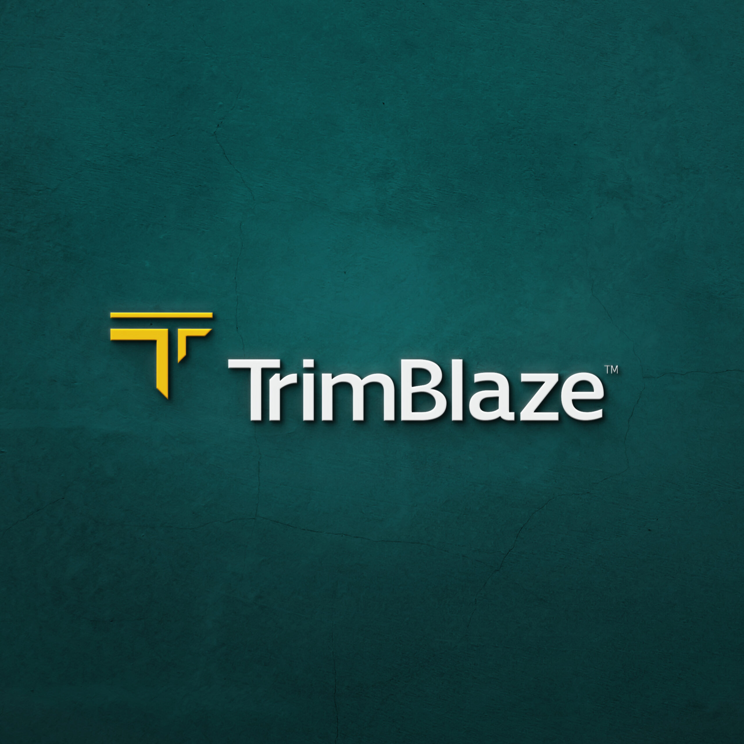
Trimblaze – a full-service finish carpentry and installation company who design and construct upscale door and molding installation.
Mission: Rebranding a 20-year-old company to visually communicate their service in a clean and updated way.
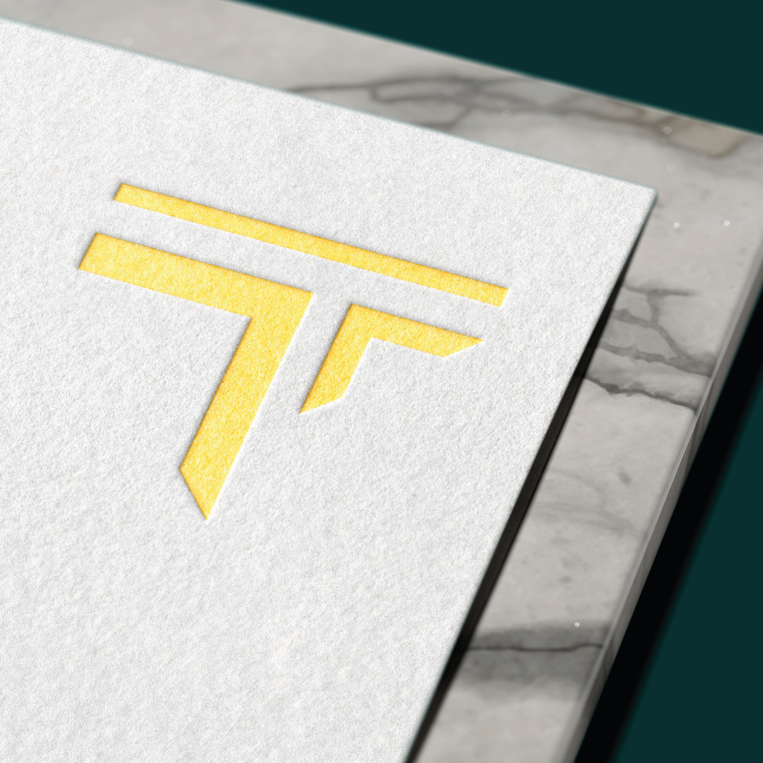
We wanted to highlight the precision of the angles of the cuts when it comes to Trimblaze’s trimmings. We aimed to convey that through the icon which is sharply cut on the angle – all while shaped like a “T” – the first letter of Trimblaze.
The Colors were our upgrade of the classic black & yellow construction colors. We borrow the construction yellow and contrasted it with classy hunter green to communicate the luxurious craftsmanship of Trimblaze.
We incorporated the icon throughout the design in the form of a pattern, accentuating the sharp lines and angles.

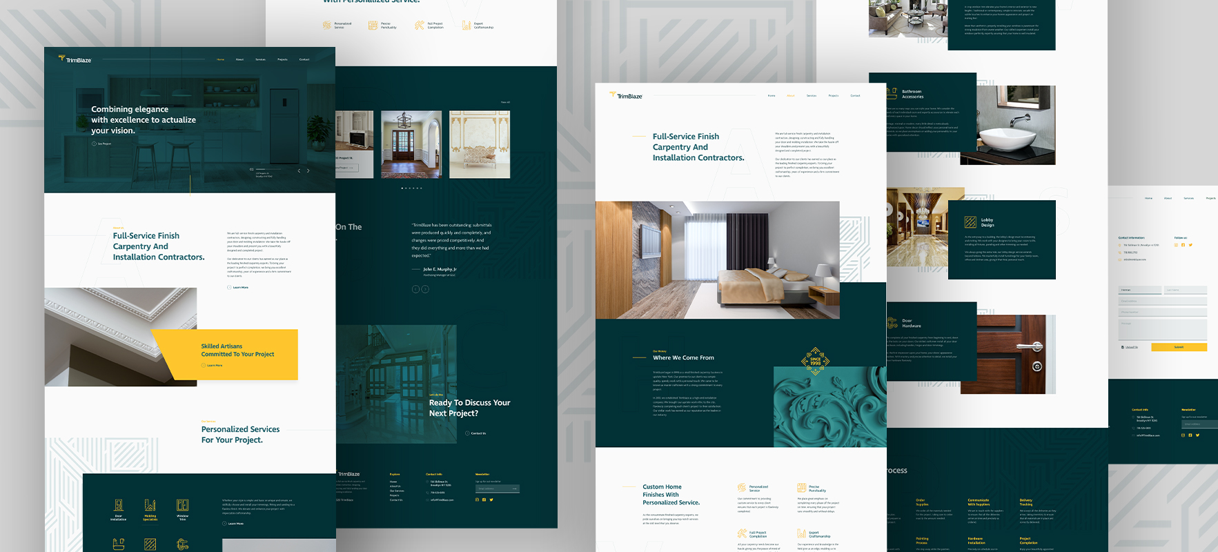
The Website
With the website, we aimed to communicate the brand’s identity of upscale modern architecture through the design, layout, and user experience. Swipe to see the magnificent end product.
Check out the website: Trimblaze.com
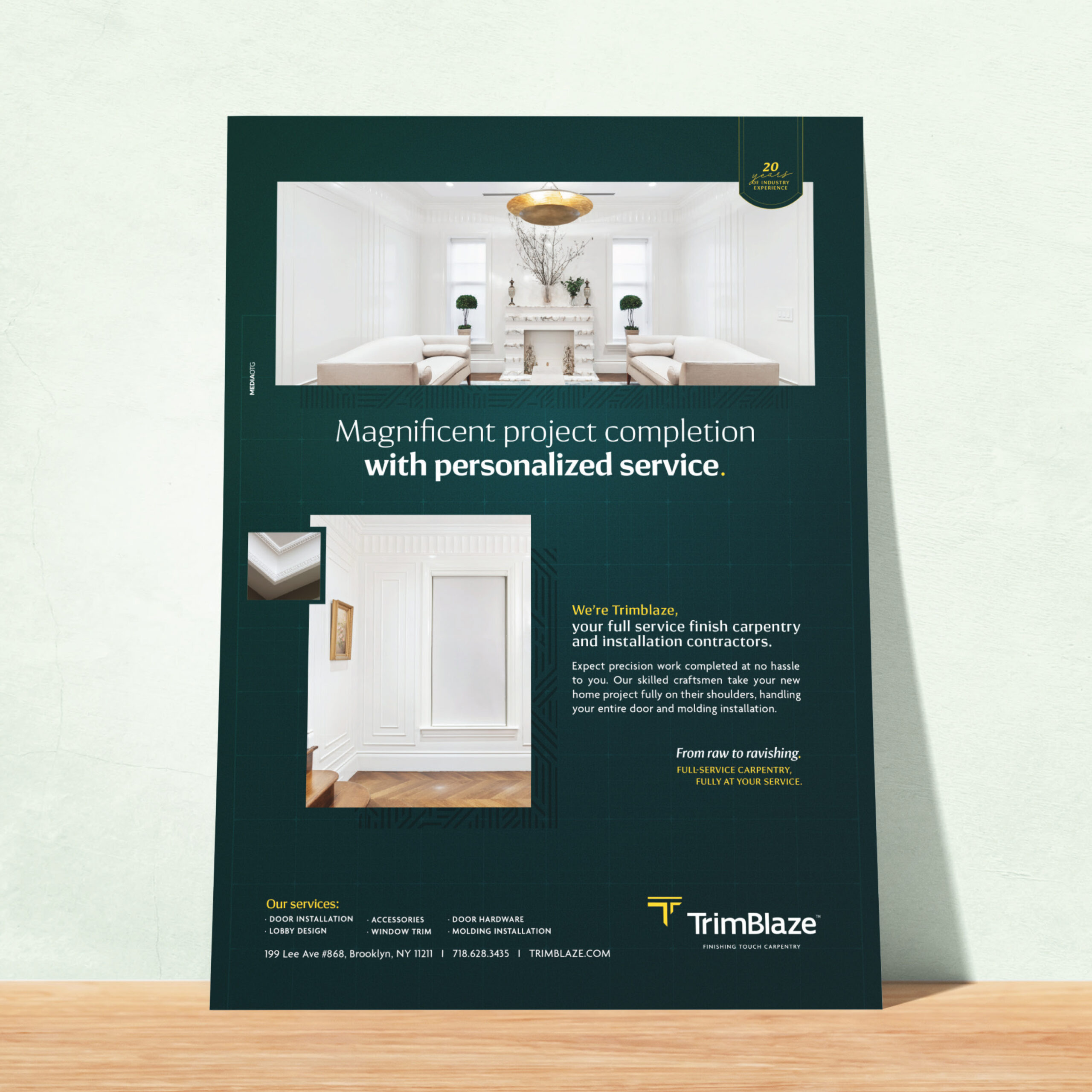
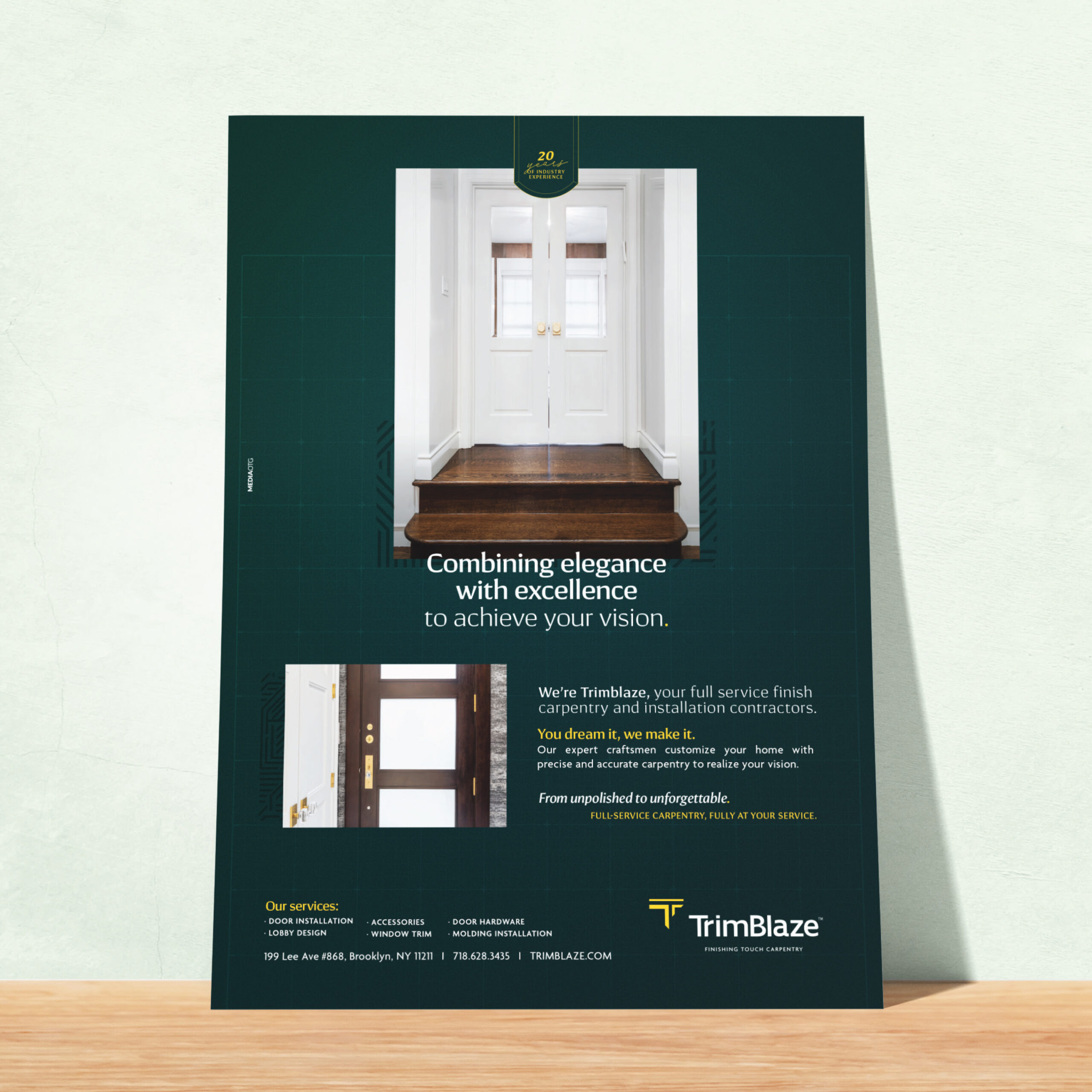
The Print Ads
We also created a series of ads to showcase the rebranding. It was important to the client to display their handiwork while explaining their services. We added an element of blueprint within the design to emphasize the build.
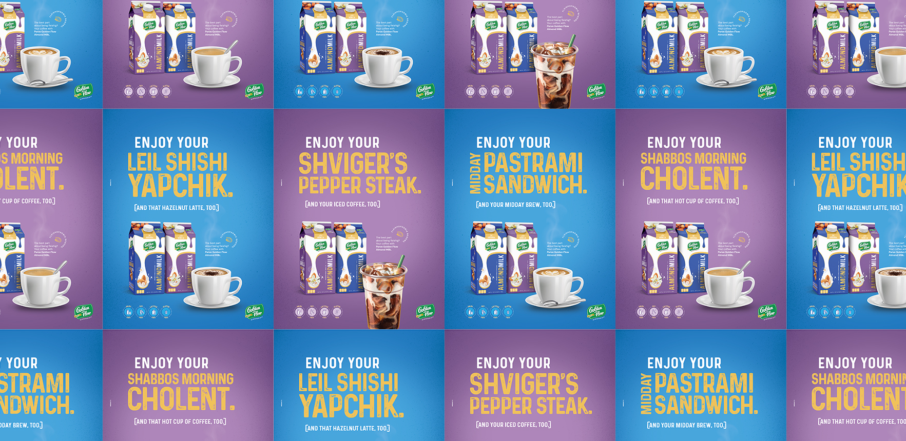
Golden Flow Almond Milk Campaign
Coming Soon
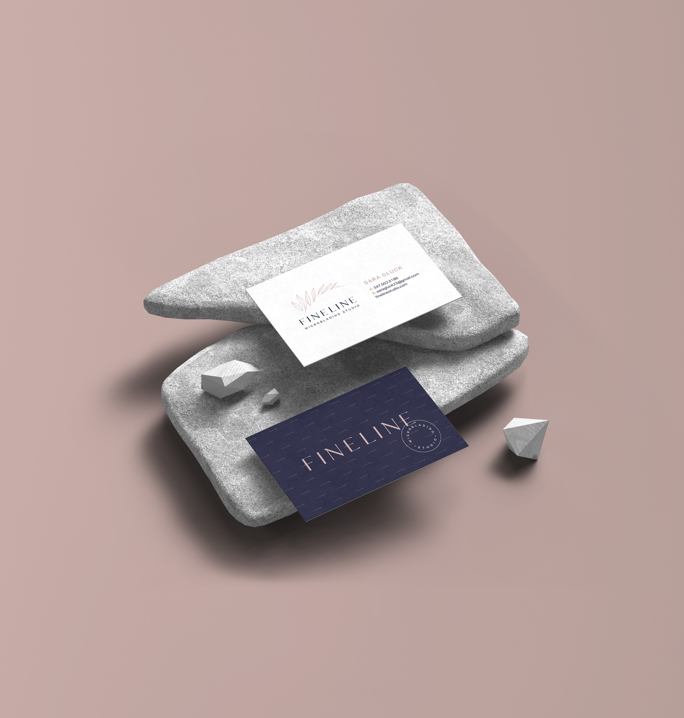
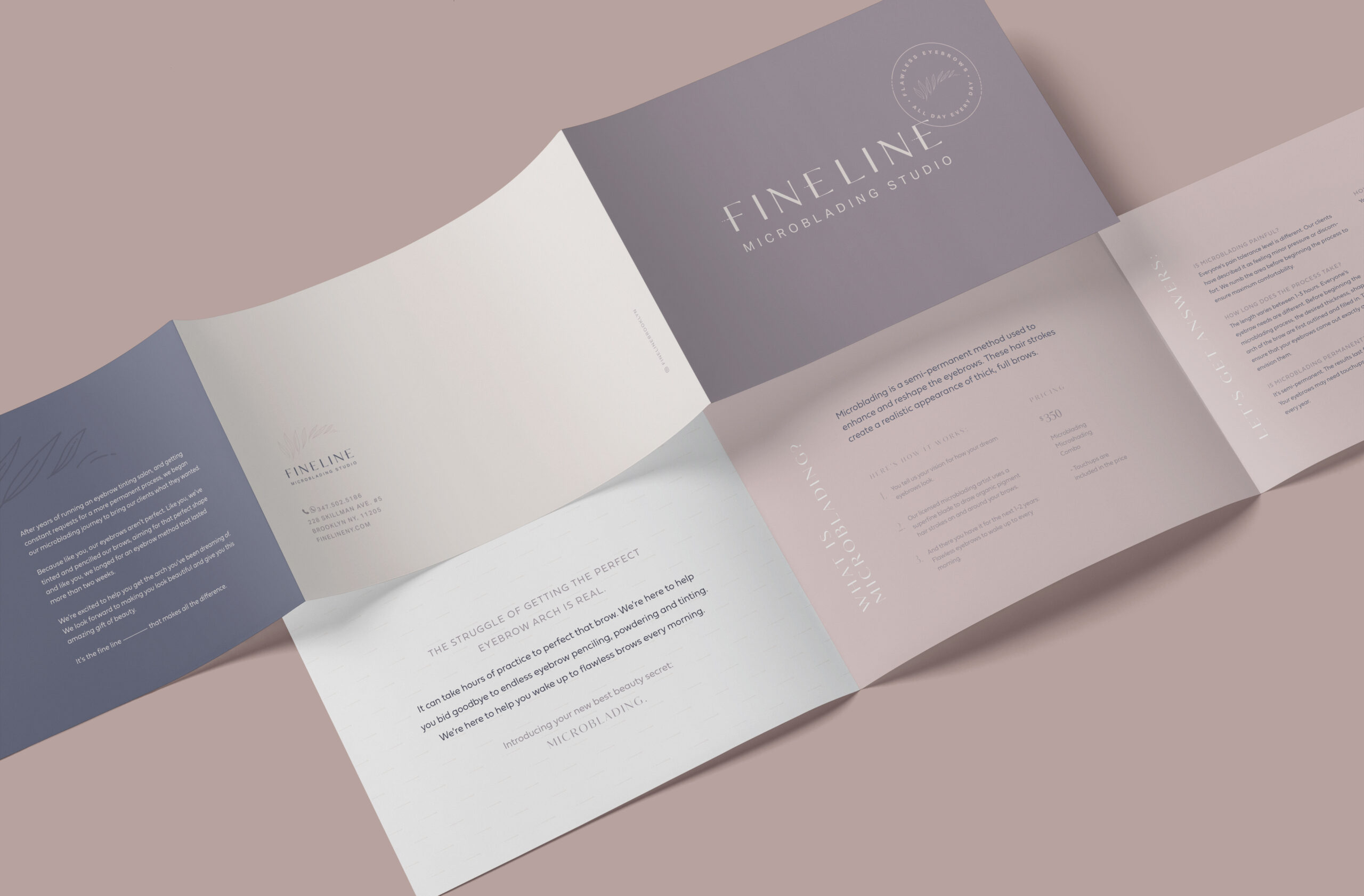
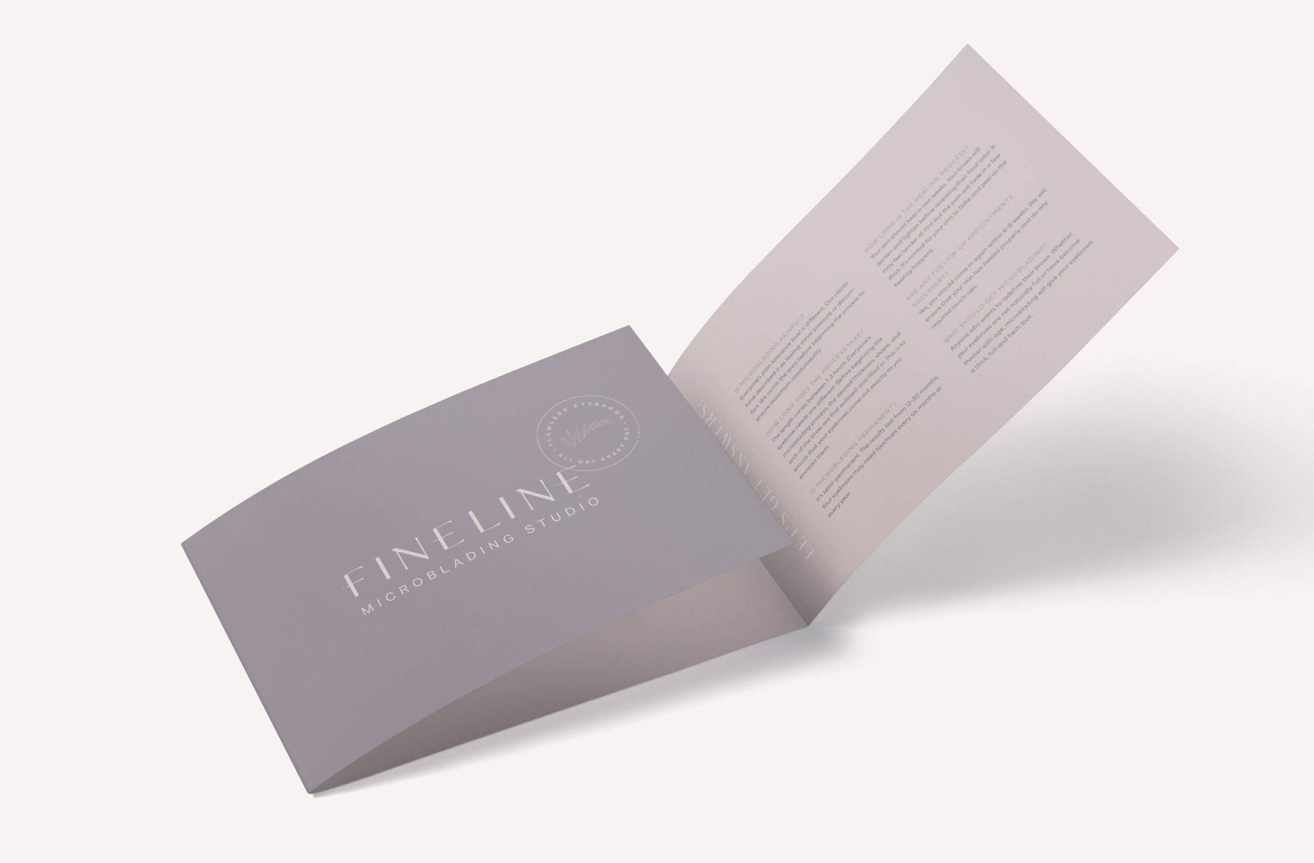
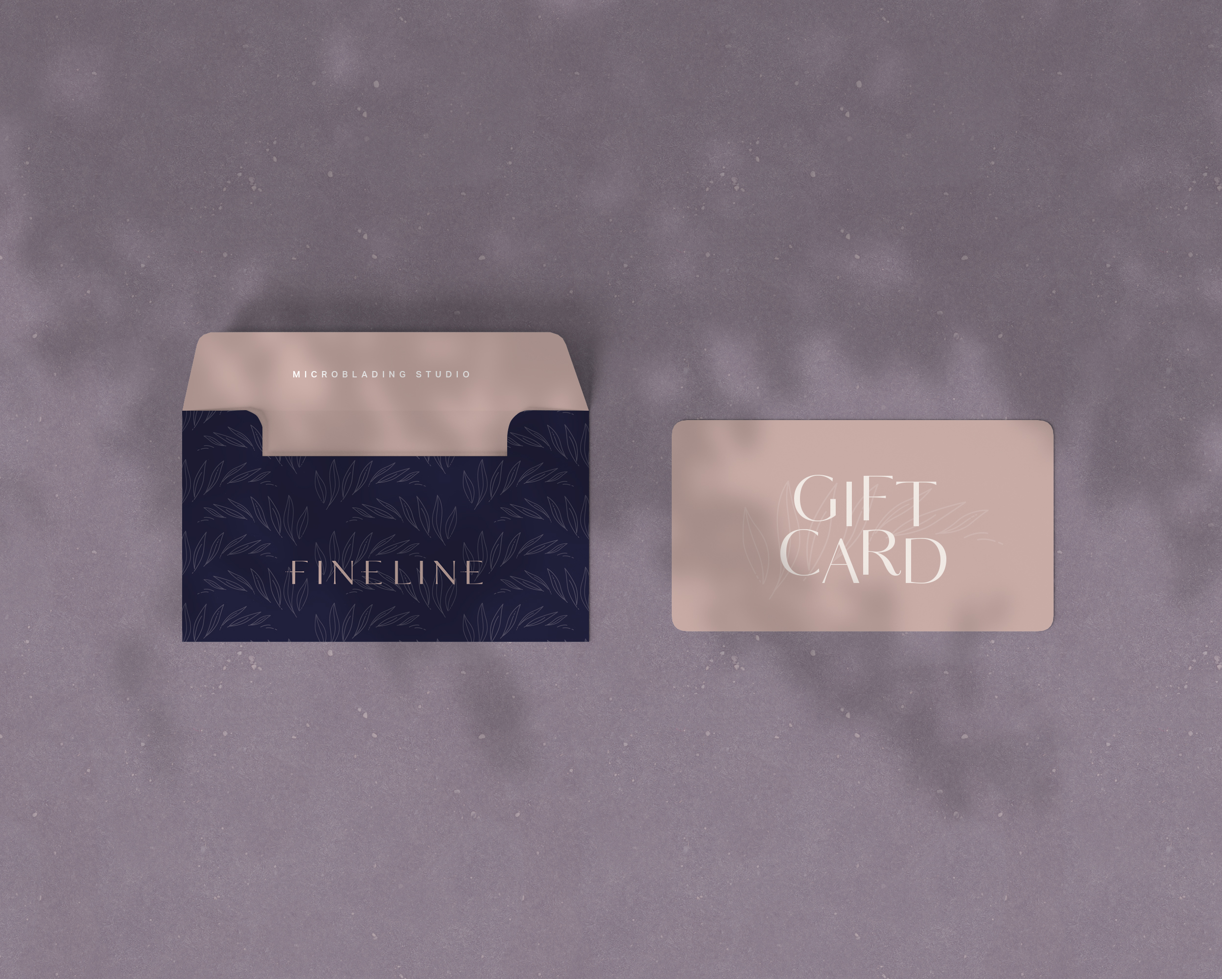
Fineline Branding
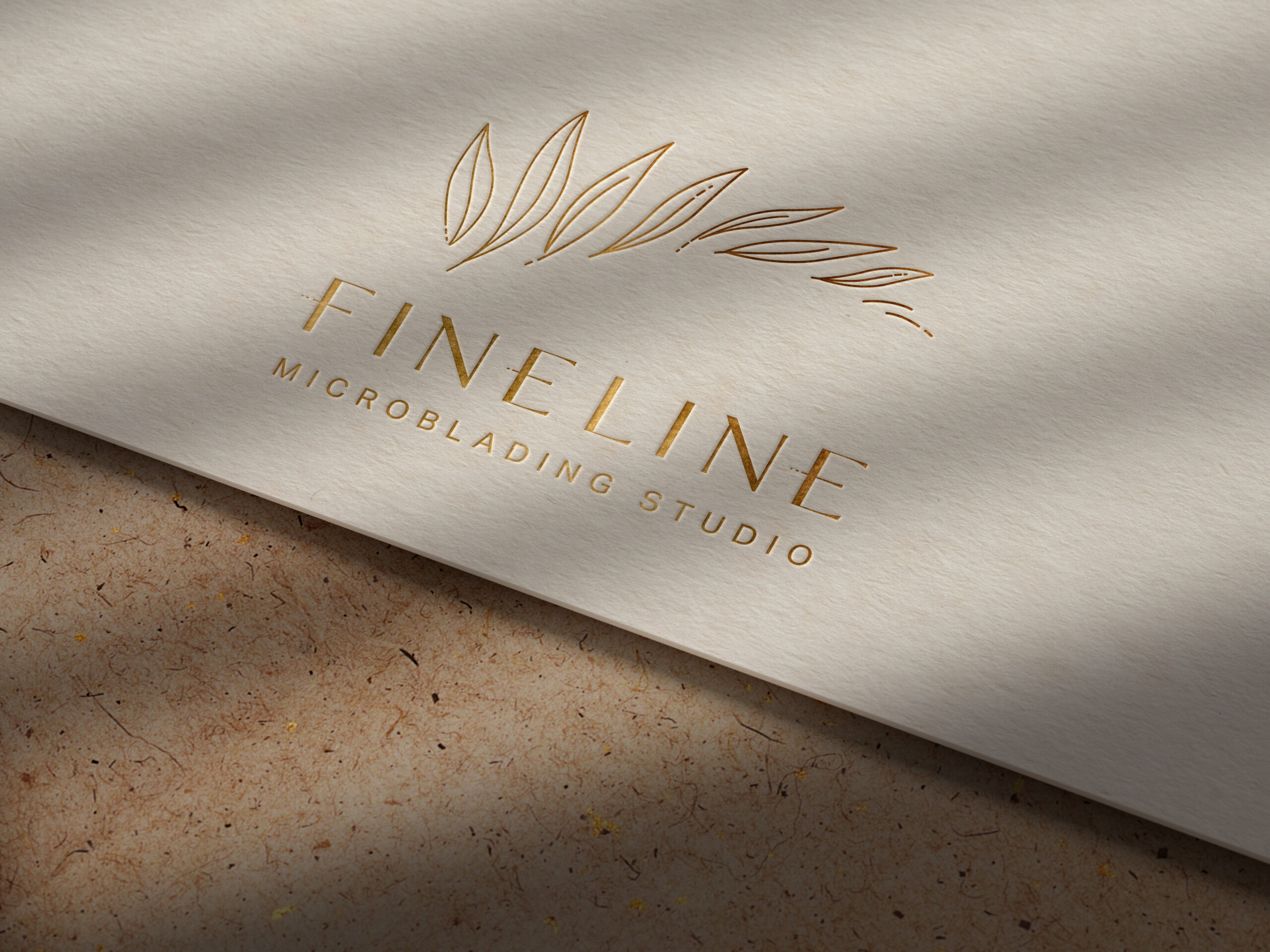
Meet Fineline – a first class micro-blading studio.
The mission was to Create, design, and develop the brand’s message and character. We designed the logo as a naturally organic shape of foliage blowing in the wind. If you look a little closer, it is shaped like an eyebrow. The leaves are individual, showing the precision of applying each tattoo one at a time. We wanted to emphasize the natural aspect of micro-blading to appeal to those who like it “au naturel”. We used soft, feminine neutrals in the purple family to convey the gentleness of the micro-blading experience.
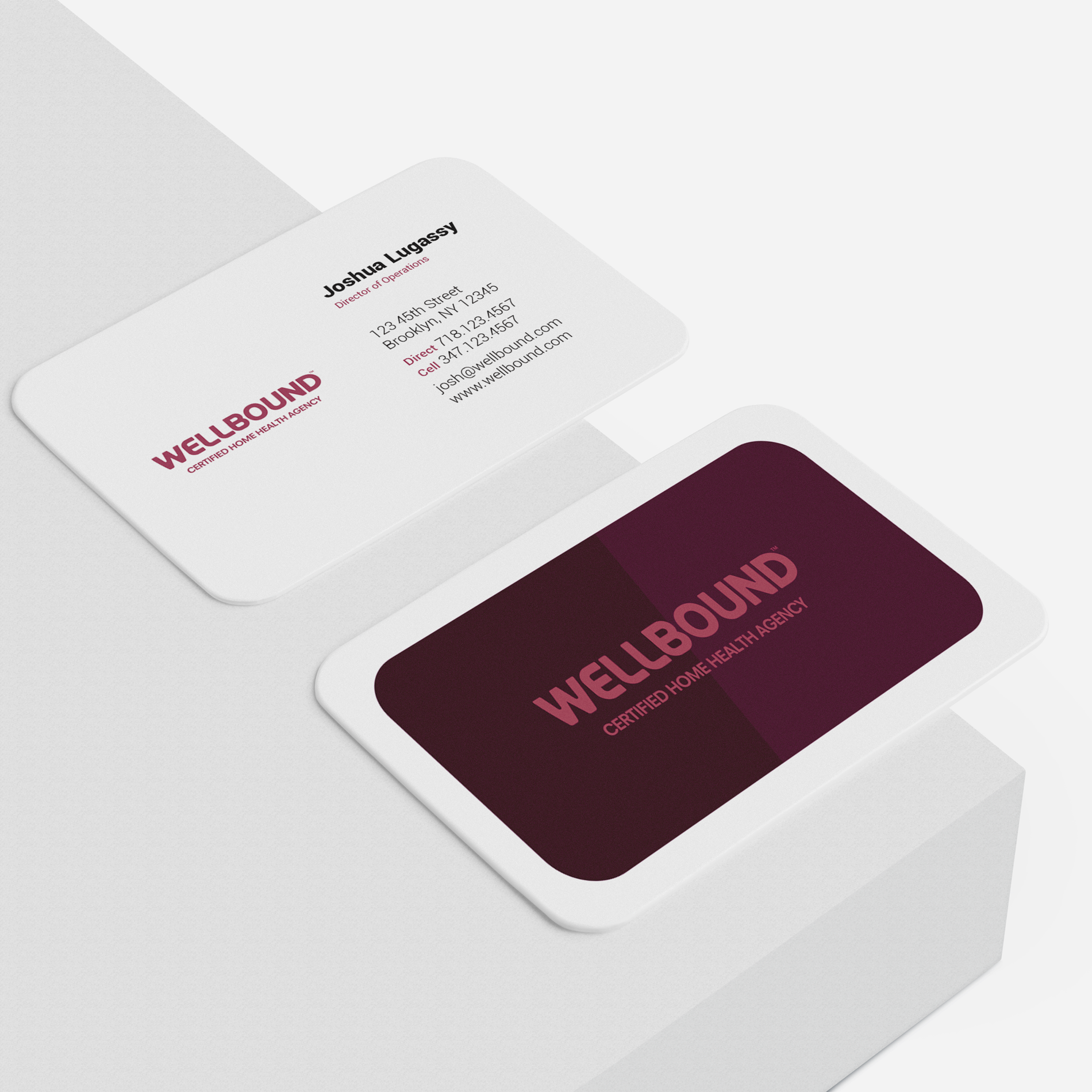
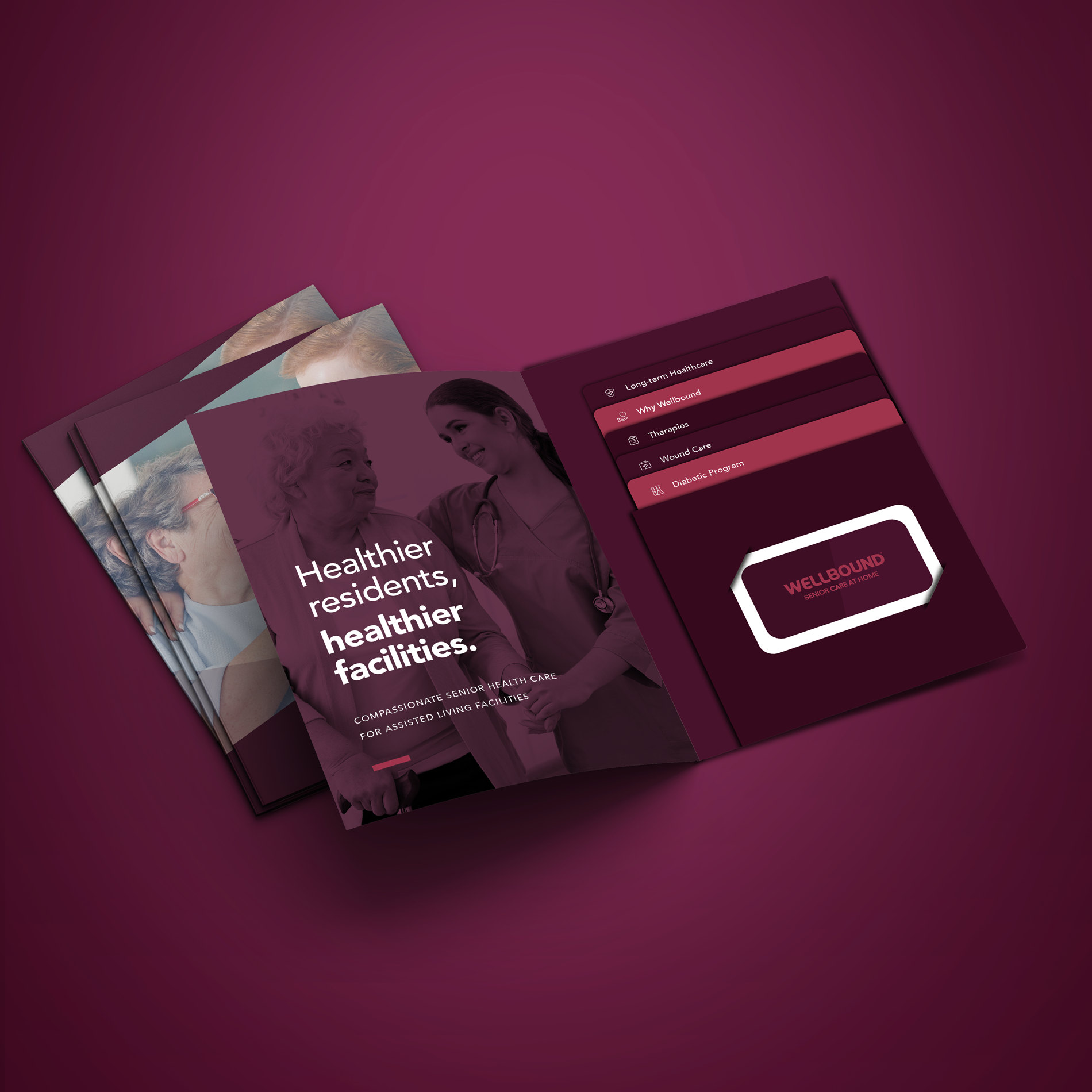
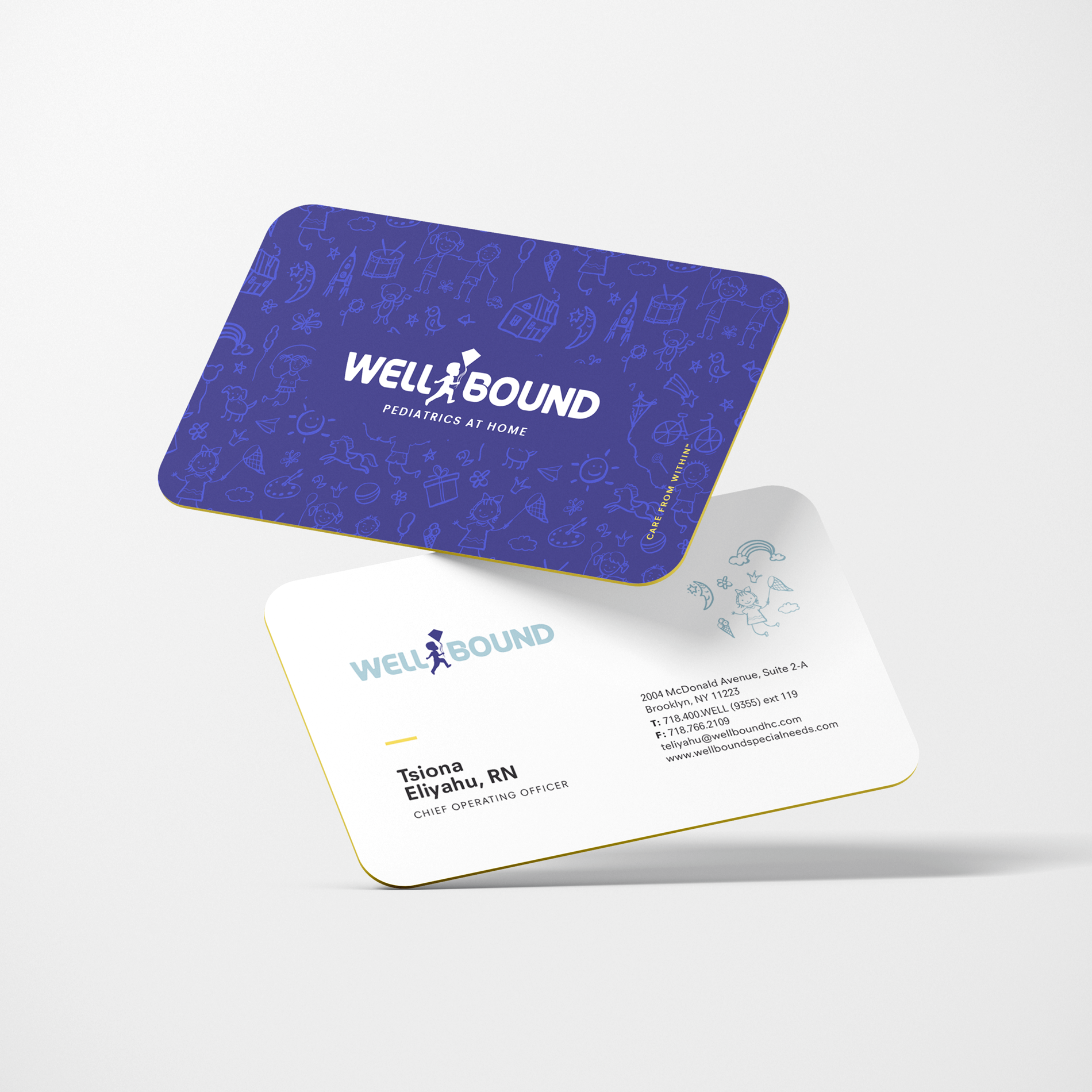
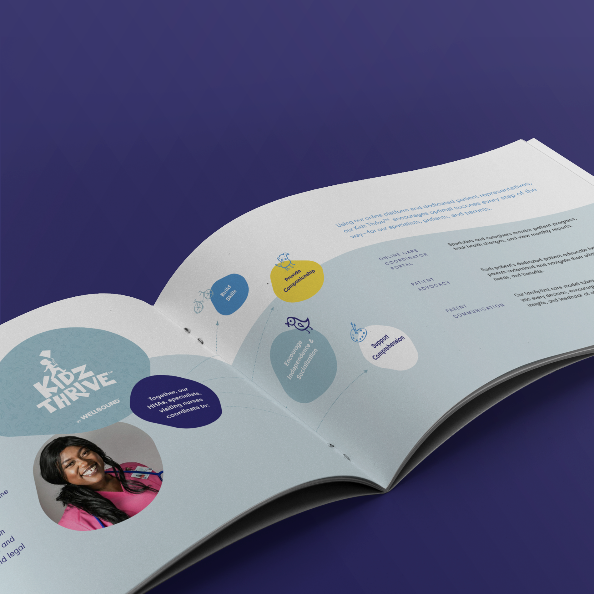
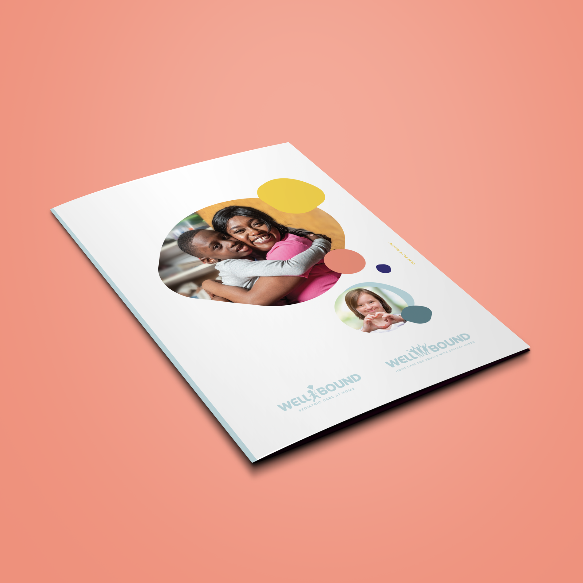
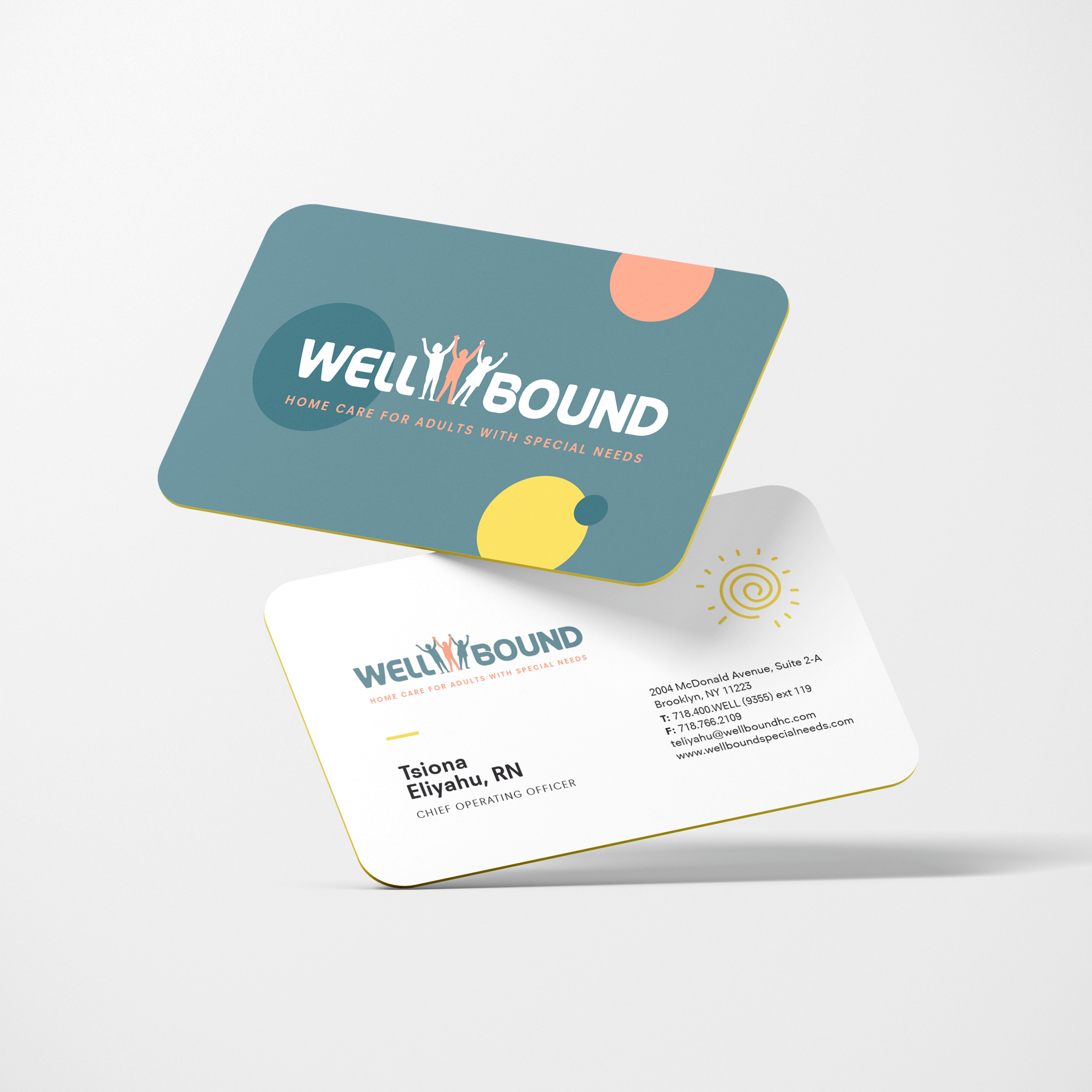
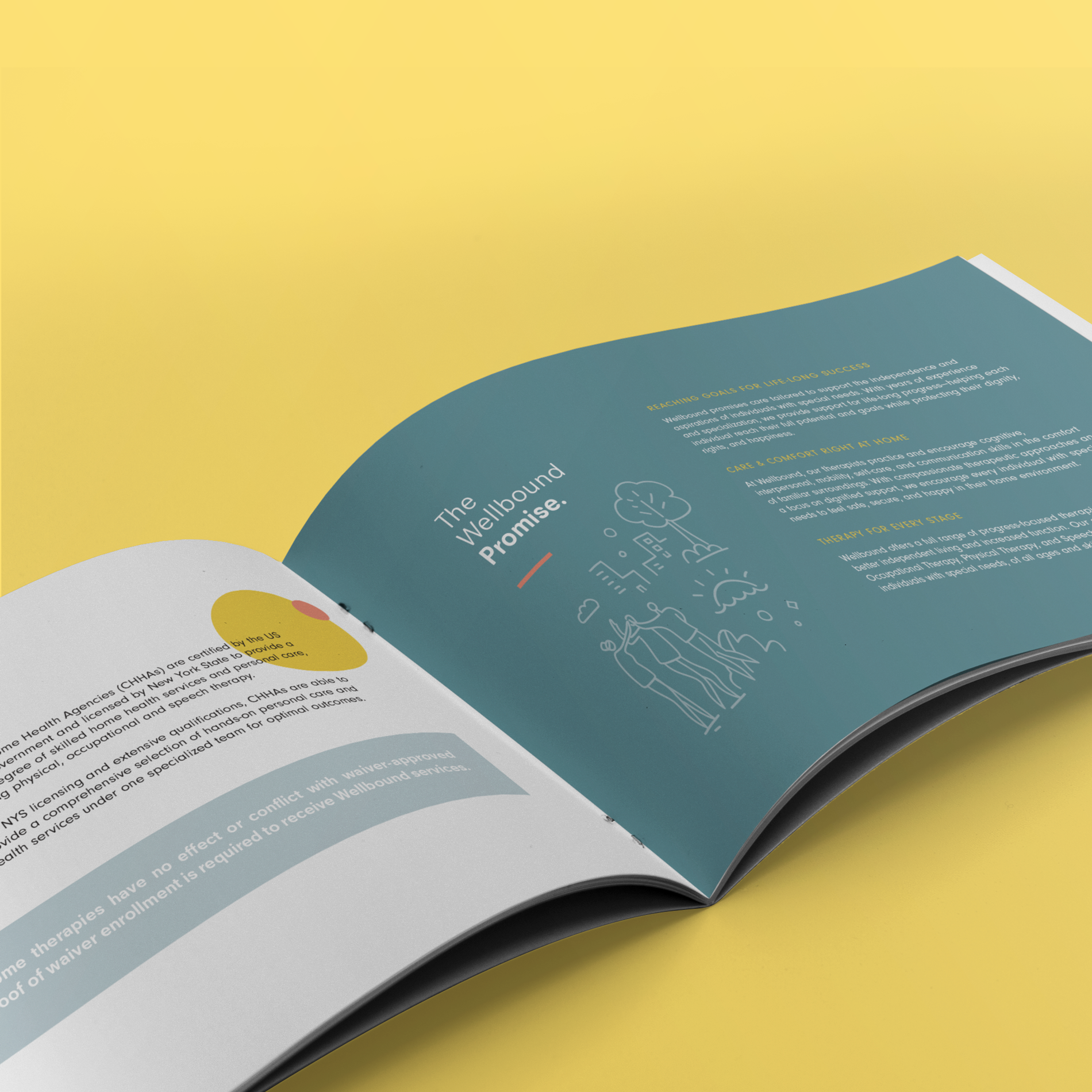
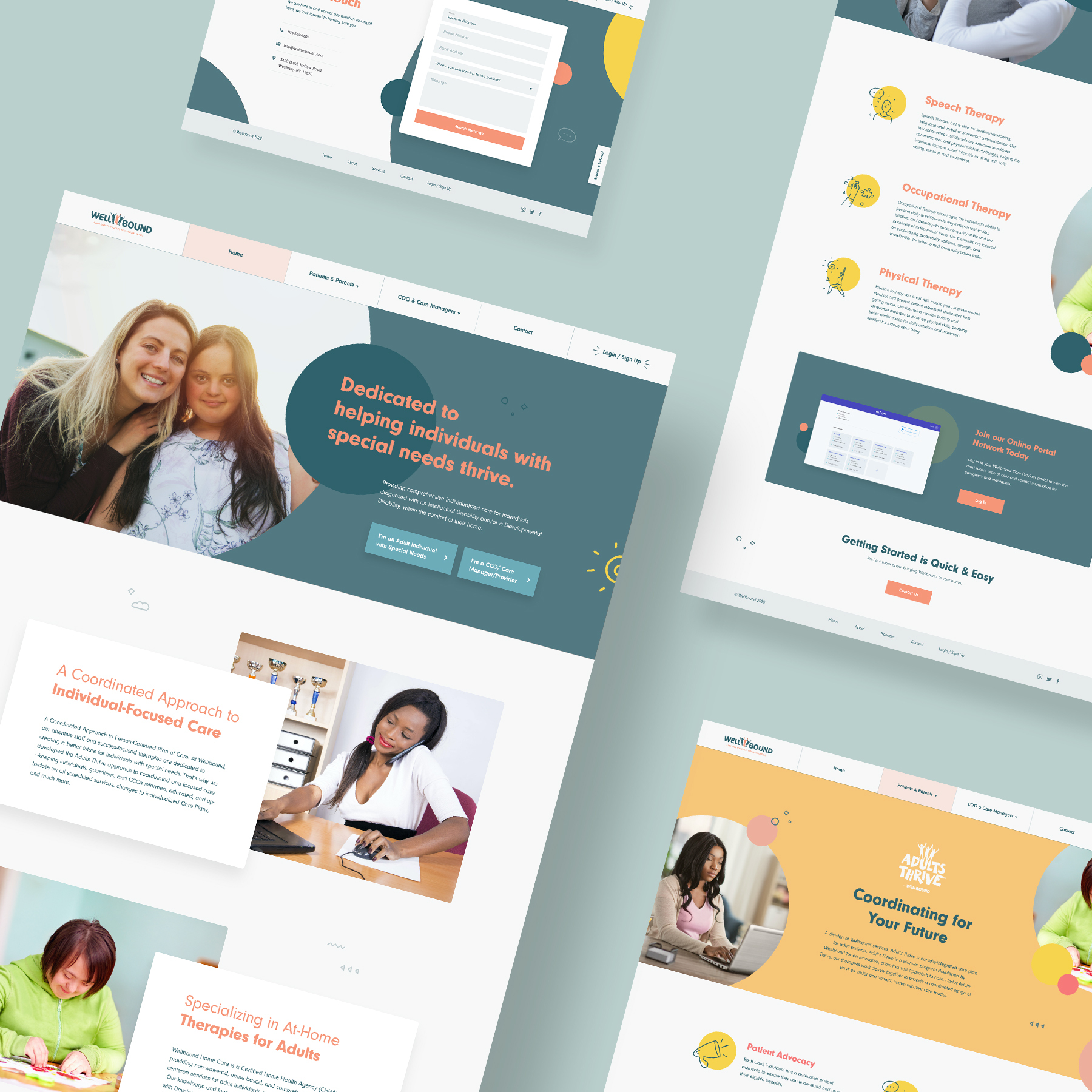
Wellbound Branding
Wellbound is a certified home health agency committed to compassionate care.
Our mission was to create, develop, and design the brand’s identity, character, and message for three divisions of the company and subprograms. We created a comprehensive corporate identity package for the client replete with print, digital, and web. Swipe to see more brand assets.
When choosing a name, we wanted to cut into the core of what the company represents. The name – Wellbound – was chosen because it reflects the heart of their mission and service.
Care is connection. The name promises partners and clients a company that shares a direct bond with the facility, is always bound by wellness intentions and intertwines skill and heart equally.
Whether they are facility-based or homebound, we make sure our patients are bound for better.
![]()
![]()
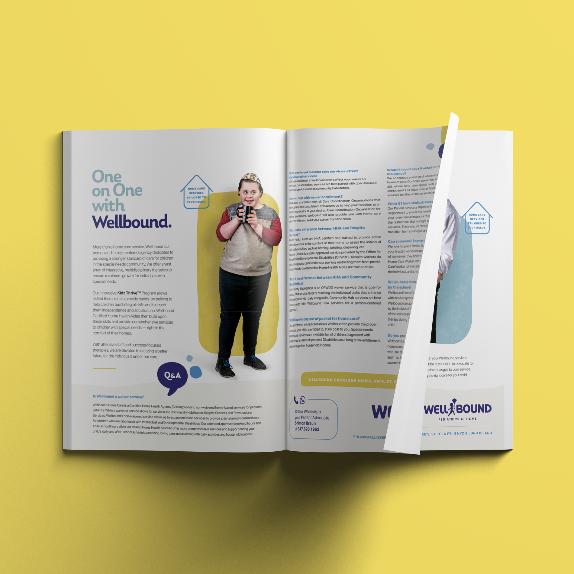
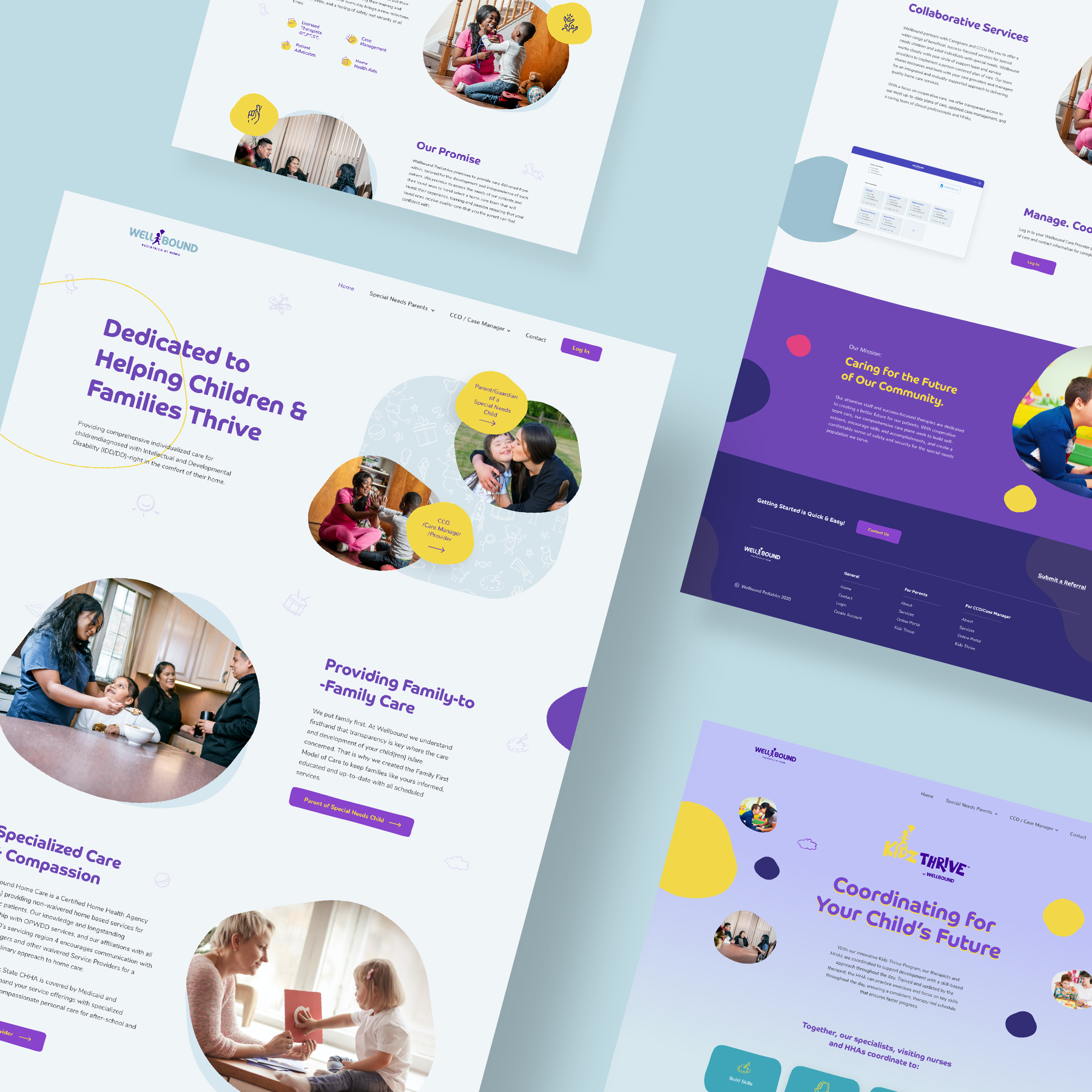
Wellbound Pediatric division
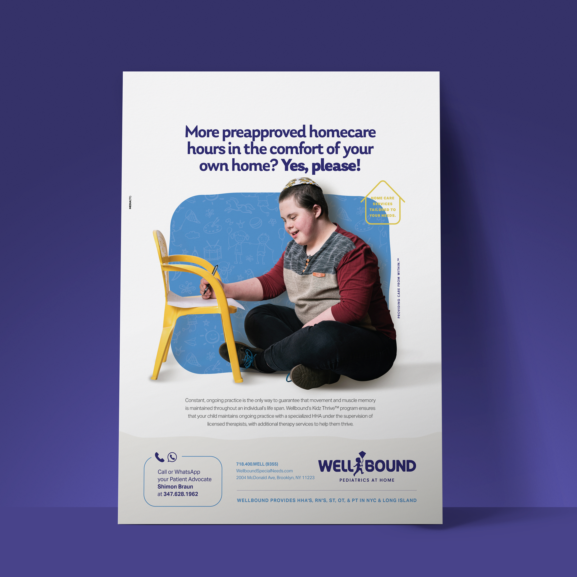
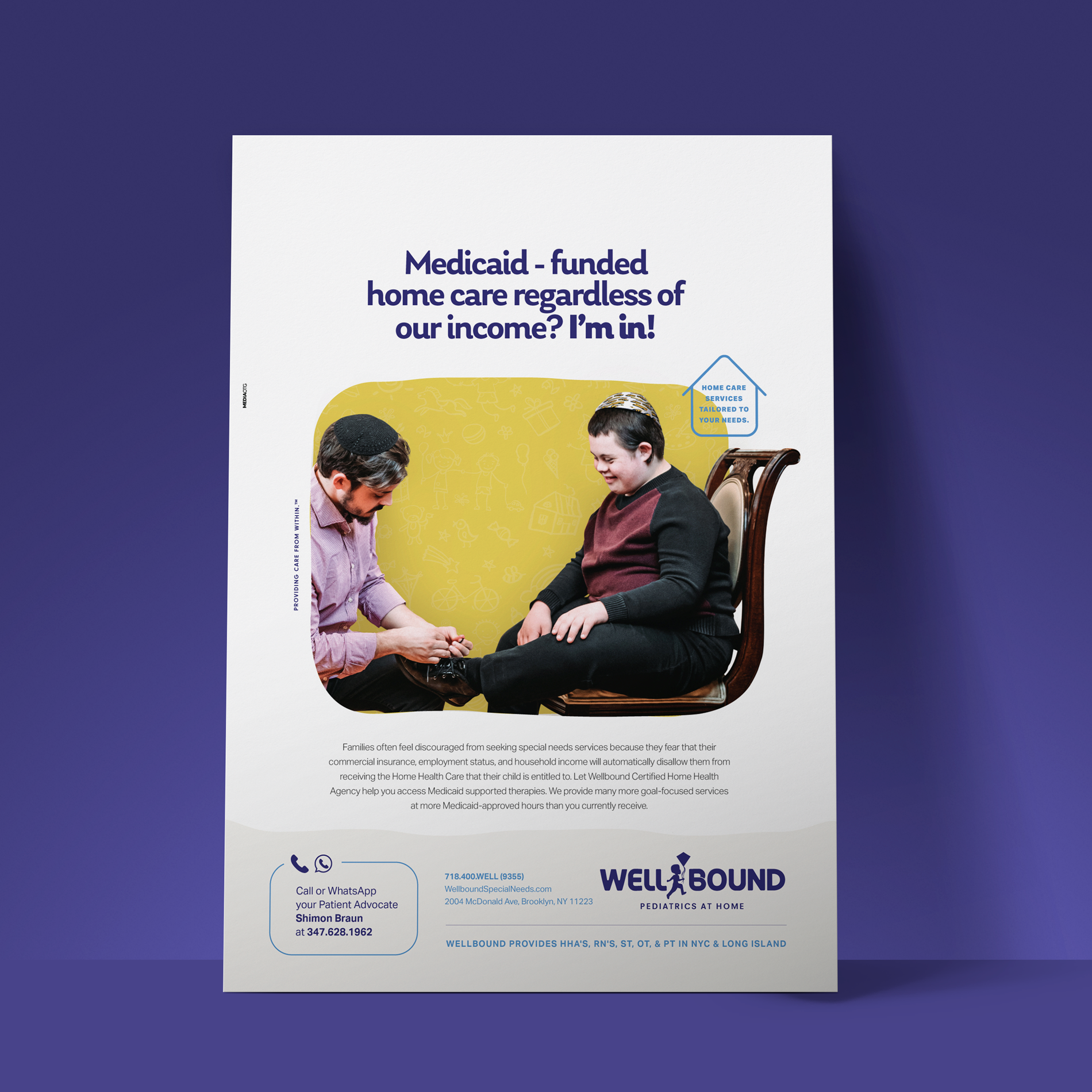
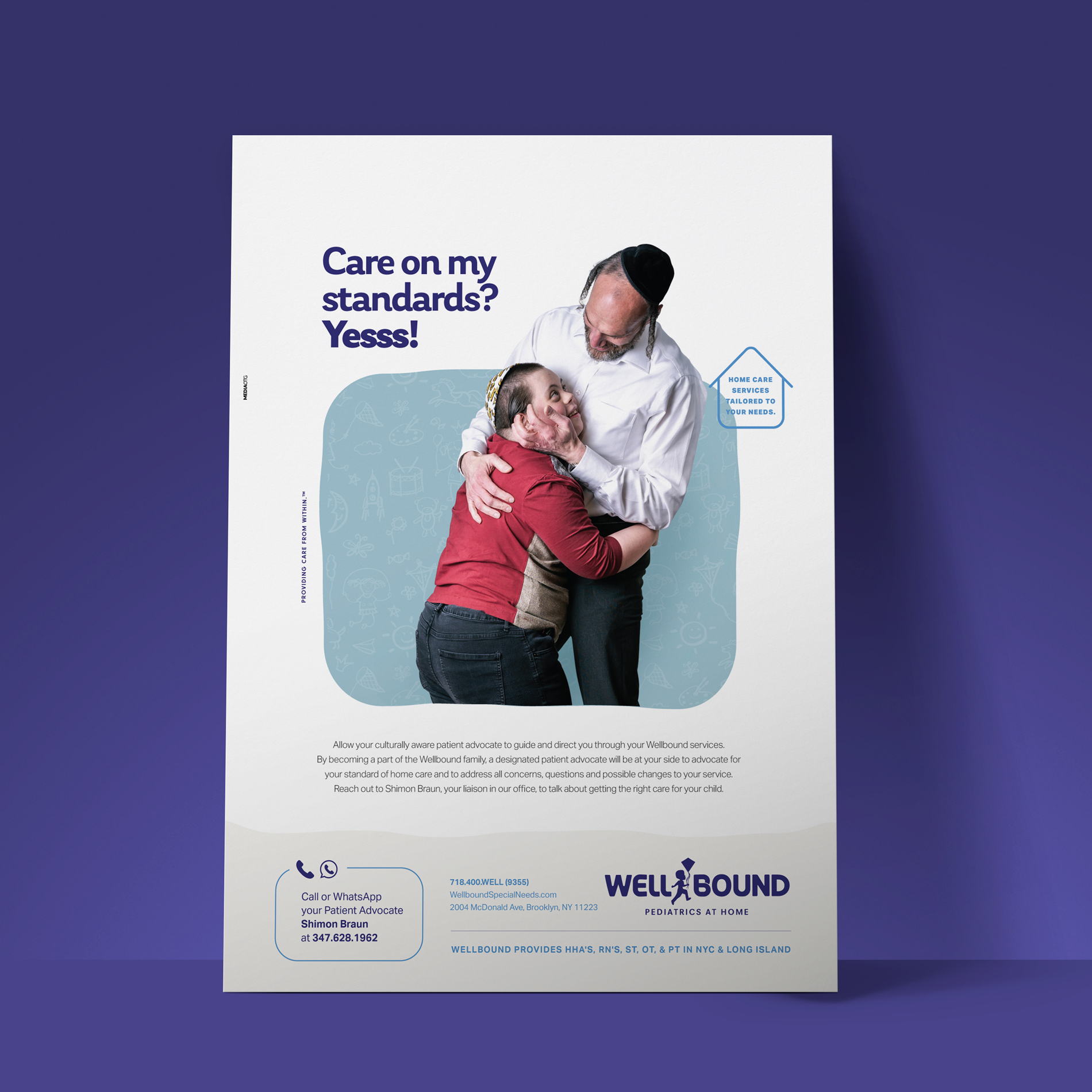
For the Wellbound Pediatric division, we replaced the “L” in the logo with a child flying a kite. We used child-friendly branding colors, while still maintaining a corporate look. See their business cards and how we incorporated their logo into their Kidz Thrive program.
We incorporated the geometric branding style into the pediatric website in an engaging and user-friendly way using responsive design. Swipe to see more pages.
![]()
The Print Ads
We created print ads and pamphlets with bold copy, compelling photography and colors and illustrations that reflect the brand’s story.
![]()
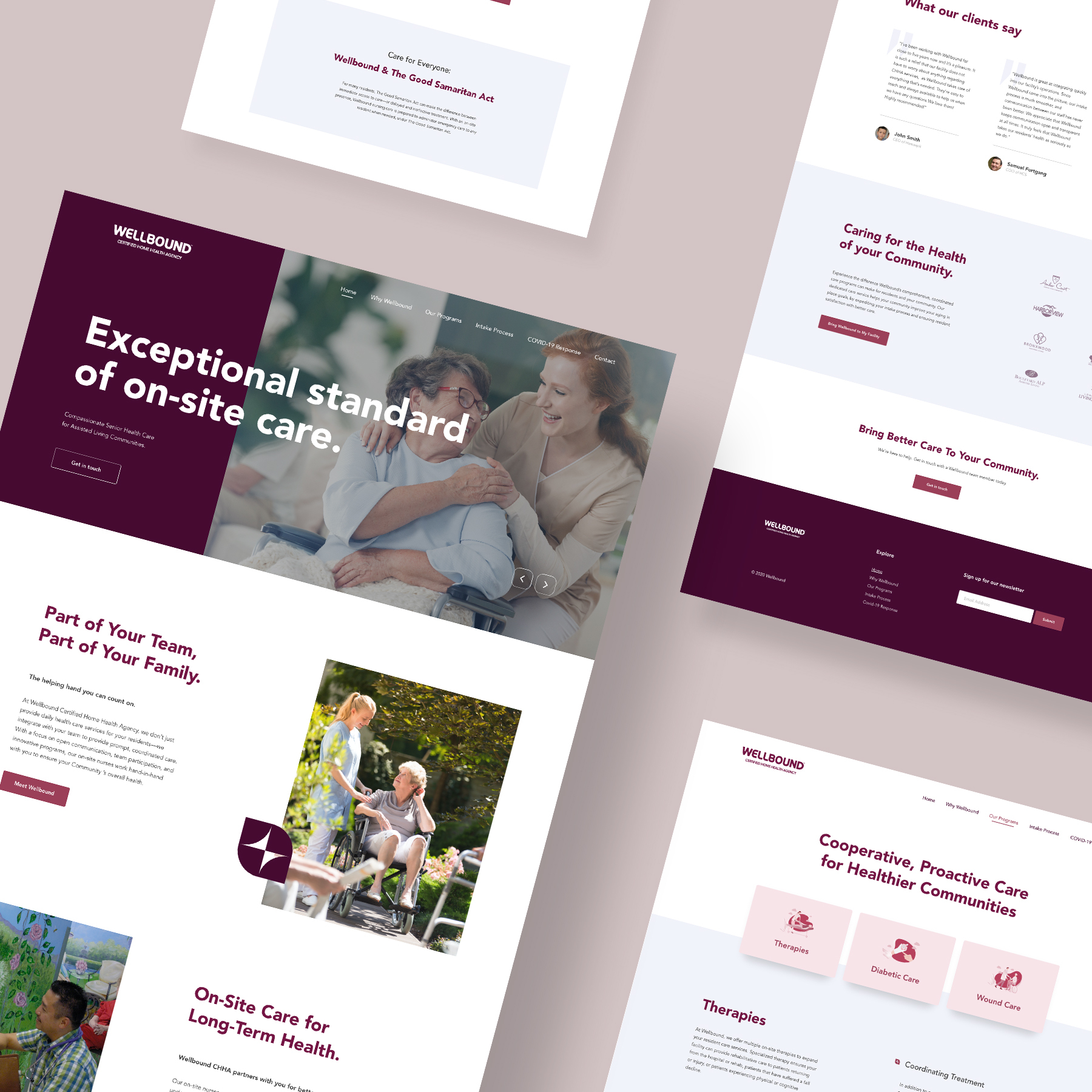
Wellbound Adult division
The Wellbound Adult division falls under the umbrella of the general Wellbound Health Care. We customized the logo while keeping the core elements. We went for a lighter and fun look with the colors with strong contrast and switched the middle “L” for an icon with abstract adults.
or each of the Wellbound divisions, we created magnificent brochures that showcase the company’s work. The brochures reflect the branding of the companies division with extensive copy detailing their services.
![]()
The Websites
For each of the Wellbound divisions, we created magnificent websites that showcase the company’s services and work. The websites reflect the branding of the companies division with extensive copy detailing their services.
Welbound Geriatric Website
Wellbound Pediatric Website
Wellbound Adults Website
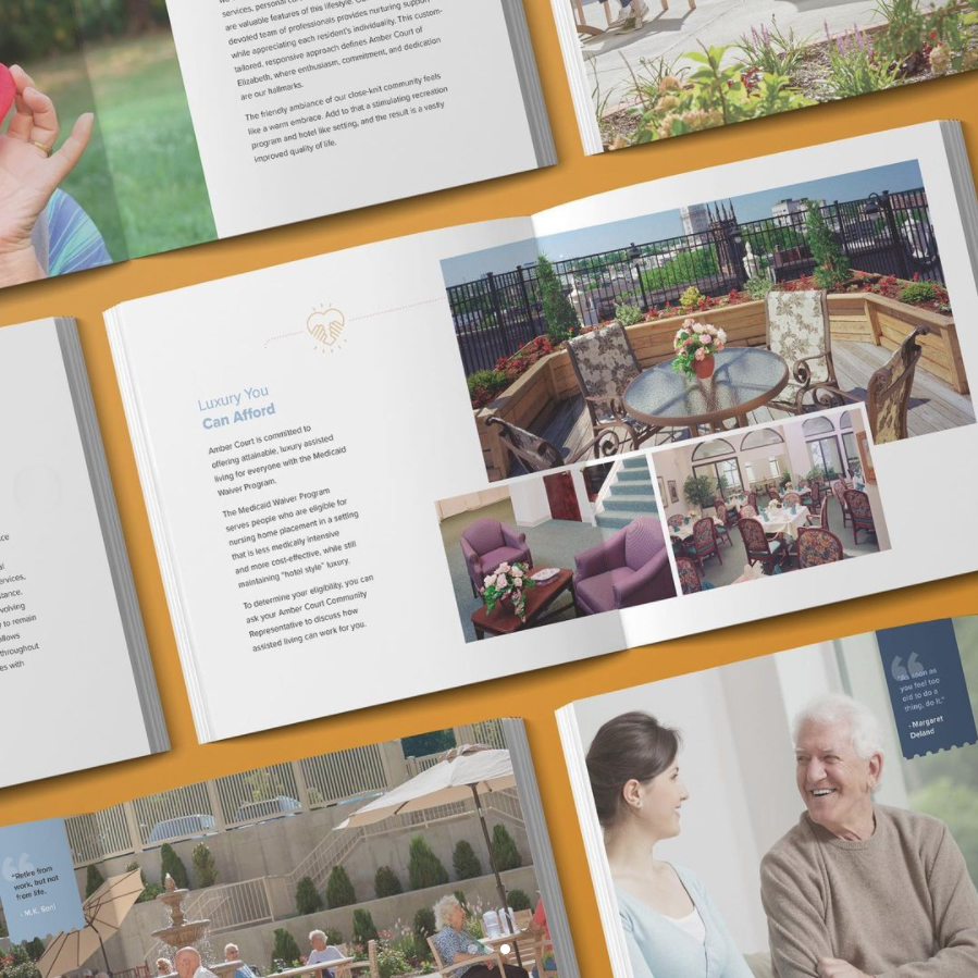
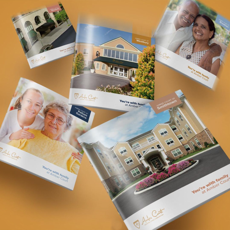
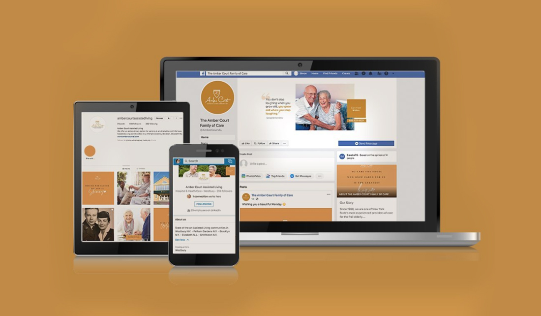
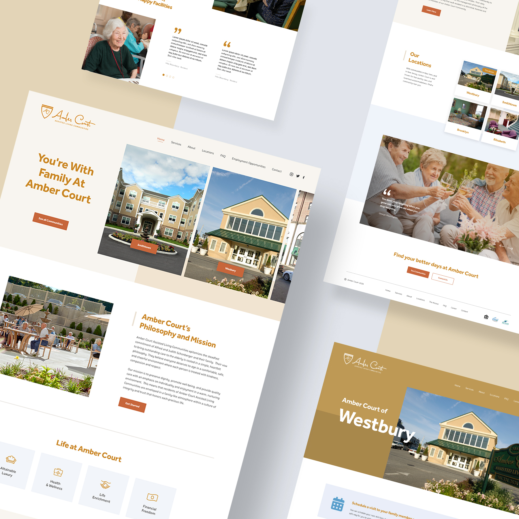
Amber Court
Meet Amber Court Assisted Living – a chain of Assisted Living Communities in New York and New Jersey.
Mission: Create, develop, and design a new website and brochures for each location, as well a create and manage a social media presence for all their locations.
For each location, we created a magnificent brochure to showcase the amenities and services of the communities. We used bold and compelling photography, against a clean and linear backdrop.
We created a modern and beautiful website with vibrant images, icons, and clear copy. Using UI/UX design, we gave the website an enjoyable and gratifying user experience. We also created a 360 digital marketing strategy for the Amber Court communities using email, Facebook, Instagram, and LinkedIn. We made a central page for the corporate headquarters, as well as subpages for each individual community. We also set up an ad campaign strategy to generate new leads and increase exposure.
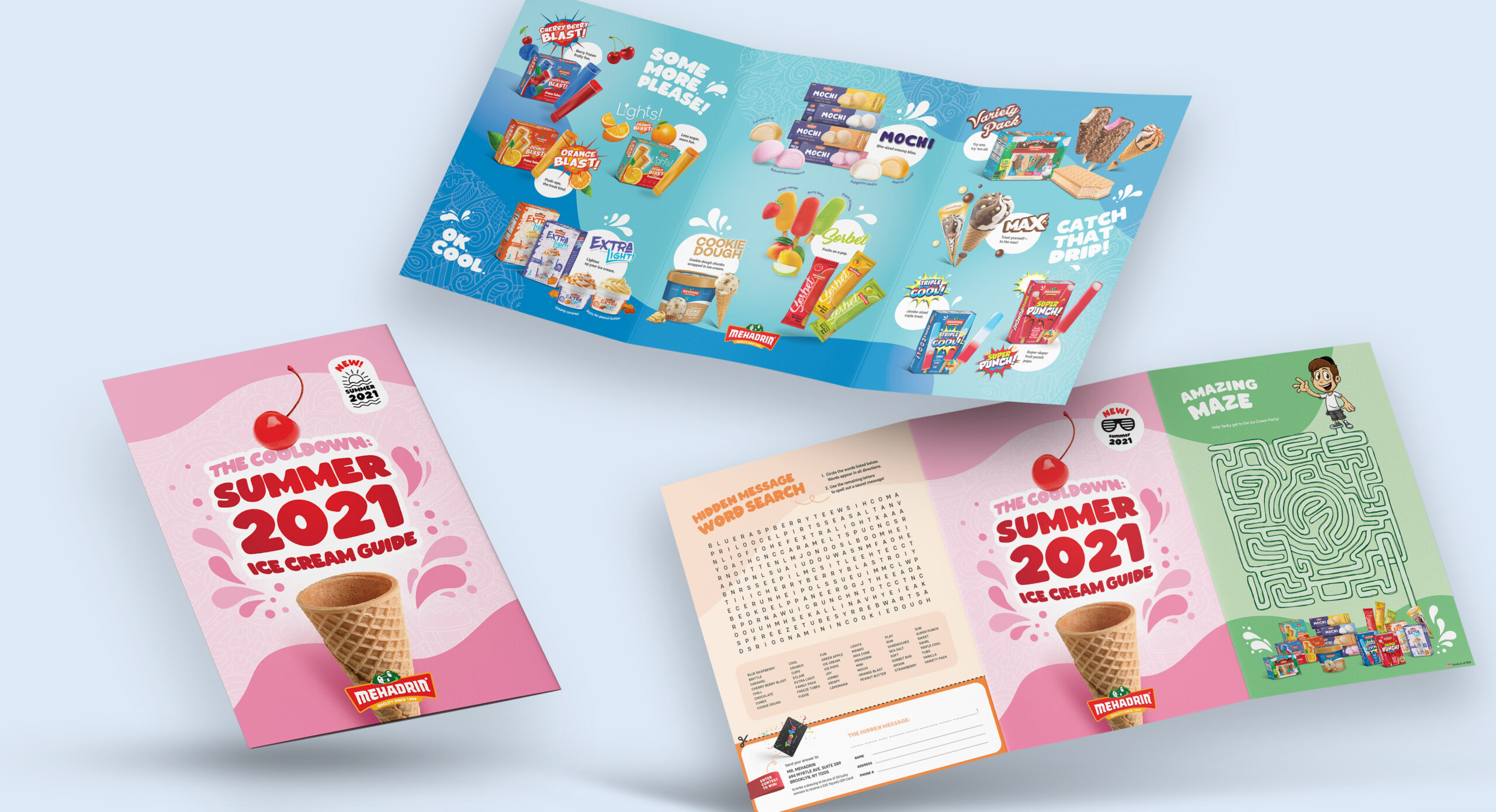
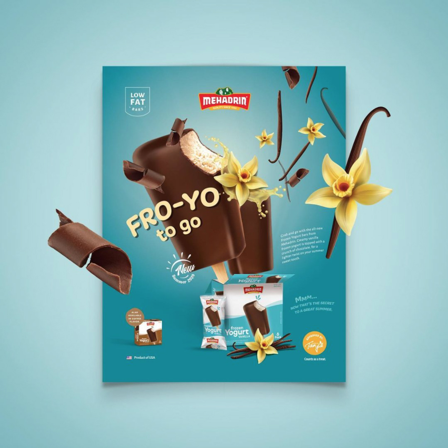
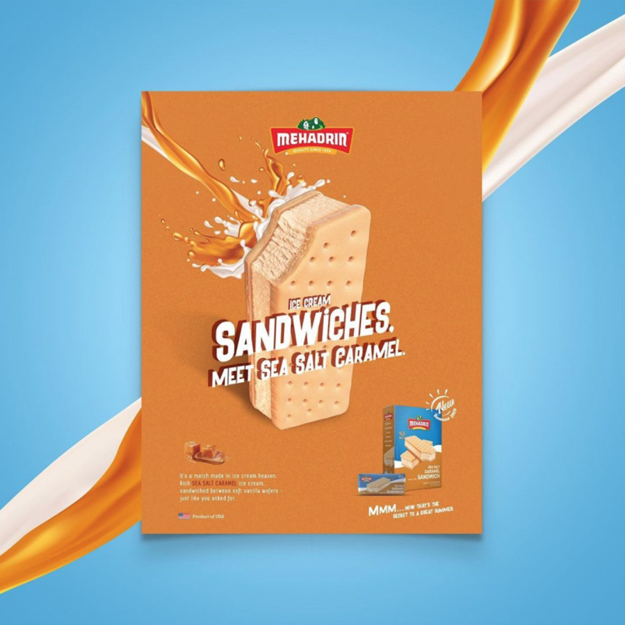
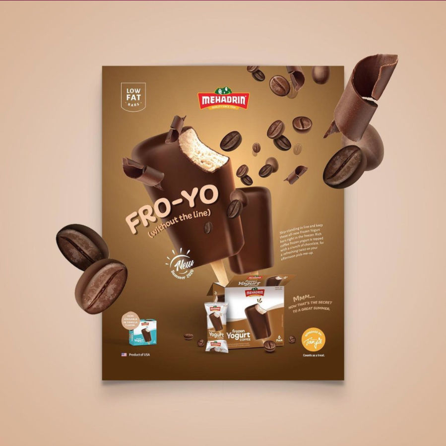
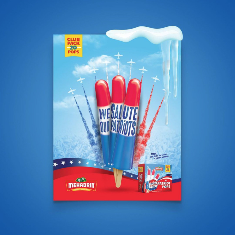
Mehadrin Summer 2020 Campaign
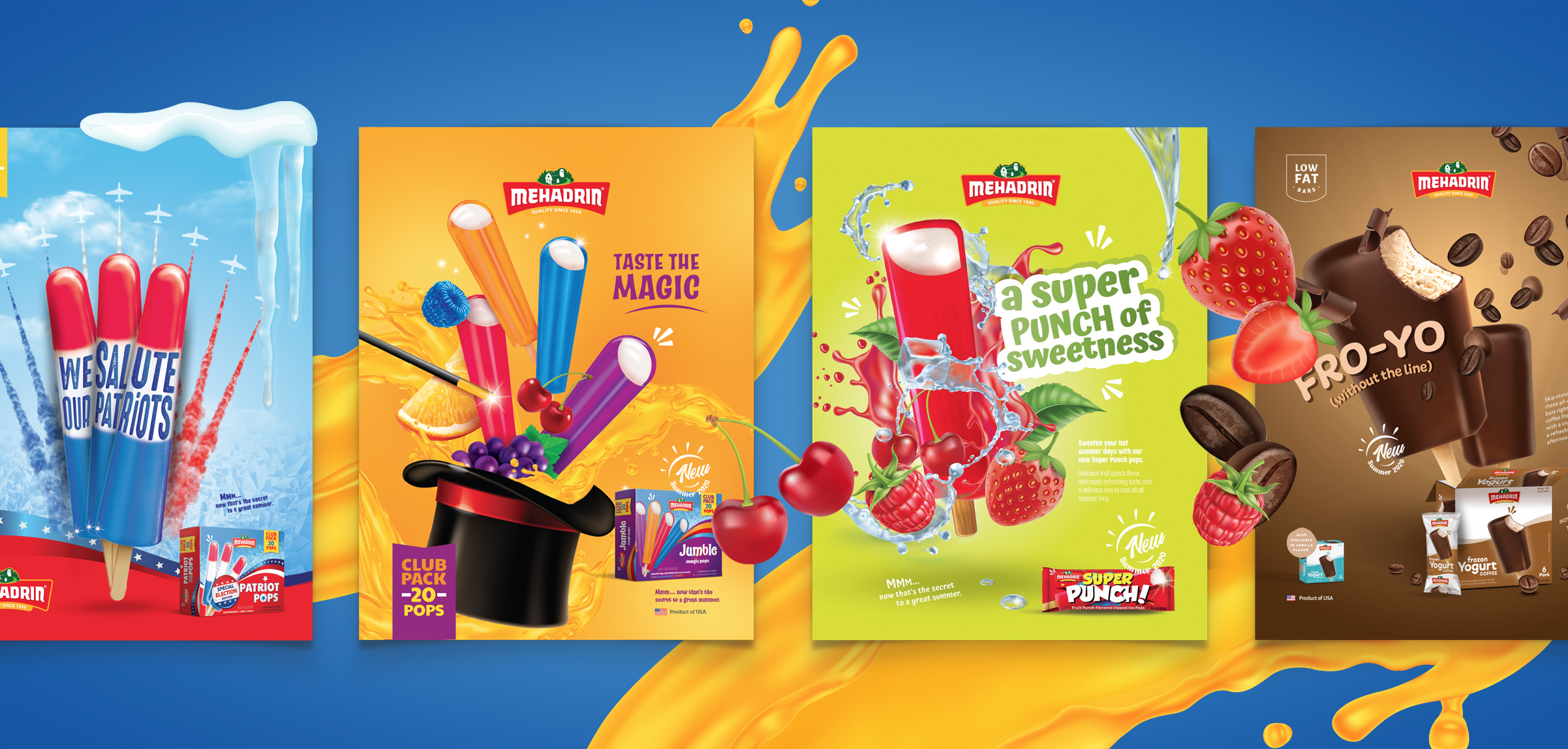
Our mission was to showcase Mehadrin’s new line of Summer 2020 products in a fun and imaginative way. Every ad was created in a graphic and animated version. In each ad, we chose to emphasize the star of the show – the ice cream – to give the consumer a taste of what they should expect.
For the Frozen Yogurt we used an image with a big bite to give the viewers a feel of what they should expect. The turquoise served as a really nice contrast against the chocolate and vanilla. For the Sea Salt Caramel Sandwich, we want to emphasize the novelty of this combination in the Kosher World. We accomplished that through the concise, yet descriptive copy – alongside the striking imagery.
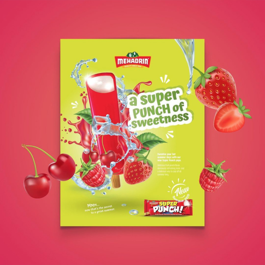
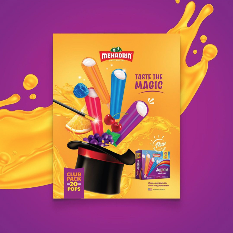
With the Super Punch, we aimed to depict the “punchiness” of the pop with eye-grabbing visual showing all the components of the ice pop. The colors and fonts chosen served as a beautiful contrast and really made the entire ad POP! The Magic Pop was so much fun to design because of it’s imaginative nature! We obviously had to include the Magicians hat 🎩 and wand. The bright and popping colors definitely made this one a show stopper!
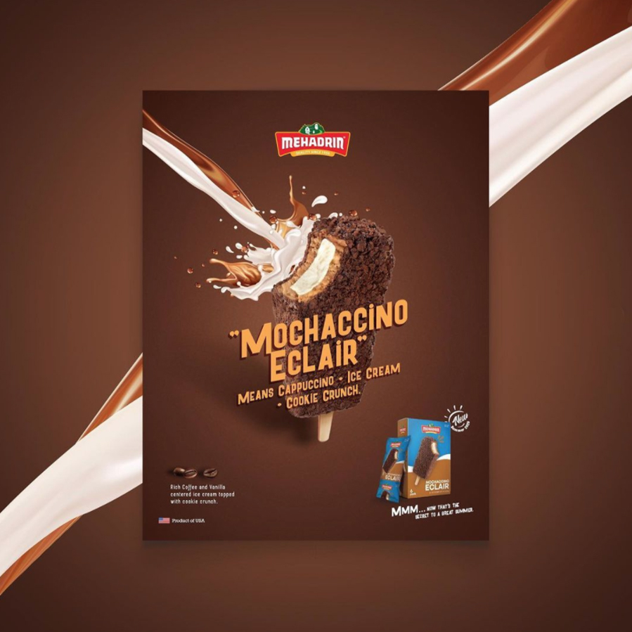
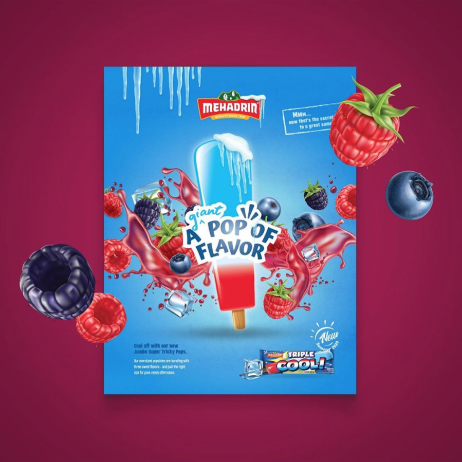
With the Mochaccino Eclair, we photographed the ice pop with a bite, so the customer can get a good picture of all the components that are inside the ice pop. For the Triple Cool POP, we really highlight the level of flavor in one bite. We centered the product alongside the striking copy in the center so the consumer’s eye, right away was attracted to that point.
The Fro-Yo! This one is for the coffee lovers, so we visually placed a lot of emphasis on the coffee theme. Since these were also being sold as singles, we displayed the packaging in a single version as well as a boxed version. The Patriot Ice Pop gave a fun nod to the current US elections. We used the flag colors and similar imagery to wrap the entire concept into one ad.
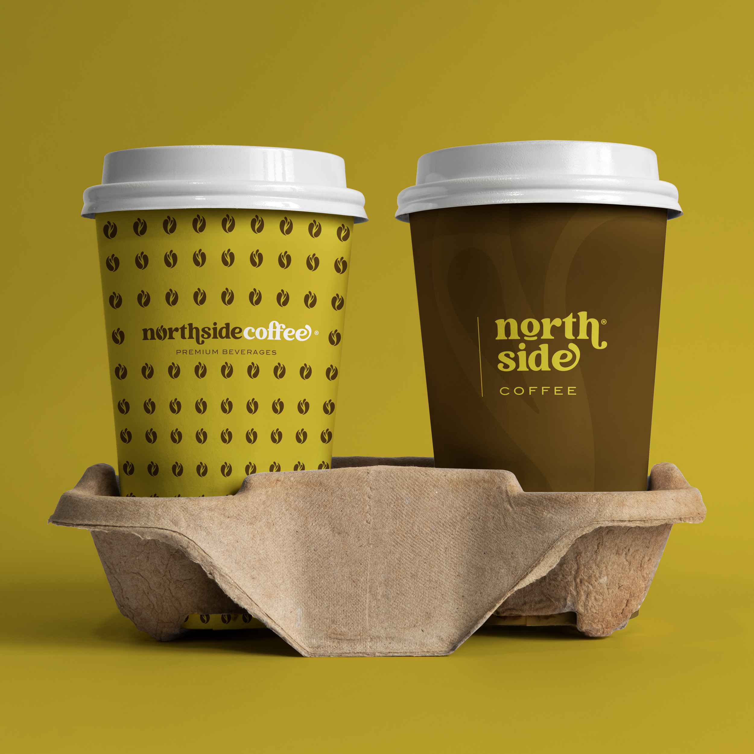
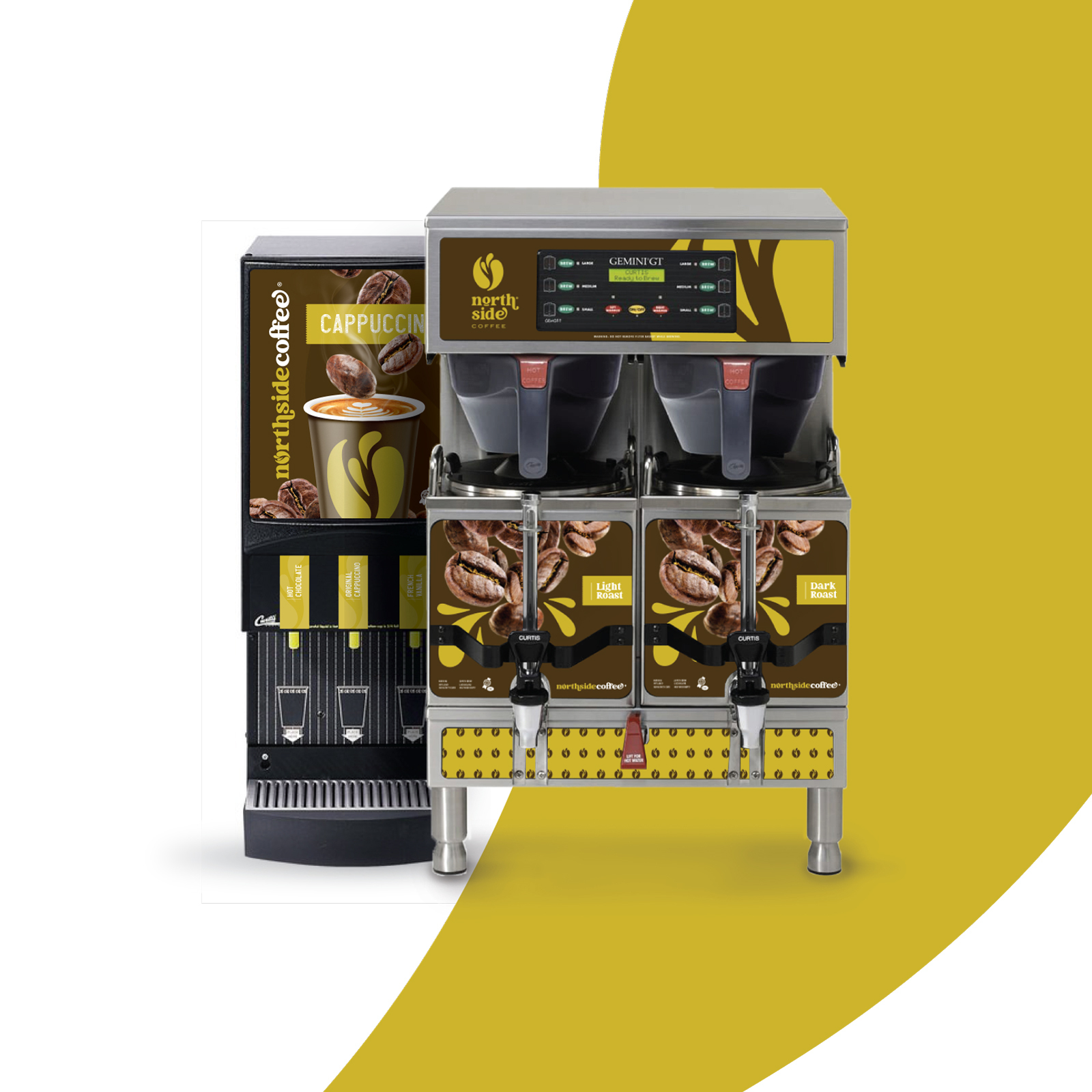
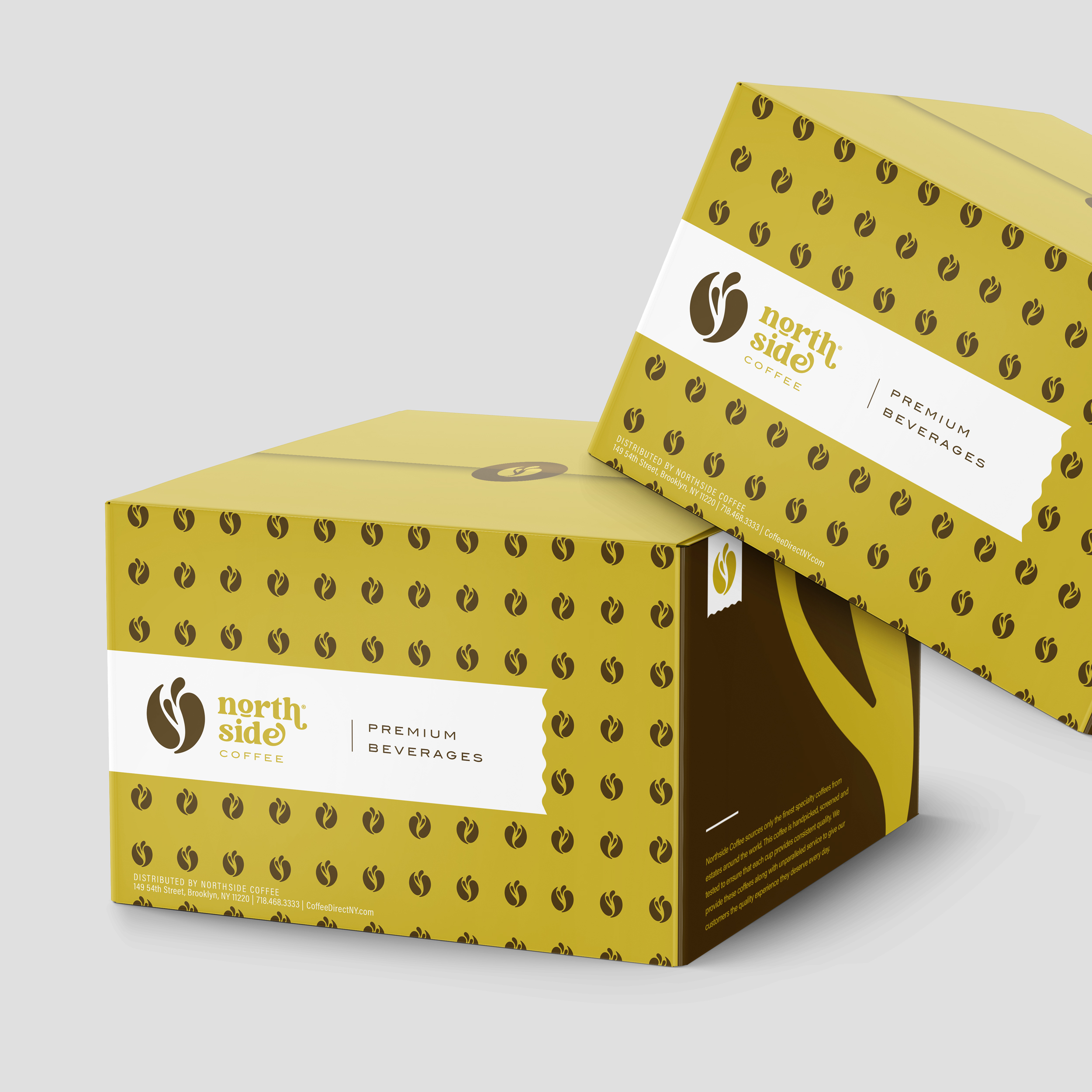
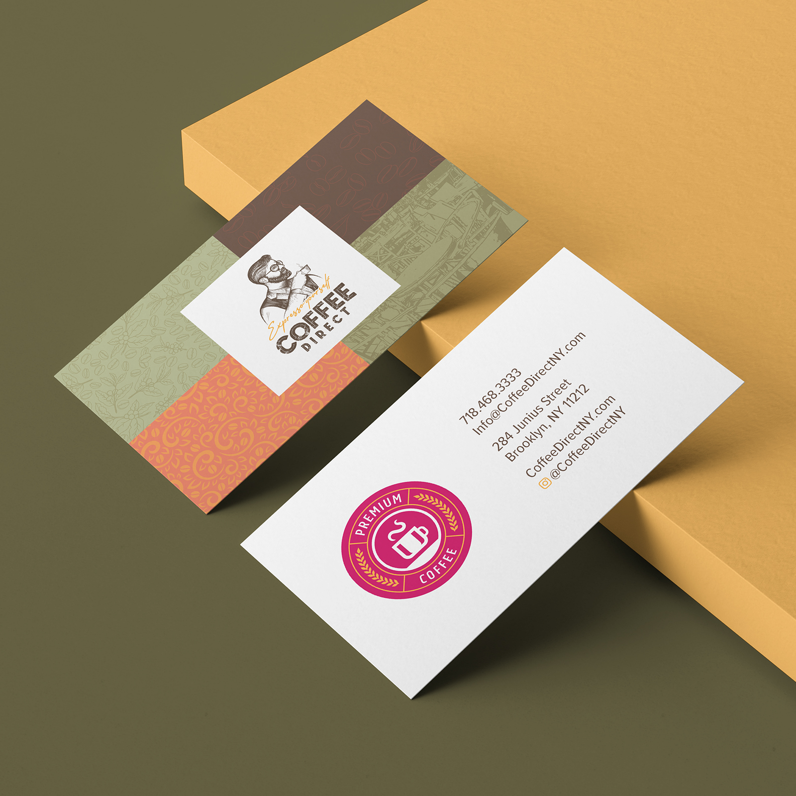
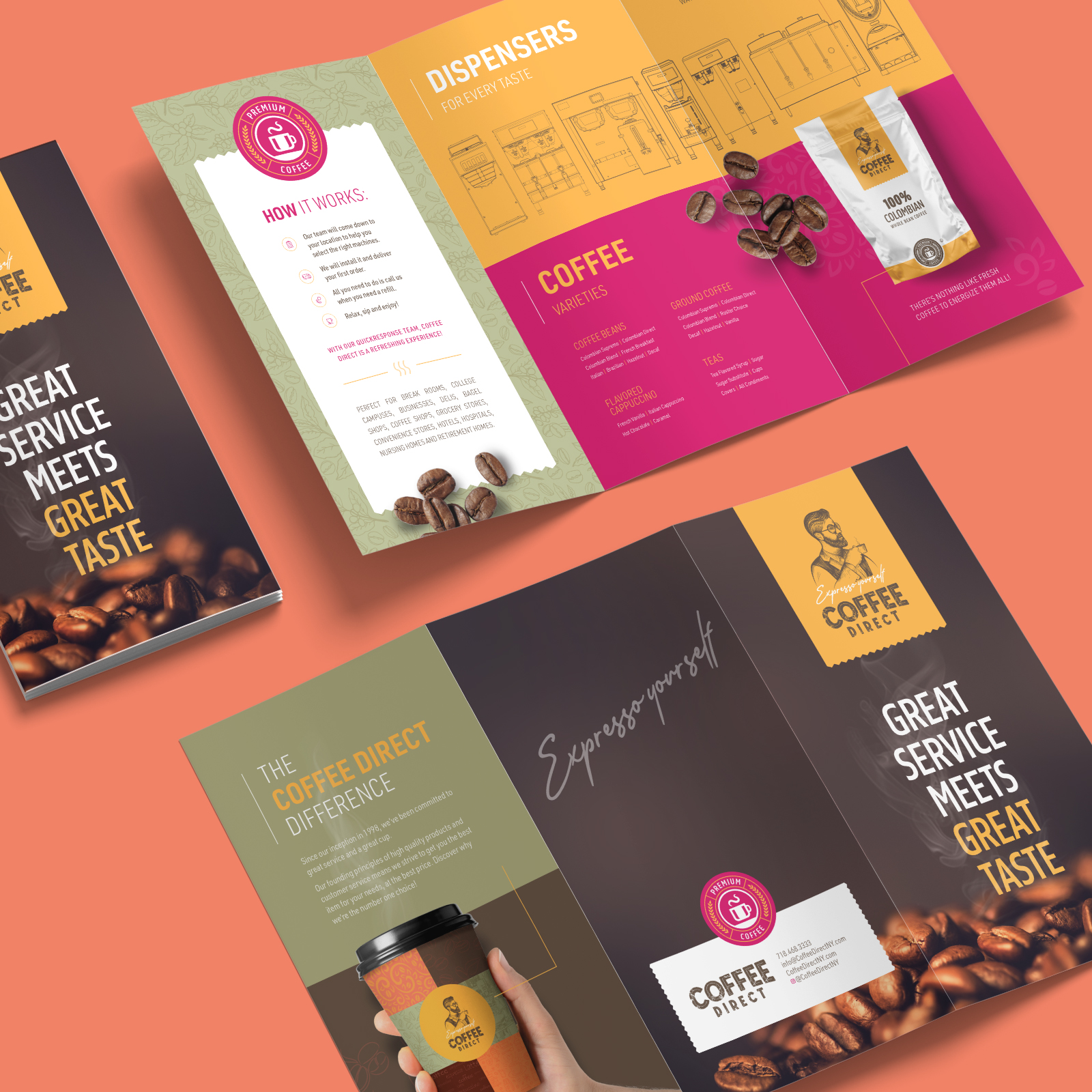
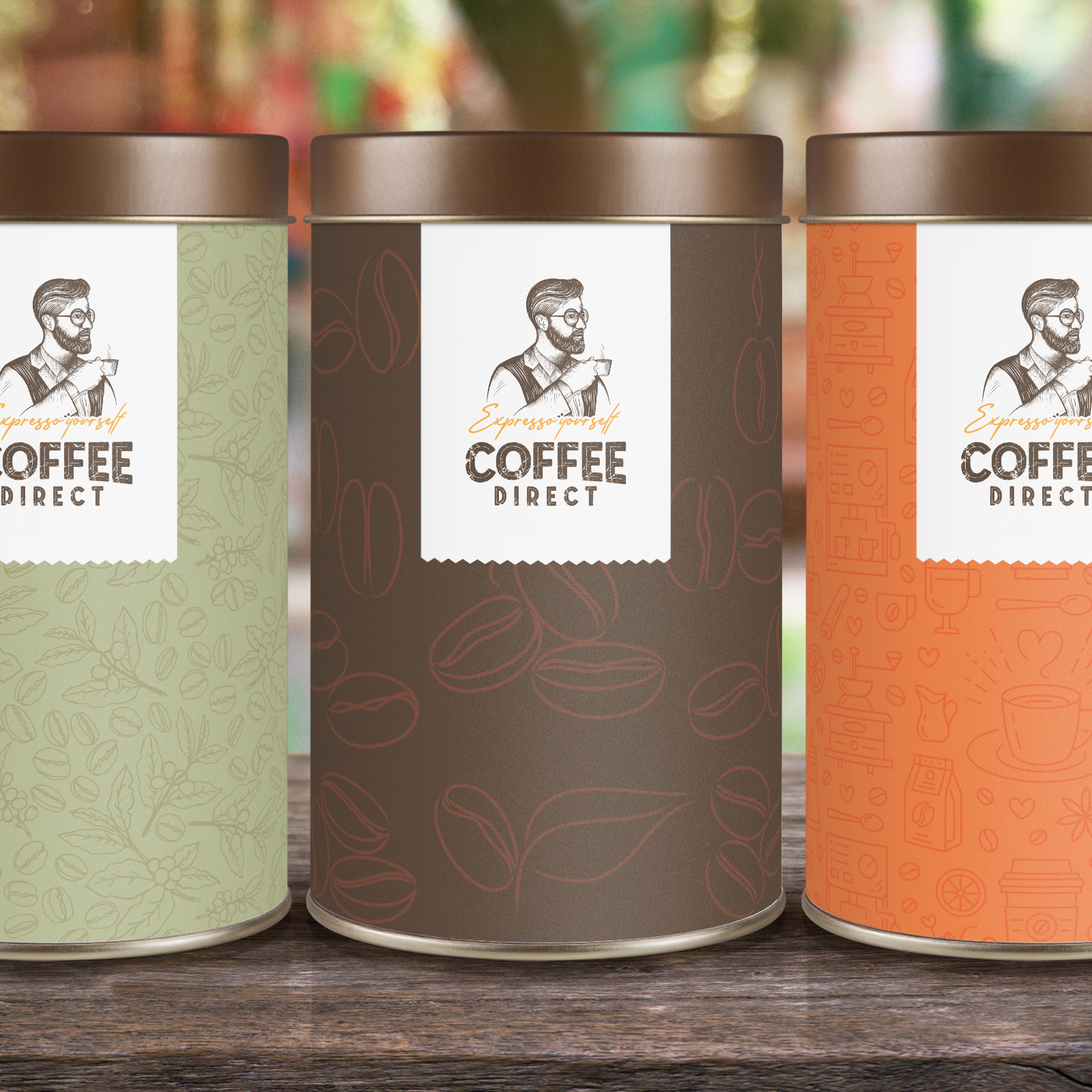
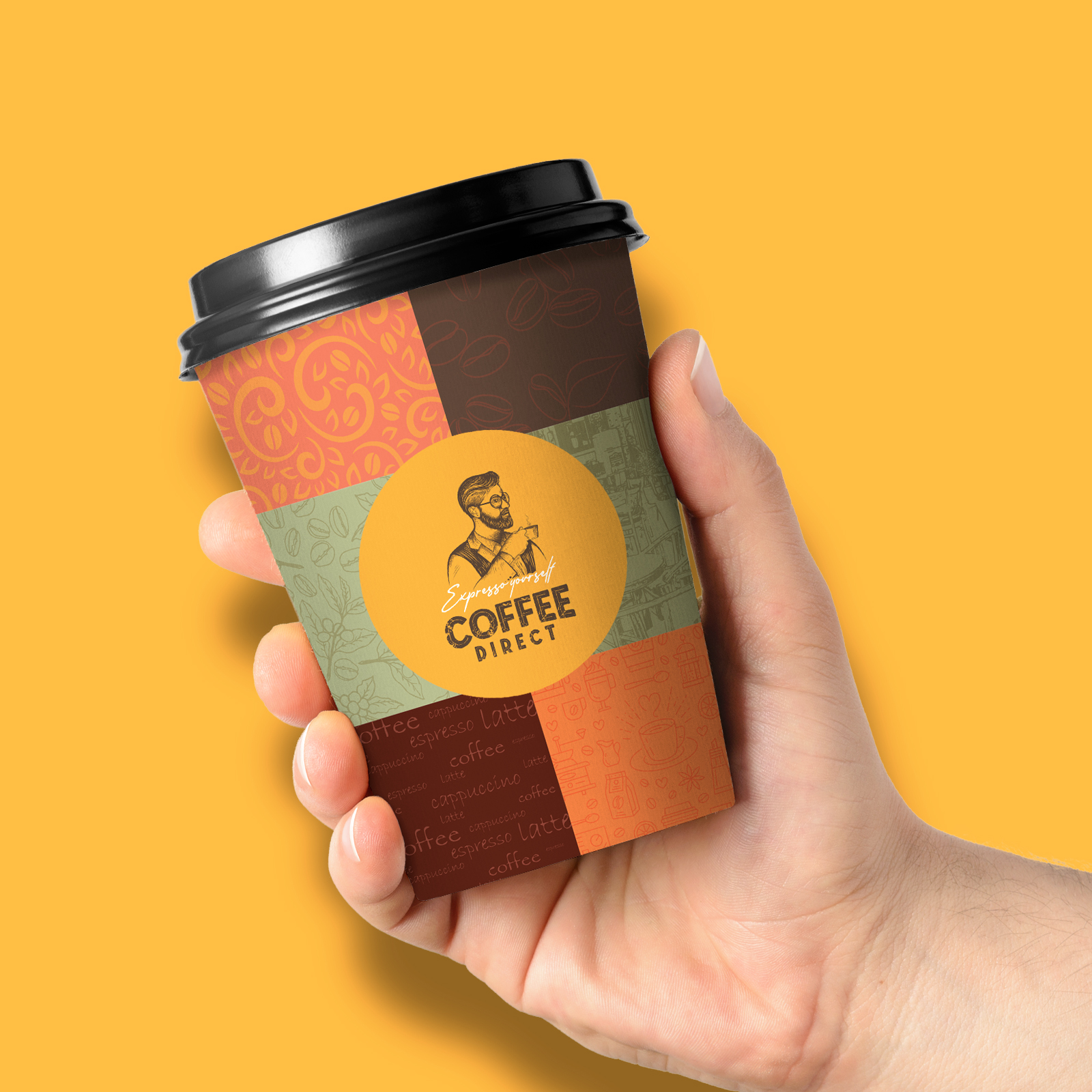
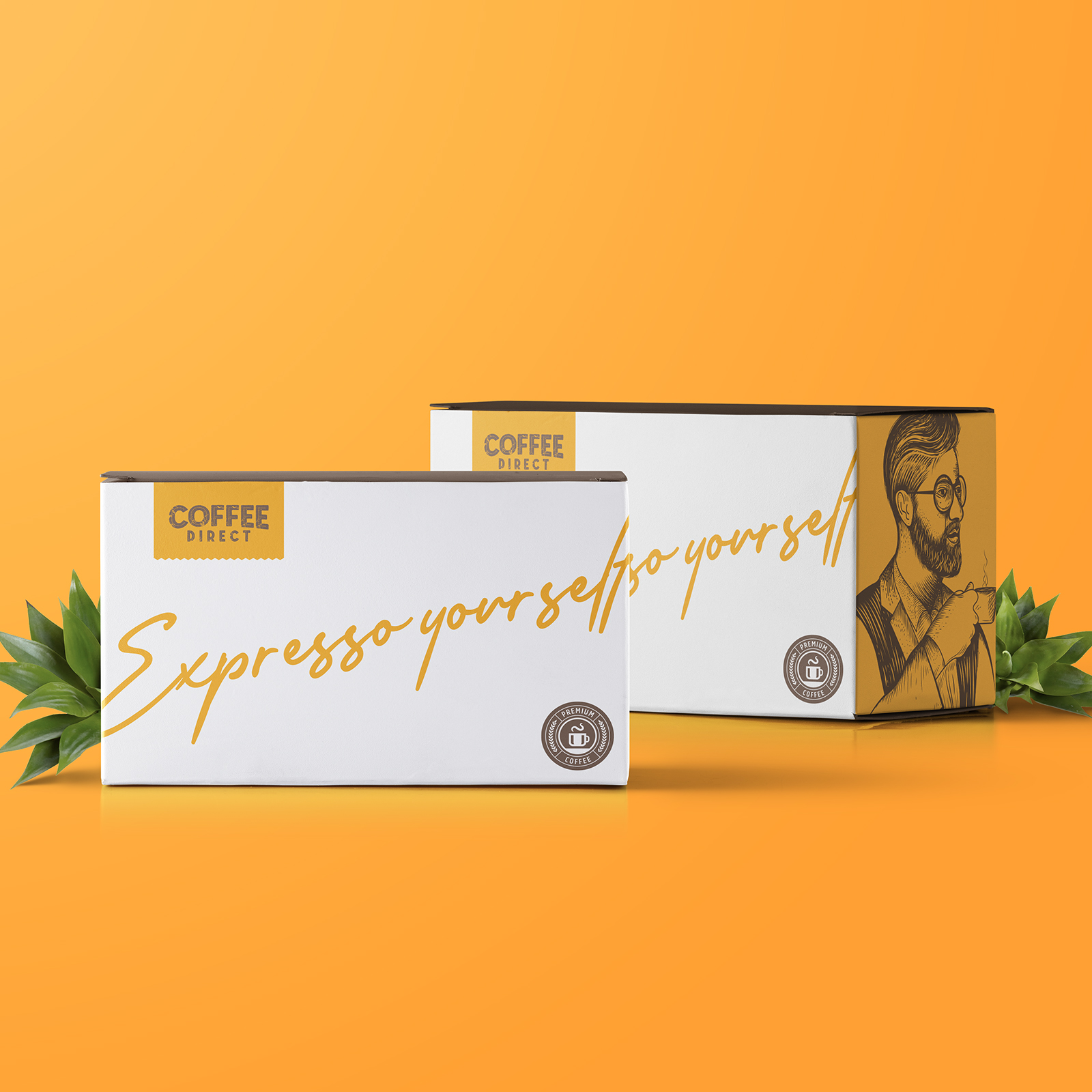
Coffee Direct Branding
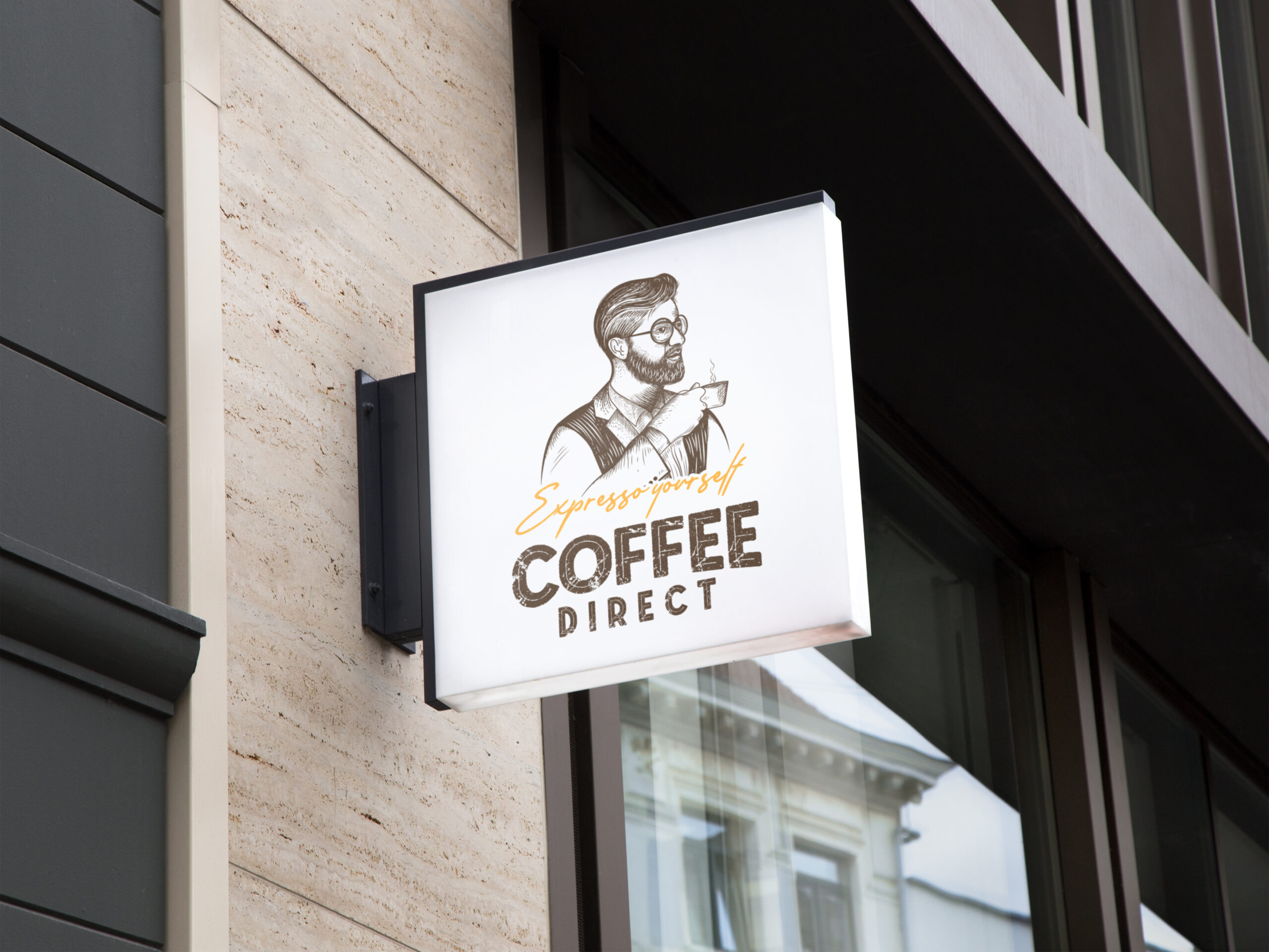
Coffee Direct – a wholesale coffee brand that distributes to local eateries and coffee shops.
With the mission set to reflect the freshness and the unique spirit of the brand we used a variety of fun and vibrant colours, while staying true to the coffee identity in a clean and classy way. The illustrated style served as a nice contrast against the boldness of the brand identity. We used a sketched pattern to reflect the avant-garde look and create a contrast against the bold colours. We chose the slogan “Espresso Yourself”, putting a double entendre on the word Espresso.

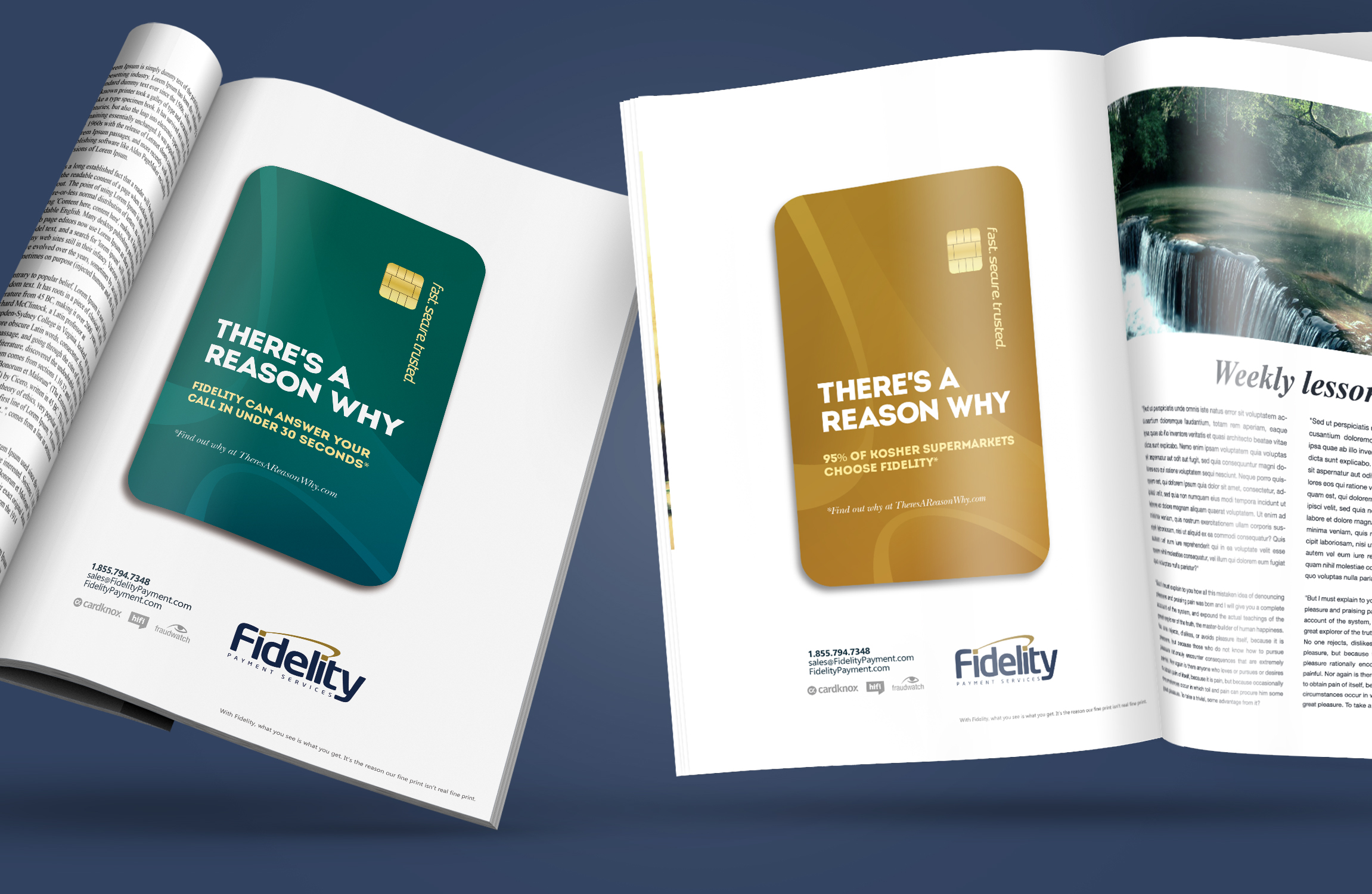
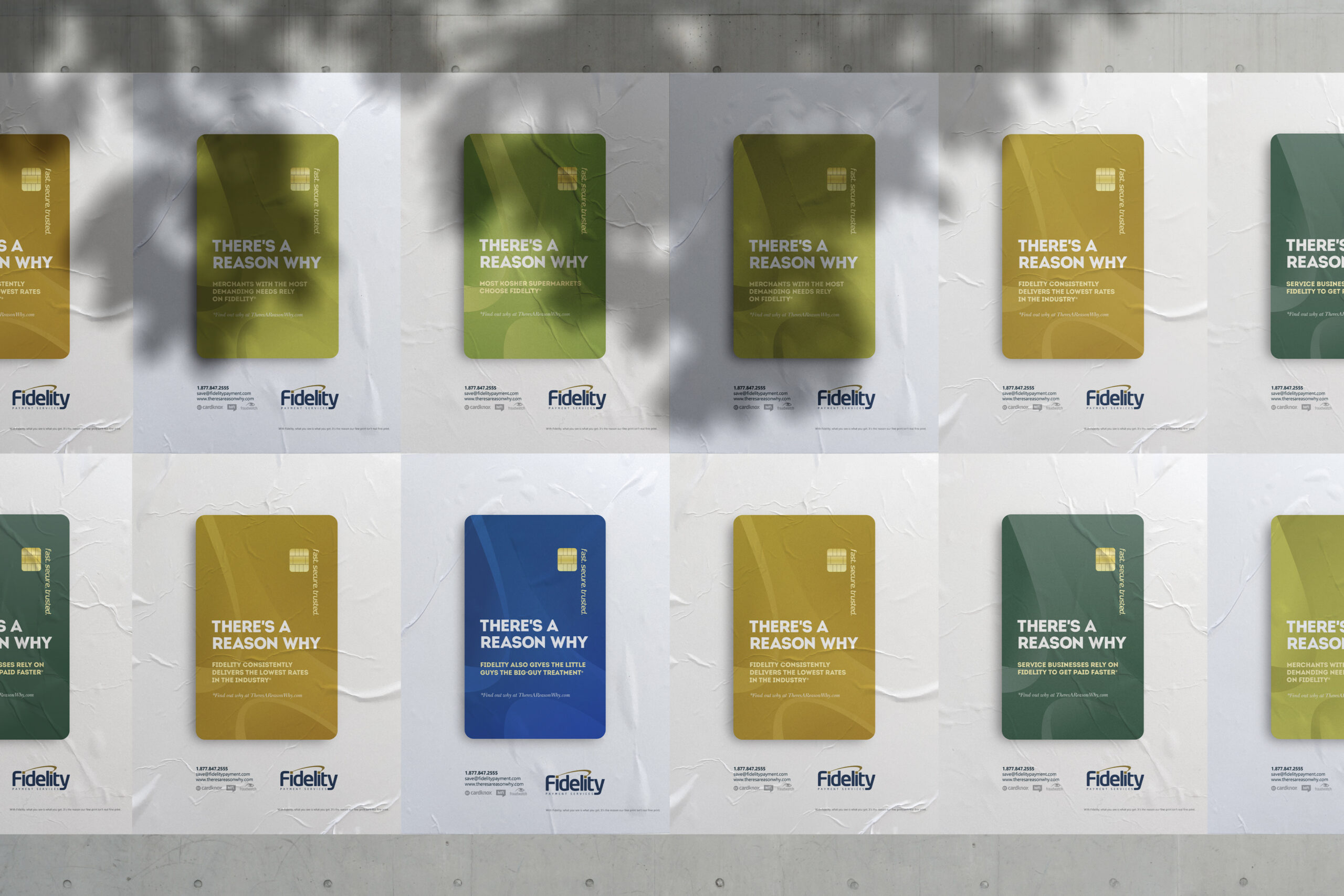
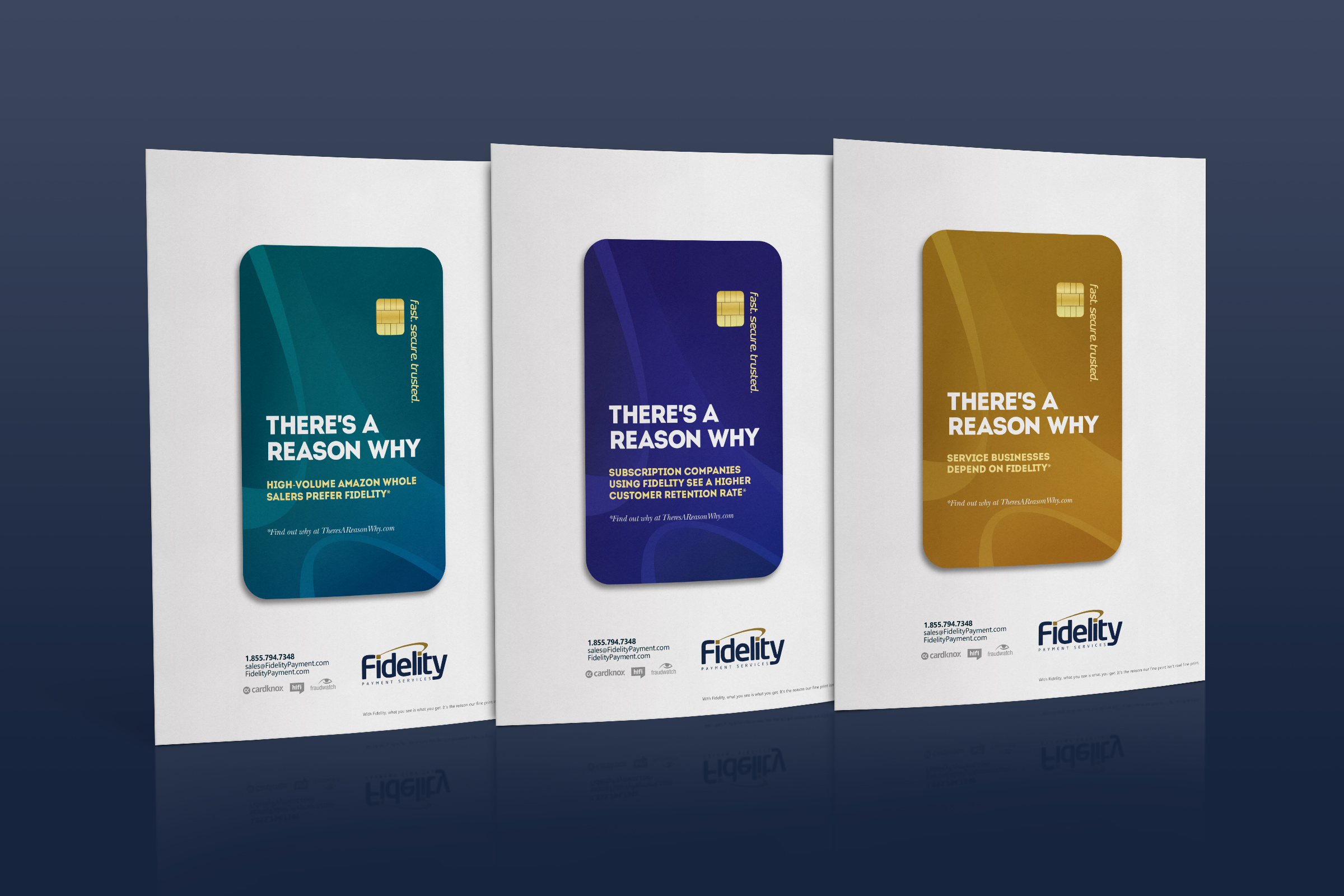
Fidelity Branding Campaign
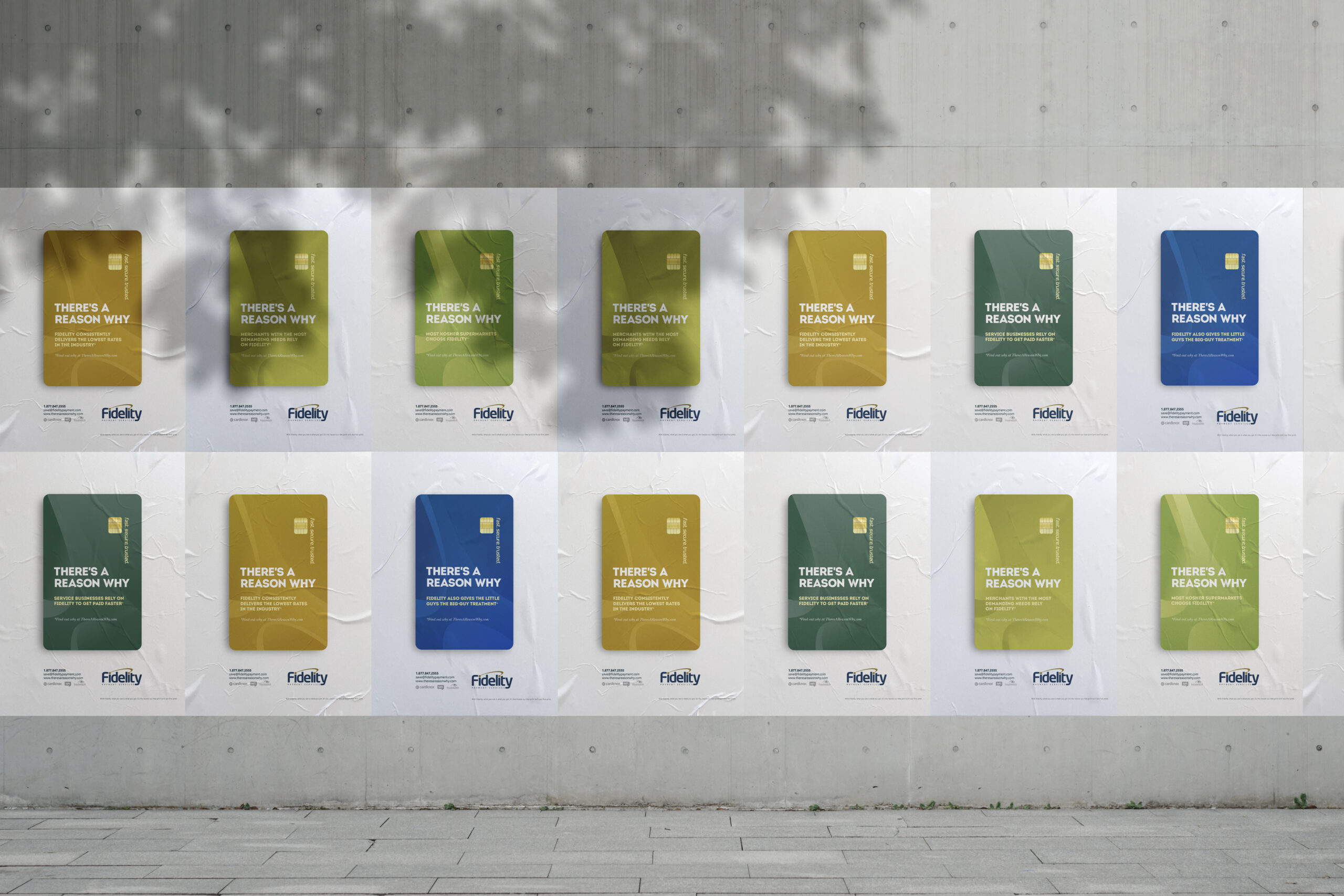
Fidelity, There’s a reason why
Fidelity Payment Services has been a pioneer of custom payment solutions for merchants across the globe and is one of the most trusted global payment processors. A member of the prestigious First Data Chairmen’s Council, Fidelity processes billions of dollars in transactions annually. Twenty-two years of industry knowledge and experience has given their global operations a competitive edge in technology, security, service, and support.
Fidelity is one of the largest and most prestigious electronic payment providers in North America. As such, they do not need to explain to the public who they are, or what they do, or why they’re better at it than their competitors. It’s common knowledge. Hence, the dangling headline and campaign slogan, “There’s a reason why”, that isn’t answered in print.
Fidelity is practically synonymous with credit cards. We channeled this idea by employing a visual of a credit card for each ad. The credit cards keep to the Fidelity brand colors for subtle reinforcement of the brand image, while remaining otherwise non-branded so as to be all-inclusive.
The campaign punchline, so to speak, is the small footnote that speaks volumes. The reason referenced in each ad, the footnote suggests, can be discovered by asking your local what-have you. This connects the end consumer with Fidelity in a strong and personal way. People are more likely to trust their connections than the word of a big brand like Fidelity, and Fidelity is self-confident enough to propose the concept.
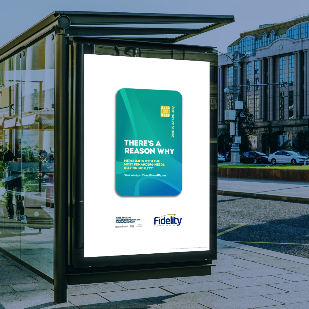
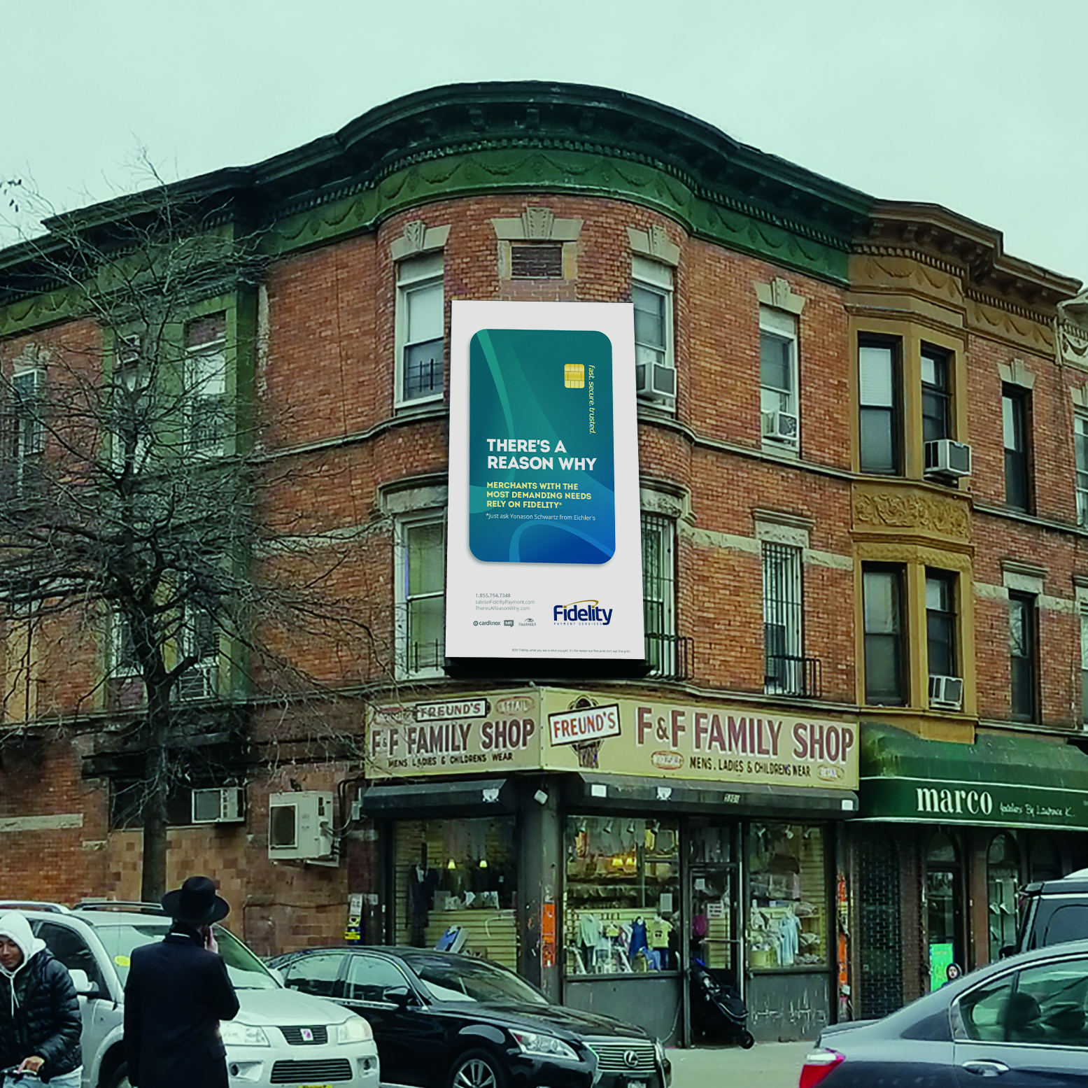
Following the general direction of the campaign, the ads are minimalistic with the credit card set against a stark, white background for a clean and effective corporate look.
This campaign targeted existing business owners and new small business owners as well as the everyday consumer.
To extend the campaign even further and broaden its reach, we created ads for bus shelters and billboards in various Jewish communities. These ads specifically reference the location where they’ll be placed, bringing the message out into the real world.
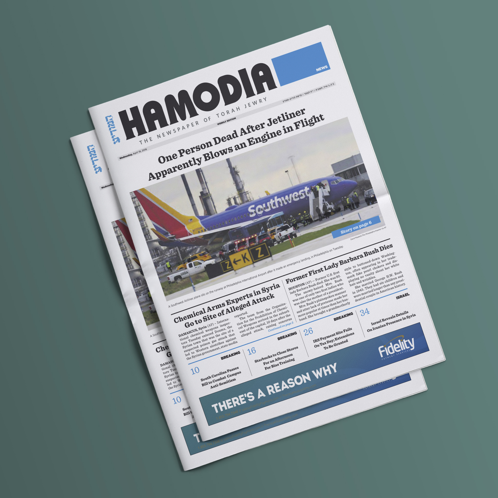
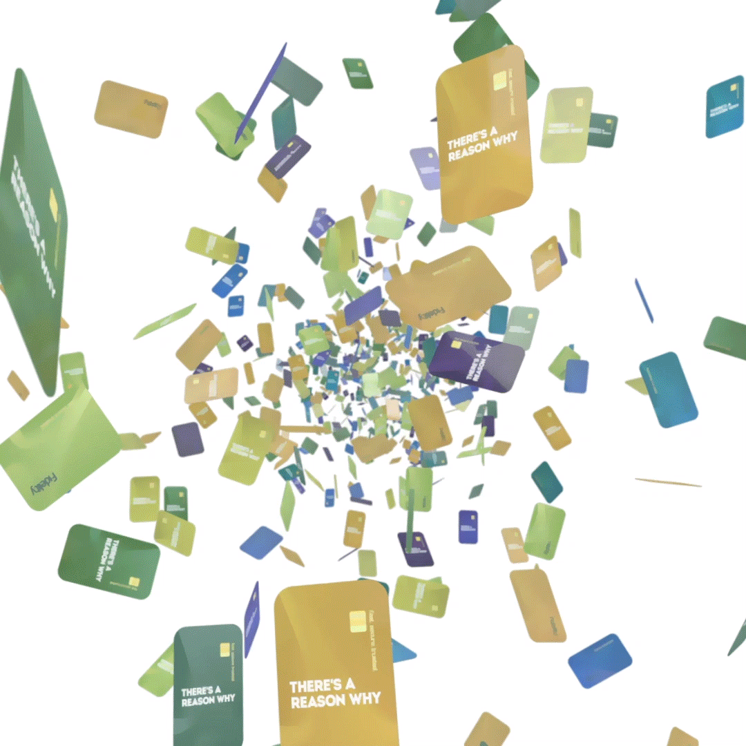
At Media OTG, we aim to reach our clients targeted demographic on every platform available. While print may work for a certain segment of their audience, adapting it to digital expands our scope and ensures that our message is communicated on all avenues.
We created a series of digital ads, and we also gave reason to the reason with the website we created to explain the reason, check it out www.theresareasonwhy.com

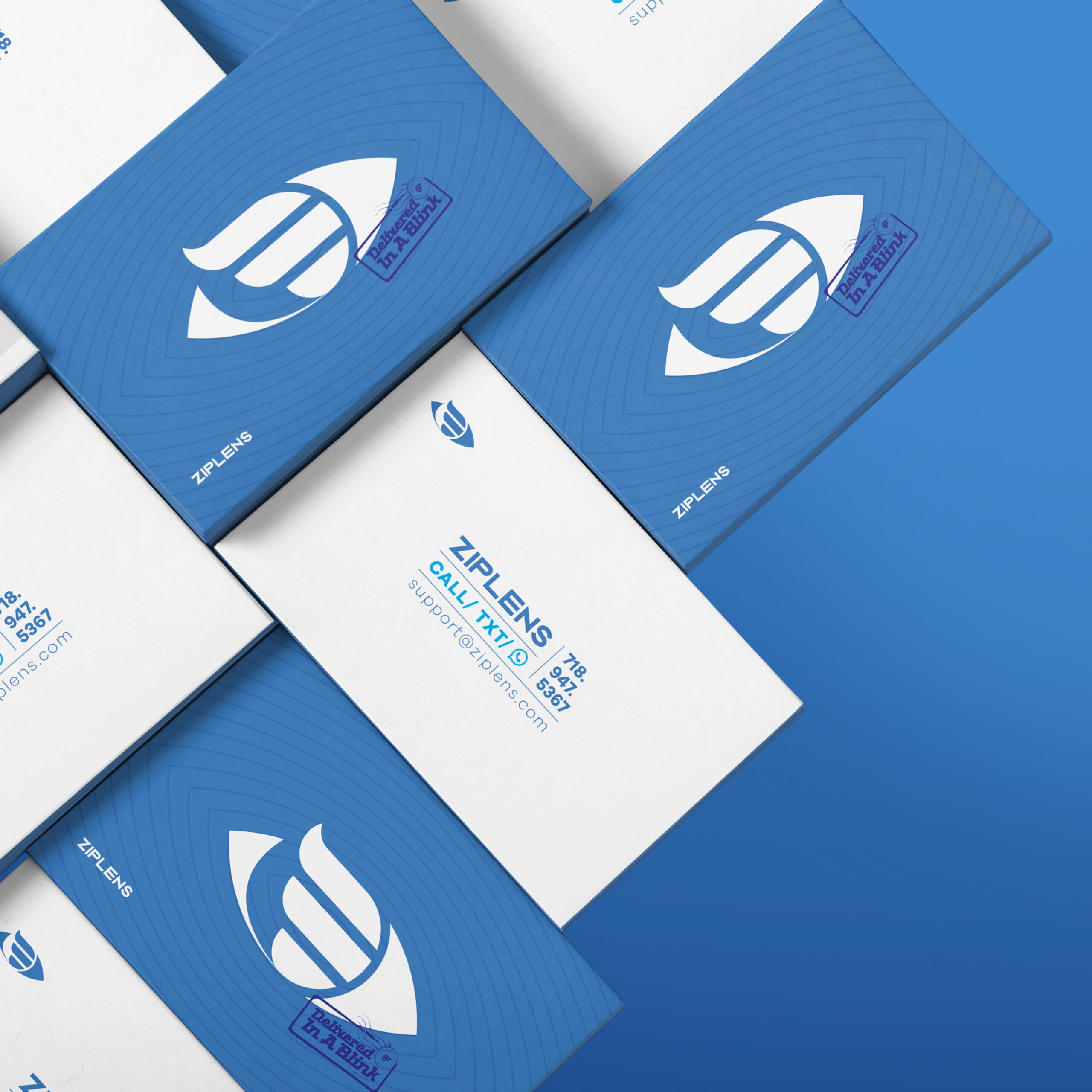
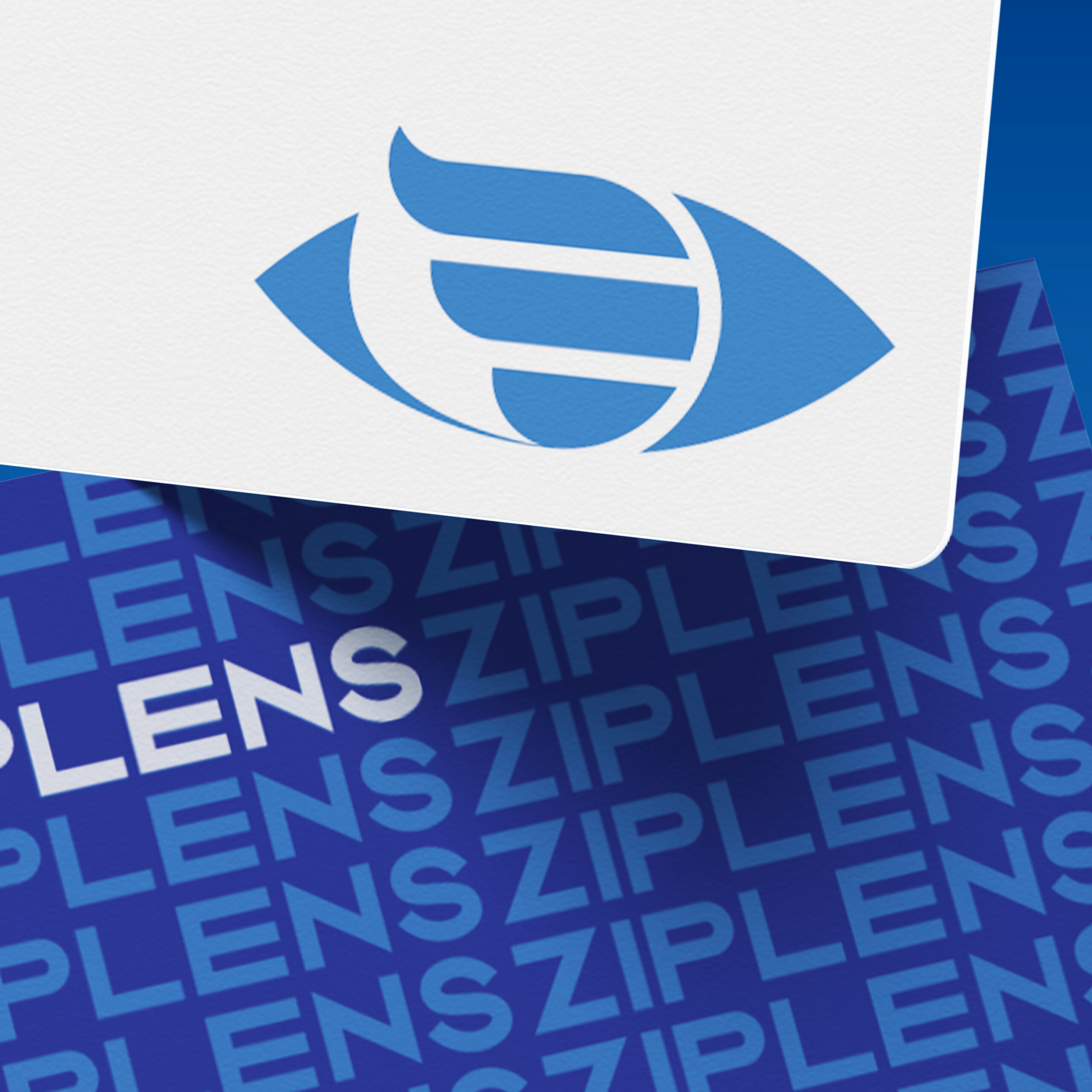
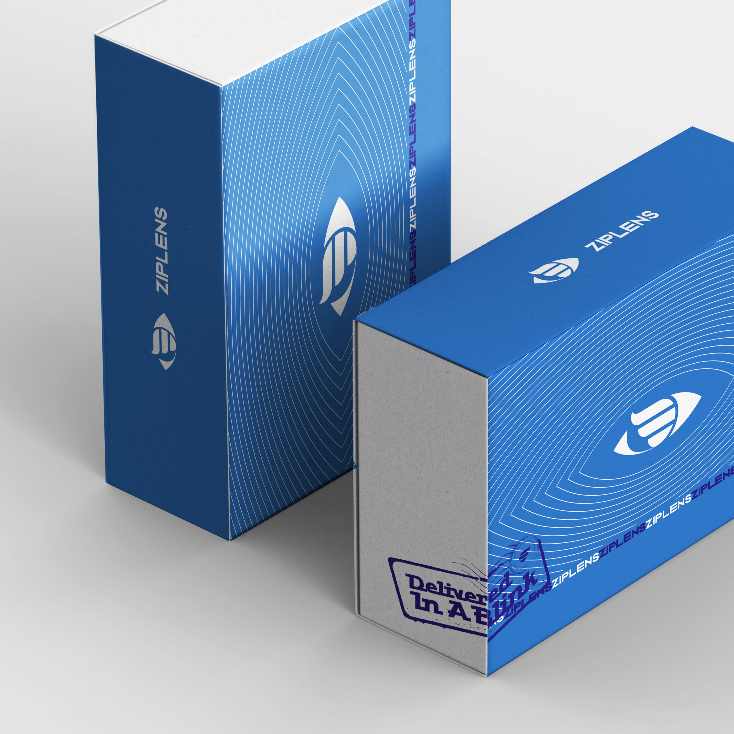
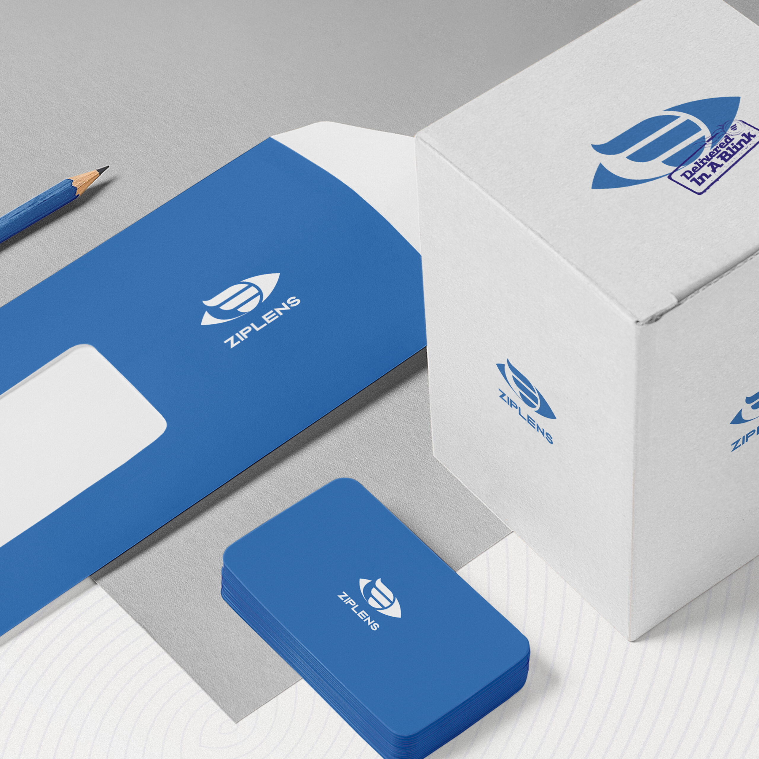
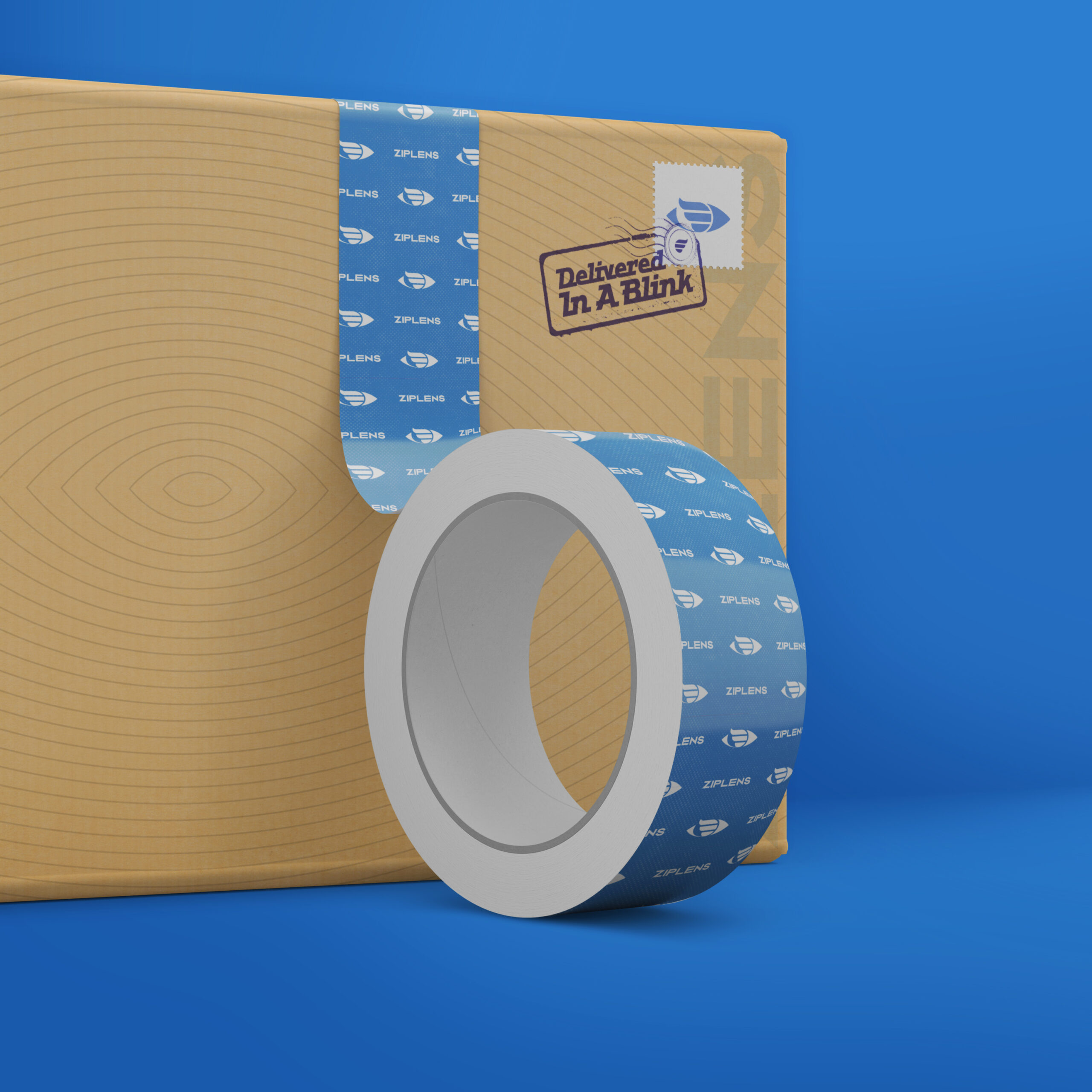
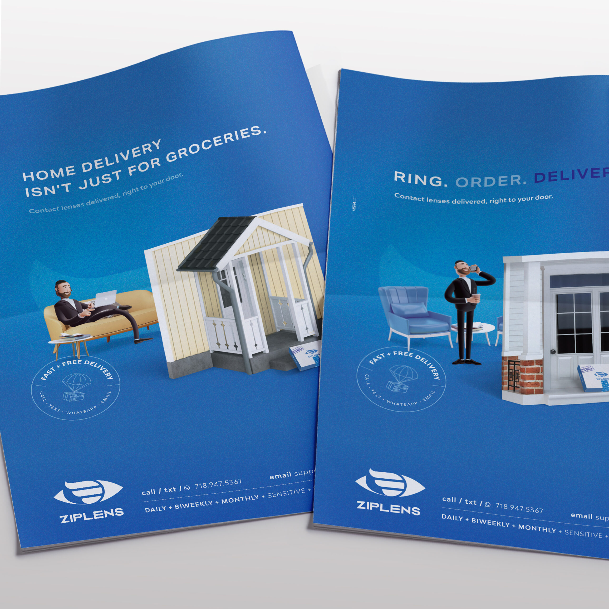
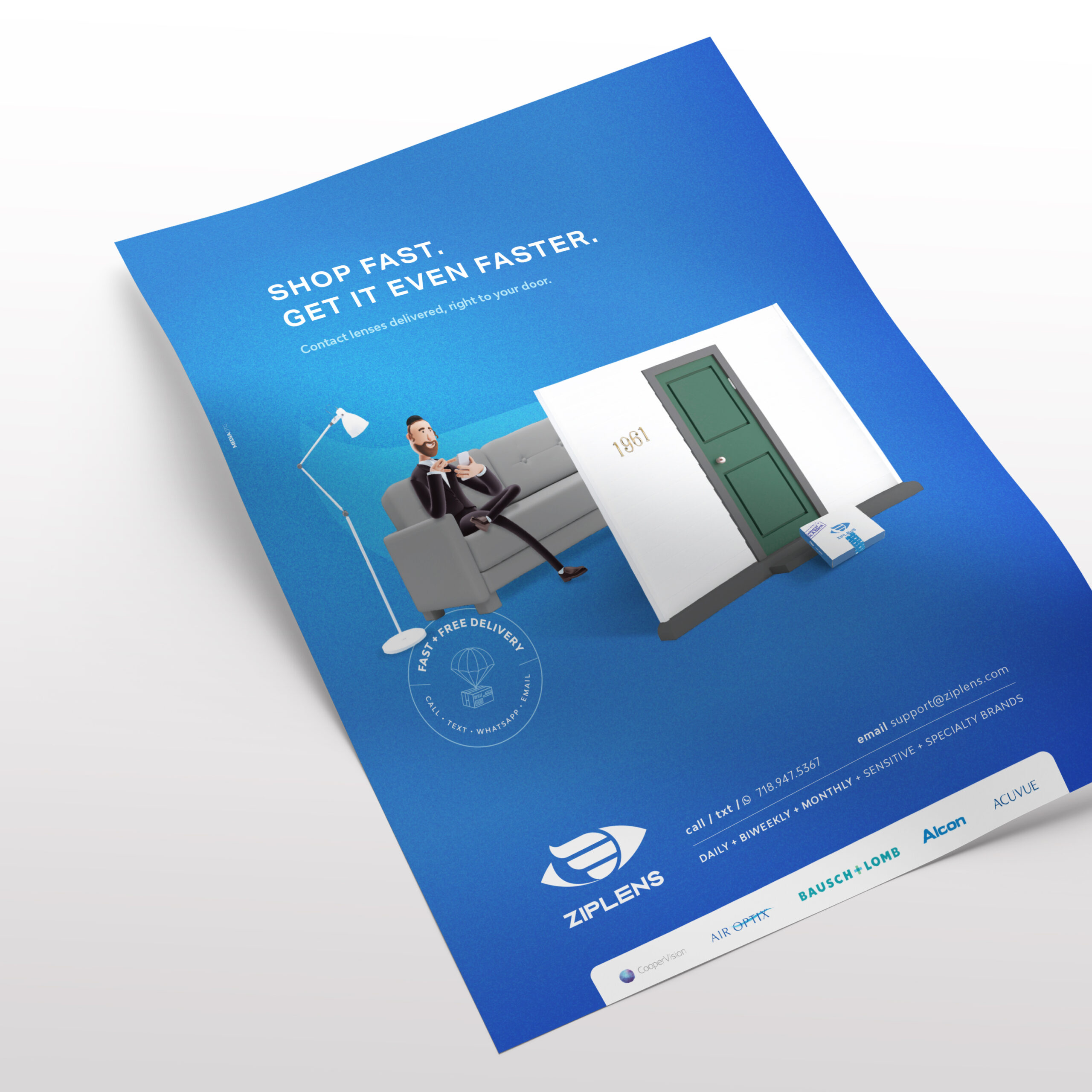
Ziplens Branding
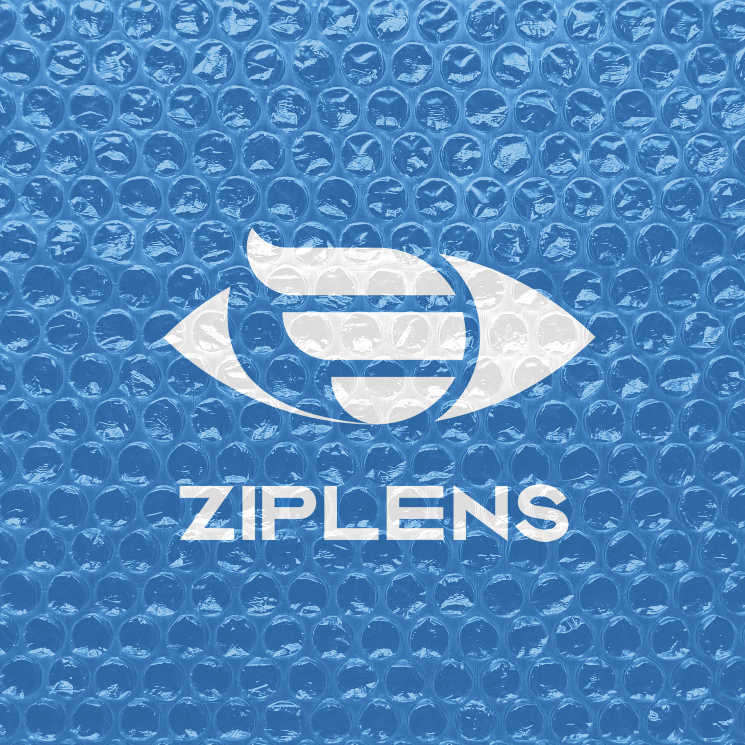
Meet ZIPLENS a company specialized in delivering eye lenses all over the US.
Mission: Create and develop the brands identity, character and messaging.
We aimed to communicate the brands story through their icon and colors. The icon perfectly illustrates Ziplens quick delivery of eye lenses. We were able to depict an eye for the lenses aspect while integrating the super quick element in the form of an illustration. Being in the eye care industry, blue was the obvious color choice. The shade we used combined with the white gave the brand a soothing yet corporate look.
Our team developed a character that personified the functions of Ziplens. We showed the character in different situations in the comfort of their home easily ordering a new pair of lenses.
Bingo
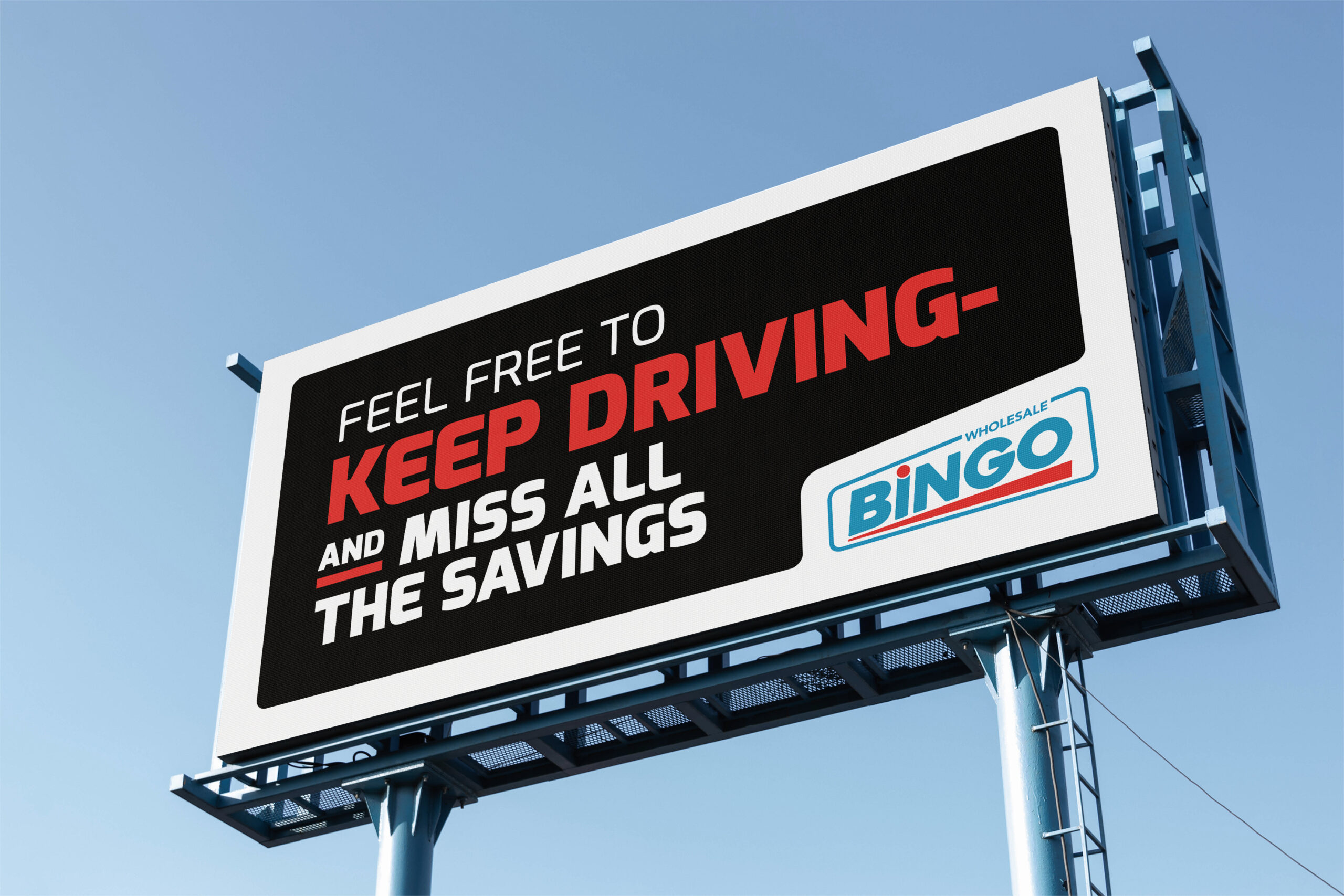
Coming Soon
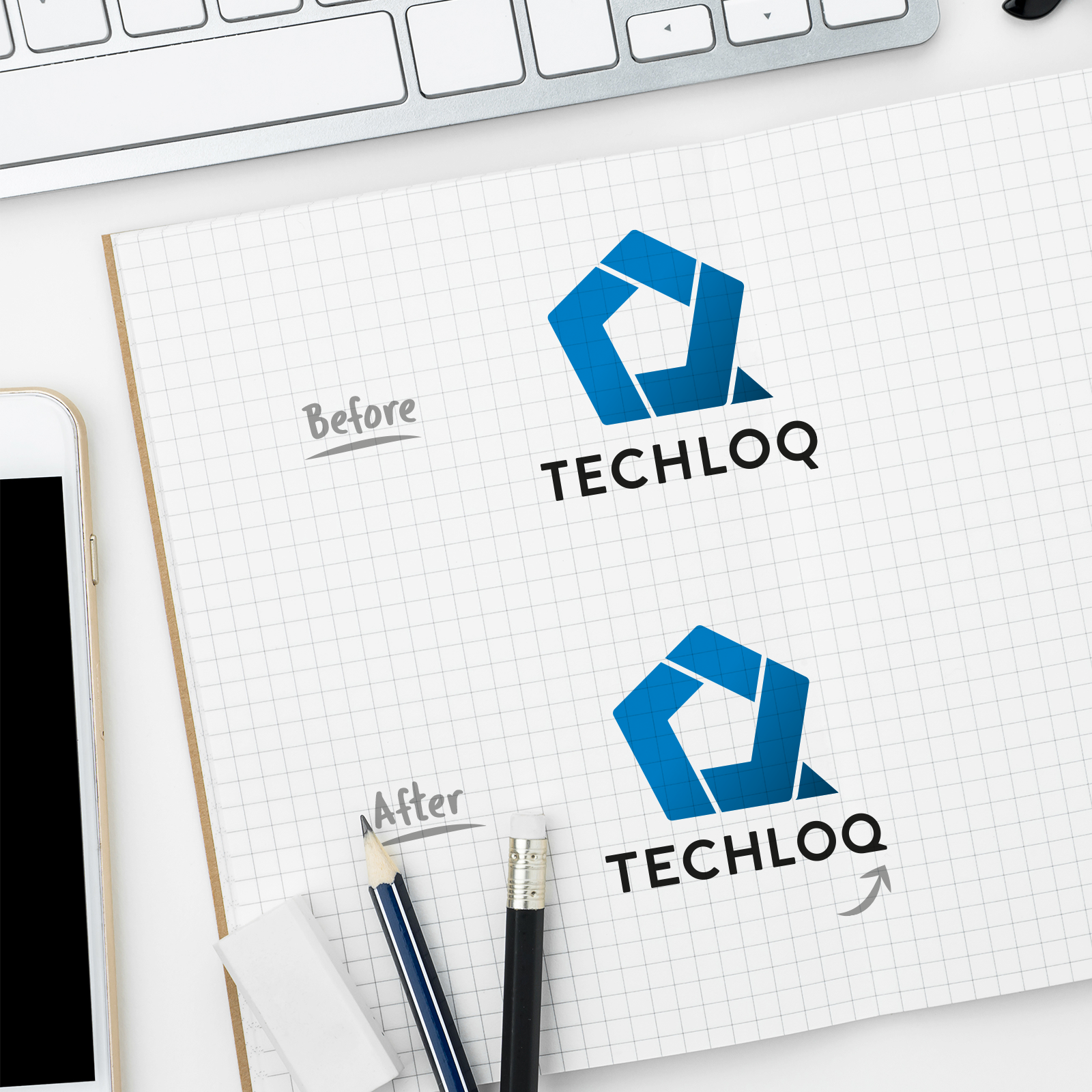
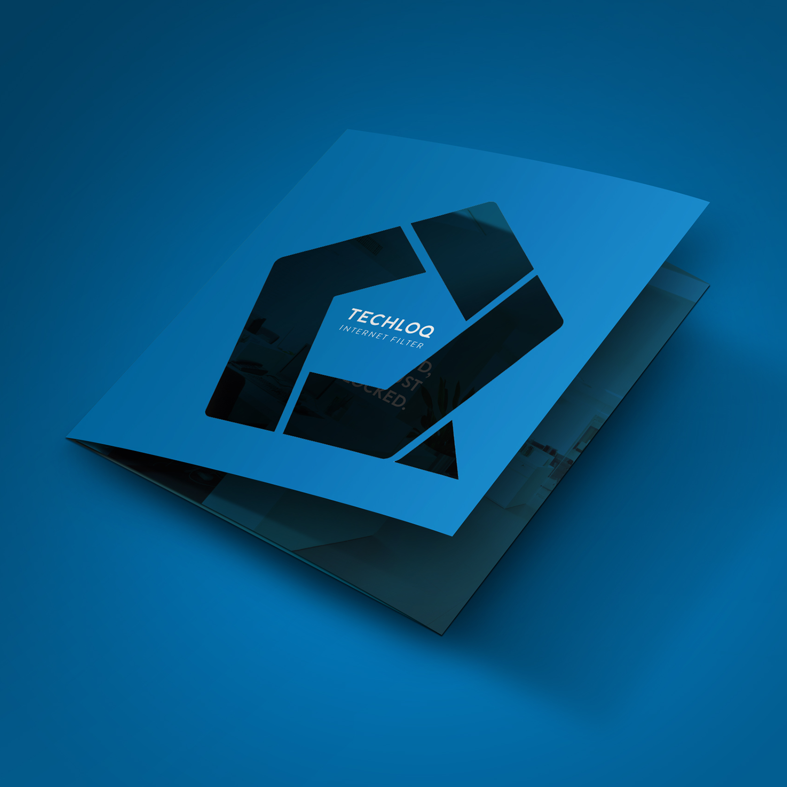
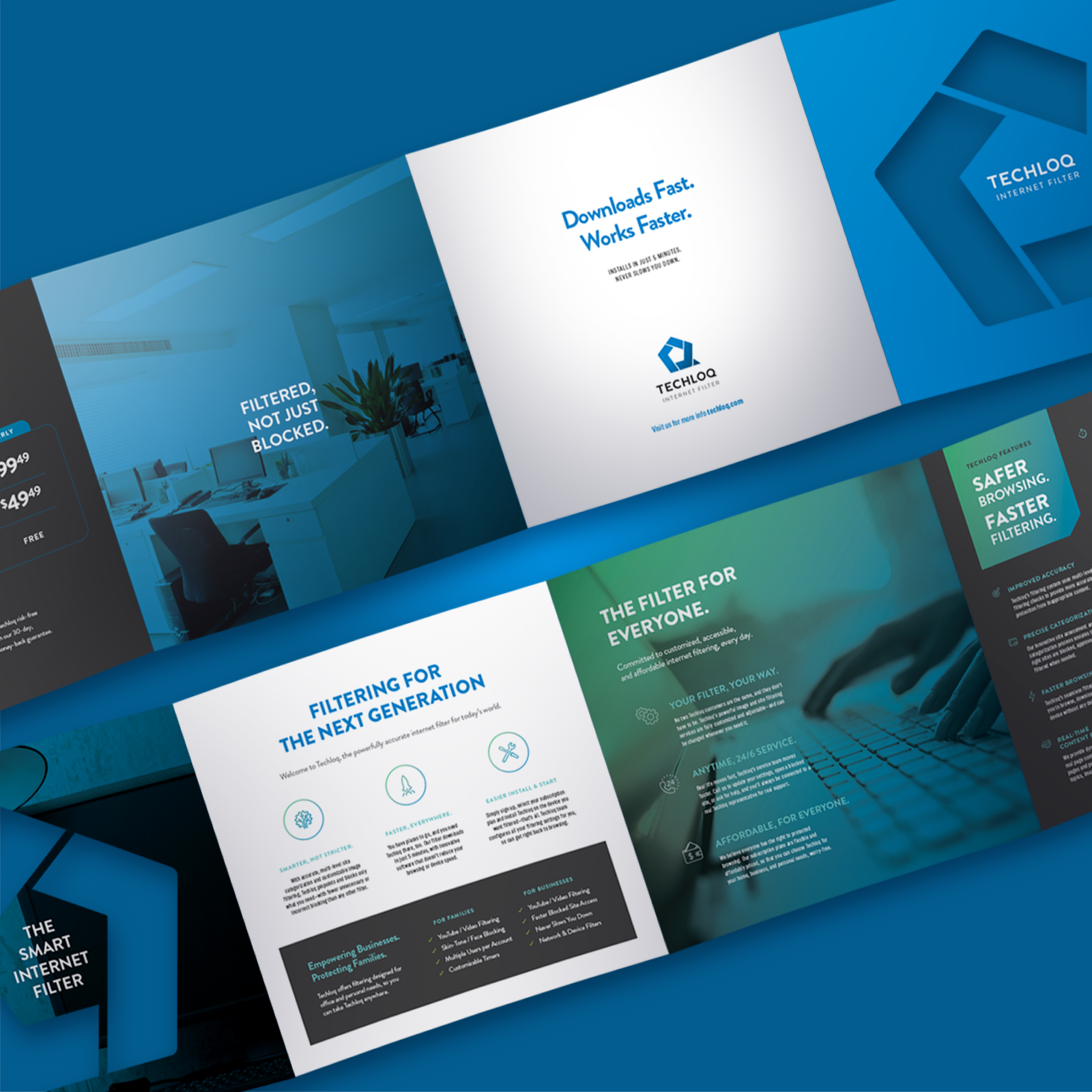
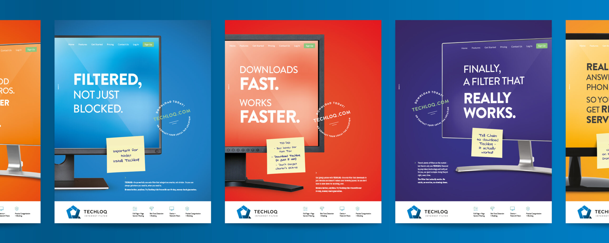
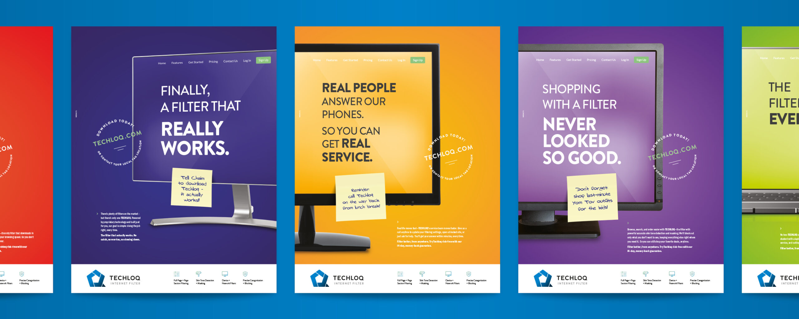
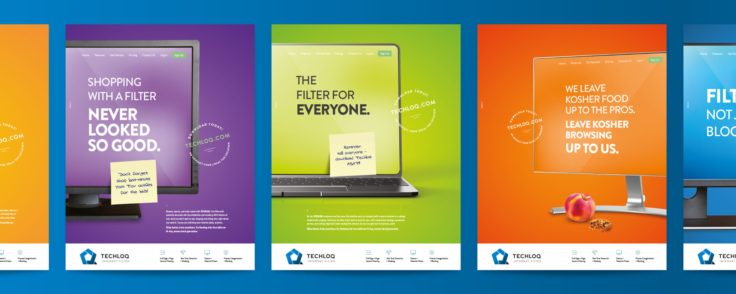
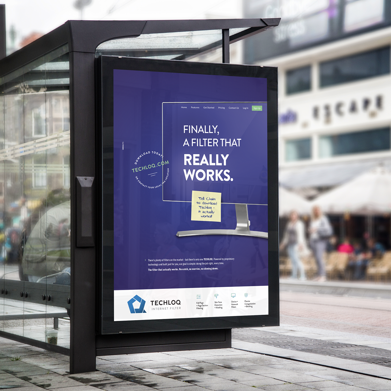
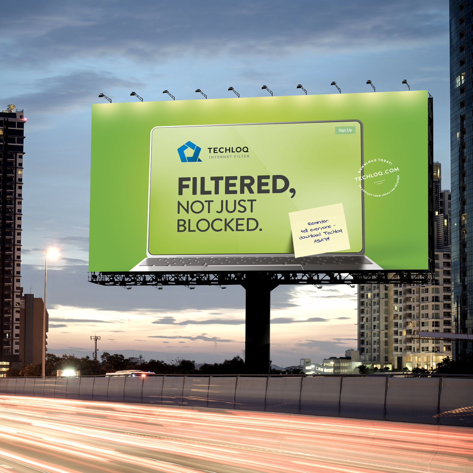
Techloq
Techloq is a computer filter company designed to upgrade the clean internet browsing experience. Ahuva took their vision and communicated it with clear, linear design.
Senior designer, Ahuva Hoberman is not just great energy, she’s a marketing genius. She created this advertising campaign that appeared everywhere — from magazines to bus stops.
A logo is made up of many subtle details. With Techloq, our talented Shevy Gerdts tweaked their logo just enough to freshen it up while maintaining their brand identity. At first glance, the before and after may seem completely identical. You will notice the words are slightly closer together and the Q line has been straightened. Encompassing it all to one clean shape allows the eye to relax and gives it a cleaner and more modern look.
While print may work for a certain segment of their audience, adapting it to digital expands our scope and ensures that our message is communicated on all avenues.
![]()
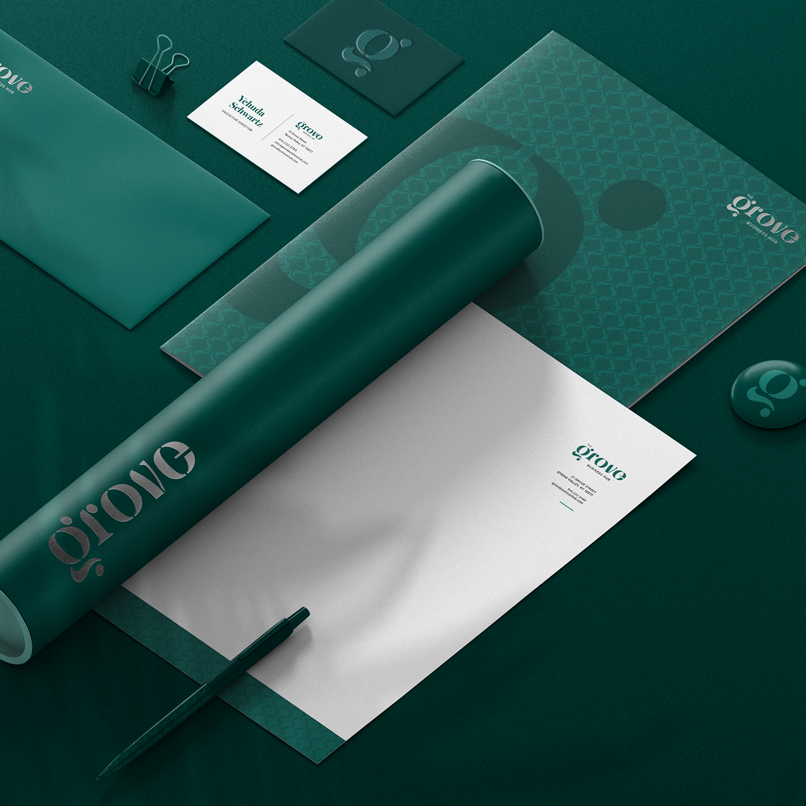
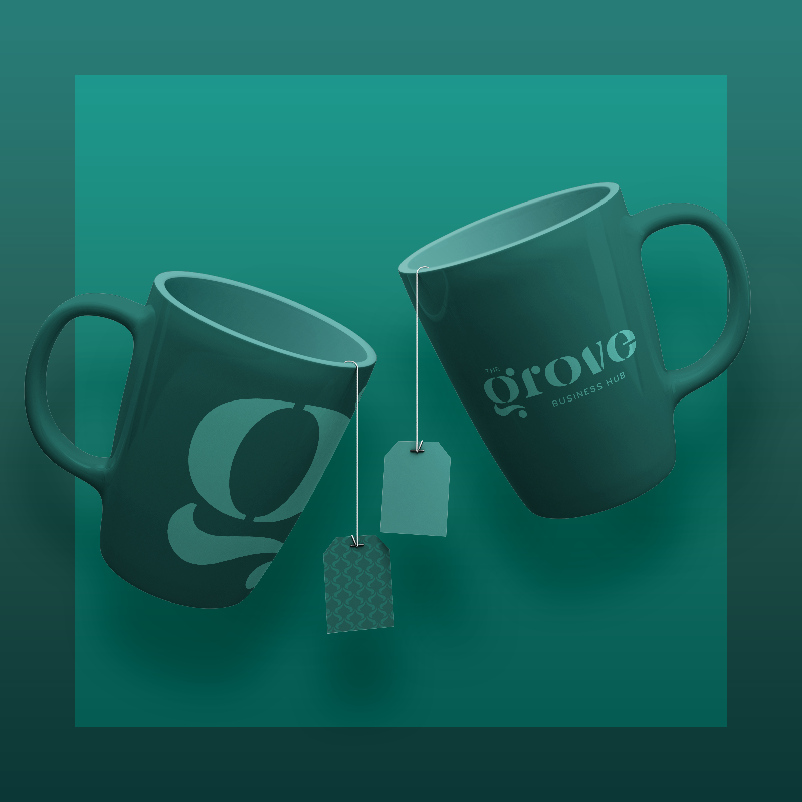
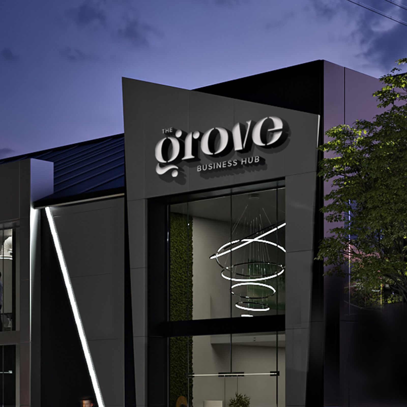
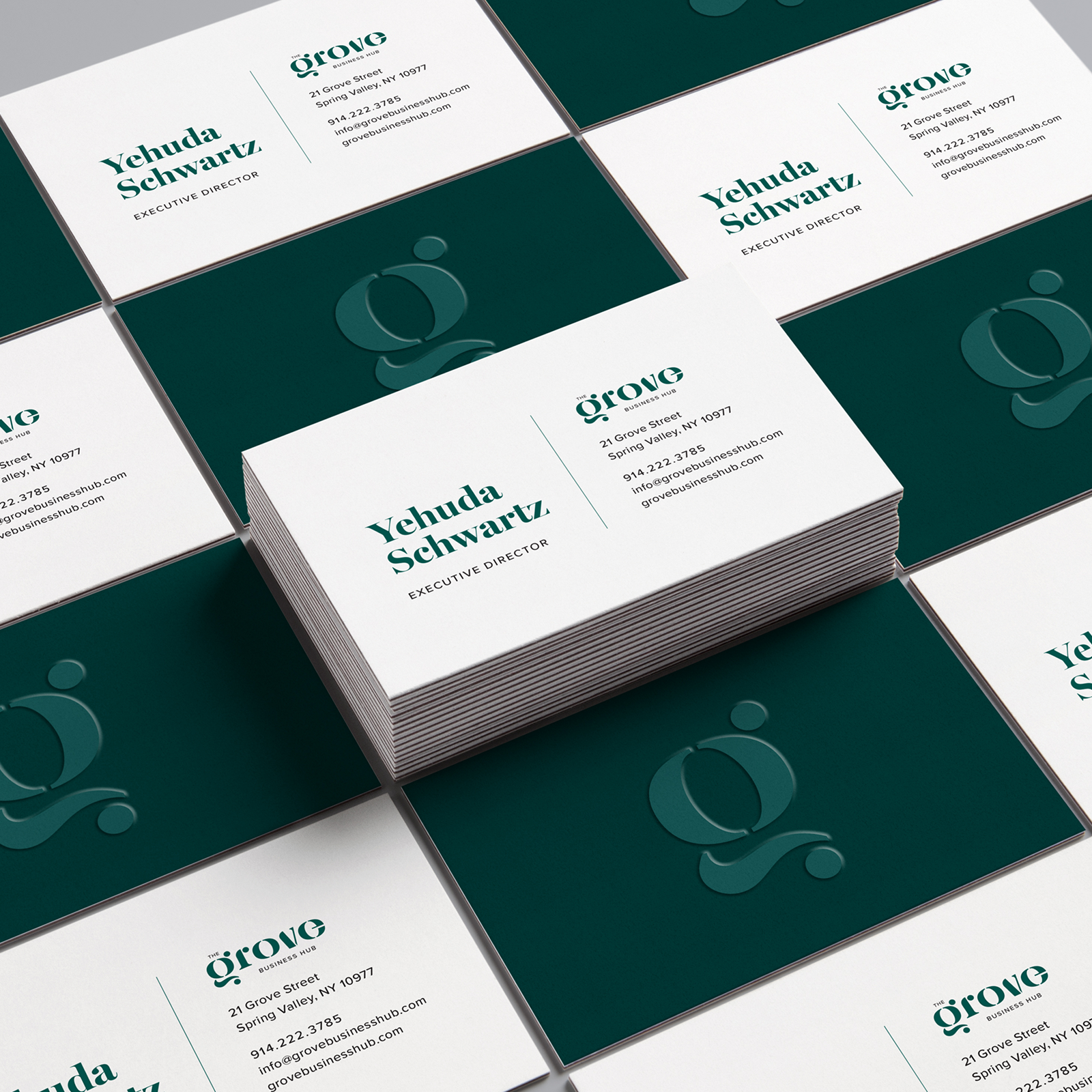
The Grove Hub
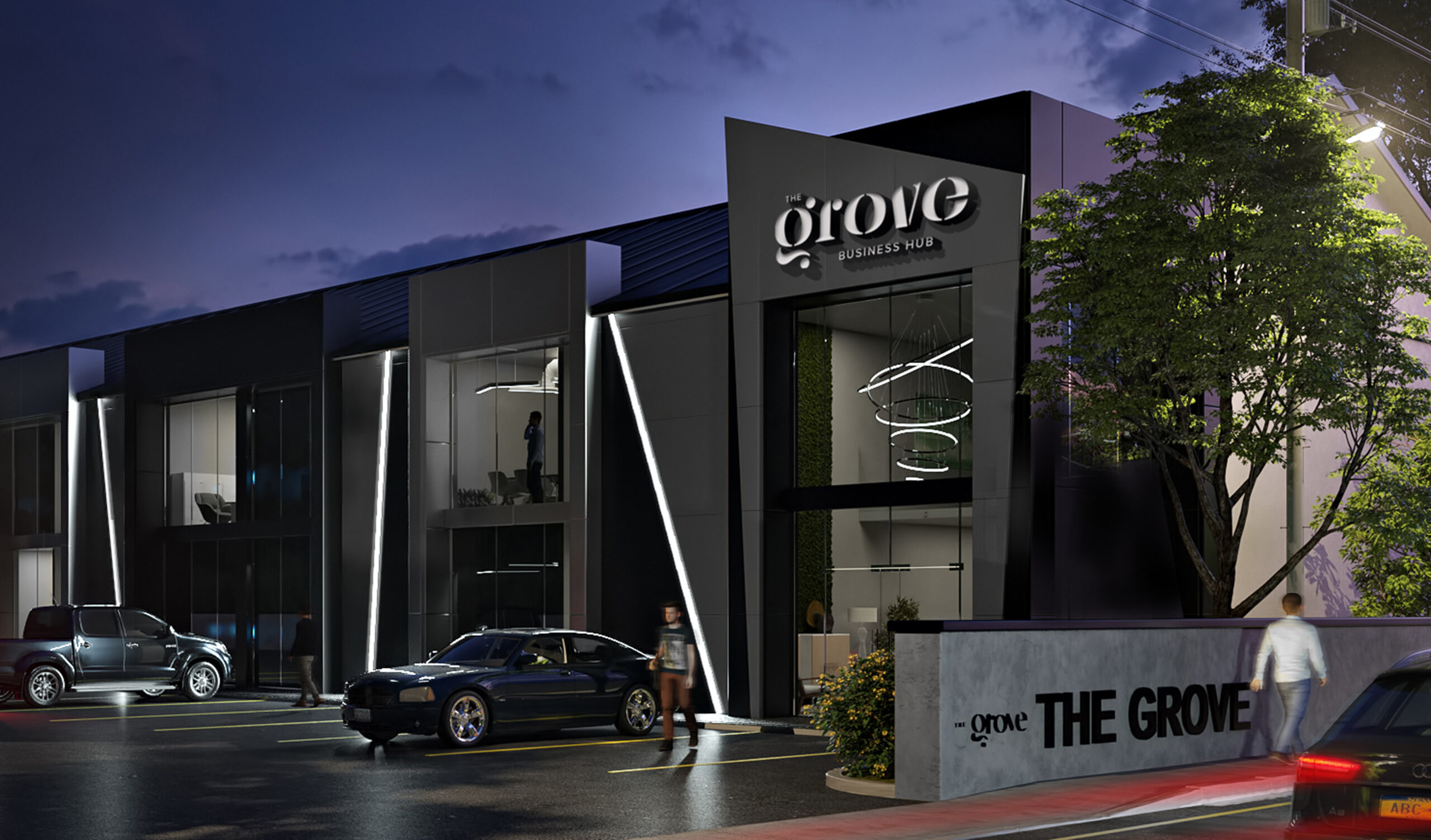
Client: The Grove
Mission: Branding
Goal: To improve the brand’s corporate and modern feel while incorporating the original brand identity.
The Grove is a premium office location giving companies an elite and luxurious space to conduct their business. We used a thematic Green color scheme to represent The Grove as a place of growing, development, and progression. The tag line “A Business Hub” was added to the brand to add to this idea of progress and advancement.
Branding a company from scratch is a challenge, but some designers might admit that branding a company from an existing identity is even more challenging. Our mission was to improve the brand’s look and feel while simultaneously preserving the original identity.
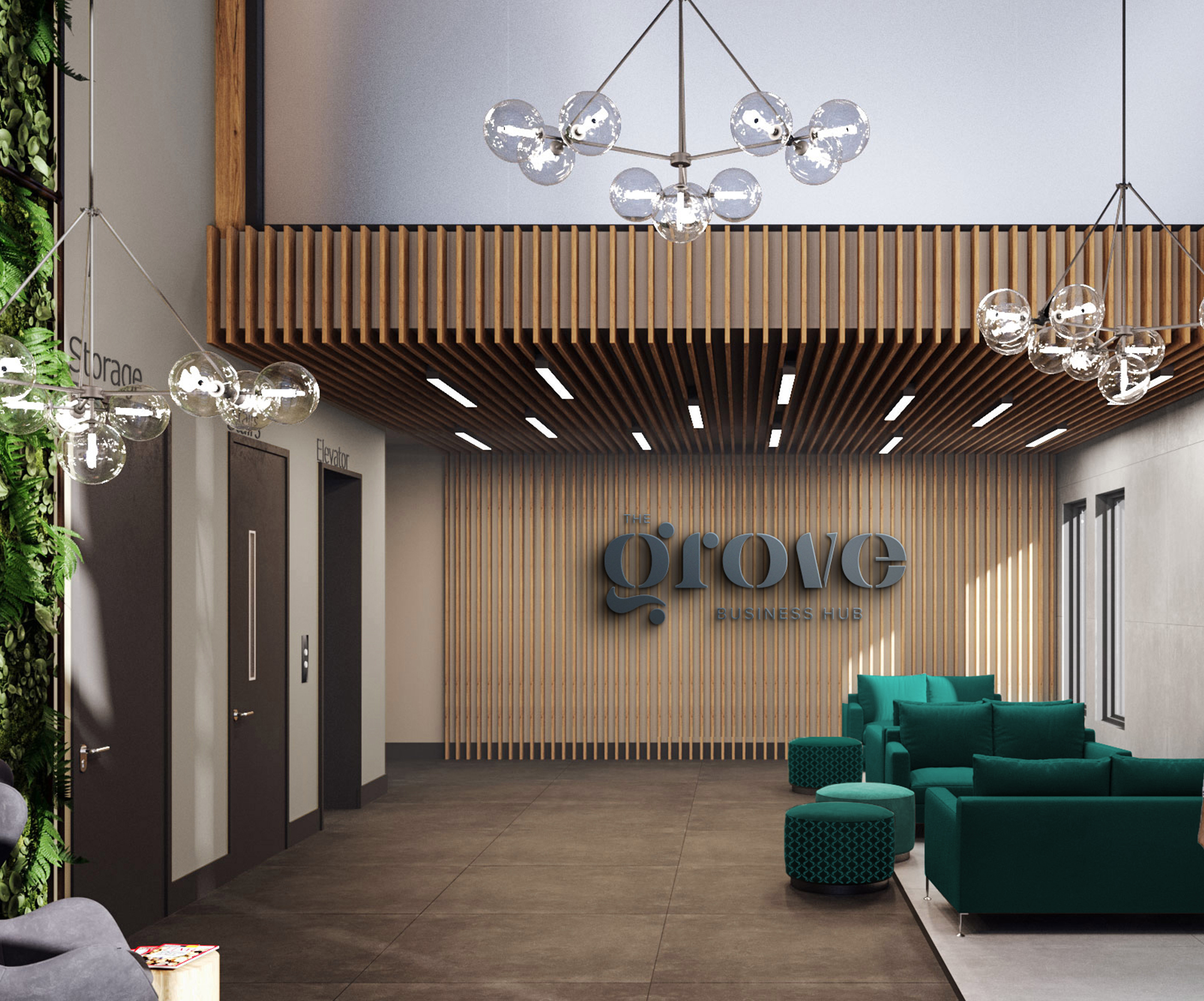
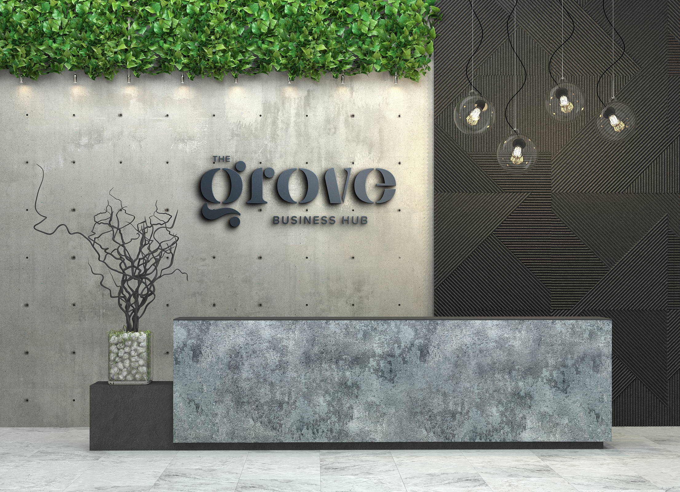
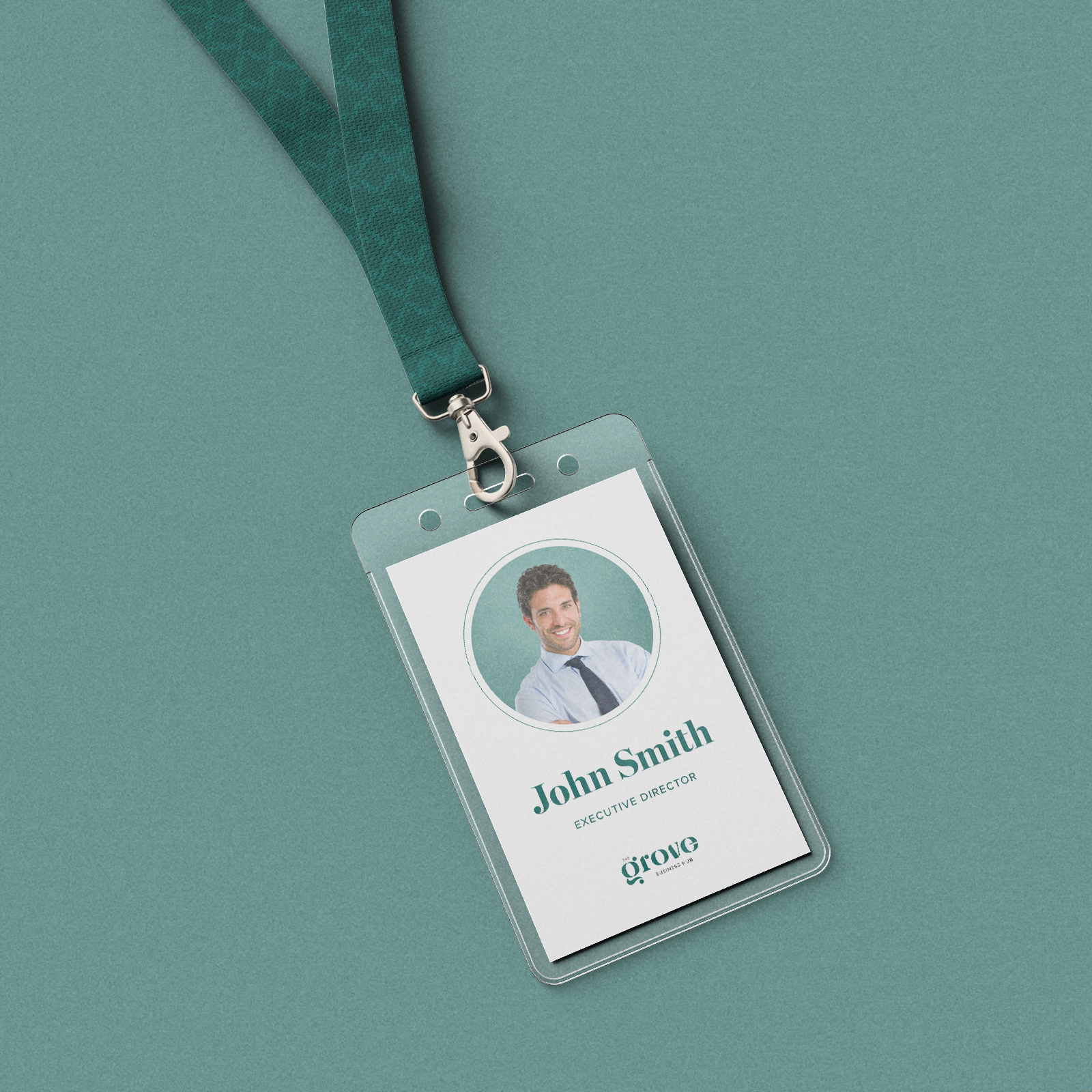
We used cutting-edge technology to create a website that was not only visually beautiful but also has a satisfying user experience. We incorporated the brand colors and elements and created an informational and interactive website with an aesthetically pleasing user experience.
Visit the website: www.grovebusinesshub.com

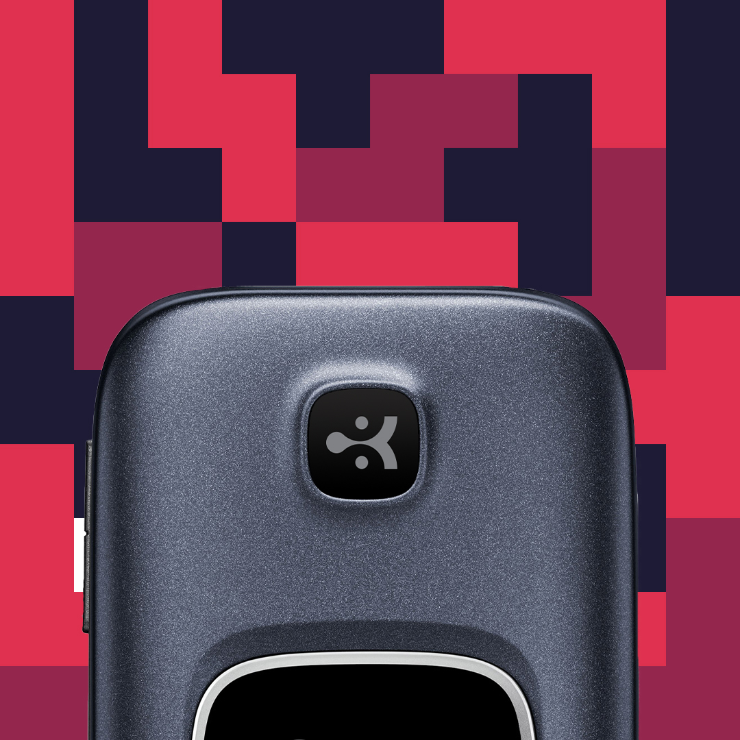
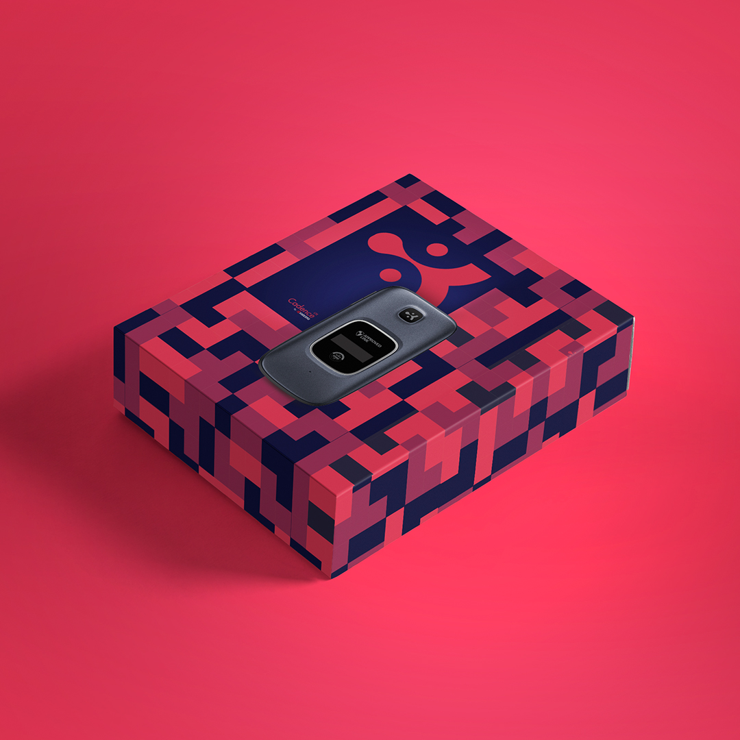
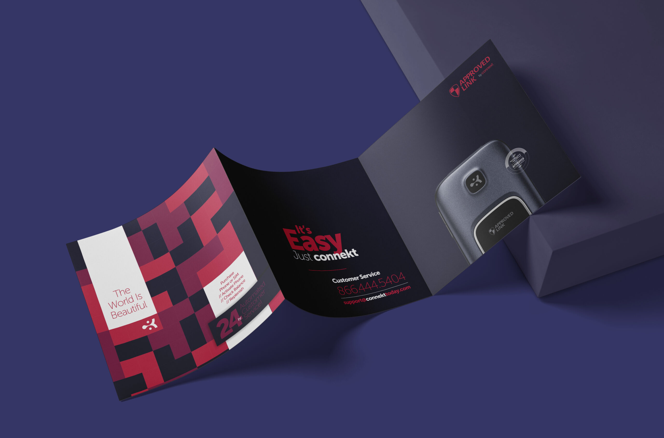
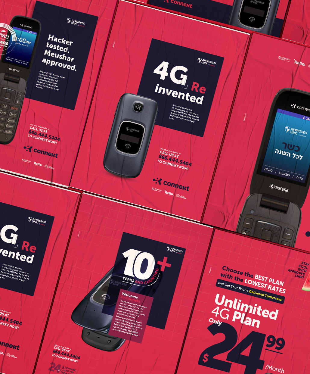
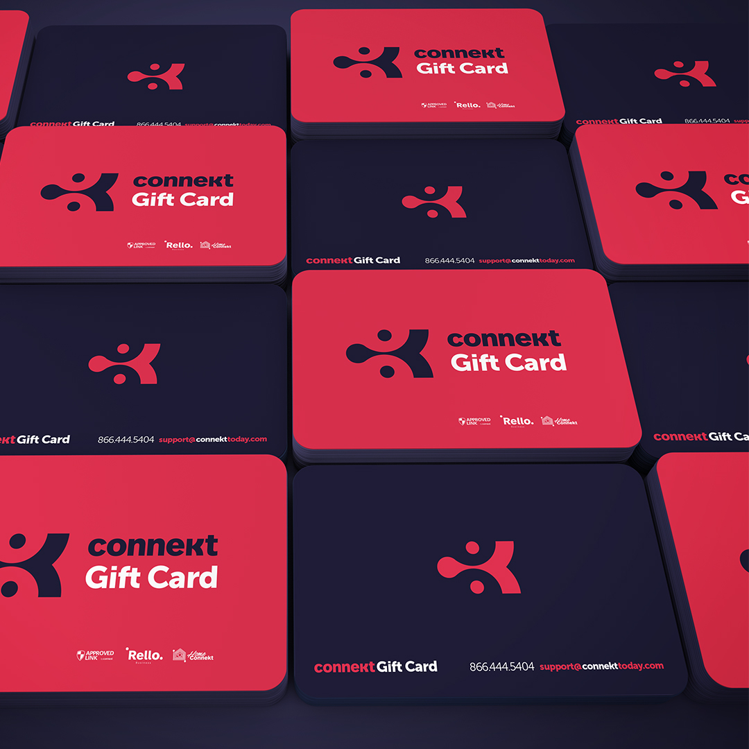
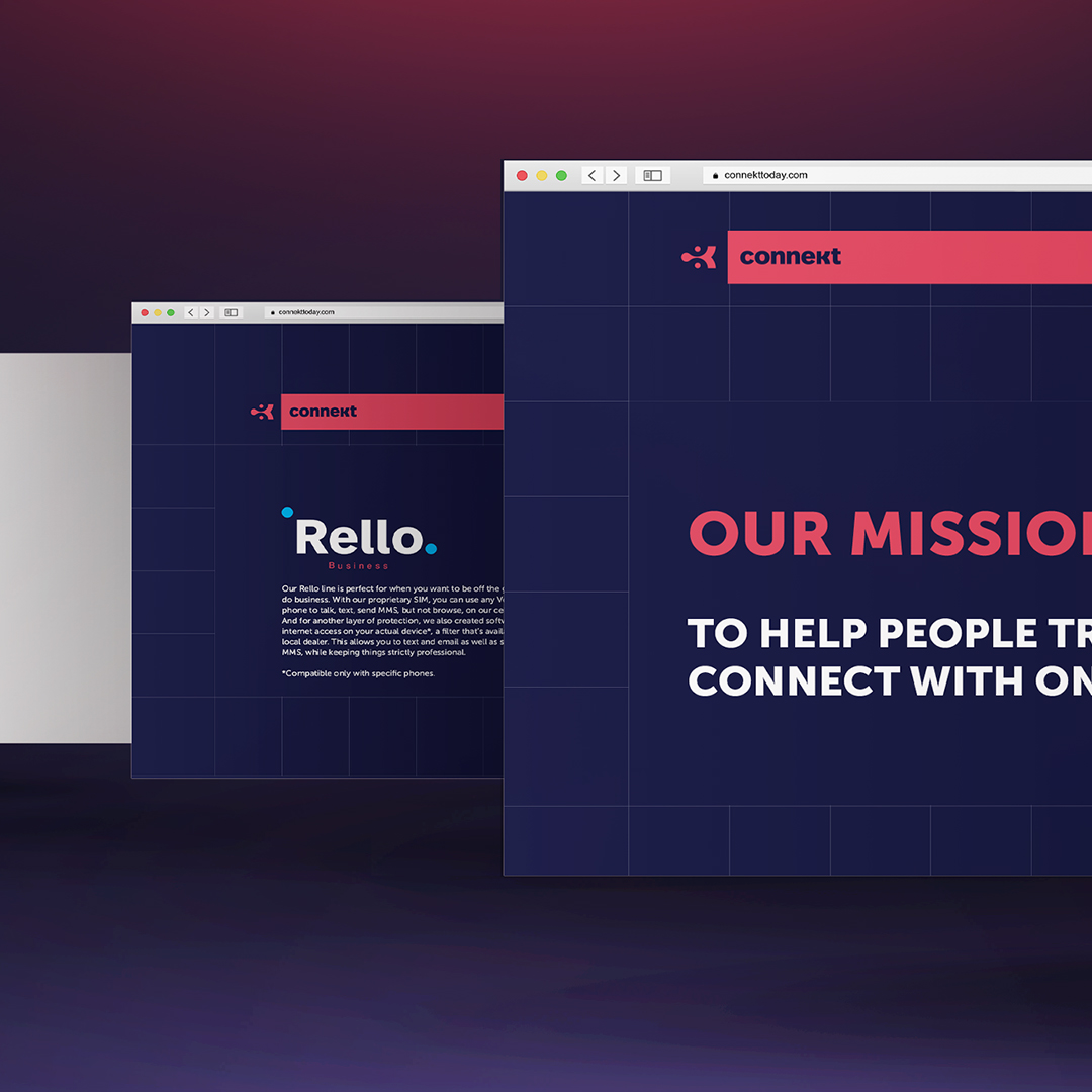
Connekt Branding
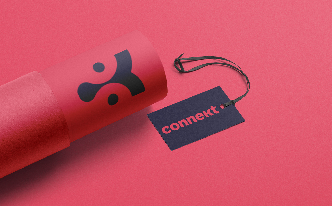
Connekt is a kosher phone and network company designed to reclaim the power of the simple connection.
When we were first approached by this client, we instantly knew what their name will be, and how their message would manifest in the branding. We met with these great people who were passionate about their cause. There was a spark, while they spoke about simple connection. Connection to the world around you, a husband to a wife, parent to child, brothers to sisters and friends. This spark is what inspired us while designing and developing the brand’s message and character.
Connekt isn’t simply a company that sells Kosher phones, it’s an idea. Connecting and appreciating the world, that exists beyond the screen.
Following that mandate, they invested in the best technology to make sure the kosher communication way is safe and smooth without any interference so that you can stay connected to the important things in life.
THE CHALLENGE
We were faced with a challenge. Apple is advertising its new iPhone with a triple lens. Foldable Smartphones are making their debut. Phones have now turned into fashion statements. How do we promote a phone that has nothing in it besides being a phone – a device to make calls. Yes, our target audience is in the market for a Kosher phone, but how can we persuade them to chose ours over the competitors?
THE SOLUTION
The answer was simple. Make it Attractive, Reliable, and clear lettering.
We created a memorable icon for the logo. The K. that makes the name of the brand: Conne’k’t and stands for the kosher word. But we focused on the “Connect to the world” message rather than the kosher, we did so by designing the K in a shape of something that is connected and you can’t disconnect it, the Drop shape captured the look of a drop that wants to stay connected to where it was.
We brought together strong and bright colors to reflect the hot product, as well as showing reliability, and trustworthy. The red represents the attractiveness of the product and the blue represents reliability and trustworthiness. As you see the brand is quite versatile and balanced you can use it in more a calm way by letting the red take control, you can give it more tone and voice by giving control for the blue, and then you can lit up the brand and emotions by the great mixture of both.
The pattern was inspired by the old Tetris game back then when we could see the pixels on our screen. Using this pattern awakes the nostalgia from when Tetris was simply a game, not an addiction. And with our sharp and strong colors, we even spiced it up.
The feedback we received was tremendous. Our campaign stood out and created a buzz. The colors and patterns left an impact. Most of all, the messaging came through. The idea of a simple connection to the world around us, our family and friends is what carried on.
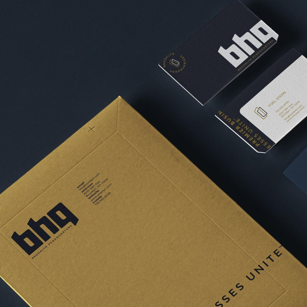
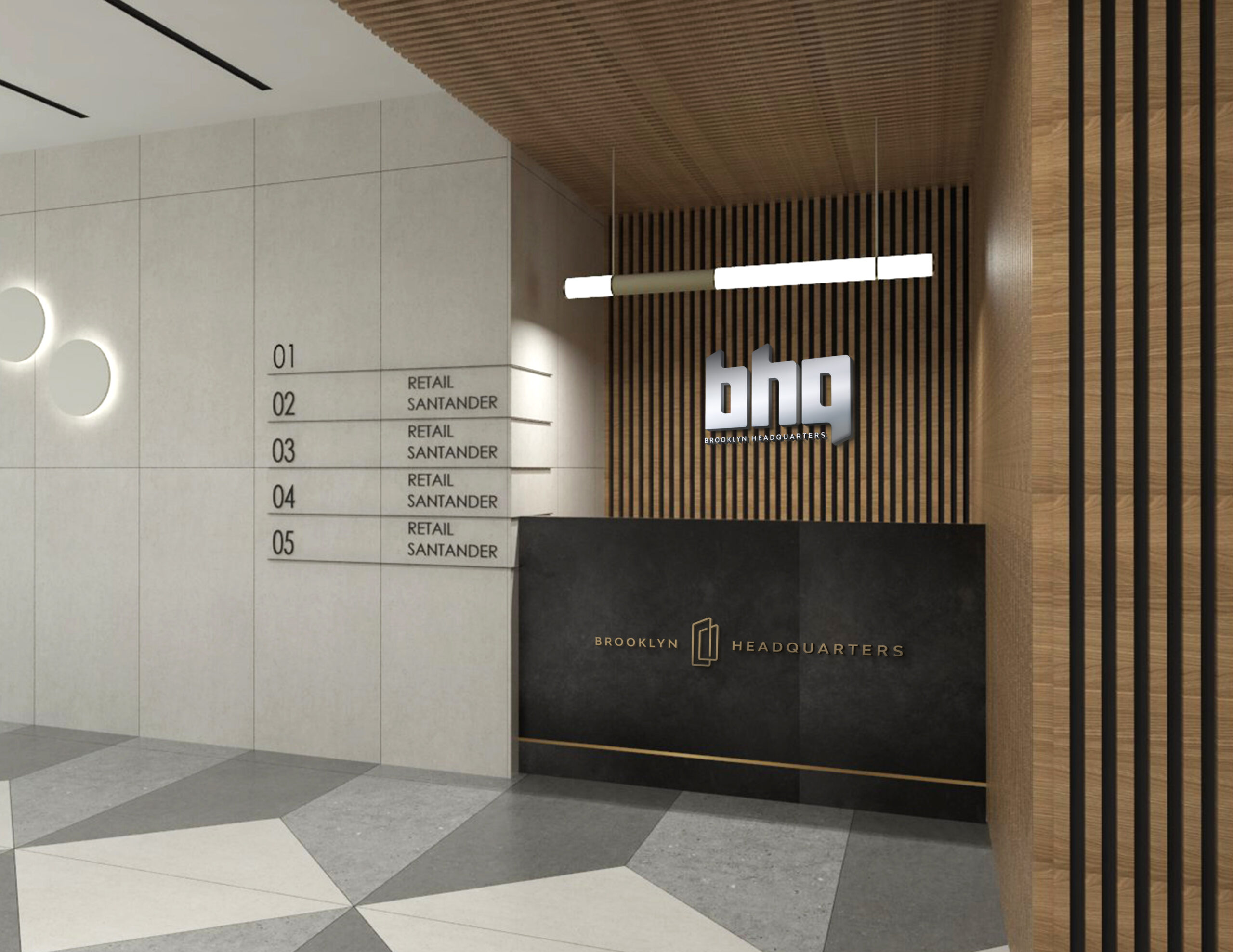
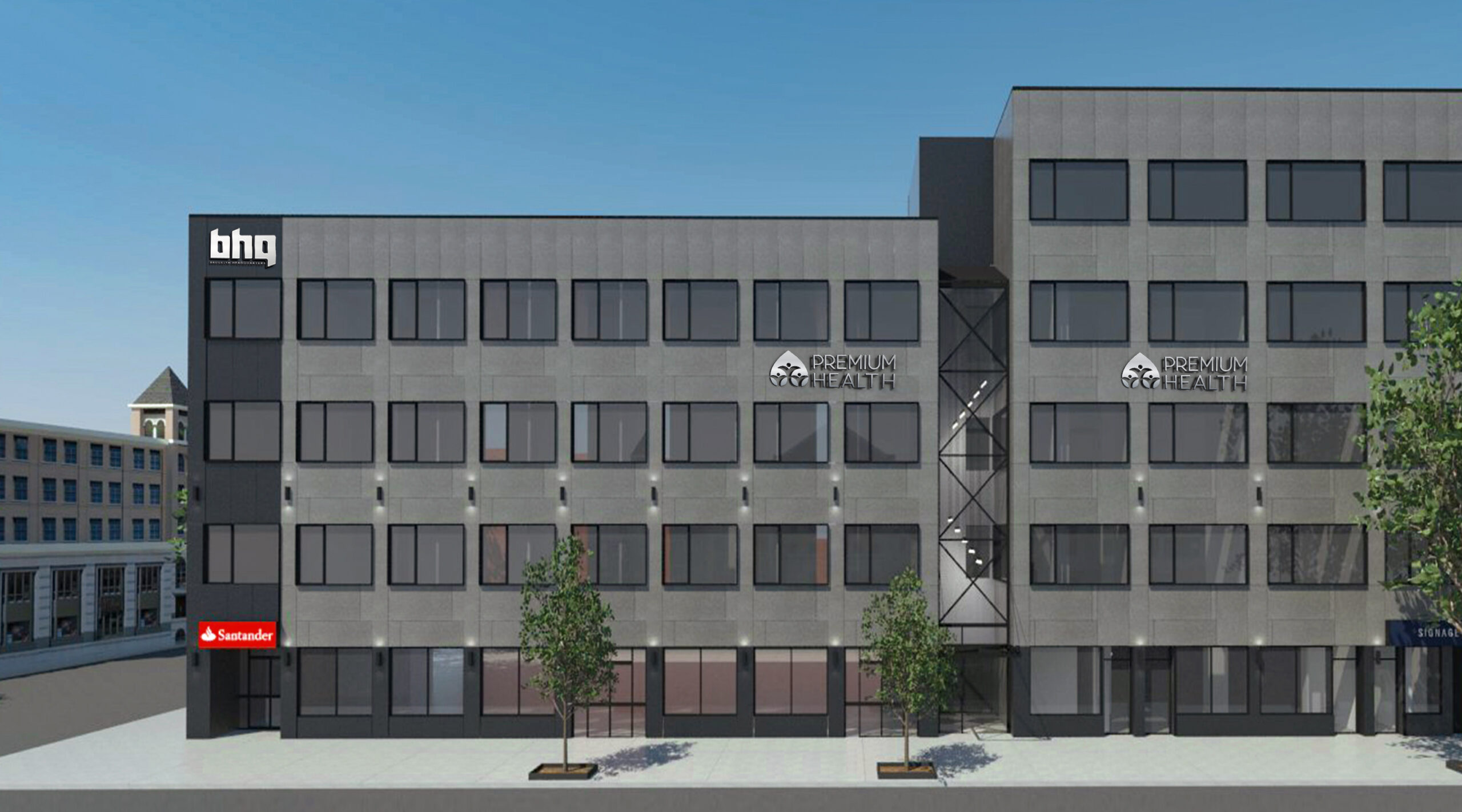
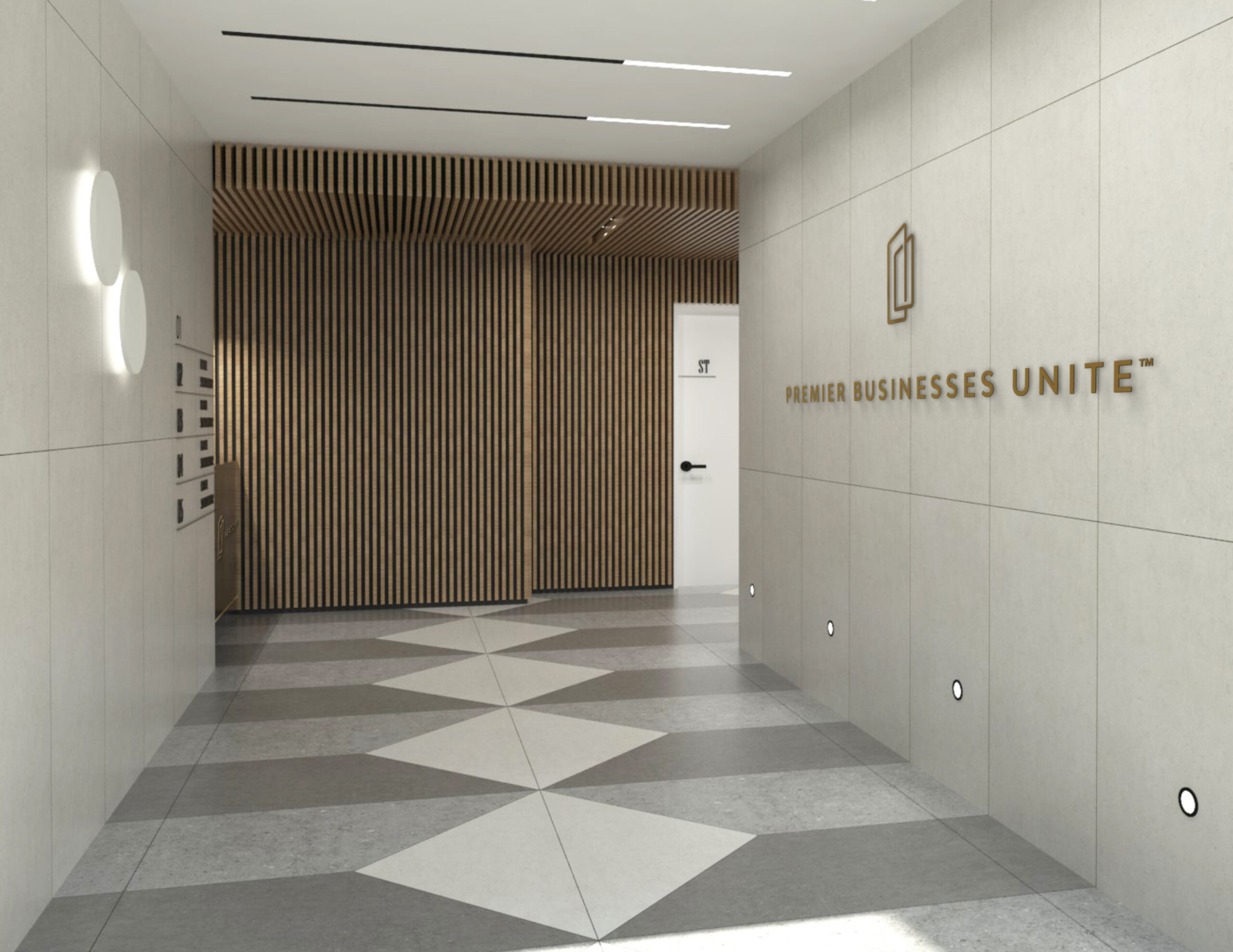
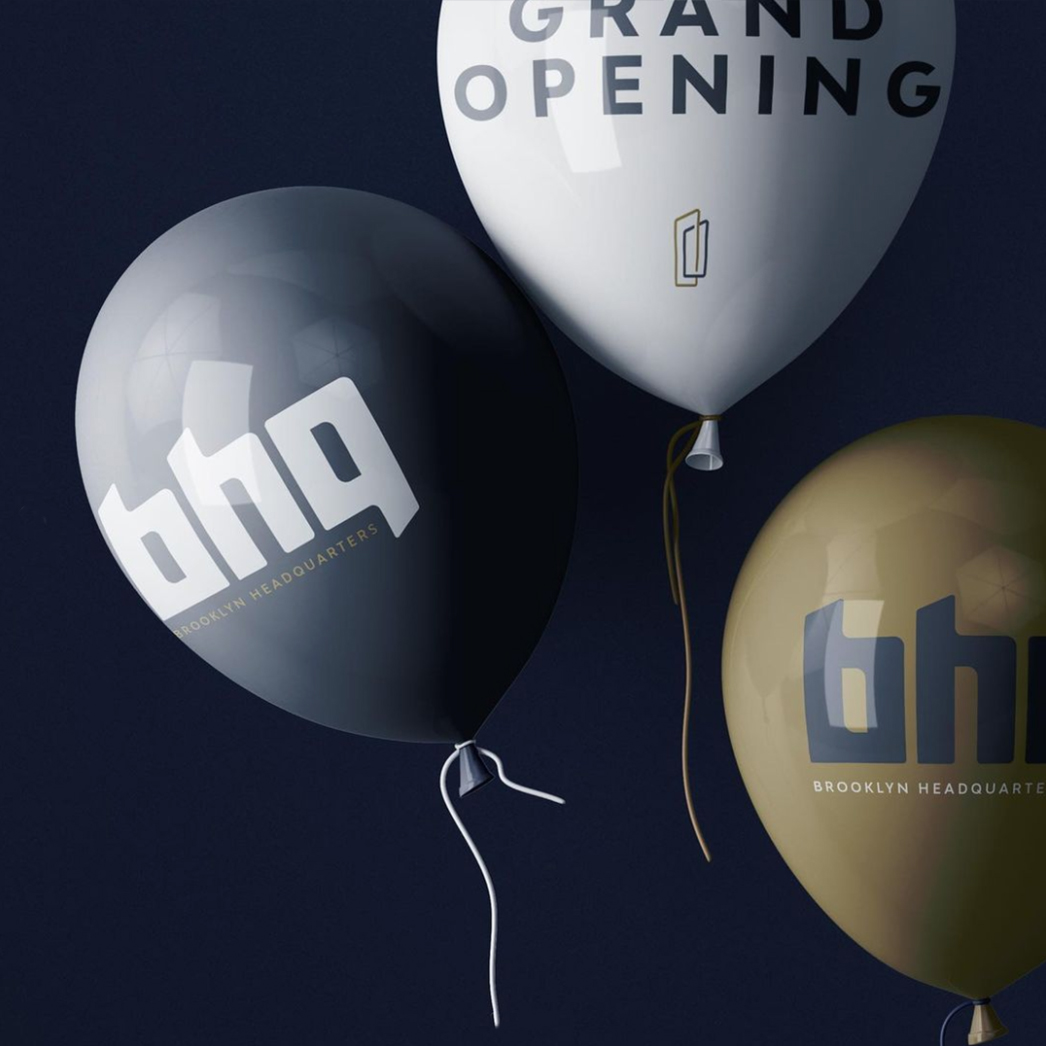
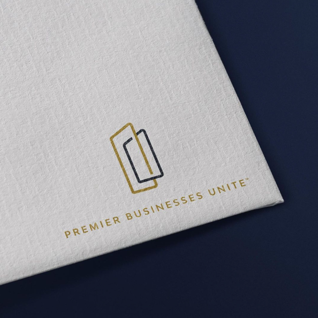
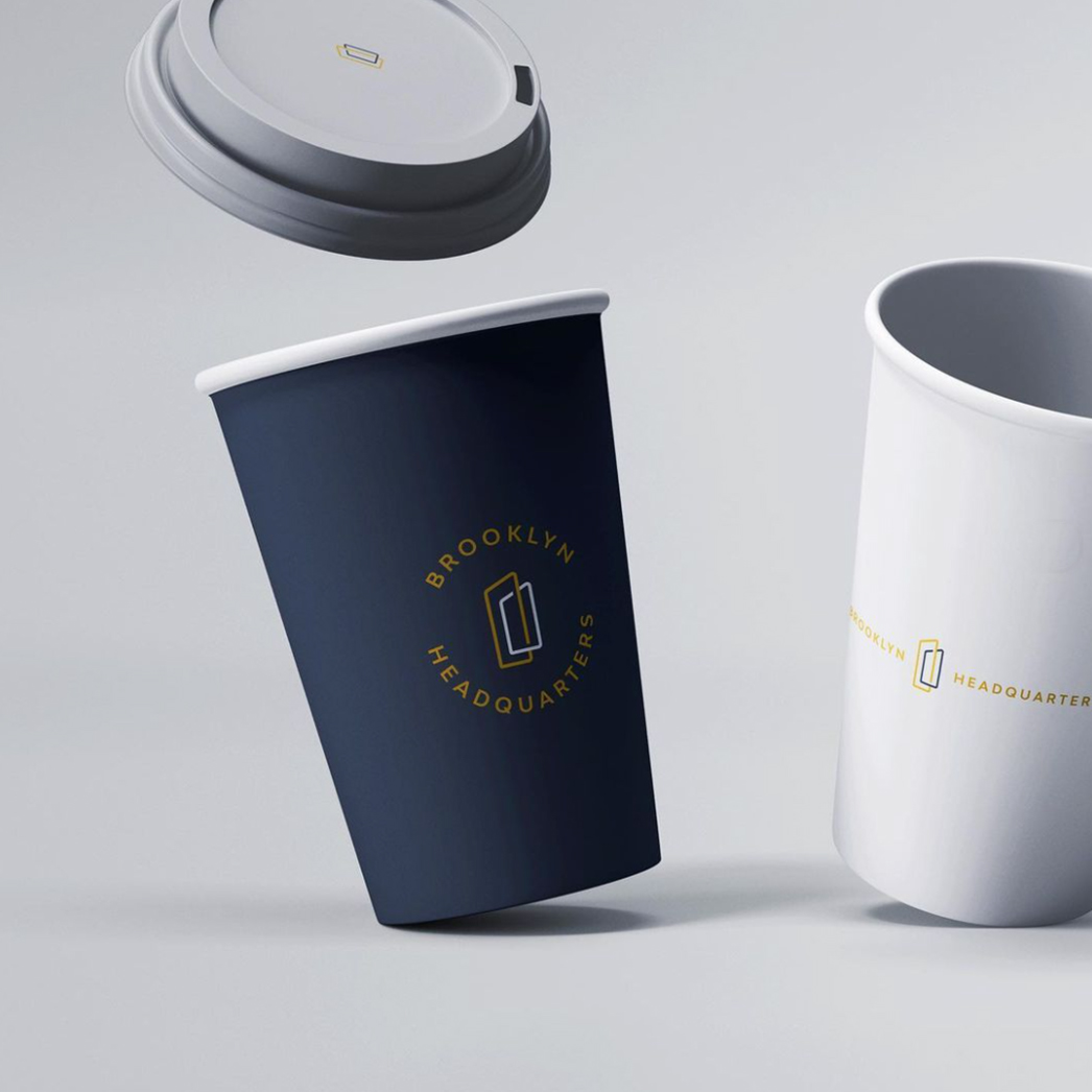
BHQ Branding
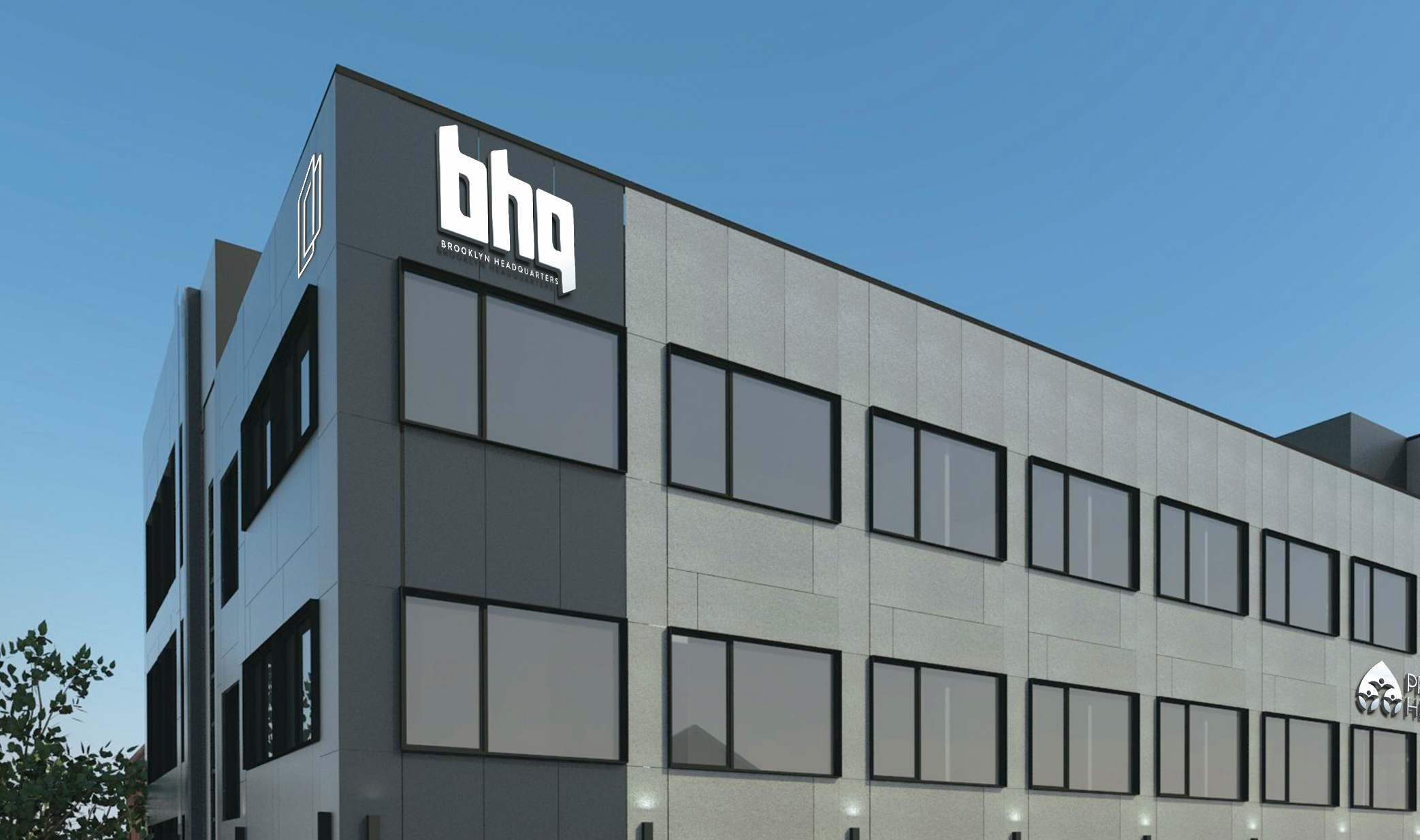
Meet BHQ (Brooklyn Headquarters) a new state-of-the-art modern building that hosts a variety of businesses, from retail to medical to corporate.
Mission: To create and develop a brand identity that conveys the brand’s story in a clear and compelling fashion.
Bold lettering characterizes this logotype of Brooklyn headquarters. The striking impression of the font allows it to stand on its own, almost an icon in and of itself.
For the brand colors, we used a base of deep blue, a true gold accent, and an off-white contrast. The deep blue gives a grounded and sophisticated feel and injects gravitas into the brand. Elegant and rich, the gold also matches the interior decor of the iconic BHQ building. The off-white provides contrast, highlighting the previous two colors.
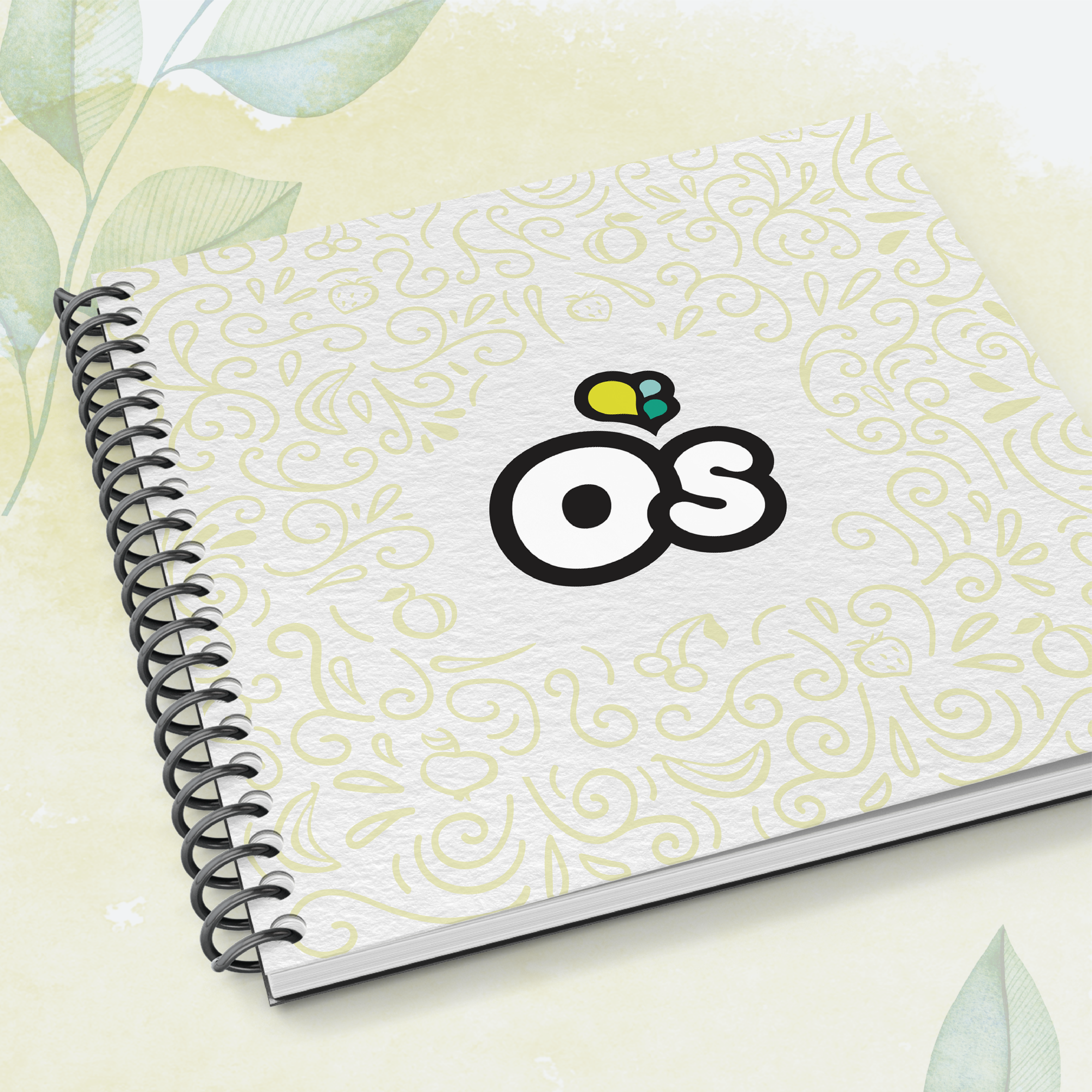
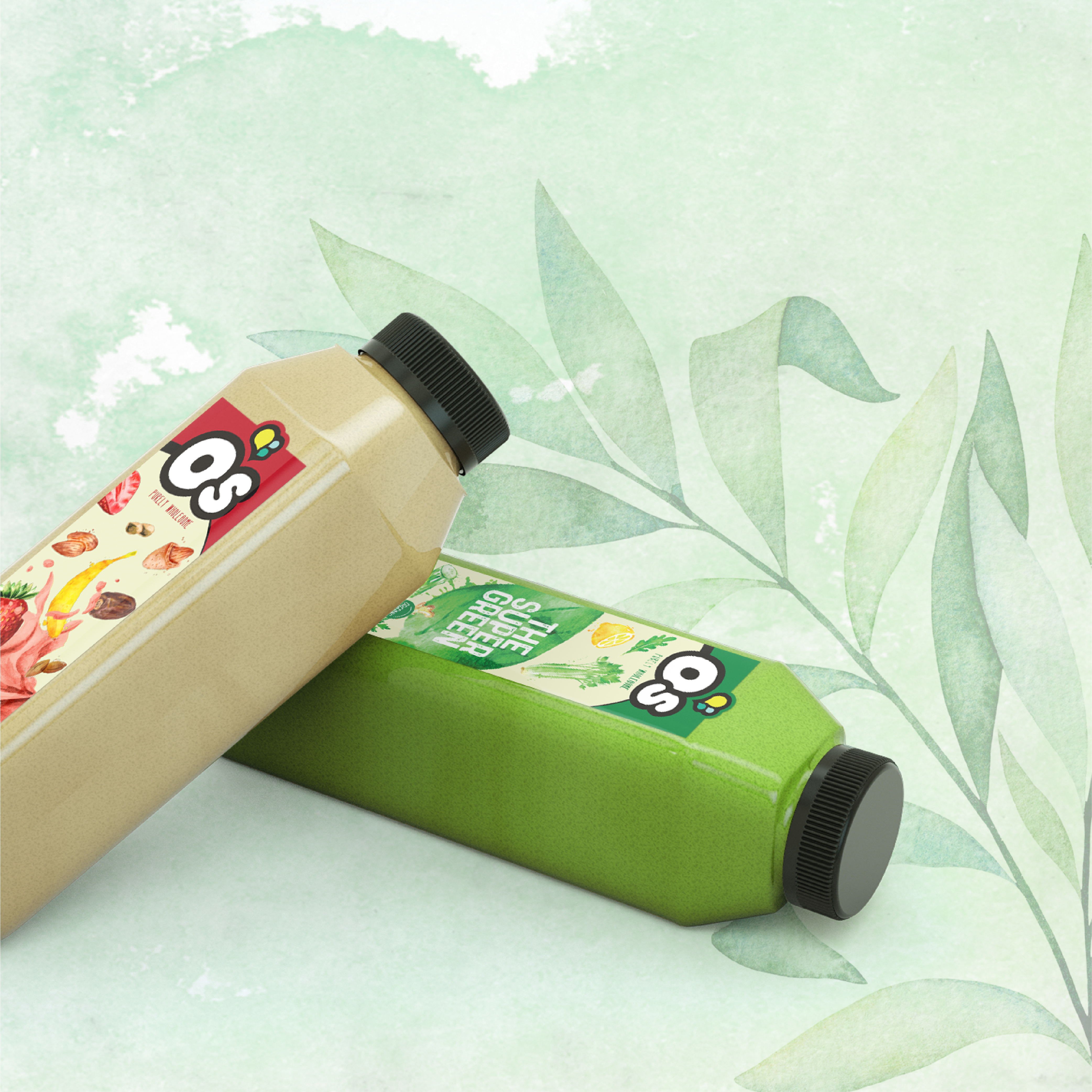
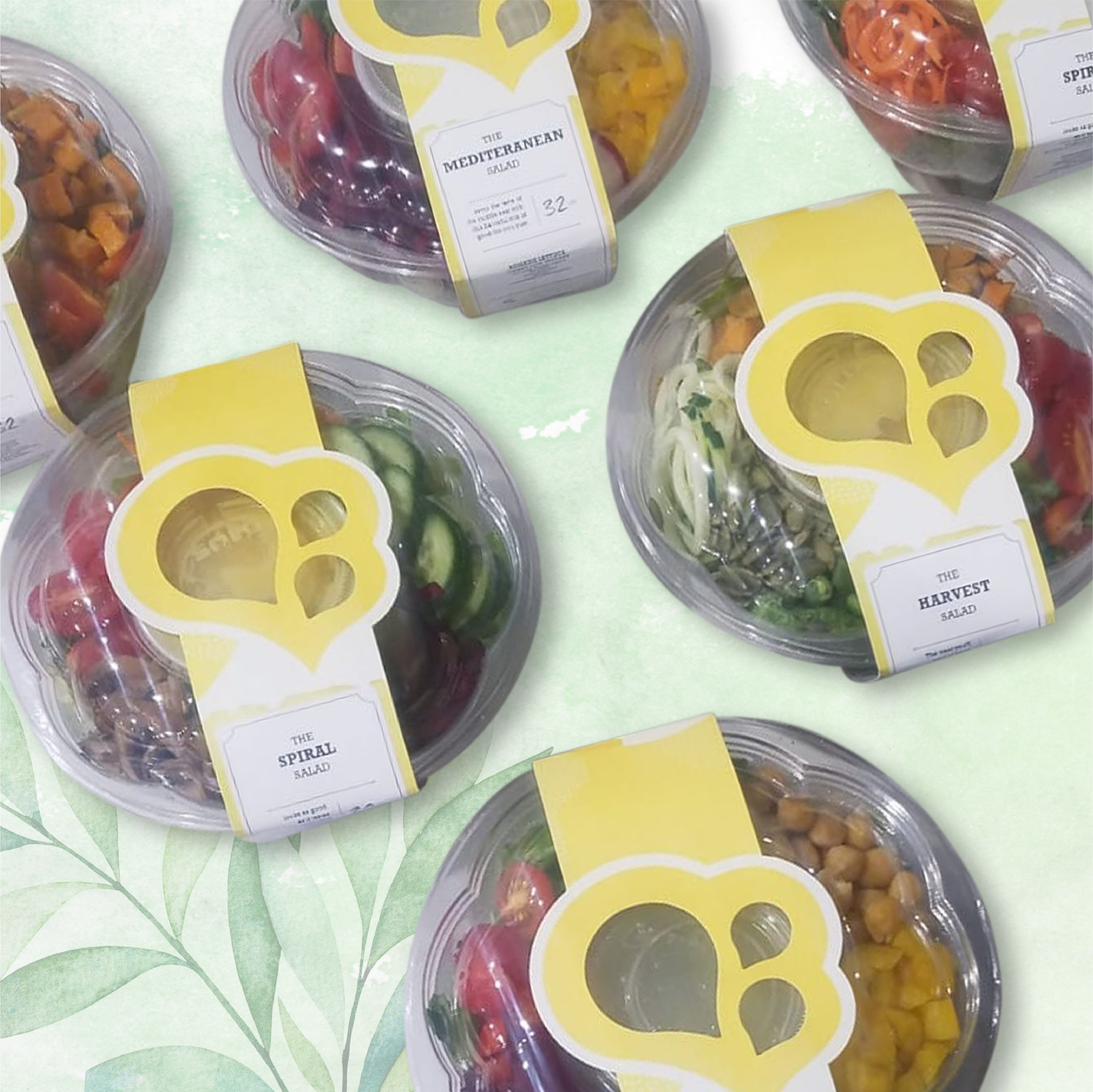
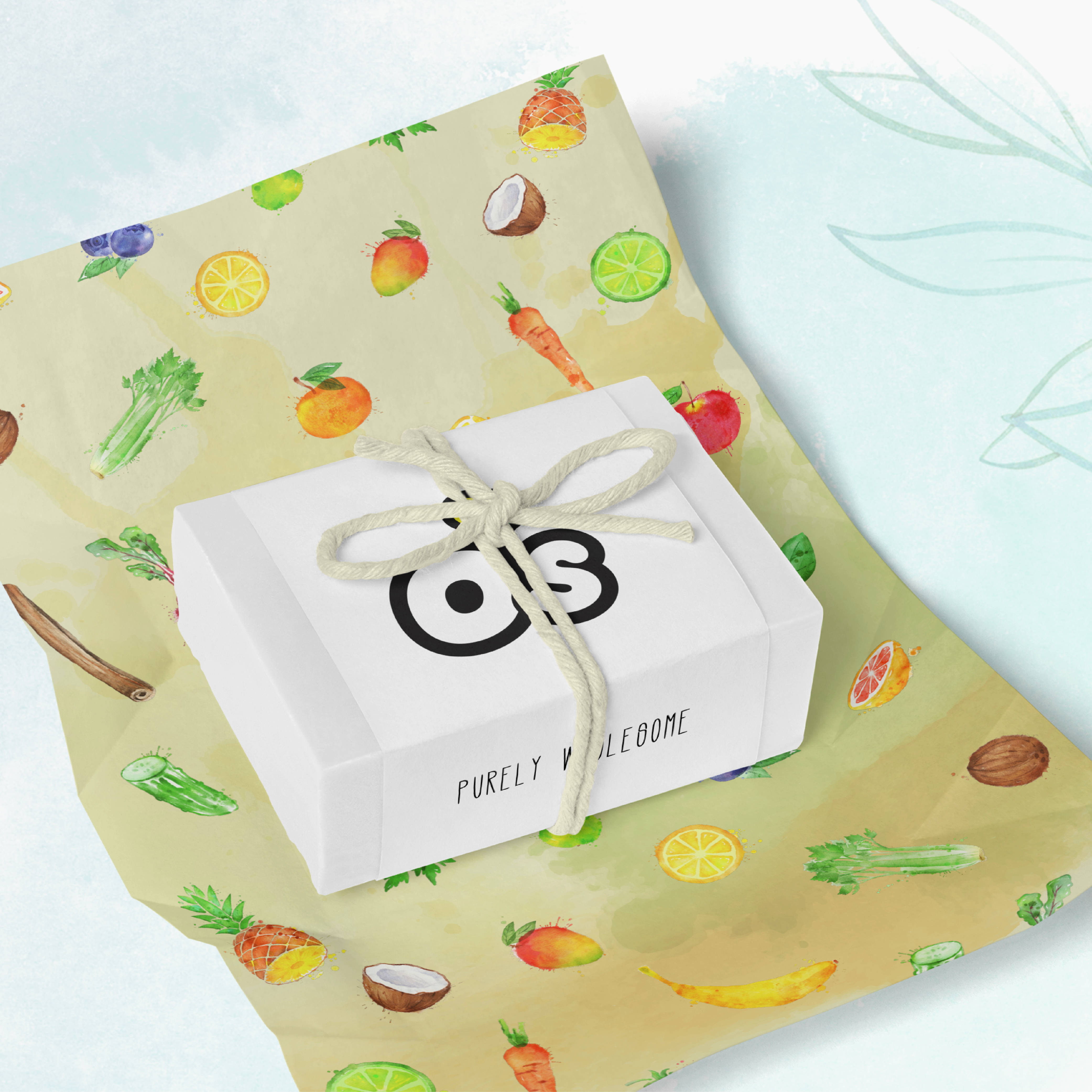
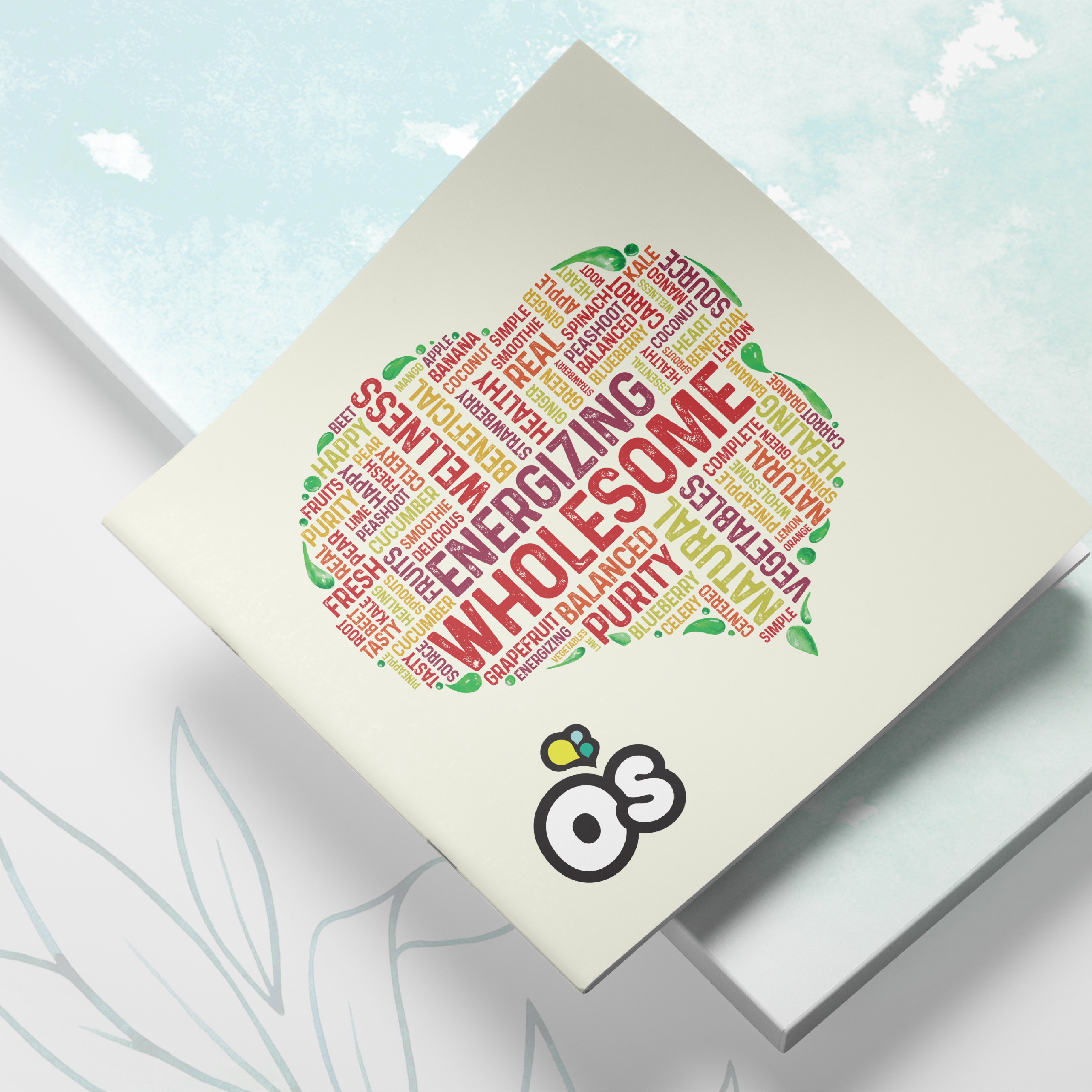
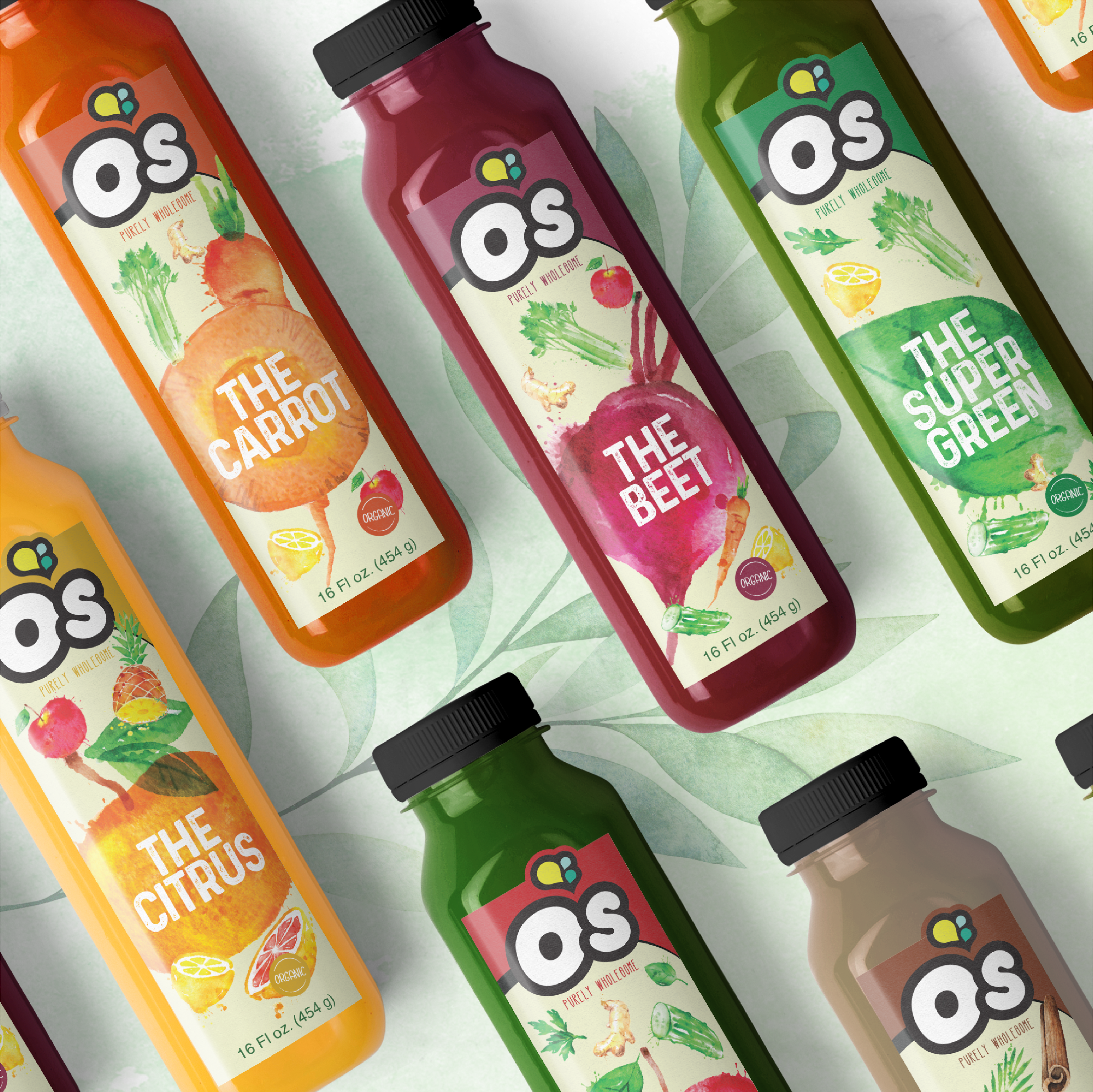
O’s Natural
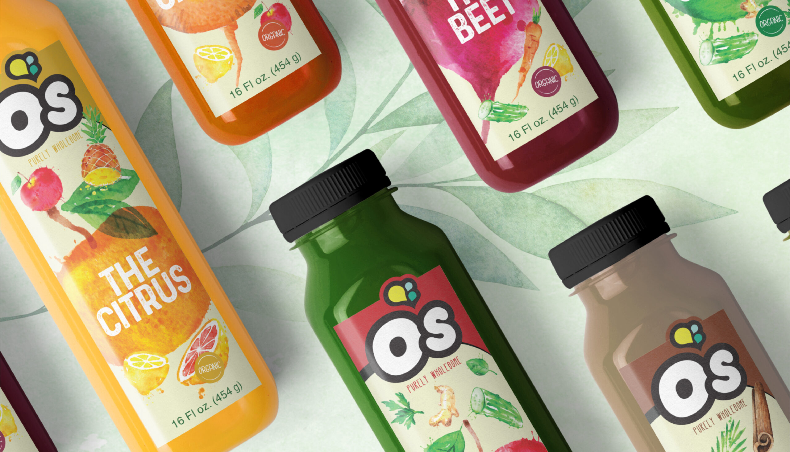
Client: O’s
Mission: Branding and Packaging
Our amazing Senior designer, Shevy, envisioned and created the branding of O’s while our other incredible Senior Designer – Rivky, constructed and designed the Packaging. O’s is all about harnessing and rejuvenating powers in fruits and vegetables to boost consumer’s daily living. O’s is proud of its all-natural products with their simple ingredients. Perfect for health-conscious individuals looking to lead a wholesome, balanced lifestyle, O’s is quite simply, Purely Wholesome.
To deliver a natural design, Rivky incorporated watercolors on all brand material to create a natural and soft design. Key brand words such as energizing and wholesome were collected to form a word cloud in the shape of O’s icon.
The die-cut on the juice and salad packaging is custom-made to accentuate O’s icon. To give an organic and transparent feel, Rivky incorporated images of each ingredient into the packaging. Therefore, when a consumer picks up a product they know exactly what they are putting into their body. Rivky’s challenge with this concept was to subtly incorporate every ingredient without making the packaging look busy or unaesthetically appealing to the eye of the consumer. She achieved this through the use of watercolors, to soften the overall aesthetic- still giving the information while Maintaining the fresh feel of the brand.
![]()