Client: O’s
Mission: Branding and Packaging
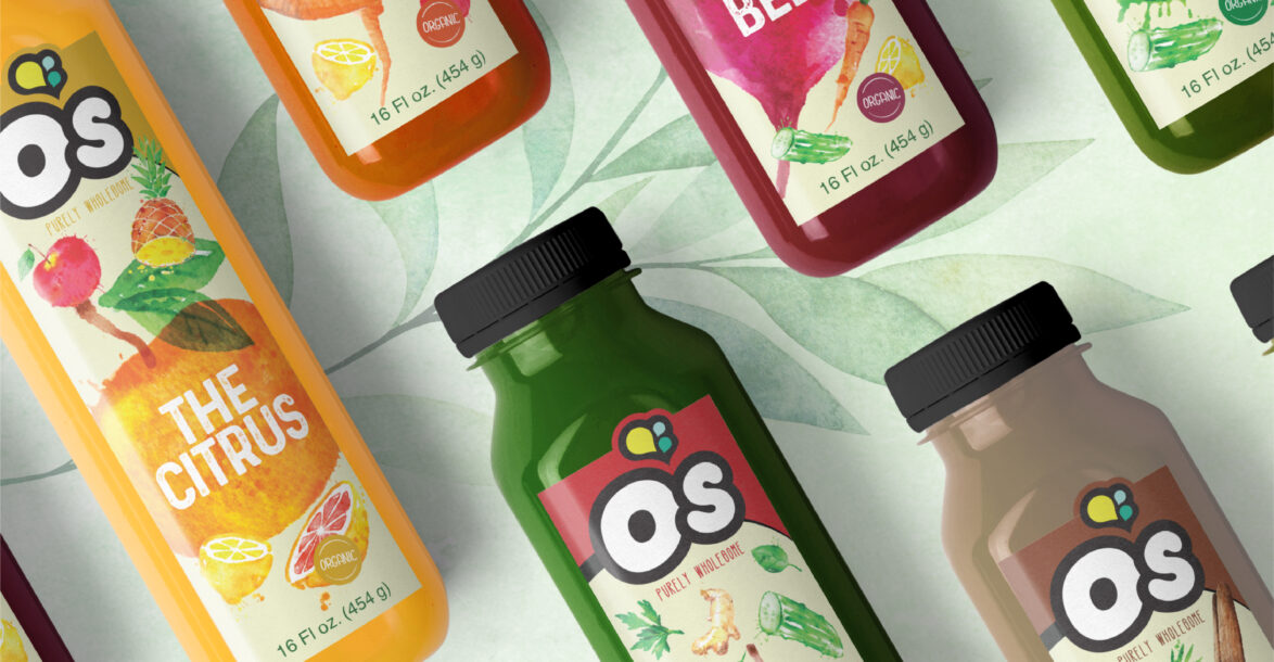
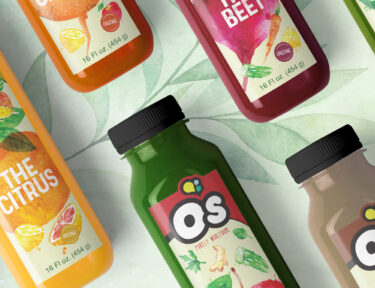
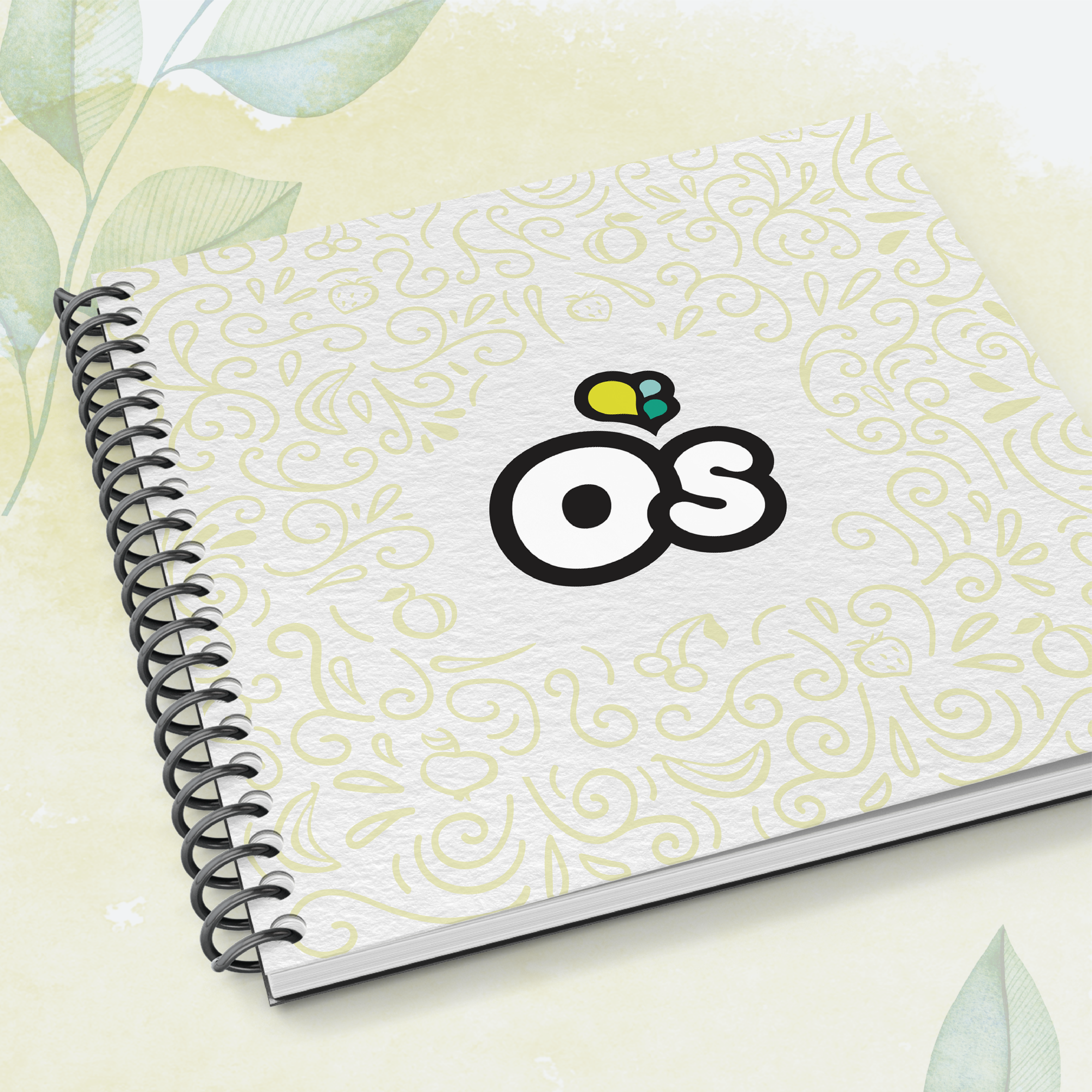
Our amazing Senior designer, Shevy, envisioned and created the branding of O’s while our other incredible Senior Designer – Rivky, constructed and designed the Packaging. O’s is all about harnessing and rejuvenating powers in fruits and vegetables to boost consumer’s daily living. O’s is proud of its all-natural products with their simple ingredients. Perfect for health-conscious individuals looking to lead a wholesome, balanced lifestyle, O’s is quite simply, Purely Wholesome.
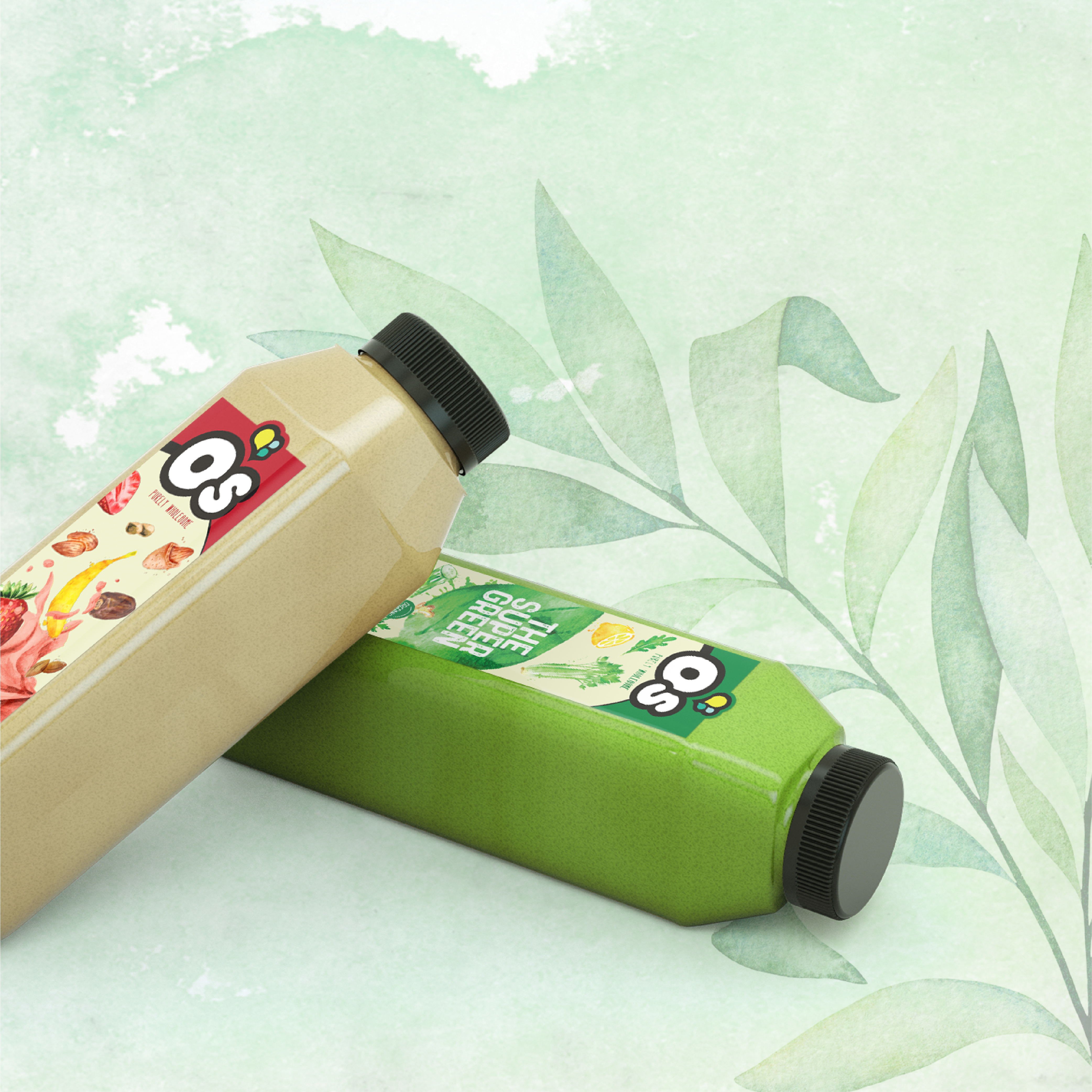
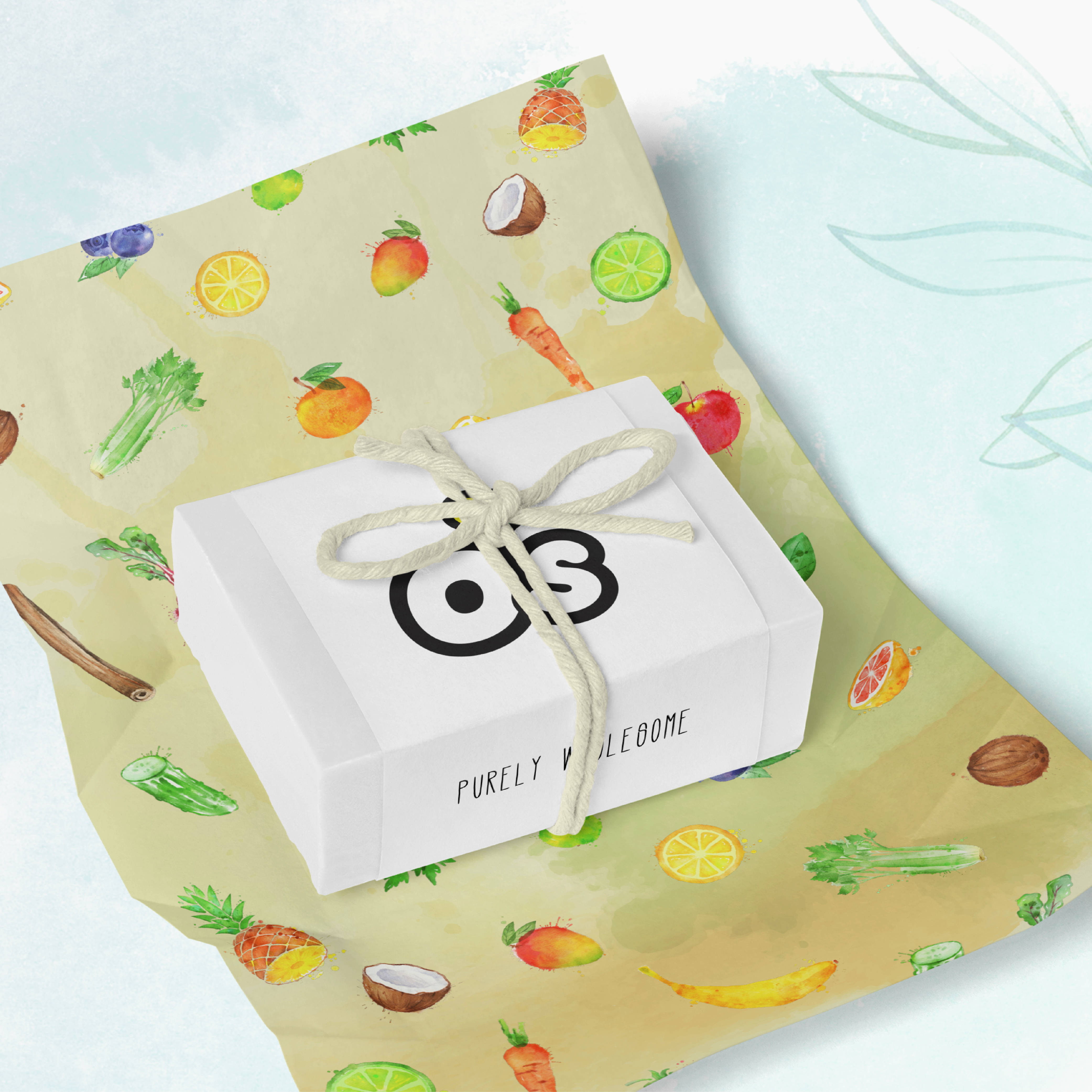
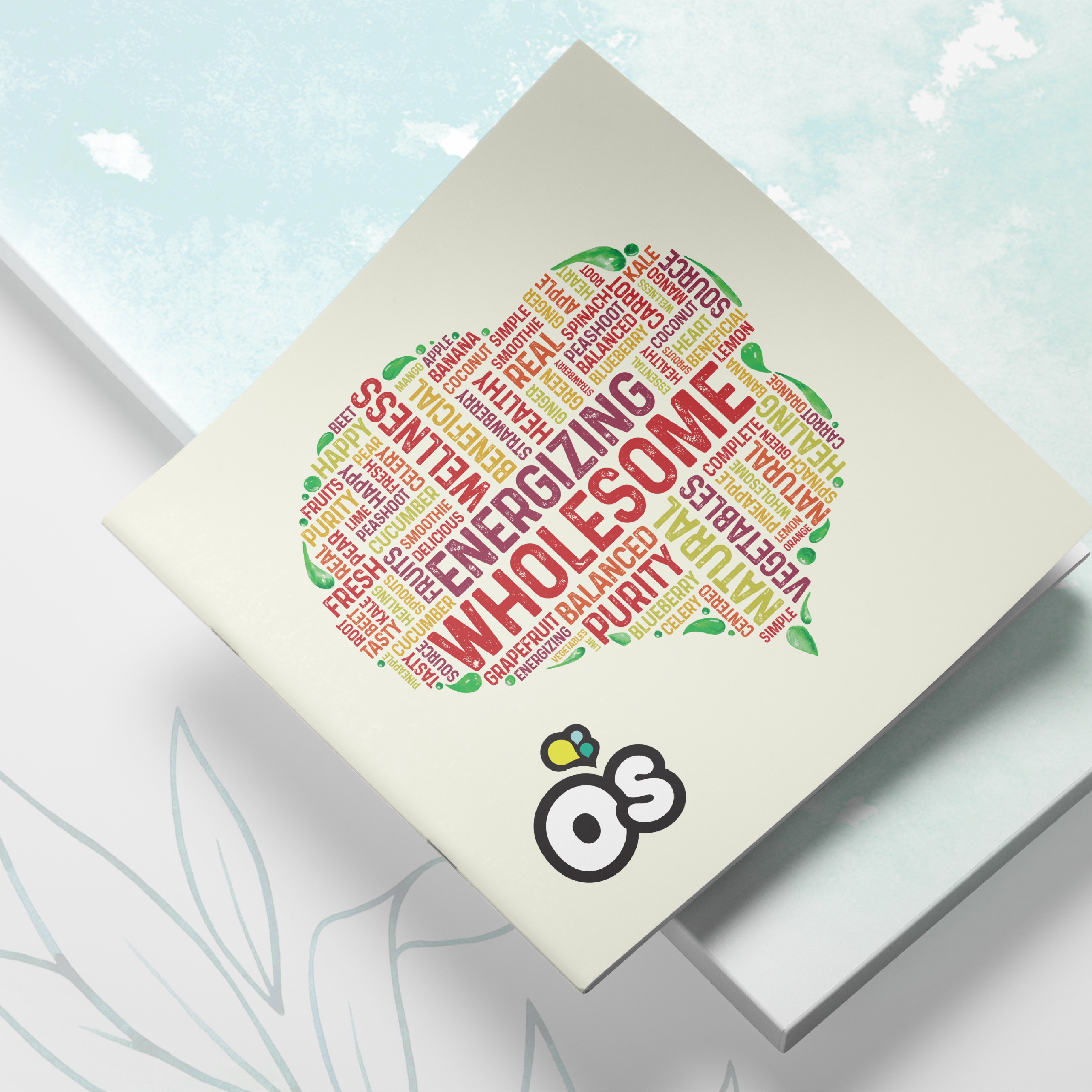
To deliver a natural design, Rivky incorporated watercolors on all brand material to create a natural and soft design. Key brand words such as energizing and wholesome were collected to form a word cloud in the shape of O’s icon.
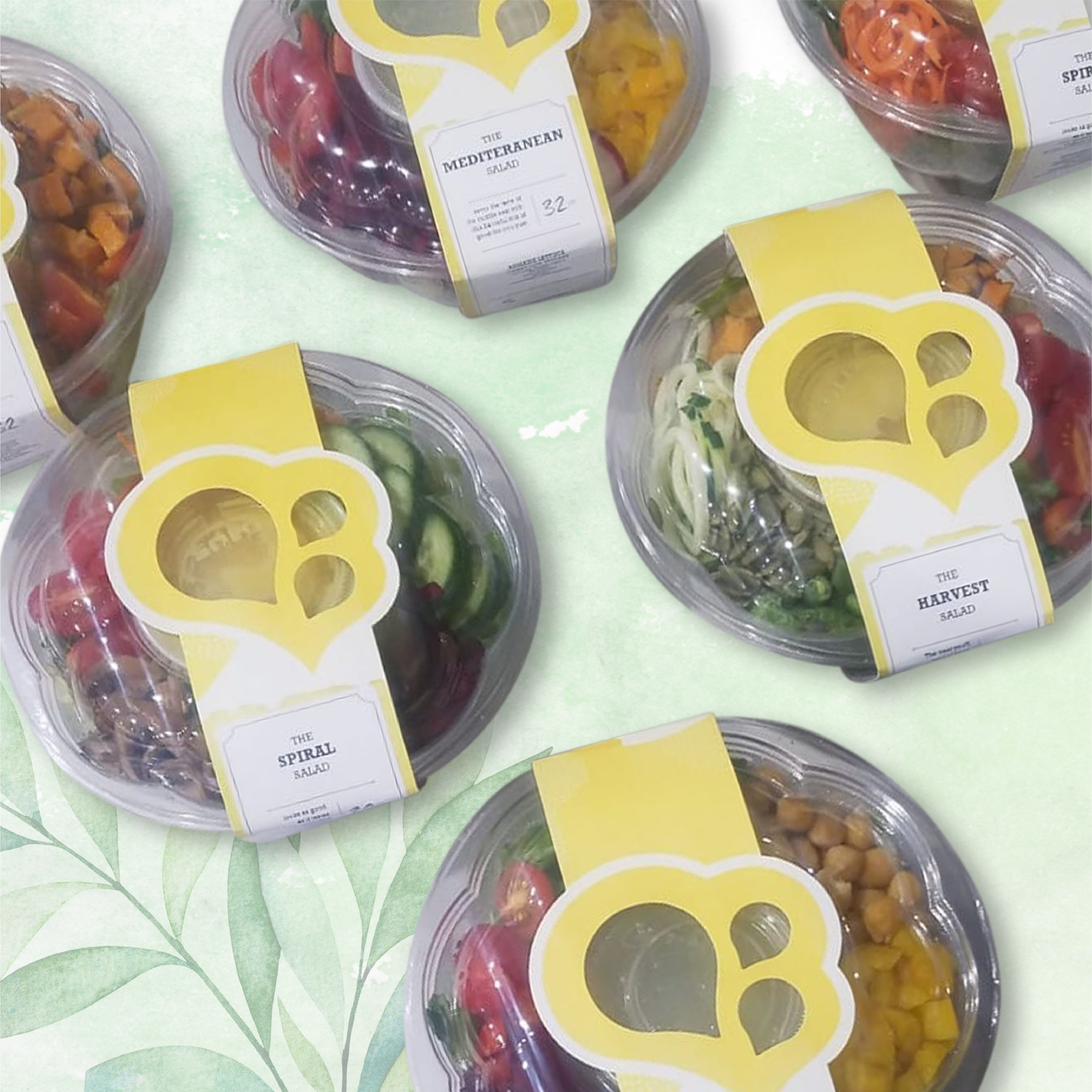
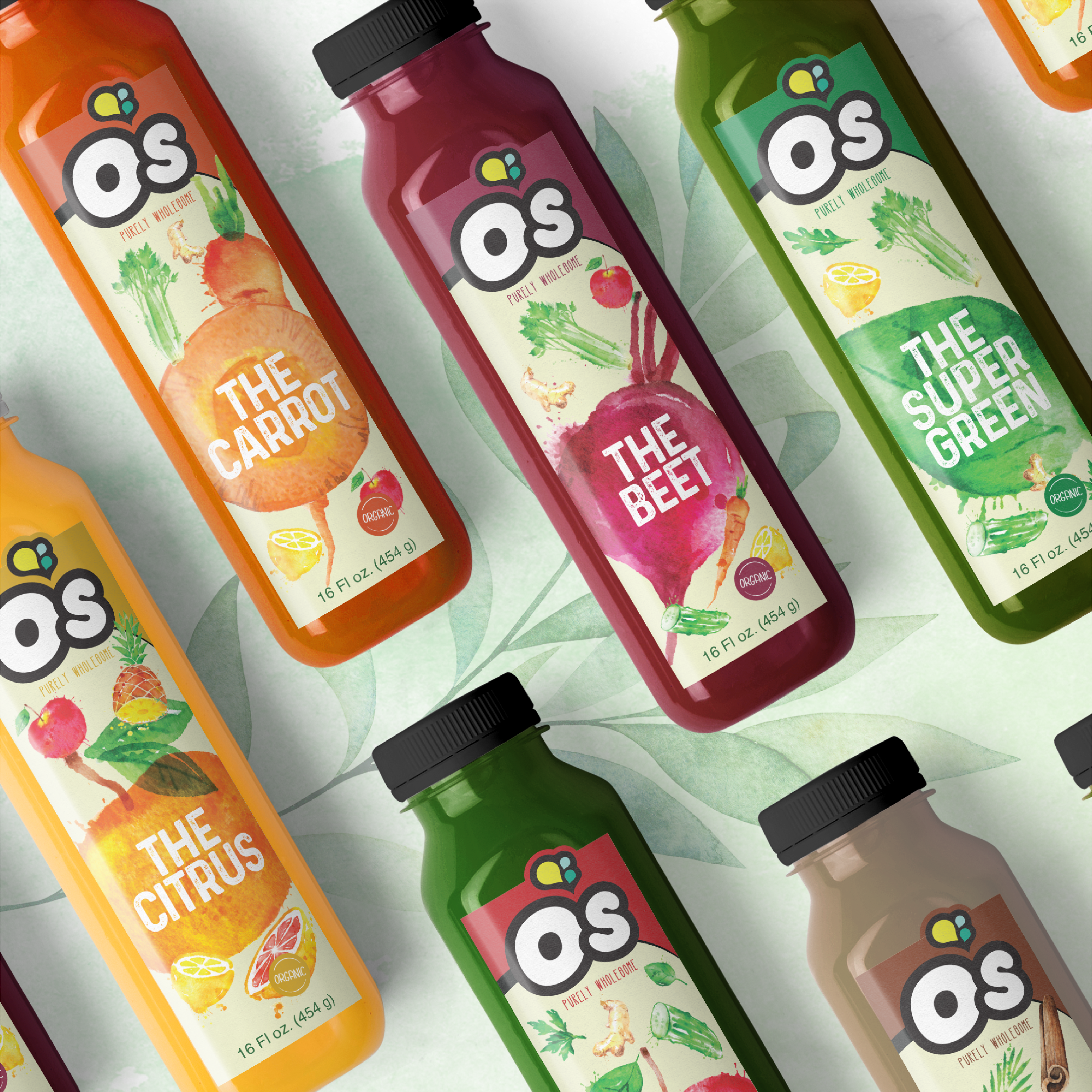
The die-cut on the juice and salad packaging is custom-made to accentuate O’s icon. To give an organic and transparent feel, Rivky incorporated images of each ingredient into the packaging. Therefore, when a consumer picks up a product they know exactly what they are putting into their body. Rivky’s challenge with this concept was to subtly incorporate every ingredient without making the packaging look busy or unaesthetically appealing to the eye of the consumer. She achieved this through the use of watercolors, to soften the overall aesthetic- still giving the information while Maintaining the fresh feel of the brand.
![]()