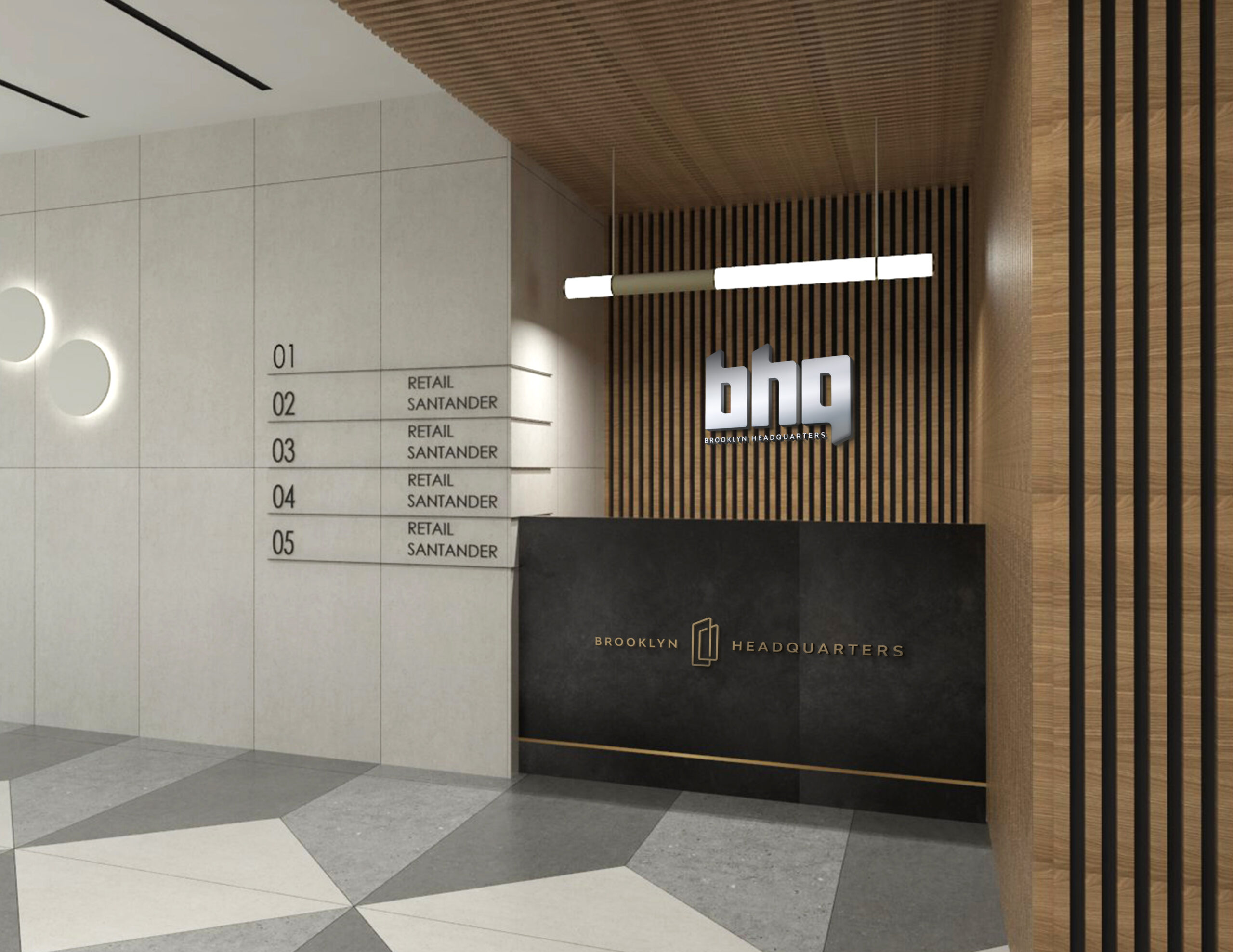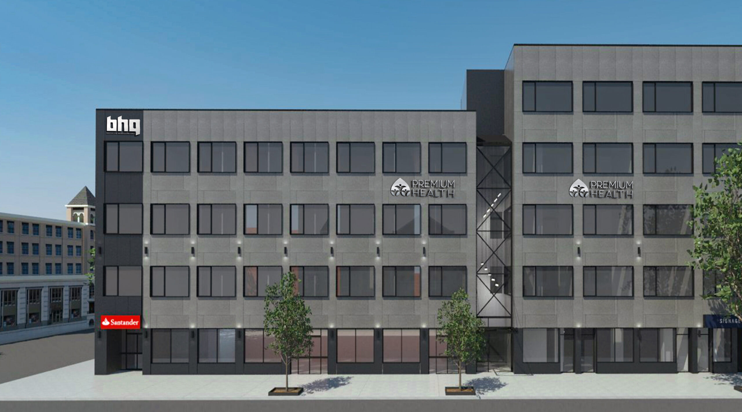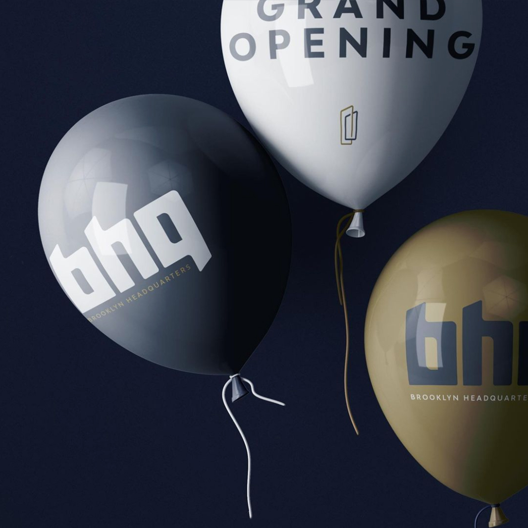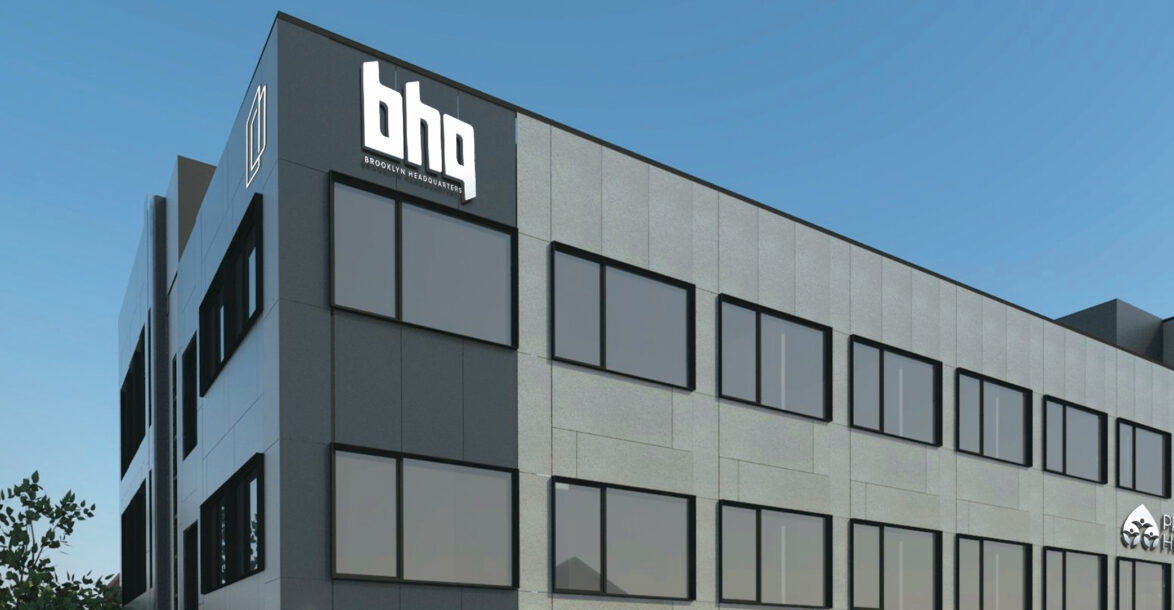

Meet BHQ (Brooklyn Headquarters) a new state-of-the-art modern building that hosts a variety of businesses, from retail to medical to corporate.
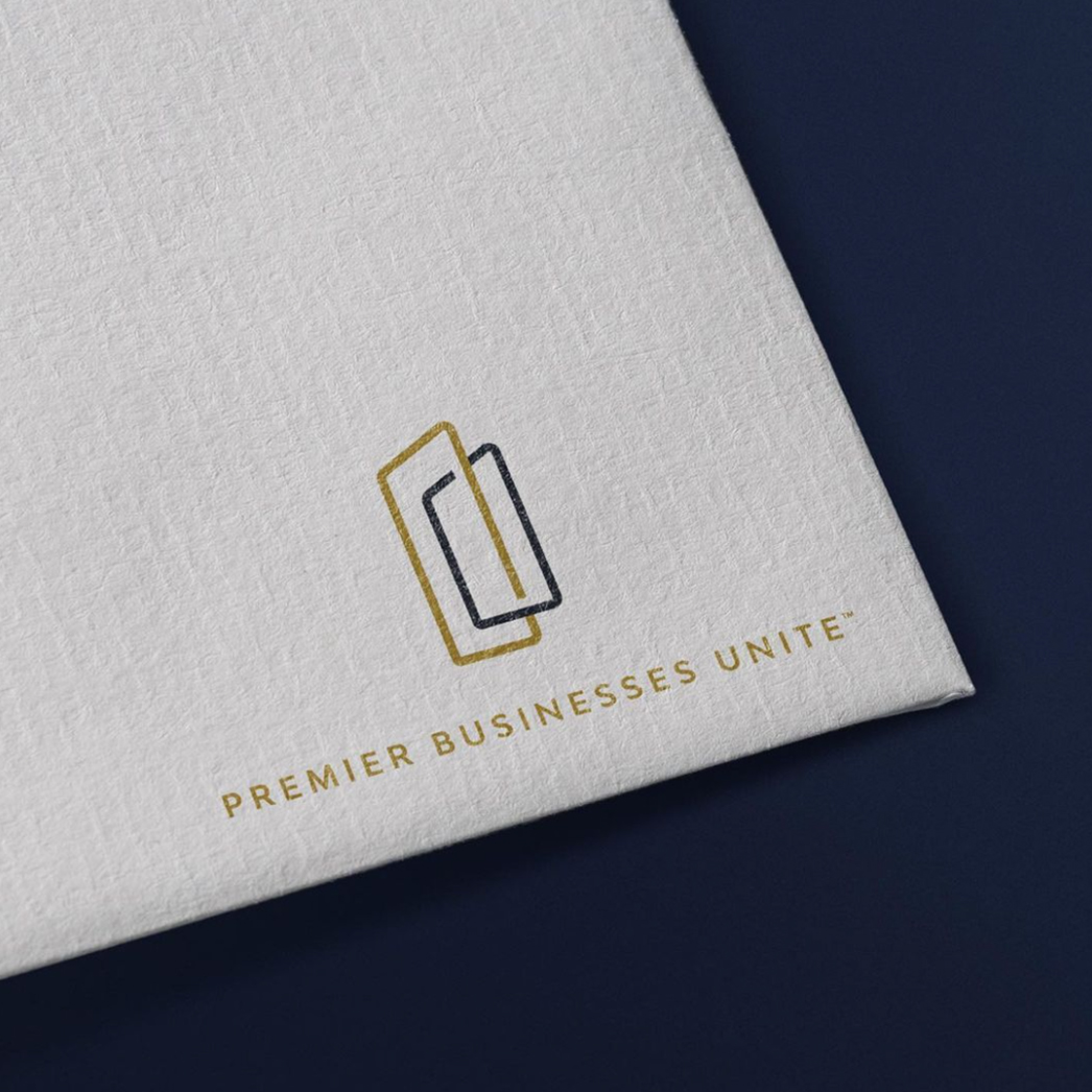
Mission: To create and develop a brand identity that conveys the brand’s story in a clear and compelling fashion.
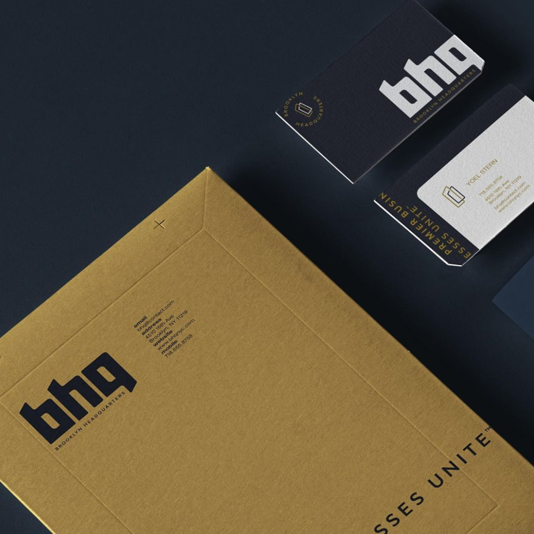
Bold lettering characterizes this logotype of Brooklyn headquarters. The striking impression of the font allows it to stand on its own, almost an icon in and of itself.
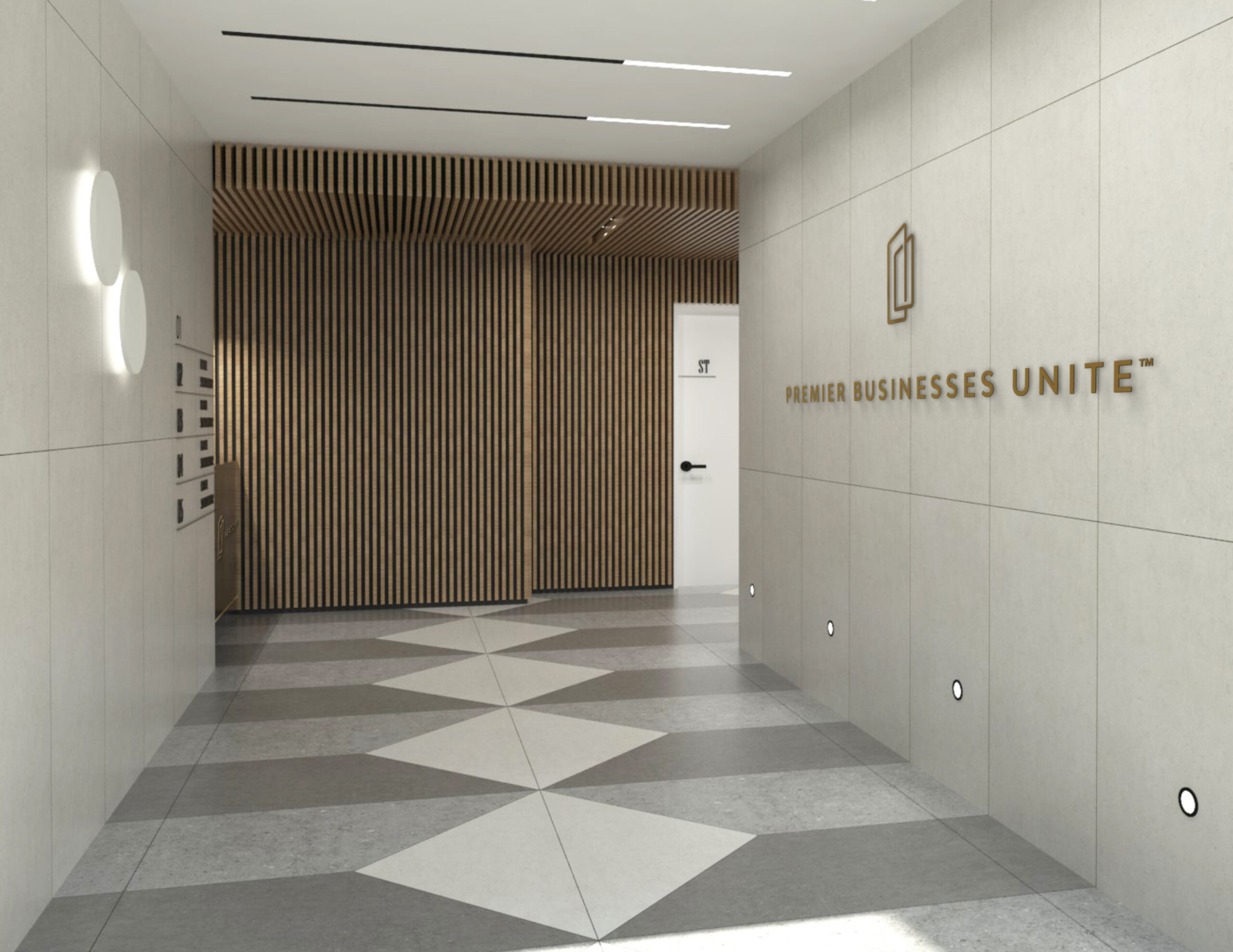
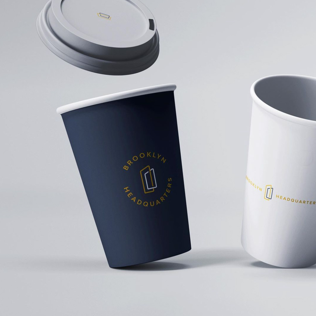
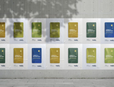
For the brand colors, we used a base of deep blue, a true gold accent, and an off-white contrast. The deep blue gives a grounded and sophisticated feel and injects gravitas into the brand. Elegant and rich, the gold also matches the interior decor of the iconic BHQ building. The off-white provides contrast, highlighting the previous two colors.