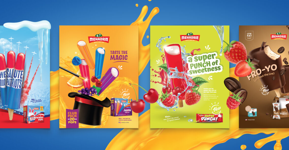
Our mission was to showcase Mehadrin’s new line of Summer 2020 products in a fun and imaginative way. Every ad was created in a graphic and animated version. In each ad, we chose to emphasize the star of the show – the ice cream – to give the consumer a taste of what they should expect.
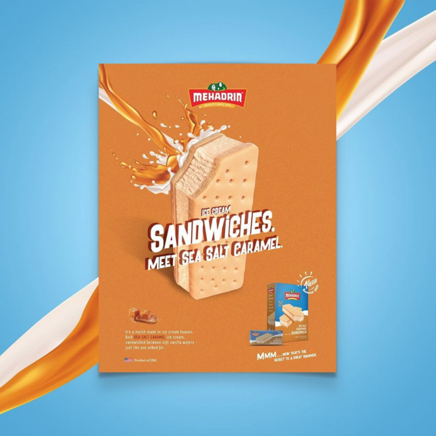
For the Frozen Yogurt we used an image with a big bite to give the viewers a feel of what they should expect. The turquoise served as a really nice contrast against the chocolate and vanilla. For the Sea Salt Caramel Sandwich, we want to emphasize the novelty of this combination in the Kosher World. We accomplished that through the concise, yet descriptive copy – alongside the striking imagery.
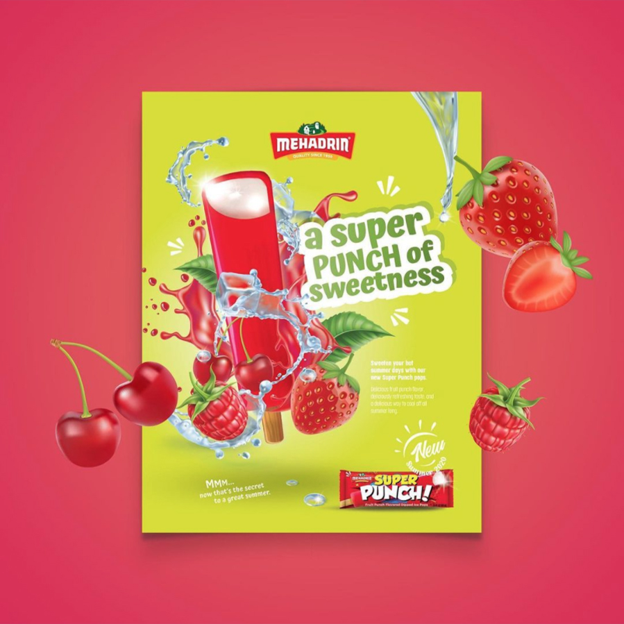
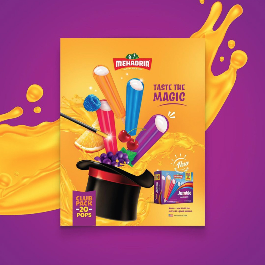
With the Super Punch, we aimed to depict the “punchiness” of the pop with eye-grabbing visual showing all the components of the ice pop. The colors and fonts chosen served as a beautiful contrast and really made the entire ad POP! The Magic Pop was so much fun to design because of it’s imaginative nature! We obviously had to include the Magicians hat 🎩 and wand. The bright and popping colors definitely made this one a show stopper!
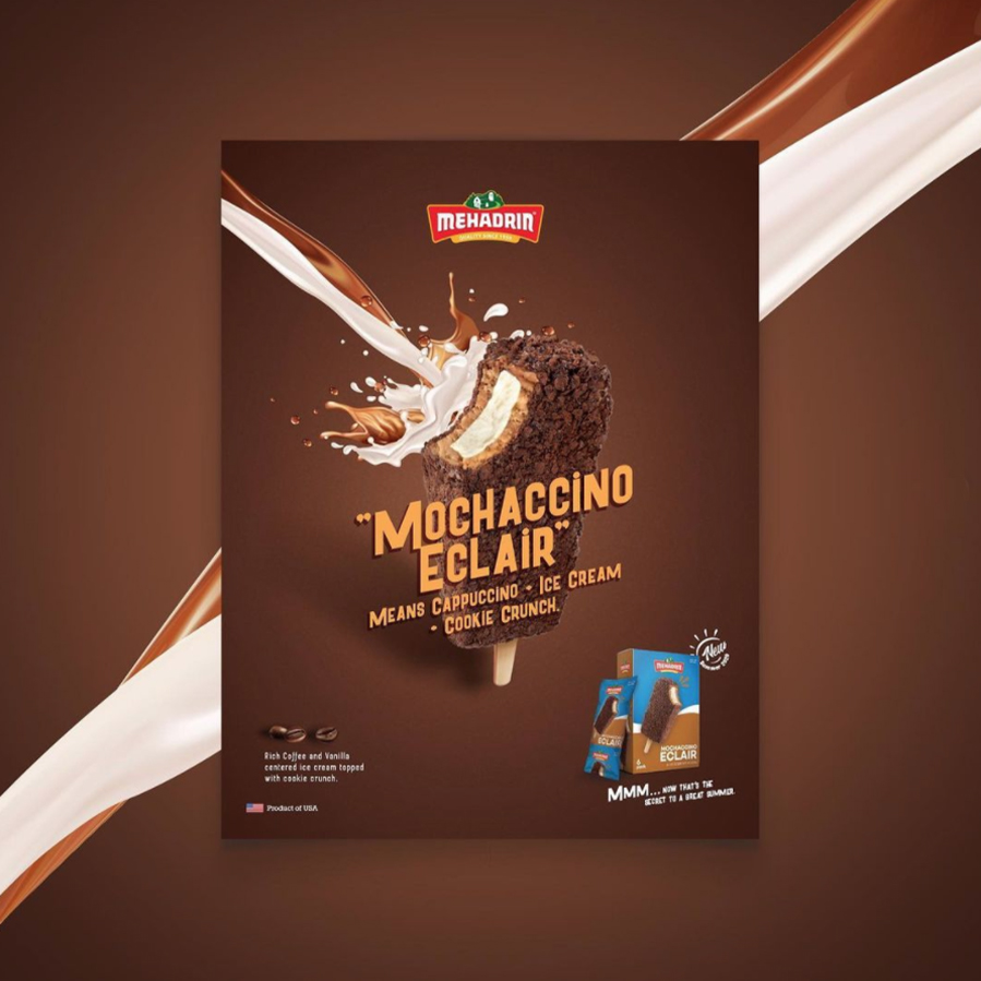
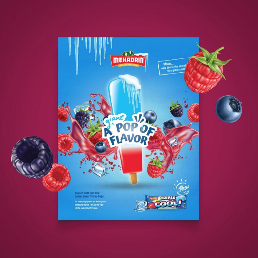
With the Mochaccino Eclair, we photographed the ice pop with a bite, so the customer can get a good picture of all the components that are inside the ice pop. For the Triple Cool POP, we really highlight the level of flavor in one bite. We centered the product alongside the striking copy in the center so the consumer’s eye, right away was attracted to that point.
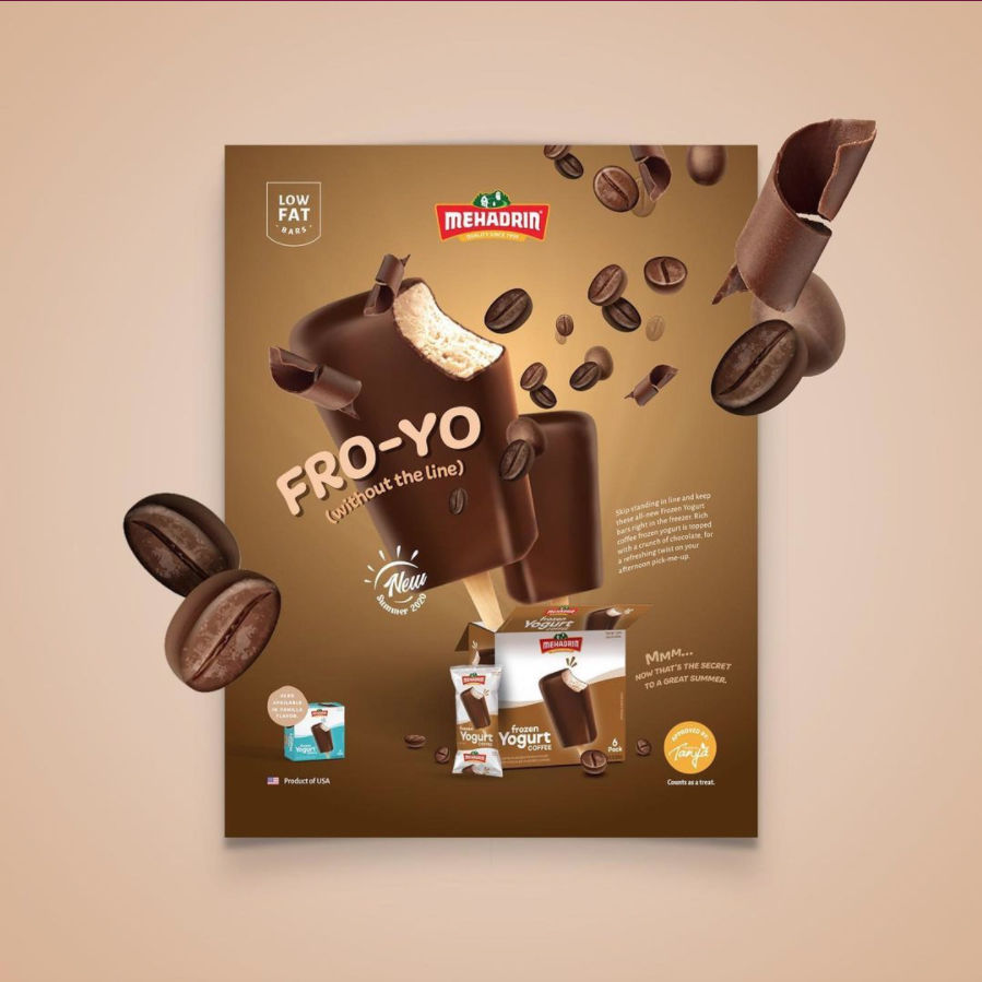
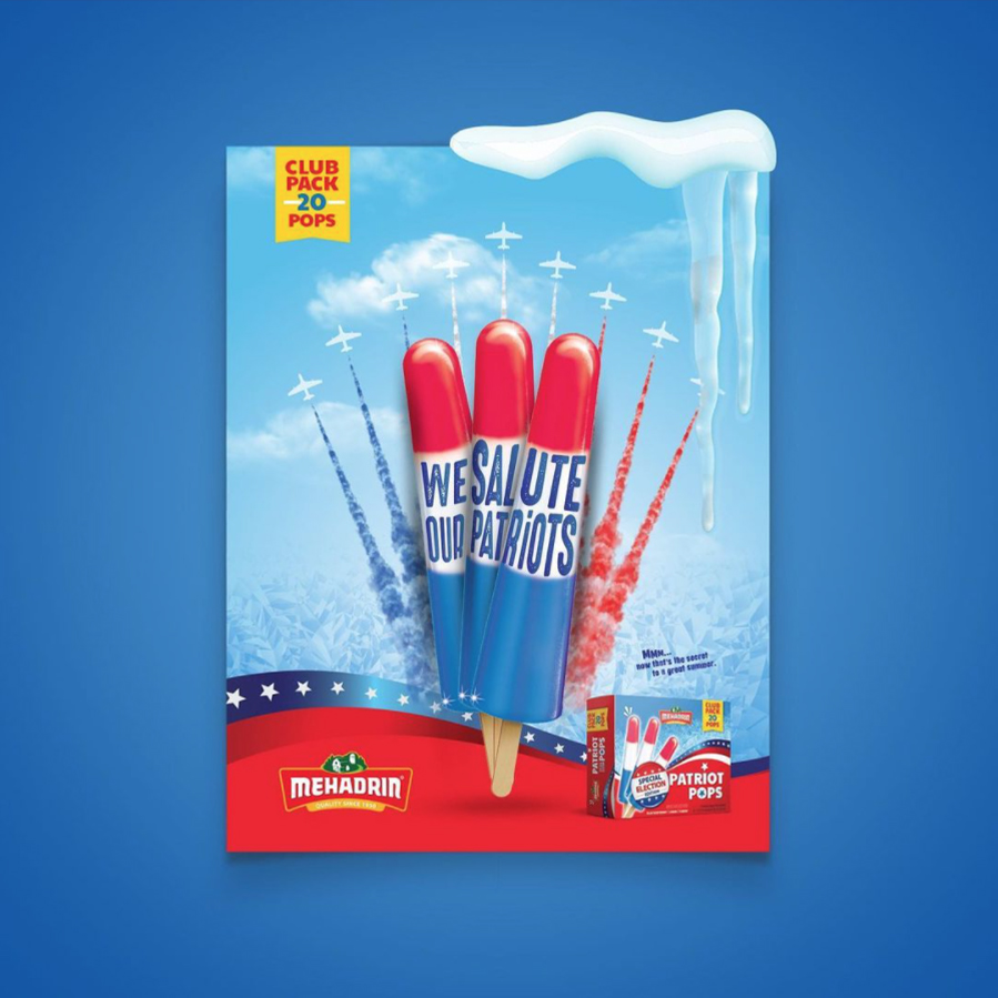
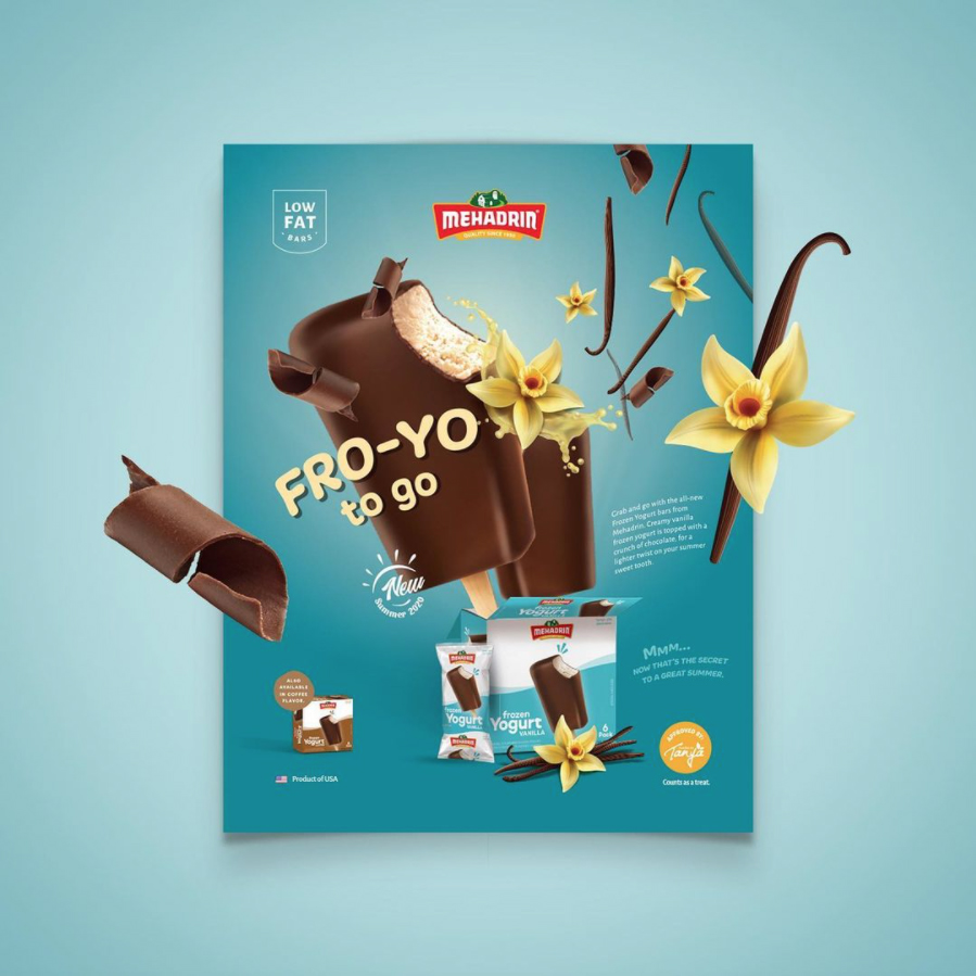
The Fro-Yo! This one is for the coffee lovers, so we visually placed a lot of emphasis on the coffee theme. Since these were also being sold as singles, we displayed the packaging in a single version as well as a boxed version. The Patriot Ice Pop gave a fun nod to the current US elections. We used the flag colors and similar imagery to wrap the entire concept into one ad.