
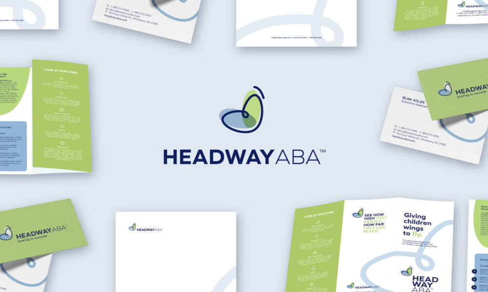
Headway ABA
Client: Headway ABA

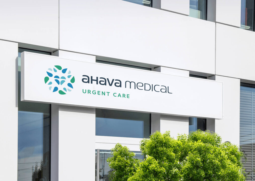
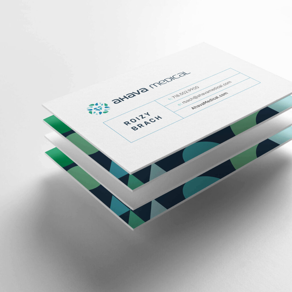
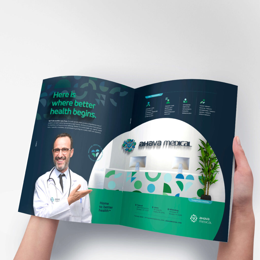
Ahava Medical is a full-service medical center, making it easy for patients to receive health care in one place.
We rebranded the 25-year-old medical center to better communicate its services in a clean and updated way. We created a comprehensive corporate identity package for the client, replete with print, digital, and an interactive website.
We portrayed Ahava Medical’s message with the powerful visual of a heart. Just as in a heart, all chambers work in unison to beat with strength, so too, all aspects of Ahava Medical work together in the effort to bring the best in health.
Ahava Medical Center
Brand Identity
Material Design
Marketing
Web Design
Web Development

The heart represents the hub that’s the medical center, doing its part to pump energy and life. The chambers of the heart that hint at the departments that exist within the medical center. Shapes that portrude out of the heart to represent specialists within the trusted circle. A team that comes together in one place to bring stellar medical care.
Various shapes cluster around the heart, representing the numerous specialties the center offers. Together they create a circle that embraces our patients within with the quality care they deserve. The circle conveys openness, trust, and a sense of wholeness.
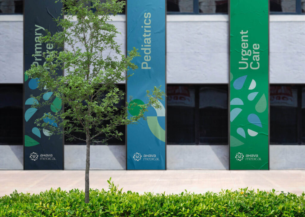
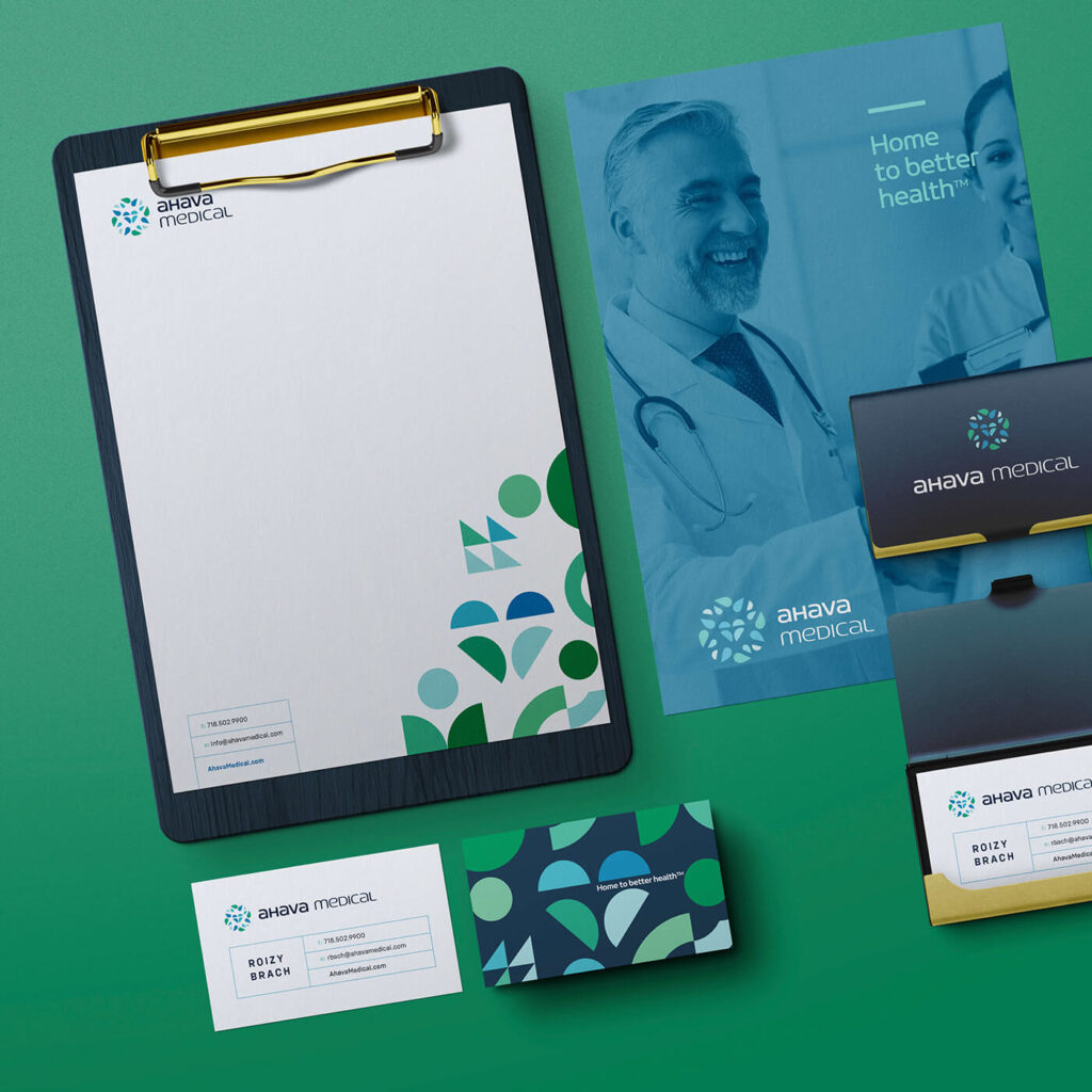
Let’s talk colors: We went with high-contrast shades of green and blue to convey the brand messaging of professionality and trustworthiness, while showcasing the distinctness of the brand with the bold colors.
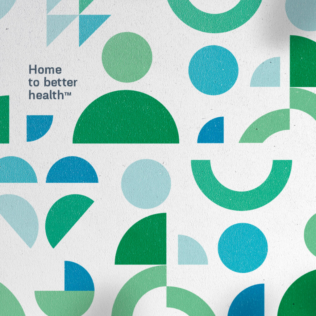
Working with the brand colors and shapes, we created a custom iconography set and pattern that displays the different functions of Ahava Medical.


Client: Headway ABA
Client: Golden Flow
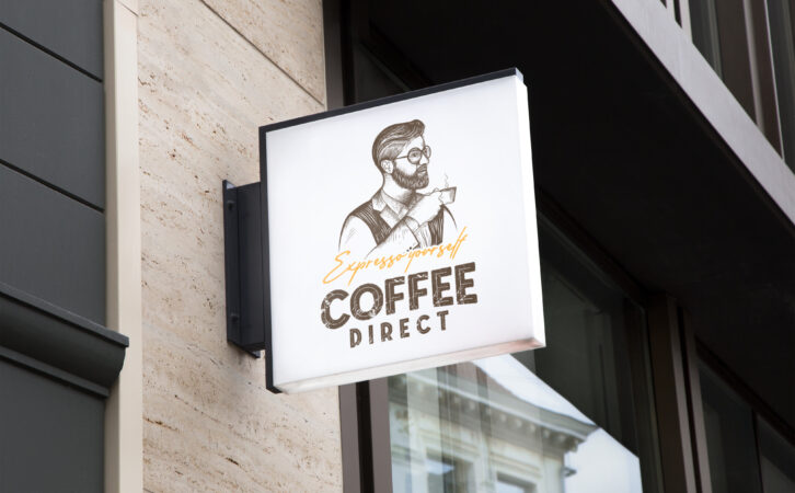
Client: Coffee Direct
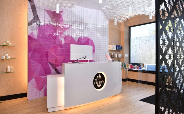
Client: White Orchid Medi Spa
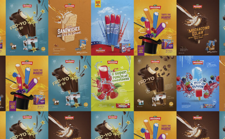
Client: Mehadrin Ice Cream

Client: Tuv Taam

Client: Fineline
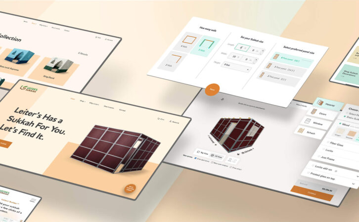
Client: Leiters Sukkah

Client: Mehadrin Ice Cream
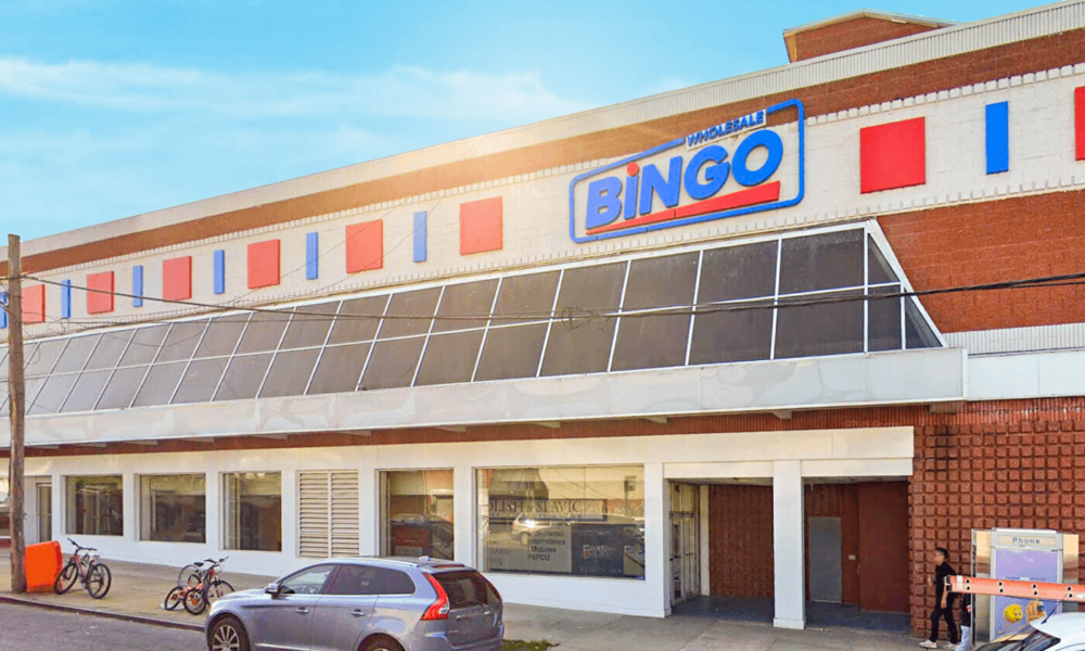
Client: Bingo Wholesale
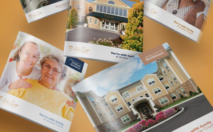
Client: Amber Court Assisted Living
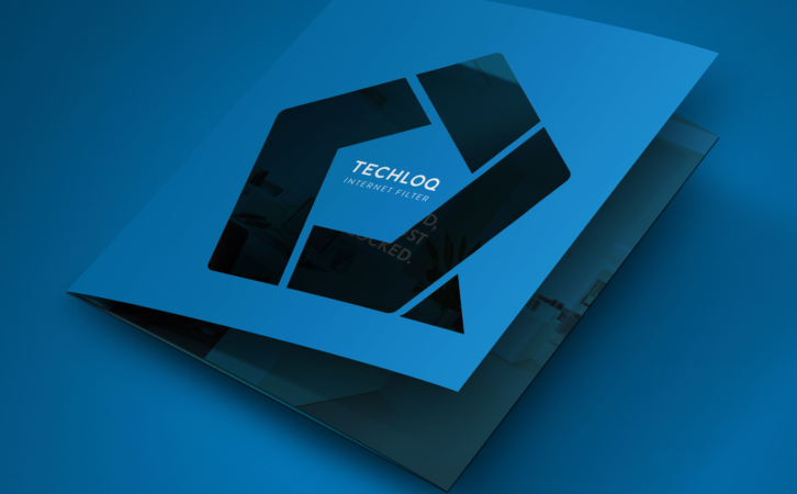
Client: Techloq

Client: Preferred Builders
Client: Techloq
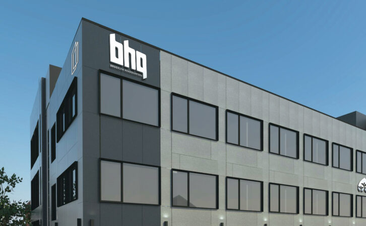
Client: BHQ
Client: Connekt

Client: Boulder Builders
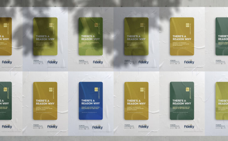
Client: Fidelity Payment Services
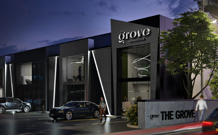
Client: The Grove Business Hub
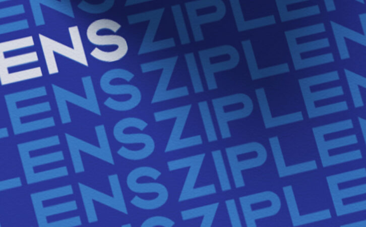
Client: Ziplens