
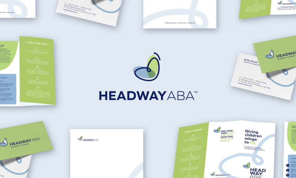
Headway ABA
Client: Headway ABA
Trimblaze is a full-service finish carpentry and installation company who design and construct upscale door and molding installation.
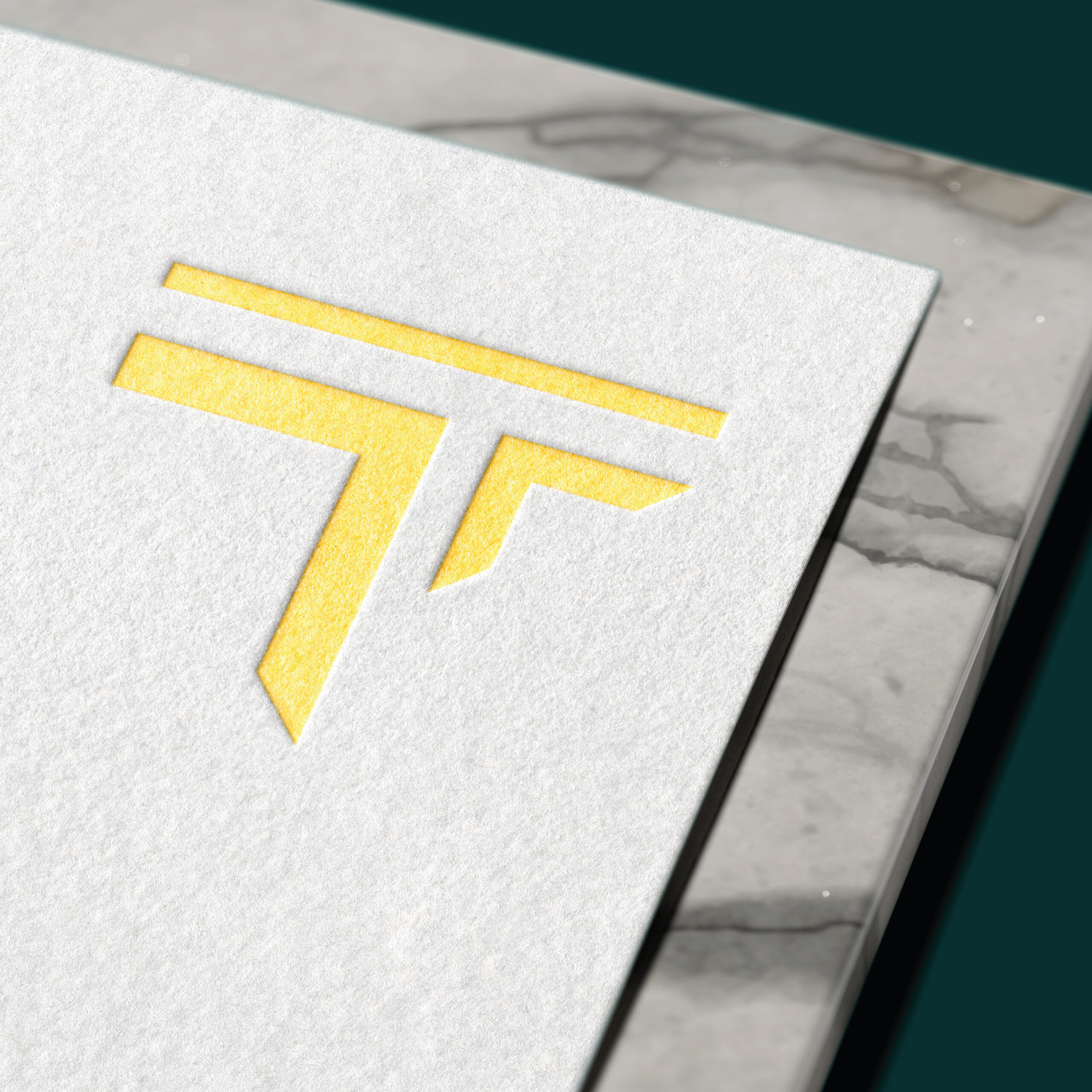
We rebranded the 20-year-old company to visually communicate its service in a clean and updated way. We wanted to highlight the precision of the angles of the cuts when it comes to Trimblaze’s trimmings, so we aimed to convey that through the icon which is sharply cut on the angle – all while shaped like a “T” – the first letter of Trimblaze.
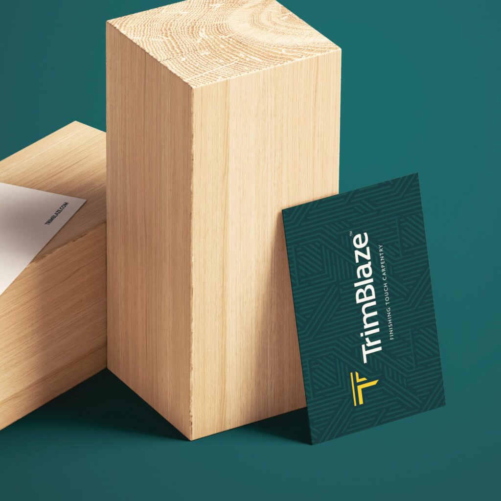
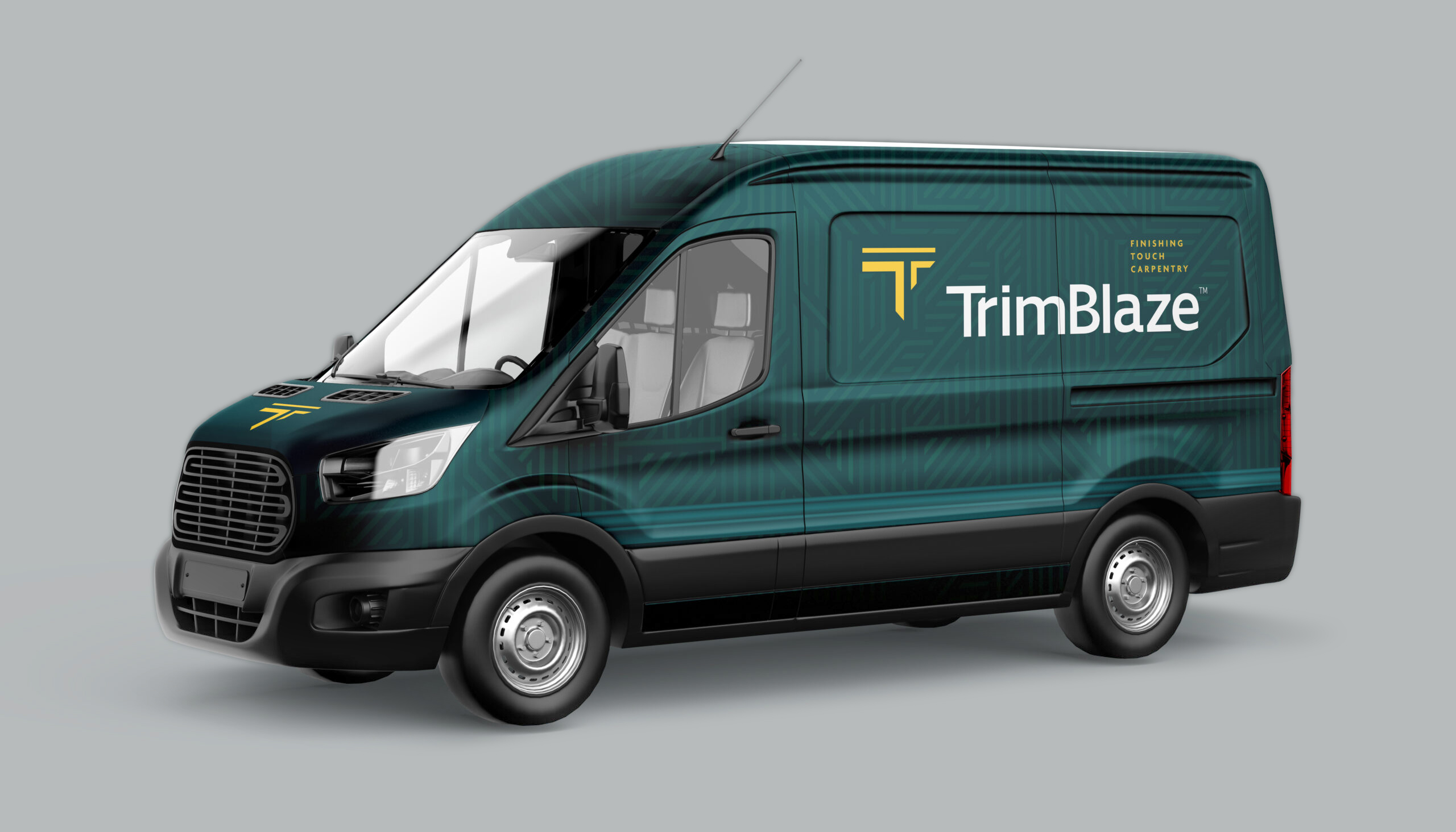
The Colors were our upgrade of the classic black & yellow construction colors. We borrowed the construction yellow and contrasted it with classy hunter green to communicate the luxurious craftsmanship of Trimblaze.
Trimblaze
Brand Redesign
Brand Material
Web Design
Web Development
Print Ads


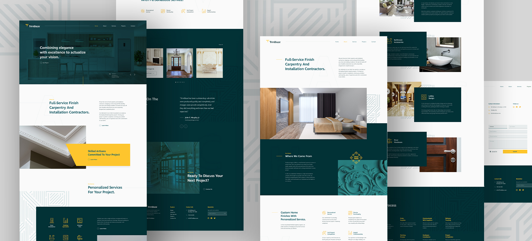
Web Design
With the website, we aimed to communicate the brand’s identity of upscale modern architecture through the design, layout, and user experience.
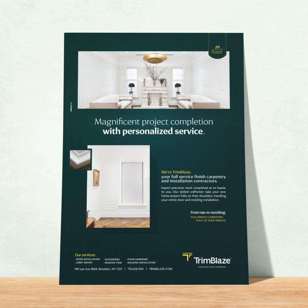
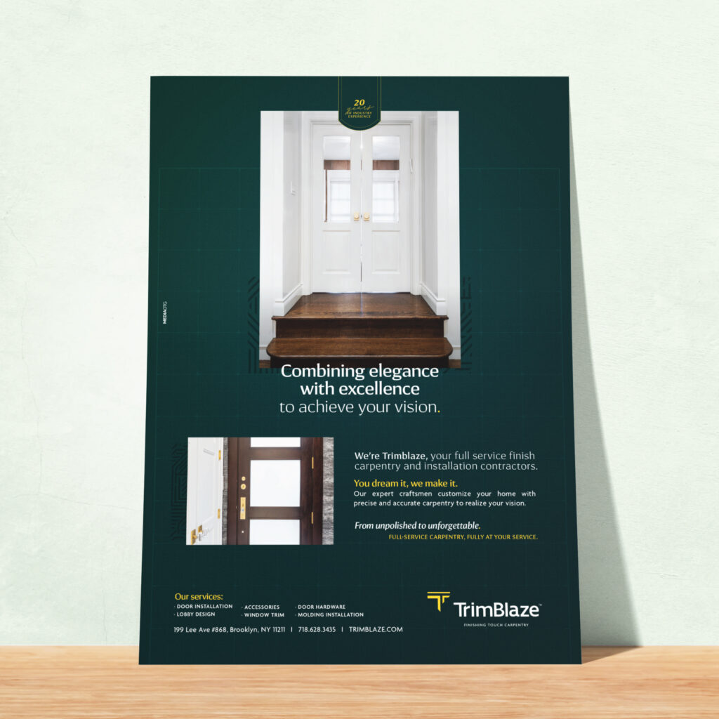
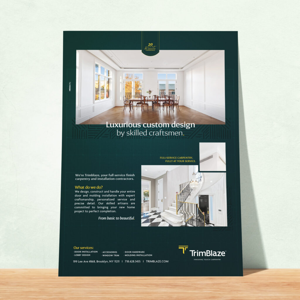
Print Ads
We also created a series of ads to showcase the rebranding. It was important to the client to display their handiwork while explaining their services. We added an element of blueprint within the design to emphasize the build.
Client: Headway ABA
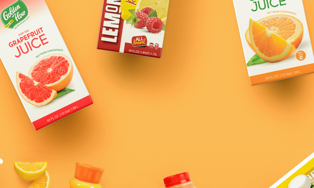
Client: Golden Flow
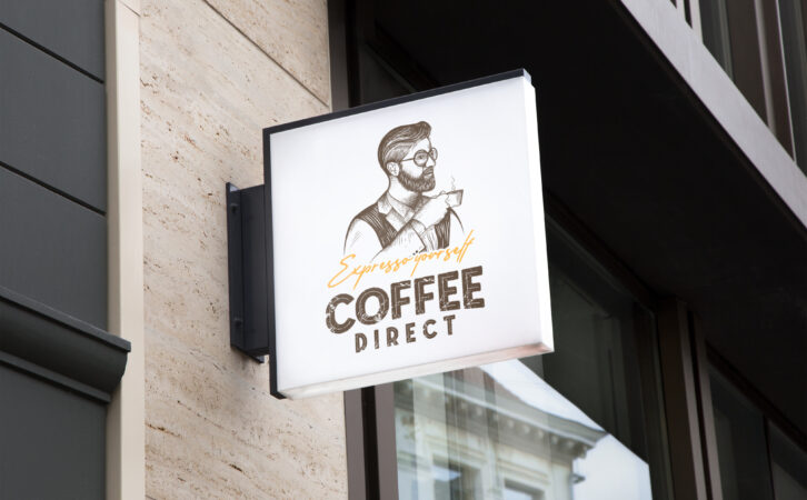
Client: Coffee Direct
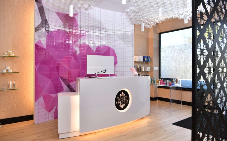
Client: White Orchid Medi Spa
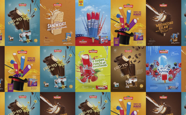
Client: Mehadrin Ice Cream

Client: Tuv Taam
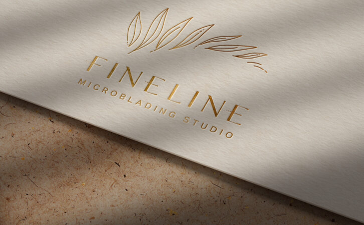
Client: Fineline
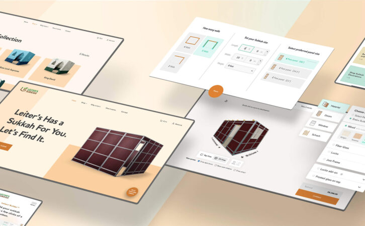
Client: Leiters Sukkah

Client: Mehadrin Ice Cream
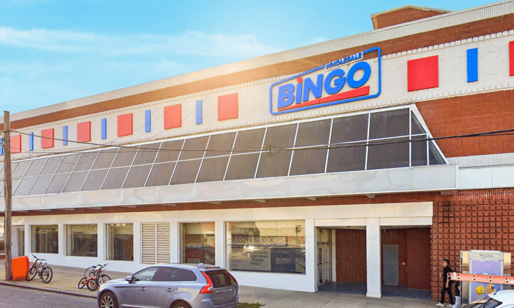
Client: Bingo Wholesale
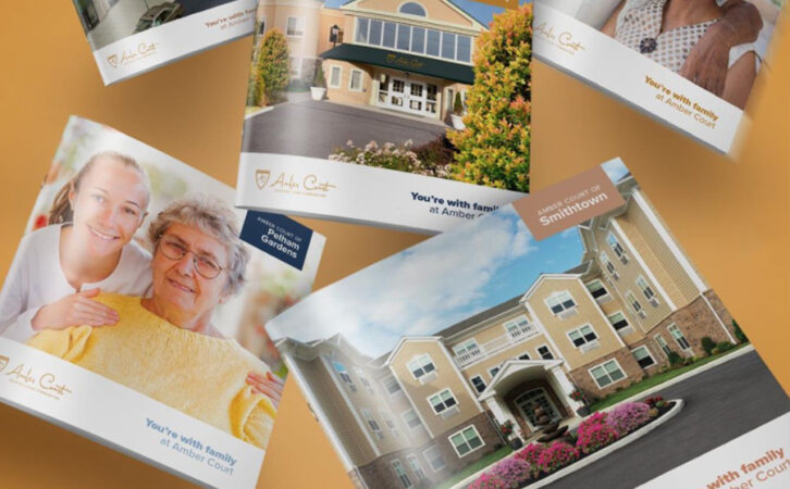
Client: Amber Court Assisted Living
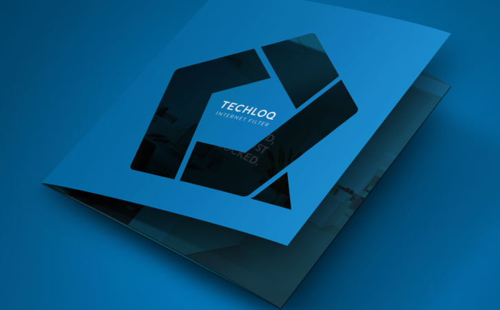
Client: Techloq

Client: Preferred Builders
Client: Techloq
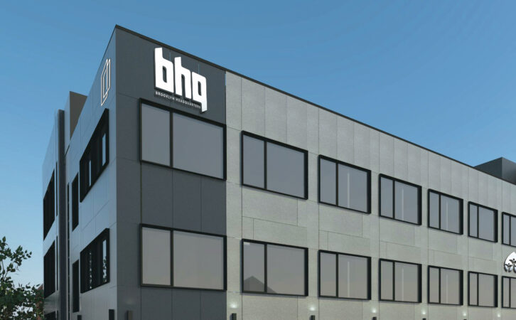
Client: BHQ
Client: Connekt

Client: Boulder Builders
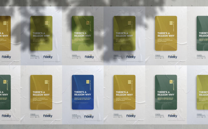
Client: Fidelity Payment Services
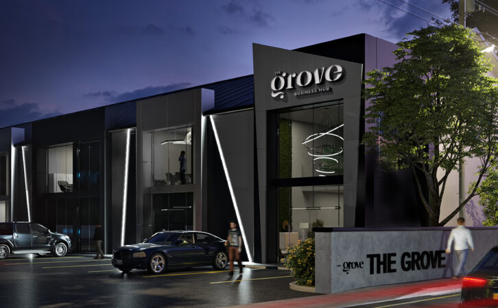
Client: The Grove Business Hub

Client: Ziplens